Master Matrix
As a result, the data values became irregular and began with a range of negative values. The attempt to provide more history to the All continues type was unsuccessful, as there were even more fluctuations in the outputs, and I couldn’t really relate to these outputs in terms of using them for an interaction.
So in conclusion I primarily used real sensor data with some scaling and processing, as the changes were smoother. This approach was suitable because, for the parts of the composition that required continuous data control, no complex gestures were involved. So I have used simple x, y, and z values, which provided sufficient accuracy and responsiveness.
Another approach was to remove the 3x rotation and total acceleration from the sensor data during the training phase to simplify the inputs for Wekinator. This was done to ensure that only the necessary data was provided, potentially making it easier for Wekinator to build a model and would result in a more efficient training. This plan proved successful, as it led to clearer outputs, which for now I have continued with this setup, using only the 3x acceleration data as the input for training Wekinator models.
The last effort in providing better data input to Wekinator was firstly to send constant data values by using the [metro] object to repeatedly trigger sensor readings at a fixed interval. If the system stops receiving data when the sensor is not moving, even for a few milliseconds, it might interpret this as a loss of connection or a gap in data, potentially leading to misinterpretations. Secondly, I tried recording some examples in Wekinator without moving my hand (just keeping it still and then pressing the record button) while maintaining a position aligned with the initial movement. I also tried to record values that were not too low in terms of speed because, as seen in the data display, low values are mostly noise and not very useful as the higher acceleration values which have a greater impact. In practice, there was a slight improvement in sensor functionality, though not significantly noticeable. But I decided to stick with this configuration, as theoretically it ensures a more stable and reliable data flow, although there should be a balance for recording more aggressive and faster movements, it also needs to align with the tempo and the overall aesthetic concept of the performance.
It is also worth mentioning that there is the possibility for experimentation with the settings of the Wekinator itself and changing the routing matrix, such as the input/output connection editor, which helped me in the early stages but not in the final one. And also WekiInputHelper, a software component that helps manage data from a feature extractor (the part that collects data), sits between Max MSP and Wekinator. It has features such as calculating the minimum, maximum, average, or standard deviation of data over time, collecting and storing data in a memory buffer, calculating changes in data (like the difference from the previous value), performing custom math, applying filters, and controlling how often data is sent or sending data only when certain conditions are met.
After establishing the connection between the two software programs, an effort was made to understand Wekinator’s three output types in relation to the composition concept and their application within the patches.
All classifiers or classification outputs represent distinct categories such as Position 1, Position 2 and Position 3. It is necessary to specify to Wekinator how many categories to use. Wekinator outputs numbers, such as 1, 2 or 3, corresponding to categories 1, 2, 3. It attempts to categorize each new input provided.
All continuous outputs generate numeric values within a defined range, divided into two types: Real-valued, for example to control smooth changes like any sliders, and Integer-valued, to adjust parameters such as filter cutoff frequency with an integer output.
The third type in Wekinator is Dynamic Time Warping (DTW), which is used to recognize and compare more complex patterns over time. Wekinator sends different output messages for different output types, for instance when it builds numeric or classification models, it computes a set of output values every time it sees a new input, but when Wekinator builds a dynamic time warping model, it continually looks at the input (despite the speed and the duration of them) to see how closely the current shape of the input, matches each of the example shapes or the trained patterns, this means that the random movements will provide no inputs from the Wekinator.
Figure 1. An overview of Wekinator Types in the Software
In my initial attempts, I tried to record multiple examples for each motion and map the DTW to turn on/off different gates and trigger some selected parameters once during the piece. However, after numerous trials it became clear to me that the absolute value of the DTW is not crucial and cannot be effectively mapped to so many distinct parts. As a result, I decided to use an unlatching or momentary switch pedal for this purpose instead.
Later, I decided to utilize DTW for granular synthesis and the chorus section. I assigned different motion patterns to trigger various parts of these effects, ensuring that any misreadings or constant values would not negatively impact the piece. This approach prevents the possibility of silence, as multiple triggers occur in succession based on different movements. To make the process more optimal, I attempted to convert the float output values of the DTW, which typically range from around 3.0 to 13.0, into a single integer state. From the resulting three integer output data streams, I selected the highest or winner value, as it represents the most probable outcome. Additionally, I implemented a timeout mechanism using a gate with a 5-millisecond delay for the on/off cycle. This ensures that the selected winner motion remains active for a short duration, helping to stabilize the output and prevent rapid fluctuations.
As the distinct categories in the classification did not contribute effectively to the compositional process, I decided not to use them for this project. Instead, I focused on working with continuous outputs to manipulate various sections, such as reverb and pitch shift during the piece. But since the outputs were not very smooth, I assumed that the lack of historical data in this type of Wekinator might be the reason, so I considered that providing more past values could lead to more consistent results.
To address this, I mapped the sensors to the DTW and then used 10 data values (7 directly from the sensors and 3 from the DTW outputs) to train another Wekinator for continuous control. Additionally, different port and message names were required for the input and output so that Wekinator could distinguish them from the DTW data.
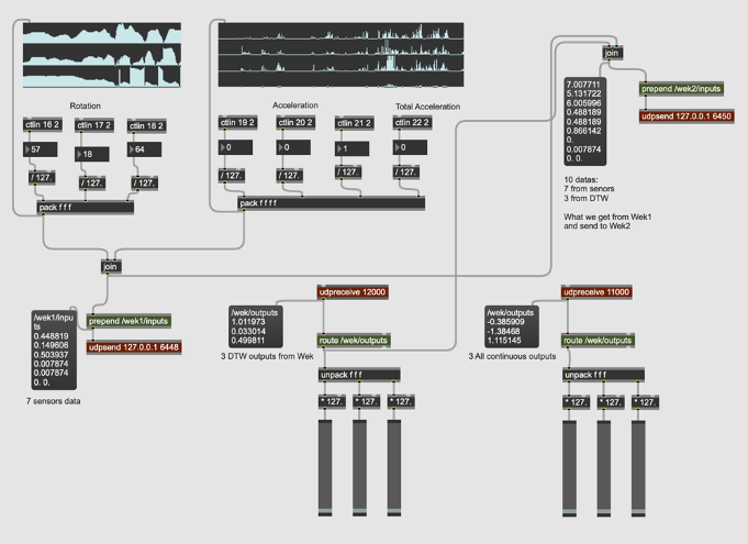
Figure 2. Max MSP Data Exchange and Configuration For DTW and All Continues Data Types
After deciding on the types of interactions in the programming part, I realized the need to use machine learning techniques to map more complex gestures and analyze and compare them. I was looking for an external library that could help me with that so I could integrate all parts of the work into a single software. I came across ml.lib7, developed by Ali Momeni and Jamie Bullock for Max MSP and Pure Data, which is primarily based on the Gesture Recognition Toolkit8 by Nick Gillian.
Unfortunately, none of the objects from the package were able to load in Max MSP, and I encountered an error indicating that the object bundle executable could not be loaded. I also discovered that the creators had discontinued support and debugging for the library. However, it appears that the library still works on windows, both in Max MSP and Pure Data and on macOS, only for Pure Data.
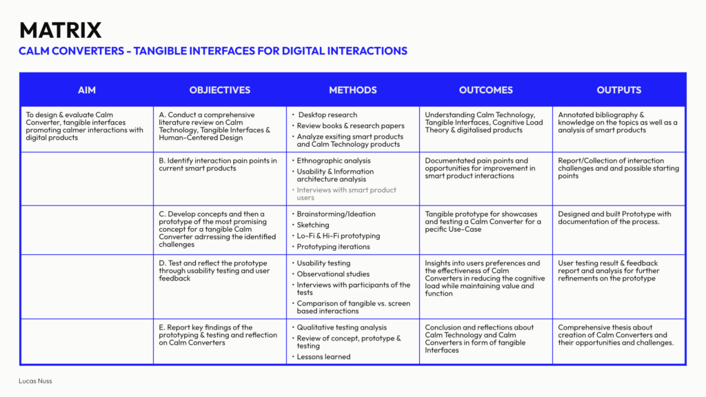
Since I had developed all the patches and processing parts in Max MSP on macOS, I decided to work with Wekinator, an open-source machine learning software created by Rebecca Fiebrink, which sends and receives data via OSC. In the early stages, I tried to [pack] all the sensor datas (3x rotations, 3x accelerations and 1x total acceleration) and send/receive them to/from Wekinator via the [udpsend] and [udpreceive] objects.
One important consideration, which is basic but necessary, is to use the same port number for the inputs. If running everything on the same computer, the localhost address is by default 6448. Another key point is that the message name used to send inputs from Max should match with the one in Wekinator e.g., /wek/inputs. The same considerations apply when receiving outputs from Wekinator. Another important factor is that Wekinator needs to know the number of inputs and outputs to properly configure the machine learning model. At this stage, I set it to 7 inputs and chose to receive 3 outputs from Wekinator.
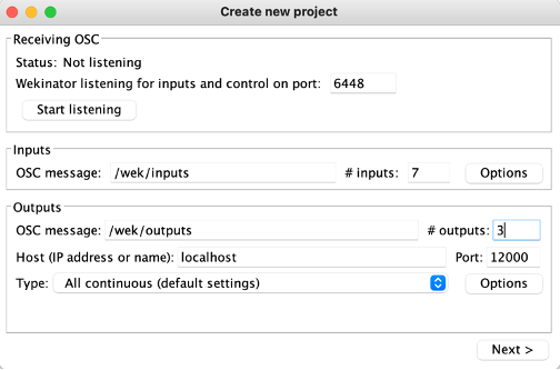
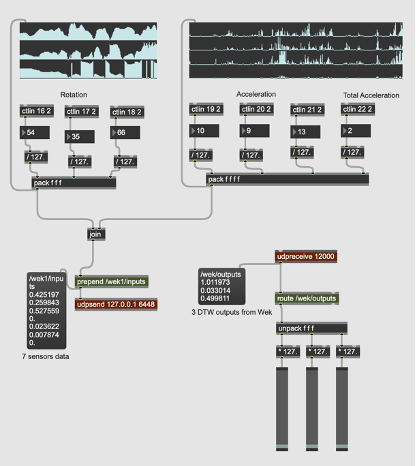
Figure 1. Real-Time Data Exchange and Configuration Between Max MSP and Wekinator
Additionally, there are other abstractions that I found necessary during the practice phase. For instance, using the [jit.grab] object to digitize video from an external source like the laptop’s front-facing camera to observe my hand movements.
At the end I used a feature found in the Extras menu of Max MSP to record and play back the Max output, as well as another buffer to record the acoustic sound of the violin, for further synchronization and mixing.
Some parts of the patch were placed in abstractions to make the patch clearer and easier to follow for the violinist, as well as to make it more accessible in different sections. This will require opening multiple windows on the screen based on the performer’s preference. Nevertheless, a presentation mode of the main patch can also be considered, offering a simplified, performance-oriented interface that allows the violinist to focus on essential controls and visual elements without unnecessary distractions.
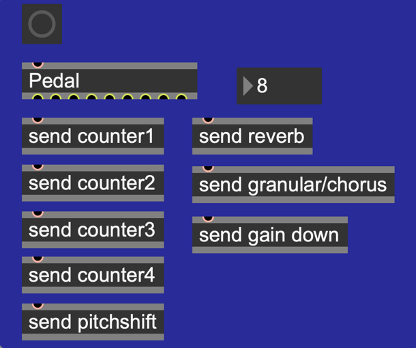
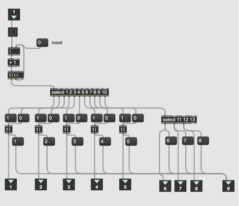
It is also worth mentioning that the function of the pedals (for 8 interactions) for the first 5 parts is to turn each one on/off, meaning the pedal needs to be pressed twice for each. However, for the last 3 parts, only one press is required. A counter number is included in this section to display the current interaction number, helping to prevent confusion while pressing the pedal.
Microsoft Word – Exposé III.docx
Figure 1. An overview of pedals functions and interactions in Max MSP
The programming strategy was to begin by recording the violin to gather materials for further processing during the piece. I used four buffers (with applied Hanning windows to smooth the edges of the signal), recording into them sequentially for later looping. The buffers will be triggered via a pedal, which activated each buffer one after the other using a counter.
After recording into the four buffers, the gate for pitch shifting of one or two buffers would open, as they contain more low-frequency content, making the pitch shift more noticeable. The pitch shift was controlled in real-time using sensor data, specifically the Y-axis rotation parameter.
After exploring pitch shifting while playing the violin, the next gate will gradually increase the reverb gain over 10 seconds, rising from -70 dB to -5 dB. The reverb parameters (size, decay time, high-frequency damping and diffusion) are controlled by real sensor data, including the Y-axis rotation. The core concept of the reverb patch is inspired by the [yafr 2] as a plate reverb by Randy Jones, in the style of Griesinger, and is part of the Max MSP library.
Next, I applied another gain adjustment using the same approach over 20 seconds to gradually introduce the chorus and granular sections. For this part, I primarily used DTW data from Wekinator to switch between different granular synthesis patches, while real sensor data controlled the chorus via the X-axis rotation parameter. The setup includes six granular synthesis patches, triggered at varying tempos. Three of these patches feature randomized start/stop (grain positions) and duration settings, creating diverse densities and sizes of the grain with or without pitch shifting and reverse effects. The remaining three granular patches have their parameters controlled by the Y-axis rotation sensor. In this section, the resulting sound creates harmony across different frequency ranges.
Recently, I started watching the YouTube documentary series „0800 SEE ORCA“, which follows the work of Dr. Ingrid Visser, a renowned orca researcher and conservationist based in New Zealand. The series, directed by Paula Kormos and featuring footage shot by marine biologist and filmmaker Robert Marc Lehmann, offers a behind-the-scenes look at orca research and conservation. It covers a wide range of topics, from the identification of individual orcas and their social behavior to the urgent threats they face due to human activity.
What I found particularly engaging about the series was not only the scientific insight but also the emotional connection it fosters with these incredible animals. The show successfully combines education with a call to action for marine conservation, making it not only informative but also deeply moving.
In this blog post, I’ll share my reflections on the documentary series and discuss how its themes tie into my master’s thesis, which focuses on creating interactive, digital alternatives to traditional animal exhibits in zoos and aquariums.
The Series: An In-Depth Look at Orca Research and Conservation
„0800 SEE ORCA“ follows the daily work of Dr. Ingrid Visser, a key figure in orca research, who has dedicated her career to studying these majestic animals and advocating for their protection. Set in the waters of New Zealand, the series offers stunning footage of orcas in the wild and provides a real glimpse into their lives and behaviors. One of the most fascinating aspects of the series is how Dr. Visser and her team use unique physical traits—like dorsal fin shapes and skin patterns—to identify individual orcas. This level of detail helps them track the health, movements, and social interactions of the population.
Another major theme is the threats that orcas face, including environmental pollution, entanglement in fishing nets, and the broader impacts of climate change. The series doesn’t shy away from showing the harsh reality of these dangers, but it also highlights the important conservation work being done to protect orcas, including rescue operations for stranded animals. Seeing Dr. Visser and her team in action during these missions, coordinating with local authorities and volunteers, was inspiring and showed just how critical community efforts are in saving marine life.
One episode that stood out to me was the one on orca strandings—a situation that can be devastating but is sometimes preventable with quick, coordinated action. Watching the team work together to rescue these animals brought home the message that conservation is as much about rapid response and collaboration as it is about research.
Emotional and Educational Impact
One of the strengths of „0800 SEE ORCA“ is how it builds an emotional connection between the viewers and the animals. Through the personal stories of Dr. Visser and her team, you can sense the deep bond they share with the orcas. The series is filled with moments of awe and wonder, like when the team spots a new calf swimming alongside its mother or when they witness a rare hunting technique. These moments are beautifully captured and make you feel like you’re right there with the team.
For me, the series underscores how important it is to communicate science in an emotionally engaging way. The facts and figures about orca populations, climate change, and pollution are crucial, but it’s the emotional connection that makes viewers care enough to act. This is something I want to emphasize in my thesis as well—how can we use digital storytelling to not only inform but also inspire people to care about wildlife conservation?
Relevance to My Master’s Thesis: Designing Digital Alternatives
As someone researching digital alternatives to animal captivity in zoos and marine parks, „0800 SEE ORCA“ was a great source of inspiration. The series proves that it’s possible to convey authentic insights into animal behavior and conservation without keeping animals in captivity. By showing orcas in their natural habitat and detailing their social structures, the documentary provides a rich, informative experience that is both educational and ethical. Here are a few ways the series ties into my research:
Conclusion: Learning Through Digital Media
In conclusion, „0800 SEE ORCA“ is more than just a documentary about orcas—it’s a powerful tool for raising awareness about the importance of conservation and ethical wildlife practices. It shows that we can learn a great deal about these animals without having to see them in captivity, and this is a central theme in my research.
As I continue developing ideas for my master’s thesis, this documentary series will serve as a strong example of how interactive digital media can be used to educate the public in a way that’s both engaging and ethical. The series highlights that with the right storytelling techniques, we can connect people to wildlife and inspire action to protect these animals in their natural habitats.
Watch the documentation here:
0800 SEE ORCA – Das Abenteuer meines Lebens | Folge 1
CoSA Graz is a place that blends science with fun in a way I hadn’t quite experienced before. I decided to visit this interactive science center because of its unique focus on hands-on learning, especially in areas like technology and natural sciences. CoSA stands out from more traditional museums by encouraging visitors to dive into the exhibits, explore scientific concepts for themselves, and learn through play. It’s designed primarily for young people, but I quickly found myself just as engaged—and I even walked away with new ideas relevant to my master’s thesis on interactive educational design.
My Experience: From Augmented Reality to Science Exploration
I started my visit with one of CoSA’s unique offerings—the A(R)dventure augmented reality experience. I chose the “Aurora Borealis” room, which places you on an Arctic research ship. The setup was impressive, blending a physical environment with digital AR overlays, and using a virtual assistant called H.I.G.G.S. (Hyper Intelligent Guiding Gadget System) to guide you through the experience. Equipped with AR glasses, I was able to interact with the objects and solve puzzles within the room.
While the concept was exciting, I found that the AR glasses weren’t as precise as they could have been. This made the experience a little frustrating at times, as I had to adjust frequently to align the digital overlays with the physical objects. Additionally, while the experience was enjoyable, I didn’t feel like I learned much. The focus seemed to be more on interacting with the AR technology itself rather than diving into the educational content, like the science behind the Northern Lights or climate change. It lasted around 10 to 20 minutes, which was a bit shorter than I had hoped for, but overall, it was a fun start to the visit.
After the A(R)dventure, I explored the rest of CoSA and was really impressed by how the center manages to make learning about complex topics feel approachable and fun. One of the highlights was the section on sustainability, where I participated in an interactive quiz that tackled questions on environmental issues. Unlike the AR experience, this part had a strong educational focus, and I came away with a better understanding of topics like renewable energy and resource management.
Another standout was the immersive projection room that explored the formation of the universe. The visuals were stunning, and the way the content was presented made a complex topic like the Big Bang feel accessible and engaging. It was an excellent example of how immersive environments can make learning both fun and memorable.
Beyond that, CoSA had a variety of interactive exhibits on subjects like physics, medicine, and technology. These exhibits were designed to engage visitors with hands-on activities that made abstract concepts easier to grasp. For example, there were interactive medical research journeys and simulations of how certain technologies work, all of which made us feel like kids exploring science for the first time. It’s clear that CoSA is designed with young people in mind, but even as an adult, I found myself thoroughly engaged and learning through play.
Interactive Learning: CoSA’s Approach and Its Impact
One of the things that impressed me most about CoSA was how well it integrates interactivity into almost every exhibit. Whether it was the AR adventures, the sustainability quiz, or the hands-on physics demonstrations, each experience invited visitors to actively participate rather than passively consume information. This aligns perfectly with CoSA’s motto: “Touching desired instead of touching forbidden!”
In terms of learning, the interactive design made the science feel more accessible and less intimidating. Topics like climate change, physics, and medicine can be tough to grasp, but CoSA uses a playful approach that encourages curiosity. For example, the immersive projection room that visualized the universe’s formation didn’t just present facts; it made you feel like you were part of the story, using visuals and sound to create an emotional connection to the material.
This emphasis on experiential learning was also evident in the way the exhibits encouraged visitors to experiment and explore. The interactive quiz on sustainability was a great way to test knowledge, but more importantly, it sparked conversations and made learning feel collaborative. Similarly, the physics exhibits made abstract principles tangible by letting visitors experiment with real-world applications.
Relevance to My Master’s Thesis: Designing Interactive Learning Spaces
My visit to CoSA was not just an enjoyable experience—it was also highly relevant to my master’s thesis, which focuses on how interactive design can enhance learning, particularly in educational settings like museums, zoos, and science centers. Here’s how CoSA’s approach fits into my research:
In conclusion, my visit to CoSA Graz was both a fun and informative experience, providing valuable insights into how interactive design can enhance educational spaces. The center’s use of hands-on activities, immersive environments, and playful learning approaches aligns closely with my research, highlighting how interactivity can make even the most complex topics accessible and engaging. As I continue working on my master’s thesis, I’ll definitely be drawing inspiration from CoSA’s blend of fun and education to design experiences that foster curiosity and active learning.
Further reading:
CoSA – Naturwissenschaft und Technik | CoSA – Center of Science Activities
Recently, I visited IKONO Vienna, a new immersive art museum that opened in spring 2024. Located in the heart of Vienna, IKONO is nothing like a traditional museum. It’s a space that encourages visitors to not only look at art but also interact with it in playful and creative ways. The museum’s 12 rooms are designed to engage your senses and invite you to participate in the experience rather than just observe it.
My visit to IKONO was not only a lot of fun but also gave me a lot of new ideas for my master’s thesis, which focuses on how interactive design can create more meaningful connections between audiences and content. Here’s a recap of my experience and how it ties into my research.
The IKONO Experience: Playful and Engaging
From the moment you step through the black curtain at the entrance, IKONO pulls you into a world where each room offers something totally unique. The first room I entered was the Spaghetti Room, where long strands of “spaghetti” hang from the ceiling, and you’re encouraged to walk through them, touch them, and just enjoy the silliness of it all. It’s simple but immediately sets the playful tone for the rest of the visit.
Next was Persephone’s Return-Labyrinth, a maze created by artist Heather Bellino. This room combined art with exploration and gave me the sense of being part of an adventure. The labyrinth was designed to make you think about nature and creativity, which I found really inspiring. Unlike a typical museum exhibit where you just look at a piece of art, here you become part of the artwork as you move through the space.
One of my favorite rooms was the Light Painting Room, where visitors can create their own digital art by painting with light. You then get your artwork emailed to you, which was a cool way to leave with something personalized. The experience felt very modern and interactive, using technology to let visitors actively create, not just consume.
Other fun parts of IKONO include the Betta Fish Lounge, where you wear a kimono and walk through a space filled with floating paper particles, and the Ball Pit, which brings out the kid in everyone. There’s also a Retro Arcade Room with working video games from the 80s and a Lantern Room that creates a peaceful, glowing atmosphere.
Interaction and Creativity: Becoming Part of the Art
What makes IKONO stand out from other museums is how it encourages interaction and creativity. Rather than simply viewing the art, you’re encouraged to interact with it and even become part of it. Whether you’re jumping into a ball pit, walking through a labyrinth, or painting with light, every room invites you to engage in a different way.
During my visit, I noticed how much people were drawn to the interactive elements. Visitors were taking photos, playing with the installations, and creating their own mini-experiences in each room. It was interesting to see how the playful, hands-on approach to art appealed to both kids and adults, creating a shared experience that’s very different from a typical museum visit.
For me, this level of engagement is one of the key takeaways from IKONO. It’s a great example of how interactivity can make art (or any content) more memorable and meaningful. Instead of passively looking at objects behind glass, visitors get to interact with the environment, which makes the experience more personal.
Relevance for My Master’s Thesis: Interactivity in Design
This visit to IKONO gave me a lot of ideas for my master’s research, which focuses on how interactive design can engage audiences more effectively. Seeing how the museum used interactivity to create a deeper connection with visitors reinforced several ideas I’ve been thinking about in my own work.
In conclusion, my visit to IKONO Vienna was not only a fun and immersive experience but also gave me a lot to think about for my master’s thesis. It showed me how powerful interactive design can be in creating deeper connections between people and the content they’re engaging with. As I continue working on my thesis, I’ll be thinking more about how to use interactivity, sensory immersion, and technology to create meaningful experiences that go beyond the traditional museum or educational model.
Further Reading:
IKONO Vienna | Die Neue Immersive Erfahrung in Wien
As I dive deeper into my master’s research on virtual and mixed reality (VR/MR), I’ve become fascinated by how immersive technologies can merge physical and digital worlds. Recently, I had the chance to explore this intersection firsthand at Graz’s Klanglicht Festival, a celebration of sound, light, and interactive art. More importantly, I contributed to Langnicht, a collaborative project that challenged me to rethink how we design immersive experiences—lessons I’ll carry into my work with VR/MR.
Klanglicht transforms public spaces into playgrounds for sensory storytelling. As a visitor, I wandered through installations that used light and sound to create otherworldly environments. Unlike traditional media, these pieces relied on abstraction and minimalism to evoke emotions, proving that powerful narratives don’t always need screens or text. For someone studying VR/MR, this was a masterclass in using simplicity to enhance immersion.
The heart of my experience was Langnicht, a project where interdisciplinary teams (including Communication, Media, Sound, and Interaction students) created an installation in Graz’s Antoniuskirche, a protected historic church. The constraints were strict: no alterations to the building, and everything had to be self-supported.
Challenge 1: Respecting History
Setting up in a centuries-old space forced us to innovate. We couldn’t drill, glue, or modify anything—so we designed modular structures that complemented the church’s architecture. This taught me the value of adaptability, a skill crucial for MR projects where digital elements must coexist with physical environments.

Challenge 2: Storytelling with Light and Sound
Our team’s task was to create a three-minute show exploring the tension and harmony between nature and technology. With no screens or text, we relied on LED pixel rails and spatial sound. How do you convey a “solar-punk” vision of the future with blinking lights and abstract audio?
We broke the narrative into movements:
The result was a minimalist yet evocative experience. It reminded me of VR/MR design, where developers often use subtle cues—like ambient sounds or shifting light—to guide users without overwhelming them.