IMPULSE #5 – CoSA – Center of Science Activities

One day when I had free time, I decided to visit CoSA – Center of Science Activities in Graz, as it’s a great source of inspiration for presenting information in an engaging and interactive way. CoSA is an interactive science center that offers an exciting experience by combining science, technology, and creativity. The museum is designed to spark curiosity and a spirit of exploration among visitors of all ages, though it is primarily tailored to children. Its exhibitions encourage active participation through hands-on activities and experiments. The museum’s spaces are divided into thematic areas such as sustainability, biology, physics, and technology. What stood out to me was the diversity of exhibits and the numerous forms of interaction. Some are simpler than others, but all are equally fun and engaging. After consulting with my professor at my home university, I decided to steer my thesis topic toward children and nature-based education.
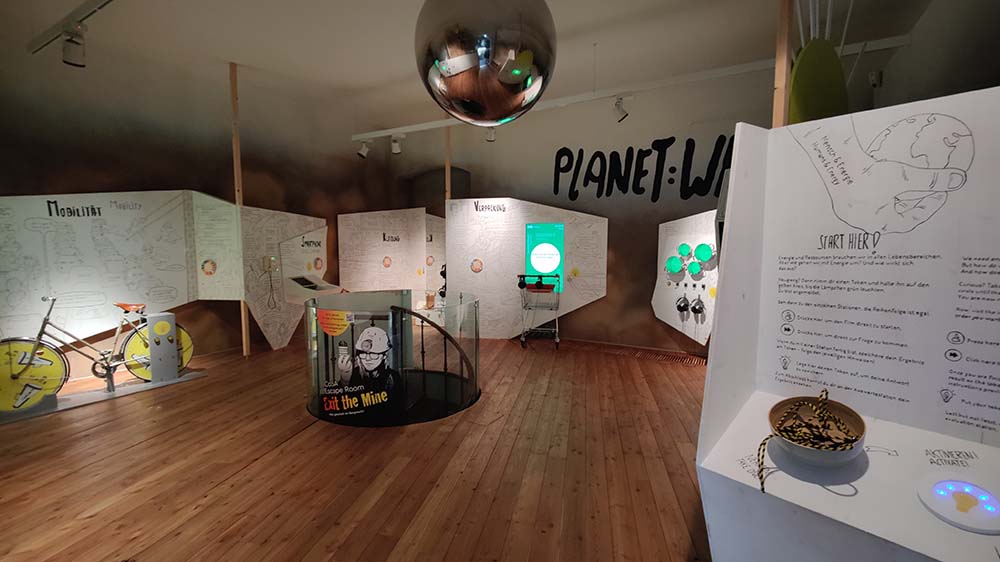
CoSA_Sustainability

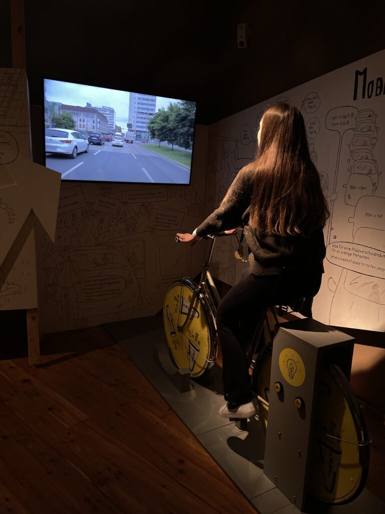
The first area I visited was CoSA_Sustainability, where visitors can learn about climate, resources, and sustainability. At the start, each visitor takes a „card“ on which they can collect results and information throughout the exhibition. The space features seven stations that provide information through games, informative videos, and audio recordings, covering topics such as energy, mobility, smartphones, clothing, packaging, nutrition, and leisure activities. After gathering information at each station, visitors have the option to answer questions based on their personal actions. For example, one question asks whether you mostly buy new clothes or second-hand, and you record your response. At the end of the exhibition, you scan your card with all your answers, and the system provides an overview of how your actions impact the environment and why. It also allows you to compare your results with those of others.

I found this approach particularly interesting, even though I already knew much of the information presented. The exhibition helped me reflect on how to present information, especially to children. I really liked the concept of comparing your actions to their environmental consequences and what is considered optimal behavior. Often, people feel attacked when told that their actions are harmful and need to change, but this method allows them to draw their own conclusions and independently decide whether they want to continue their habits or make changes. I concluded that this „play – decide – learn – compare“ approach could also be highly effective in nature-based schools as a method for fostering critical thinking.


CoSA_Experimentarium & Technology

The other two sections – experiments and technology – immerse visitors in a wide range of diverse interactions. The section on experiments was particularly captivating, as it covered various topics in physics. For instance, there’s an activity where you strike a large drum to observe the movement of air, alongside exhibits on color theory, perception, and types of electromagnetic radiation. It’s fascinating how such an approach can draw people into topics they might not initially find interesting. One example that stood out was an exhibit where visitors could learn about the essential parts of a car and how they fit together. The room features a car frame, and participants must place all the components in the correct spots, such as headlights or steering wheels. Once assembled, the car can be driven in a simulation. This interactive and tangible approach provides both a sense of accomplishment and a deeper understanding of the topic. I believe the combination of digital screens and physical experiences in this museum was perfectly balanced. The museum manages to blend technology with hands-on activities in a way that makes learning both immersive and enjoyable. It truly invites you into a world of discovery and exploration.

CoSA is a world unto itself, where time seems to stand still. This experience left a strong impression on me, inspiring me to think about the learning process in new ways. It also made me reflect on the story my design will tell and the world it will create for users. Much like the museum, I want my projects to be engaging, surprising, and capable of transporting users into another world.

IMPULSE # 8: Insights from Jeff Sutherland’s Scrum Framework

IMPULSE # 7: Lessons from Tony Fadell’s TED Talk on Design

IMPULSE #6 : Practical Applications of Lean UX

In practical terms, I’ve already started incorporating these Lean UX strategies into my research. This ensures that every iteration of ONTEC’s UI reflects real-world usage patterns and solves actual problems faced by its users.

https://jeremybird276.medium.com/implementing-lean-ux-in-the-real-world-8aa7ca880e54

IMPULSE # 5: Building Value Through Lean Product Development

IMPULSE 4#: Insights from the AVL 2025 Sales Conference

Throughout the conference, I had the opportunity to speak with several salespeople who use ONTEC in their day-to-day work. Their feedback was invaluable in shaping my understanding of the app’s strengths and areas for improvement. Here are some of the insights I gathered:

Impulse #07: CoSA

CoSA Energy Space
Links

CoSA: https://www.museum-joanneum.at/cosa-graz

IMPULSE #4 – FBTB 2023: Ellen Lupton – Storytelling and Visual Design

I was intrigued when I heard the term „storytelling in design,“ so I wanted to explore it further and see where it could be applied. While searching the internet, I came across an interesting video on YouTube of Ellen Lupton’s lecture at the „From Business to Buttons 2023“ conference about storytelling and visual design. In her lecture, she discusses how storytelling can significantly impact design and its meaningfulness. Design is not just about aesthetics; it’s a way of communicating ideas, emotions, and messages. Through her presentation, she explained how storytelling principles can help designers convey strong messages and build deeper connections with their audience.


Lupton begins her talk with the statement that every design, whether digital or physical, is a form of storytelling. Designers create entire journeys through interactions with a product or service, but also countless small interactions along the way. She compares this to a story, explaining how every story needs action and emotion. A good story presents the action in an engaging way, resulting in a satisfying emotional response. As designers, we create action—which is the narrative—and then wrap it in emotions by creating various atmospheres through colors, fonts, layouts, and so on. That’s why she says every path is its own story. Sometimes the path itself is so strong that it becomes a character in the story, like the highway in the movie Mad Max. It introduces us to the story, like an invitation. And even though it may seem like the path is straightforward, we must take a leap, and we’ll discover that somewhere along the way, there are curves. Additionally, every story has a beginning, middle, and end, just like in design. Users experience a journey, starting from their first contact with a product to the point of making a decision—an action.

The second thing she mentions is the rule of threes. She explains that it’s easier for users when they have three options rather than too many, like when choosing movies on Netflix. Having fewer options makes it easier for us to decide. For this reason, information is often grouped into threes, simplifying complex information and making it easier to understand. These principles are also used in restaurants like McDonald’s. This rhythm can also be used to create an unexpected moment of surprise, like in an advertisement for a product. Additionally, it can be applied in dashboard design to visually separate information for easier comprehension.

Another narrative model she mentions is the Hero’s Journey. The protagonist is a person who typically goes to a different, magical world, experiences new and exciting things, faces challenges, and then returns home—it’s always a circle. Designers, through their decisions, create that “magical world” into which the user enters, inviting them into a “green world.” This is why some applications use green. She also mentions examples of purple for mystical/magical vibes or neutrals for natural products. It all depends on what the product is about and the atmosphere we want to create. What’s also important is designing the experience as a labyrinth that leads the user to their goal, creating a sense of security or excitement. Throughout the experience, it’s essential to include the previously mentioned emotions. One of the most powerful emotions is humor, but it can also be surprise or even suspense. These create engagement and energy, building a connection with the product.

The last concept she mentions is resolving and creating conflict. Resolving conflict involves eliminating pain points users encounter, thereby creating a better experience. On the other hand, creating conflict can involve using red to emphasize that something is wrong, pop-up messages that indicate an error, or notifications that warn users they’ll lose their streak, like in Duolingo.

Beyond static elements, she highlights the importance of interactivity in digital design. Every interaction a user has with a design is part of the narrative. For example, smooth and intuitive interactions can give users a sense of control and satisfaction, while design tricks like animations can create “magic” in their experience. This helped me view my project more holistically and consider how I could make it more engaging for users in a fun and story-like way.

Impulse #7 // Study Subject and Final Showcase // Luminous Flora – Combining Creativity and Technology for an Immersive and Interactive Art Experience

For our final master studies showcase »Kaleidoscope«, I had the opportunity to work on a project that merged art, interaction design, and media design in a unique and immersive way. The project, titled “Luminous Flora”, invited visitors to create their own personalized flower arrangements using a tablet, and experience their design through projection mapping onto a 3D sculpture. As interaction designers, my team and I were primarily responsible for the app development and integrating the design with the projection system. This experience allowed me to explore the challenges of user interface design and discover new tools that dramatically impacted our process, specifically ProtoPie.

The Concept: Merging Creativity and Technology

The core concept of “Luminous Flora” was to give visitors an opportunity to design their own flower bouquet, combining their creativity with digital technology for a truly interactive art experience. The idea was while using a tablet, visitors could choose flowers, arrange them as they liked, and then see their creation projected onto a custom-made polygon structure, making the bouquet appear as a tangible, 3D object. The flowers were carefully crafted in a 3D program, ensuring realistic textures, colors, and shapes to bring them to life digitally. This combination of user interaction and projection mapping showcased how art and technology can collaborate to create something innovative and engaging.

Overcoming Technical Challenges: From Coding to ProtoPie

Initially, we planned to build the app using Angular, but we quickly hit technical roadblocks. Integrating live projection and connecting with Resolume software proved difficult, and our coding skills couldn’t keep up with the project’s complexity. That’s when we first heard about ProtoPie, a no-code design tool. At first, we were uncertain, but soon realized it was the perfect solution. ProtoPie’s intuitive interface allowed us to focus on the creative aspects without getting bogged down by coding challenges. It enabled us to create interactive prototypes without any coding. We could design interactions using simple triggers and actions, making the process much faster. Its integration with Figma allowed us to easily import our designs and turn them into prototypes. ProtoPie’s component-based system also made it easy to maintain consistency across the app. The real-time preview feature allowed us to instantly test and refine our interactions, speeding up the iteration process and enhancing our workflow. ProtoPie ultimately allowed us to turn our creative ideas into a fully functional interactive experience for the Luminous Flora project, without the technical struggles we initially faced.

A Collaborative Journey: Lessons Learned

The development of the Luminous Flora project taught us valuable lessons in collaboration and adaptability. The process wasn’t always smooth, and there were times when communication between different majors was challenging. At the beginning, it was difficult to stay on the same page and manage tasks effectively. Sometimes, as deadlines approached, it felt like we were scrambling to complete everything. However, despite these challenges, we pushed forward, and the end result was an interactive experience that exceeded our expectations. The collaboration between the different design disciplines was crucial. By constantly communicating, sharing ideas, and giving feedback, we were able to create something that not only worked technically but was also engaging and creative. The final app was visually appealing and easy to navigate, offering users an immersive experience as they designed their bouquets and saw them projected in real-time.

Conclusion: Insights into User Interface Design and the Future of No-Code Tools

The Luminous Flora project provided me with valuable insights into the integration of user interfaces with physical experiences, particularly through projection mapping, and how external factors like lighting, environment, and technological constraints shape the design process. I learned how essential it is to choose the right tools, as ProtoPie allowed us to rapidly prototype and test ideas without the burden of complex coding. This experience has significantly influenced my research, especially in understanding how external influences can affect user interface design and user interaction. Moving forward, I’m eager to explore no-code tools like ProtoPie more deeply, as they offer new possibilities for faster iteration and creative experimentation, especially in the development of adaptive systems. The ability to create personalized, responsive interfaces with ease has opened new paths for my future projects, and I look forward to further exploring these tools in the context of dynamic, user-centered design.

Links

https://kaleidoscope-showcase.netlify.app
https://www.protopie.io
https://resolume.com

IMPULSE #8 Dystopian Valley

This is a reflection on an article by Yves Bellinghausen in Brand Eins (Dec/Jan 2024/25 issue) “01.01.3000 is a Wednesday – About tomorrow and how it can get better”.

In his article “Dystopian Valley”, Bellinghausen describes Silicon Valley as a symbol of positive visions for the future. The author asks whether there is anything left of this spirit today.

Bellinghausen quotes John Perry Barlow from his “Declaration of independence of cyberspace” to illustrate this positive drive for the future. In his 1996 Declaration of Independence of Cyberspace, Barlow wrote: “We are creating a world where everyone can enter without privilege or prejudice based on race, economic power, military strength or social background. Your legal concepts of ownership, expression, identity, movement and context do not apply to us. They are all based on matter, and there is no matter here.” From this quote, it can be concluded that cyberspace is understood as a place of freedom that is awaited with great longing.

Bellinghausen cites Shoshana Zuboff as a counter-position and perspective from today’s world. She is an economist and the author of the book “The Age of Surveillance Capitalism”. She writes: “They have appropriated people’s lives and turned them into data in order to make predictions and profits. Surveillance capitalism claims our personal lives as free raw material.” The instrumentalization of cyberspace for capitalism is thus in conflict with the place of freedom that Barlow hopes for. Zuboff concludes in her book: “Let there be a digital future, but let it be a human future first.”

The emancipatory potential of the technology for the people has been left behind and Big Tech is aiming to even further push their political influence and power. Bellinghausen uses Elon Musks latest political engagement in incoming President Donald Trump’s campaign as an example. He speculates, that Musk will be assigned an administrative position. Through some quick research I gathered, that Musk has been tasked with leading Trump’s new Department of Government Efficiency (Doge). Aleks Phillips from BBC News states that “It is a role that is expected to garner him influence over government policy – and the regulatory environment facing his enterprises.“

Bellinghausen continues to state that many Silicon Valley companies were founded with humanitarian concepts in mind, but thanks to enormous amounts of venture capital, they grew into monopolies that aggressively beat out out their competitors. He uses Google as an example. Google was founded in 1998 by two Stanford students with the aim of organizing the world’s information and making it universally accessible. The company’s famous motto was: “Don’t be evil.” Around 2000 Google fought against Microsoft’s monopoly. Then they themselves became a giant and began to devour one industry after another, fueled by venture capitalists‘ desire for returns.

Bellinghausen concludes that Google perfected the platform capitalism by acting as a free broker in the digital economy, collecting data from its users and passing it on to the highest bidder when selling advertising space. But unlike in the early days, these are no longer humanitarian visions for the future.


Links:

https://www.eff.org/cyberspace-independence

https://shoshanazuboff.com

https://a16z.com/why-software-is-eating-the-world