18 – Results of Experiment 2

For my second experiment I wanted to find out if people can spot the difference between handmade designs and digital designs that have an analog look to them. This way I wanted to find out if the effects of the handmade aesthetic require the actual time and effort or if a fake will lead to the same look, and the consumer doesn’t even notice.

In my experiment I showed my participants 6 designs, 3 of which were handmade and 3 of which only have a handmade look added to them. I asked them to tell me which ones are analog in their opinion.

The results varied, and my participants never all had the same opinion. At first, I showed them two collages, one analog and one digital and here the participants agreed the most. 71% correctly assesed the handmade collage and 86% could tell that the other one was made digitally. Even the digital illustration was found out by 71%. It was harder for them to tell the letterpress print was made by hand. Only 43% could tell, so the majority guessed wrong. For photography there seems to be a similar confusion. Out of two pictures, one analog and one digital, both were believed to be made digitally by a majority of 57%.

To conclude the results, it is not that obvious if a design is made analog or digital with a fake analog look. The tendency was correct on only 4 out of 6 designs, and never was it obvious to everyone. Especially with photography and letterpress it seems to be harder to tell. I do think the results could possibly be different if I showed them the works in person, instead of digitally on a screen – because this is where you can really see the difference of analog design.

These results show that the look and the effect of the handmade aesthetic on the consumer are not necessarily dependent on the process of creation. I personally find these results quite unmotivating because it means that the special effort that is put in when making something by hand, cannot always be observed. But at least it tends to be observable.

During my preparation I asked myself if it is that much more efficient to fake the handmade look. Since I got all my “fakes” from tutorials online I noticed that on top of creating the digital work (which can sometimes take quite long too), you then have to put in an extra effort to make it look imperfect. I think here it really depends on the medium. For photography, it is clearly still faster to make it digitally and fake the look, but for example for illustration, I can imagine a designer drawing something by hand quicker than building it on illustrator and then making it appear imperfect afterwards. Therefore, I believe it is a complex question, that can only be answered depending on a specific design. It cannot be said generally if a “fake handmade” design has the same effect as an analog one, and neither can it be said that it is easier and quicker to produce a digital one. Also since the handmade look has associations like „authenticity“, I think it could really backfire to fake the look, because some consumers might still notice.

17 – Experiment 2

For my second experiment I wanted to find out if it really matters that an artwork is made by hand or if it is enough for it to just have a handmade aesthetic. This idea came to me after I stumbled upon a video of a designer who explained how he fakes a handmade look.

In order to investigate this, I created a quiz with different artworks, some of which are actually handmade or produced in an analog way and some of which are digital creations that have a handmade look added to them. I asked my participants to click on the pictures they believe are handmade/analog.

For the handmade/analog works I chose some that I came across during my research the past two semesters. A collage I wrote about in my las blogpost, a letterpress print I saw at DruckZeug, and an analog picture I took. The digital fakes I all took from online tutorials on faking the analog aesthetic. I chose a collage, an illustration and a photograph, to get a wide variety of different techniques.

I am really interested in the outcome of this survey. Since I have been working on this topic for a while now, I find it a bit easier to tell the difference, but I am not sure how obvious it is to others. To get an even more realistic answer I sent this survey not only to designers but also Students from other fields, that have never produced a design neither digitally nor analog.

Survey:

https://docs.google.com/forms/d/e/1FAIpQLSd33c3Oaq99Fl94Kv90USmyBBjMbVv9NlxL7qs0L-cw2fr9eQ/viewform

sources:

https://www.itsnicethat.com/features/the-guardian-election-editorial-graphic-design-illustration-spotlight-140624

https://www.instagram.com/druckzeug

youtube.com/watch?v=df0HpEn4hmk&t=506s

youtube.com/watch?v=koml2ZNeCqU

https://www.instagram.com/reel/C6q_EaEAWge/?igsh=cHVoanJuenY2ZXpp

Books:

Verpackung Marketing : Packvertising

Produktion und Veredelung

Beispiele von diversen Verpackungen

Beispiele Alkoholika und developing Progress

Beispiele

Geschichte der Verpackung

Beispiele

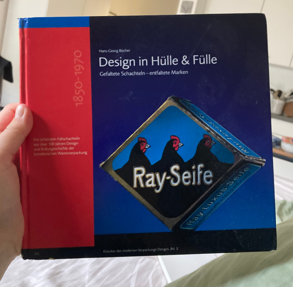
Geschichte der Faltverpackung

16 – On the Guardian creative team making all its election artwork by hand

“The rise in disinformation and fakery cemented the idea to do the opposite and lean into the craft of doing things for real.” – Chris Clark

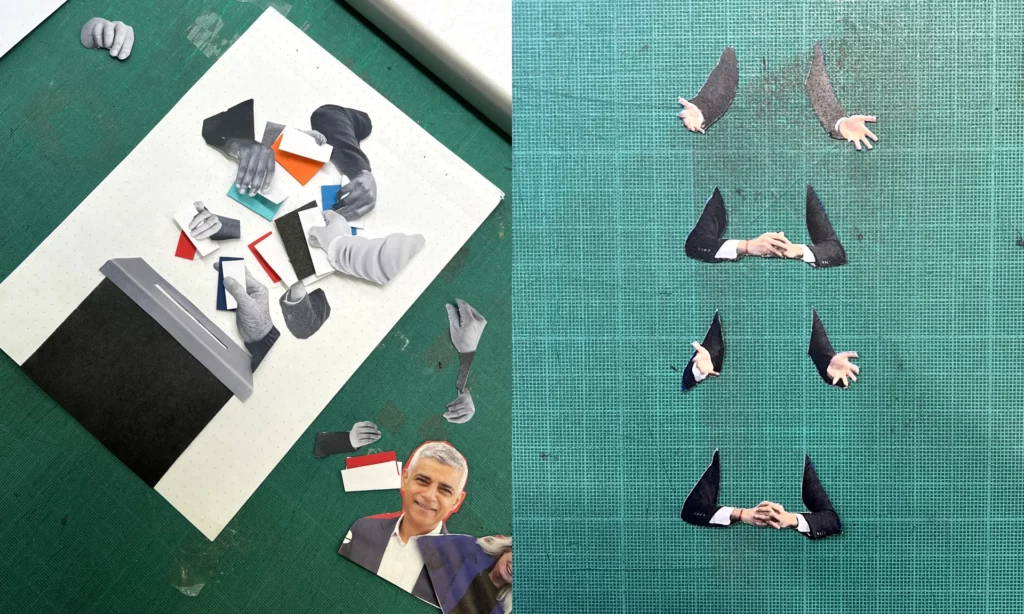
During my free time I stumbled upon an article about how the creative team of the guardian create all their artworks concerning the election by hand, in an imperfect aesthetic. This caught my attention right away, because it fits my topic perfectly. Why would a big newspaper take the time and effort to create handmade graphics?

The creative director of this campaign Chris Clark said: “The main spark of inspiration came from a conversation with a desk editor describing the country as ‘broken’, with nothing fitting or working quite as it should. This in parallel with the rise in disinformation, and fakery either through AI or generative articles really cemented the idea to do the direct opposite and be as honest and transparent in the creative process as we could – to lean into the craft of doing things for real.”

One of the main ideas was to build trust. With all the misinformation and fake news that are spread surrounding elections, it was important for them to create an authentic, trustworthy and approachable atmosphere for the readers.

But by using ripped paper cut outs they also want to visualize a “broken Britain” and how it could be put back together.

They choose to make the graphics by hand instead of faking the look on a computer. Because why fake it if you can make the real thing, and because they were in the privilege of having a good and agile team. The style is influenced by the specific employees and has variations in it. It allows for quick working, that would take much longer on a Mac, the digital design director says. He also mentions that in the beginning it was hard to stop themselves from reworking the results but especially by limiting their time they got much more productive. Now they create up to six artworks a day.

It is not like in digital design, where you usually have a strict style guide, but instead the regular process of it and the methods are what creates consistency. They set up some rules, like using mainly black and white pictures, that they either cut out or rip, but the rest is left open to create the most fitting results for the stories.

When asked how they make the designs look so distinctively handmade, the creative director answered the following: “In not only embracing the imperfections but amplifying them. We’re deliberately not removing any of the damaged paper, worn photocopies or dirty toner, and trying to be as responsive and immediate as possible. We’re often choosing the first composition and giving them very little enhancement from what is captured in the camera. “

This confirms my assumption from last semester, that “handmade” can be a countermovement to new technological developments like AI. With more and more fake images circulation on the internet, and free tools to create these, it makes sense that people feel safer when seeing an analogue image. I found it really interesting that such a big campaign chose the handmade style, but it also confirms the relevance of the topic of handmade design. It’s not only for niche, small businesses to sell on etsy and craft martkets but also for the masses. And yet this campaign also fits right in with my findings about the associations of the handmade look. Craftivism gave handmade visuals a irrevocable connection to politics and morals. This can be seen clearly by this creative campaign of political coverage.

Source: https://www.itsnicethat.com/features/the-guardian-election-editorial-graphic-design-illustration-spotlight-140624

17. Different Emotional Expressions

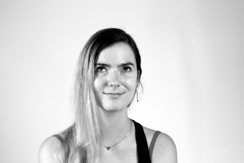
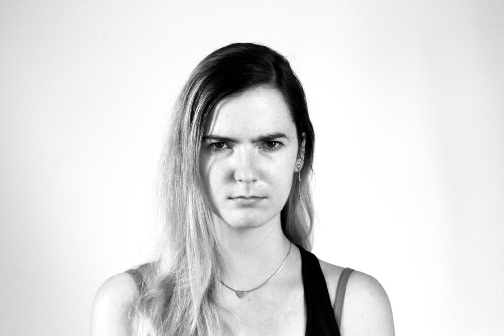
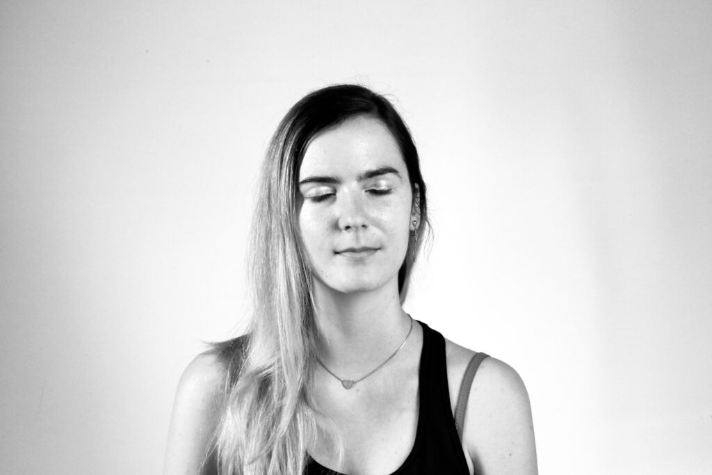
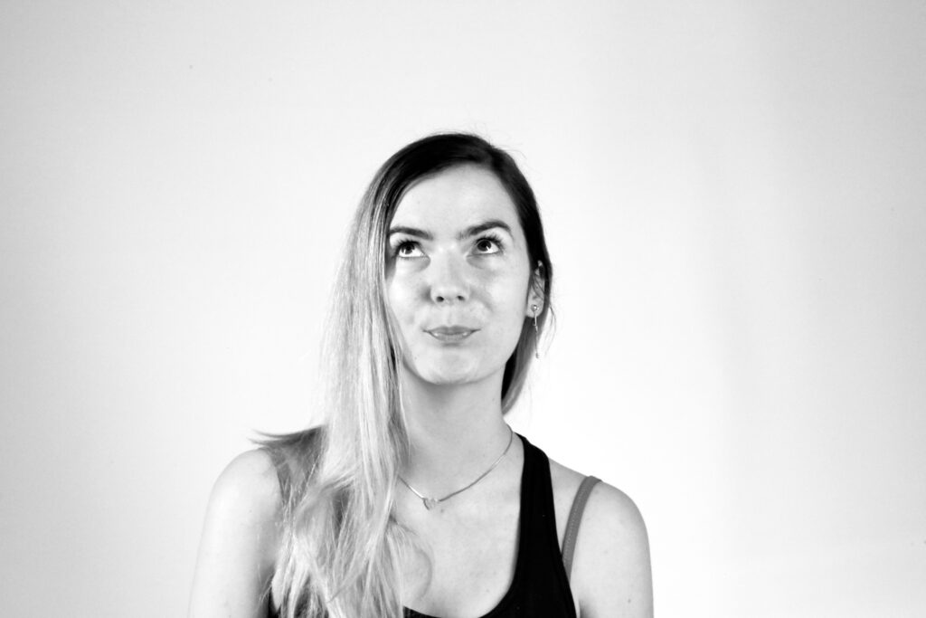
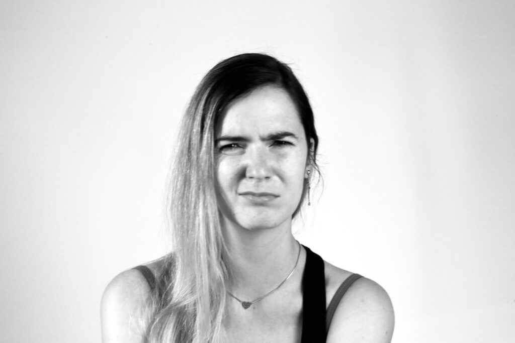
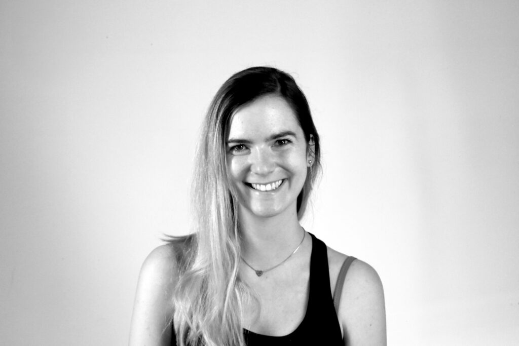
Shooting displaying different emotions

How to use the images for experiments

Here are some photographs I have taken of myself, each capturing different emotions. My next step is to present these images to a larger test group. To enhance neutrality and emphasize the facial expressions, the photos are in high-contrast black and white. One approach is to have participants view the images and generate their own adjectives to describe the emotions. Alternatively, I could offer three specific adjectives for them to choose from. To explore the perception of subtle micro-expressions, these adjectives should represent specific subcategories of broader emotions; for instance, terrified, anxious, and frightened could all fall under fear. A third option is to provide a comprehensive list of adjectives from which participants can select one for each photograph. Ultimately, I aim to determine if there are any consistent or common patterns in the adjectives assigned by the test group.

Process and Ideas:

Since the survey revealed that the majority of respondents would prefer a traditional card game, I will likely focus my efforts in that direction. However, the question remains whether the idea of incorporating QR codes or augmented reality (AR) can still be utilized to enhance the experience. For instance, imagine having a QR code on the packaging that customers can scan while in the store. This could provide them with access to the latest promotions, detailed information about the game, or even an augmented reality preview of the game’s features and content.

Such an interactive element could significantly influence their buying decision by giving them a more immersive and informative glimpse into what they are purchasing. It would allow potential buyers to visualize the game’s components and understand its value before making a purchase. 

Survey

To help me determine the direction I should ultimately pursue, I initiated a survey. Unfortunately, I’ve only received 14 responses so far. However, even with this limited number of responses, the results appear to be quite definitive and provide a clear indication of the preferred direction.

Experiment 1 – Completing the Poster Experiment

In my previous blog posts, I explored the integration of randomness into design by generating random grids, shapes, and color palettes. Today, I want to share the results of combining these elements into my first experimental poster.

To create the poster, I selected two layout grids and two color palettes from my previous experiments, and used two randomly generated shapes. Here’s a breakdown of the process and the results.

1: Combining color palettes and grids

First, I experimented with applying the color palettes to the chosen grid layouts. This stage was important in understanding how the randomness of the color and the grid structure interacted visually.

2: Integrating shapes

After exploring the color and grid combinations, I further experimented with the first grid and color combination by adding the two randomly generated shapes. This addition brought dynamic visual elements that contributed to the overall theme and composition.

The two shapes I choose form this blog entry.

3: Adding typography and text

For the final touch, I wanted to incorporate typography and random text. I asked ChatGPT to suggest two random Adobe fonts:

  • Headline Font: Veneer
  • Body Text Font: Acumin Pro

The topic I chose for the poster was dance, inspired by the dynamic and fluid character of the shapes, reminding me of dance movements. Here’s the final poster with text added:

Conclusion

The experiment demonstrated that randomness can bring a fresh perspective and unique aesthetic to design. The combination of random grids, colors, and shapes created interesting compositions, while the addition of text using randomly selected fonts added a layer of depth and meaning to the poster. The fluidity and unexpected results of these random elements demonstrated the creative possibilities that can happen when control is loosened and randomness is allowed.

//20 Summary and Next Steps

Summary

Throughout this semester, I had the opportunity to explore various tools and methods, deepening my understanding of the integration of technology and paper. I conducted an interview and gathered diverse opinions and insights on the topic, which significantly enriched my perspective. I was also able to try out the integration of printed material for learning with digital tools.

Next Steps

Moving forward, I plan to continue this exploration by experimenting with these tools in innovative ways. Here are the key projects I intend to pursue:

  1. Creation of an Enhanced Orientation System: I aim to experiment with NFC to create an improved map system. This will involve exploring ways to enhance traditional maps with digital features, making them more interactive and user-friendly.
  2. Implementation of NFC in Books: I plan to experiment with embedding NFC (Near-Field Communication) technology in books. This could revolutionize the way we interact with printed materials, providing instant access to supplementary digital content.
  3. Community Integration in Books: Another exciting project is to integrate community interaction within books using various platforms and forums. This could facilitate a richer, collaborative learning experience where readers can discuss and share insights in real-time.

Additionally, I am particularly interested in further exploring the integration of digital and analog methods for learning. This hybrid approach has shown great potential and effectiveness, and I believe it needs further investigation

I am excited to continue these experiments and projects during the summer, aiming to find out new possibilities and innovations while merging paper and digital.

Experiment 1 – Step 3: Exploring Random Color Palettes

Continuing my exploration of randomness in design, I’ll now move on to the next step in my experiment: generating random color palettes. In the previous steps, I delved into creating random grid layouts and experimenting with random shapes. Now I’m going to explore how random colors can affect our design process.

Generating Random Color Palettes

Color can dramatically affect the mood, style and perception of a design. By introducing randomness into color selection, I want to uncover unexpected combinations that can lead to innovative and unique aesthetic results. There are several random color palette generation tools available online, each with its own unique features:

Online Tools for Random Color Generation

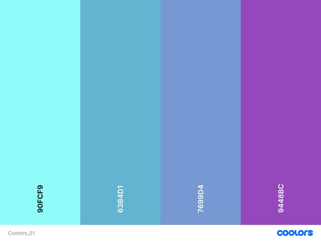
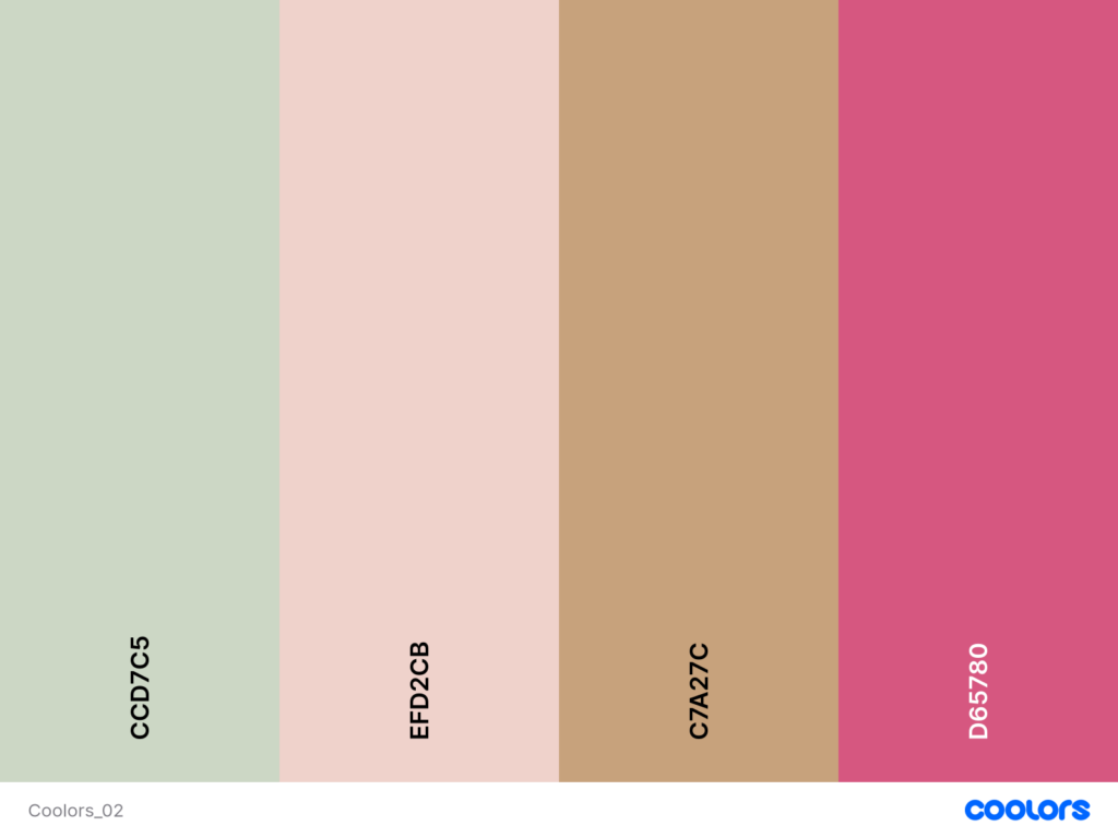
  • Coolors.co: A versatile tool that lets you generate palettes with a specific number of colors. You can lock colors you like and generate the rest randomly. This flexibility allows for a blend of control and spontaneity.
  • Colormind.io: An AI-powered palette generator that creates palettes with five colors. It also provides examples of how the palettes can be applied in design, which can be a great source of inspiration.
  • Perchance.org: This generator produces palettes with five colors, and you can decide how many palettes to generate at once. It’s a straightforward tool for quick experimentation.

Experimentation with ChatGPT

In addition to using these online tools, I also experimented with generating random color palettes using ChatGPT. Here are five color palettes generated for the experiment:

  • 3-Color Palette 1:
    • #FF5733 (Vivid Orange)
    • #C70039 (Dark Red)
    • #900C3F (Wine Red)
  • 3-Color Palette 2:
    • #28A745 (Green)
    • #FFC107 (Amber)
    • #17A2B8 (Teal)
  • 4-Color Palette:
    • #343A40 (Dark Gray)
    • #FF6F61 (Coral)
    • #6C757D (Slate Gray)
    • #FFE8D6 (Cream)
  • 2-Color Palette:
    • #1E90FF (Dodger Blue)
    • #FFD700 (Gold)
  • 5-Color Palette:
    • #FF4500 (Orange Red)
    • #32CD32 (Lime Green)
    • #8A2BE2 (Blue Violet)
    • #FFDAB9 (Peach Puff)
    • #8B0000 (Dark Red)

By experimenting with these tools and methods, I can see how randomness in color selection opens up new possibilities for creativity.