17/ Testing tactile photography on people

I gave my prototypes of tactile photography to 4 people. Here is what they answered to my questions:

1. Do you like it?

      A: Yes. It’s interesting/cool. You can touch it. I like it more when it is on some parts of the photography and not everywhere. I would touch the parts that are obviously a tactile part.

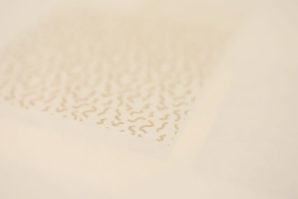
      B: Yes. It’s interesting that not only you can touch the photography, but you can feel it. I don’t like the dots on the photography – they annoy me. I don’t understand why there are tactile parts on the part of the photography where there’s nothing. It doesn’t make sense (”There are no clouds there on the photo!”).

      C: I do. I don’t like it when the tactile parts are on the back because it doesn’t give me any visual feedback.

      D: Yes. I don’t mind turning the photo. I especially like the experience when it’s incorporated in the photo.

      2. What’s the experience like?

        A: On some it’s interesting, on some it’s not. On some photographs I don’t like how it looks.

        B: It’s something new. Not everyone does this to the photography. It’s more interesting when the tactile part is in front and not in the back.

        C: Good. I like touching this. It adds a new element to the photography.

        D: Interesting. It reminds me of children’s books.

        3. What would make this better?

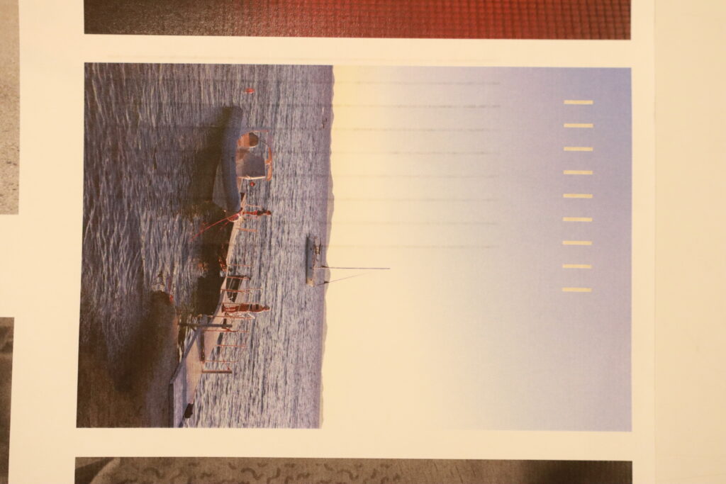
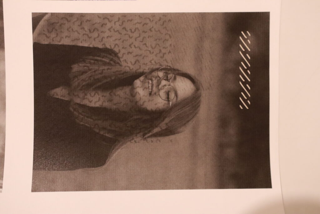
          A: I would like it more if the touching part would be only on one place on the photo (in the left corner), or on the place where there is actually something on the photo (e.g. on the tree, on the boat).

          B: I wouldn’t put dots on random places, but on some places that makes sense because otherwise it’s confusing.

          C: I don’t like the experience when the tactile parts are on the back. It doesn’t have the same effect.

          D: I like when it’s on the front and on the back, but not on every photo. It would be also interesting if the tactile part would be on visible parts (e.g. on the dog). But it would be also okay if it’s on blank parts as long as it makes sense. I can use my imagination.

          4. Would you prefer an album?

            A: Yes. But the ones that are really interesting and pretty I would rather have in hands. It would be interesting if tactile parts would be exaggerated more. It should stand out so that you want to touch it.

            B: No. I like the idea of having it in hands.

            C: This is more interesting and you can spend more time on touching things. It slows you down and makes you focus on the details

            D: No. I think this is more interesting.

            In conclusion, I should focus on the appearance of the tactile parts of the photograph because I don’t want the photographs to look bad and for people to no longer enjoy them. I believe that the photograph should be primary, and the tactile design should be secondary. It’s interesting how some of the participants like the idea of having tactile experience on the back, and some of them didn’t. Another thing that was thought-provoking is that this experience reminds of flipping through a children’s book. I will take this into consideration and search for some inspiration in children’s books.

            //18 My Experience with NFC Technology: Configuring and Using NFC Stickers

            Introduction

            To continue my research about connecting digital to analogical I decided to try out NFC sticker (Near Field Communication). My goal was to see how NFC stickers could be used to bridge traditional and digital resources, in an efficient way. Here, I’ll share my experience, from purchasing and configuring NFC stickers to testing them and gathering feedback.

            Purchasing and Configuring NFC Stickers

            I started by purchasing a batch of NFC stickers, small adhesive tags that can store various types of information accessible via NFC-enabled devices. To configure these stickers, I needed to install an app, so I downloaded “NFC Tools” on my phone, a popular choice for reading and writing NFC tags.

            Step-by-Step Configuration

            1. Scanning the NFC Code: Using the NFC Tools app, I scanned the NFC sticker. This scan provided detailed information about the tag, including the type of tag, available technologies, and whether it was writable.

            2. Writing to the Tag: I selected the „write a record“ option within the app. This feature offered several configuration possibilities. For my initial test, I decided to configure the tag with a URL linking to my portfolio. However, NFC Tools allows for various other types of records, such as: application records, social network links, search links, file links, contact information, email addresses, text messages.

            This versatility makes NFC stickers incredibly useful for a wide range of applications.

            Testing the Configured NFC Stickers

            After configuring the NFC stickers with the URL to my portfolio, I tested them and then demonstrated their use to several people. Here’s what I discovered:

            • User Confusion: Most people were initially confused about how to use the NFC stickers. They needed further instructions on how to activate the NFC feature on their phones and how to scan the stickers correctly.

            • Device Compatibility: In one case, a person didn’t have an NFC-enabled phone. In another instance, the phone’s NFC functionality needed to be manually activated.

            • Speed and Convenience: Once users understood how to use the NFC stickers, they found the process of accessing the linked URL quick and convenient. This indicated a clear potential for NFC technology, despite the initial learning curve.

            Observations and Insights

            While configuring and testing NFC stickers, I noticed several advantages:

            • Ease of Configuration: Using the NFC Tools app to configure the stickers was straightforward and user-friendly.

            • Variety of Uses: The ability to write different types of records to NFC stickers makes them highly versatile. Beyond URLs, they can be used for a multitude of purposes, enhancing both personal and professional applications.

            •User Familiarity: A significant problem was users’ unfamiliarity with NFC technology. Many people are not used to using NFC and require guidance to understand its benefits and functionalities. However, when users try nfc once, it is easy to understand its function for next time, as not many steps are required

            •Comparation to QR Codes: compared to QR Codes, the use of NFC stickers is faster and more efficient.

            Conclusion

            My initial experiments with NFC stickers revealed both opportunities and challenges. The main challenge lies in educating users on how to utilize NFC effectively. However, once this problem is overcome, the speed and convenience of NFC technology can greatly enhance the user experience.

            16/ Using a laser cutter to create tactile experience on photography

            For the next experiment, I chose to experiment with the laser cutter we have at university. The main idea was to engrave a pattern onto the paper (photography).

            What I wanted to learn:

            1. How deep an engraving can be?
            2. Is the engraving deep enough to create a tactile experience
            3. How does the engraving affect the photo?

            For the next experiment, I decided to use the laser cutter available at our university. My main idea was to engrave a pattern onto a piece of paper to see what would happen. I wanted to learn three things from this experiment:

            1. The depth.

            First, I wanted to find out how deep the laser cutter can engrave. Knowing this would help me understand what kinds of designs I could make and how precise they could be. I used a 150 g paper.

            Result: The depth of the engraving turned out to be shallower than I expected. Although I can measure the exact depth, it’s clear that it didn’t penetrate as deeply as I had hoped. This might be because the paper I used was relatively lightweight. I suspect that using a heavier paper could result in a deeper engraving. However, I am concerned about how using thicker paper might impact the quality and appearance of the photograph. I aim to avoid paper that is too thick, as it could alter the way the photograph looks and feels. Balancing the paper weight to achieve the right engraving depth without compromising the photo’s integrity is something I need to consider further.

            Another unexpected outcome was that the design became visible on the front side of the photograph due to the paper’s thinness. I’m still unsure how I feel about this. While it adds an interesting element, I’m not entirely pleased with how it changes the original appearance of the photograph.

            1. Tactile experience.

            Second, I wanted to see if the engraving was deep enough to feel with your fingers. If the engraved lines can be felt, it would add a new sensory experience to the photography, making them more interesting to touch as well as to look at.

            Result: The tactile experience is minimal. Because the engraving isn’t very deep, there’s not much to feel with your fingers. When the pattern is visible on the front of the photograph, it suggests that it should be touched. However, if the pattern weren’t visible, I don’t think it would be as apparent to the observer that they should touch it.

            1. Effect.

            Third, I was curious about how the engraving would affect a photo. I planned to engrave a pattern onto a printed photograph to see how the lines and textures created by the laser would interact with the image underneath.

            Result: The engraving appeared on the photograph more prominently than I had anticipated. This was not the outcome I was aiming for, as it significantly altered the original image. Moving forward, if I decide to experiment with the laser cutter again, I recommend using a much more minimal pattern or design for engraving. By doing so, the impact on the photograph should be less intrusive, preserving its original aesthetic while still incorporating the engraved elements. This approach would allow for a subtle enhancement rather than an overwhelming alteration.

            Brauchen Spiele immer lustige Charaktere? Was macht gutes Karten- und Brettspiel-Design aus?

            Die Welt der Karten- und Brettspiele ist vielfältig und bunt, mit Designs, die von schlicht und elegant bis hin zu humorvoll und lebendig reichen. Doch brauchen Spiele immer lustige Charaktere, um erfolgreich zu sein? Was macht ein gutes Spiel-Design wirklich aus? In diesem Beitrag vergleiche ich die Designelemente von zwei meiner Lieblingskartenspiele, Rommé und Kuhhandel.

            Der Klassiker Rommé

            Aussehen der Karten: Rommé-Karten haben ein klassisches Design, das sich seit Jahrhunderten bewährt hat. Die Karten bestehen aus den vier traditionellen Farben – Herz, Karo, Kreuz und Pik – und sind in Nummern- und Bildkarten unterteilt. Jede Karte ist schlicht, aber elegant gestaltet, mit klaren und leicht erkennbaren Symbolen und Zahlen. Die Bildkarten (Bube, Dame, König) sind oft kunstvoll illustriert, was dem Spiel einen Hauch von Geschichte und Tradition verleiht.

            Meine Meinung: Ich schätze das zeitlose Design der Rommé-Karten sehr. Die Klarheit und Einfachheit machen das Spiel leicht verständlich und zugänglich für Spieler aller Altersgruppen. Die traditionellen Symbole und Illustrationen strahlen eine gewisse Eleganz aus, die das Spiel zu einem Klassiker in jeder Spielesammlung macht.

            Kuhhandel: Humorvoll und Lebendig

            Aussehen der Karten: Die Karten in Kuhhandel sind das genaue Gegenteil der schlichten Rommé-Karten. Jede Karte zeigt humorvolle und farbenfrohe Illustrationen von Tieren, die mit einem bestimmten Wert versehen sind. Die Illustrationen sind detailreich und oft karikaturistisch, was dem Spiel eine fröhliche und lebendige Atmosphäre verleiht. Die Karten sind nicht nur funktional, sondern auch optisch ansprechend und tragen zur Gesamtstimmung des Spiels bei.

            Meine Meinung:Ich liebe die verspielte und humorvolle Gestaltung der Kuhhandel-Karten. Die farbenfrohen Illustrationen und die witzigen Darstellungen der Tiere machen das Spiel zu einem visuellen Vergnügen. Diese Gestaltung trägt wesentlich zum Spaß und zur Leichtigkeit des Spiels bei und hebt es von traditionelleren Kartenspielen ab.

            Vergleich:

            Design und Ästhetik:

            Rommé: Setzt auf traditionelles, zeitloses Design mit klaren, leicht erkennbaren Symbolen und kunstvollen Bildkarten. Es ist elegant und funktional, perfekt für ein klassisches Spielerlebnis.

            Kuhhandel: Bietet eine lebendige und humorvolle Ästhetik mit detailreichen, karikaturistischen Illustrationen. Es ist farbenfroh und unterhaltsam, ideal für ein lockeres und spaßiges Spiel.

            Auswertung – Umfrage

            Um ein allgemeines Verständnis zu erhalten, welche und warum Brettspiele beliebt sind habe ich Personen befragt welche im Alter zwischen 18 und 64 sind. Folgende Antworten sind dabei heraus gekommen:

            Wie oft spielst du Brett- oder Kartenspiele?

            Welche der folgenden Spielarten bevorzugst du? (Mehrfachauswahl möglich)

            Welche der folgenden Design-Elemente sind dir bei Brett- und Kartenspielen am wichtigsten? (Mehrfachauswahl möglich)

            Wie wichtig ist das Design eines Spiels für deinen Kaufentscheid?

            Beeinflusst die Gestaltung der Spielbox deine Entscheidung, ein Spiel zu kaufen?

            Wie wichtig ist die Qualität der Spielmaterialien für dich?

            Welche dieser Elemente erhöhen für dich den Wiederspielwert eines Spiels? (Mehrfachauswahl möglich)

            Wie wichtig ist dir die Spielmechanik im Vergleich zum Design?

            Kaufst du eher Spiele von bekannten Designern oder Verlagen?

            Wie informierst du dich vor dem Kauf eines neuen Spiels? (Mehrfachauswahl möglich)

            Welches Design-Element könnte dich davon abhalten, ein Spiel zu kaufen?

            Nenne ein oder mehrere Spiele die dir besonders gut gefallen und warum? 

            4. Gestaltung einer Website für die Ausstellung “Oh, Shift!” – Brainstorming

            Am 28.06.2024 findet die Poster Ausstellung “Oh, Shift!” des Communication Design Majors statt. Hierfür wird eine Website benötigt, welche ich für meine Forschung verwenden werde. Ich werde eine Website gestalten, welche im Anschluss von Benutzer:innen getestet wird.

            Die Website soll folgende Elemente enthalten:

            • Alle animierten Poster der 7 Gruppen – 21 Poster
            • Links zu den einzelnen Unterseiten
            • Impressum

            Inhalt ca. wie hier http://www.thechangeclub.at

            Inspiration:

            https://nft.fluffyhugs.io/gallery

            https://100daysofpoetry.gallery

            https://unseen.co/world

            https://futureofbeauty.loreal.com/en

            https://ang-studio.com

            https://www.1-placevendome.com/en

            https://www.pontusrudolfson.com

            Keywords:

            • Infinite Grid
            • Infinite Scroll

            Design:

            • Klare Gestaltung
            • Minimalistisch
            • Micro-Interactions
            • Sound?
            • Schwarz/Weiß → Poster sind sehr verschieden, sie sollen der Main Focus sein

            Things I’ve learned

            Die Startseite fokussiert sich sehr auf experimentelles Design, Buchungsseiten, bzw. Seiten bei denen es mehr um die Inhalte geht fokussiert sich das Design mehr auf die Usability und Übersichtlichkeit.

            Research 20: Conclusion Phase 2

            In summary, I explored various topics, conducted two surveys, and facilitated an experimental and provocative poster workshop. These activities have gradually guided me towards a clearer direction for my final topic. Initially, I started broadly with the concept of how to communicate animal and environmental welfare and the impact of disturbing images. Through my research and the first survey, I identified a significant issue: the exposure of very young people to inappropriate ads and campaigns on social media, which can negatively affect their development. This realization prompted me to focus on the younger generation.

            I believe it is essential to equip children with the right tools and discuss important topics early on, as they are the adults of tomorrow. However, it is crucial to communicate these topics appropriately.

            Given my passion for art and illustration, I see potential in combining this topic with my creative skills. I am not yet fixed on a specific end product, as this will depend on further in-depth research. Potential outcomes could include a picture book or a large mural.

            There is an opportunity to collaborate with schools and develop a significant project that may have a more substantial impact than initially anticipated. I am also considering partnerships with pet shelters or similar organizations to facilitate easier adoption or general promotion. Focusing on our regional wildlife and nature could be a great approach as well.

            Over the next few weeks, I will continue to explore and refine the topic to prepare for in-depth work in the upcoming semester. I am excited about this project, as the topic is very important to me and to society as a whole. Effective and fair communication is crucial when discussing such subjects. Many people form strong opinions based on well-promoted social media content without conducting their own research. Therefore, it is vital to convey the truth and encourage critical thinking. Communication design and illustration are valuable tools for designing impactful messages for the public.

            Research 19: Results 2nd Survey

            Analysis of Initial Survey Results

            Background and Learnings

            After distributing the survey questionnaire, I received responses from only two participants out of the expected ten. This low response rate highlighted some issues with the timing and method of distribution:

            1. Timing: The survey was conducted just before the end of the school year, a particularly stressful period for teachers.
            2. Distribution Method: The questionnaire was sent by intermediaries to people who did not know me, reducing the perceived importance of completing it.
            3. Length and Complexity: The survey contained numerous questions, requiring significant time to complete.

            Future Improvements:

            • Contact participants directly to enhance engagement.
            • Consider conducting in-person interviews for more in-depth data.
            • Use a shorter, more focused online questionnaire to reach a larger audience quickly.

            For a balanced dataset, gathering 2-3 responses per different age range of children would be ideal. Despite the limited data, the responses provide a valuable starting point for this topic.

            Results of survey

            Kindergarten Teacher (Children aged 0-6)
            • Animal Welfare: The teacher believes discussing animal welfare is premature for this age group. Instead, the focus should be on learning about animals in general and how to handle them properly.
            • Teaching Respect: She emphasizes being an idol through her behavior, demonstrating respect for others and animals. She teaches children never to touch unfamiliar animals and shows them how to handle known animals.
            • Nature Respect: She fosters respect for nature by familiarizing children with local flora and fauna.
            • Mediums Used: The teacher uses real images to show how animals look and prefers picture books as her medium of choice.
            • Developmental Consideration: She stresses the importance of considering children’s developmental stages rather than just their age. Ensuring a focused, undisturbed environment is crucial when introducing new topics.
            • Main Goal: Her primary aim is for children to become familiar with their surroundings and see as much as possible from a young age. Discussions on animal welfare should come later, when children can understand more complex topics.
            Elementary School Teacher (Children aged 6-10)
            • Communication Style: The teacher continues to use simple and visual communication methods.
            • Animal Welfare Topics: She introduces topics like handling pets and meat consumption. Her class dedicates a week to animal welfare around World Animal Welfare Day.
            • Mediums Used: She uses picture books and age-appropriate images from the web.
            • Experience with Disturbing Content: Previously, she used disturbing videos but found them ineffective and now avoids such methods. She continues to discuss the importance of treating animals well and environmental issues.

            Image Preferences

            Both teachers preferred the most realistic still illustrated image (Image 1). But also number 3 and 4 could work. They found the other images nice and pretty but too unrealistic or imaginative to effectively convey the topic.

            Overall, I gained a solid foundation from the responses, which answered some questions but also raised new ones. There is still a possibility of receiving additional questionnaires from older age groups, which will be crucial in determining the focus age group for my work. The insights provided were valuable, and I am considering focusing on wildlife and nature in Austria. I might convey this information through a picture book format. This idea needs further thought, and once I finalize my direction, I will need to conduct in-depth interviews and additional research.

            17// Exploring the Integration of Digital and Traditional Learning Tools

            Introduction

            After researching various techniques to connect digital and paper-based resources, I realized the importance of finding a more precise research question. To identify this question, I decided to apply the technologies I have explored to specific fields and document my findings in a series of blog posts. My initial focus is on using these technologies for learning.

            The Potential of Hybrid Learning Tools

            I began by examining the typical layout of a book page, noting its advantages: it’s easy to write on and is commonly used in classrooms. However, the material offered in a book is often insufficient, and learners frequently rely on online resources like forums, dictionaries, and YouTube videos when a teacher isn’t available. This led me to wonder: what if a book could integrate both traditional and digital learning tools?

            Experimentation and Feedback

            To explore this idea, I experimented with printing a page from a C1-level German reading comprehension book. To enhance learning, I integrated QR codes that linked to an online forum for discussing the text and to Context Reverso, a tool that provides examples of unknown words and can be translated into different languages.

            I tested this hybrid approach by showing it to another German learner. The feedback was generally positive; she appreciated the QR codes‘ advantages in learning. However, she mentioned that she wouldn’t use the forum much and suggested using it for writing activities instead of just questions and answers.

            Next Steps

            Next, I will try to integrate audio and video into the learning process. Currently, I am using QR codes that redirect users to other platforms. However, I believe it would be more effective to have a unified app that consolidates all these resources.

            Conclusion

            Integrating traditional and digital learning tools has the potential to significantly enhance the educational experience. My initial experiments with QR codes and online forums show positive feedback from people who tested it. I will try to make this model better and try to integrate the studied technologies.

            15/ Finding interesting tactile elements in nature

            I took Professor Feil’s advice and went outside to photograph interesting objects in nature that seemed appealing to touch. As I observed nature, I realized that when I think about tactile experiences, I often start to feel the texture of an object in my mind before I even touch it.

            This exercise turned out to be really useful. As I explored, I found many intriguing tactile elements in the natural world. For example:

            • Edge of the leaf
            • Flowers
            • Nature elements combined with everyday objects (rain + car)
            • Metal objects
            • Fence
            • Ripped paper

            There were more textures, patterns, and forms than I had expected. This experiment helped me pay more attention to details and gave me a better understanding of how to incorporate tactile elements into my future photography projects.

            Although the exercise was really helpful, I realized that for my final project, I don’t want to focus solely on simple photographs of objects. Instead, I aim to capture more complex scenes that evoke deep emotions and tell a story. I’m going to use these natural elements as an inspiration.

            I want my final photographs to go beyond mere visual representation and engage viewers on a more emotional and sensory level. By doing so, I hope to create a more immersive and impactful experience that resonates with people. I want to continue pushing the boundaries of traditional photography by integrating more tactile and interactive components into my pieces.