Designing Chaos – Navigating Chaos

In this blog entry I will explore the use of chaos in graphic design and look at projects that incorporate chaos as a central theme in the design process. I will delve into the stories behind the disorder that shapes modern design, from strategic visual identity design to the current trend of chaotic maximalism.

Navigating Chaos – Creating Visual Identity by Using Chaos Theory

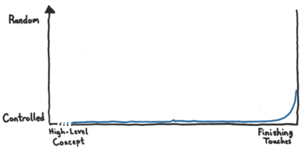
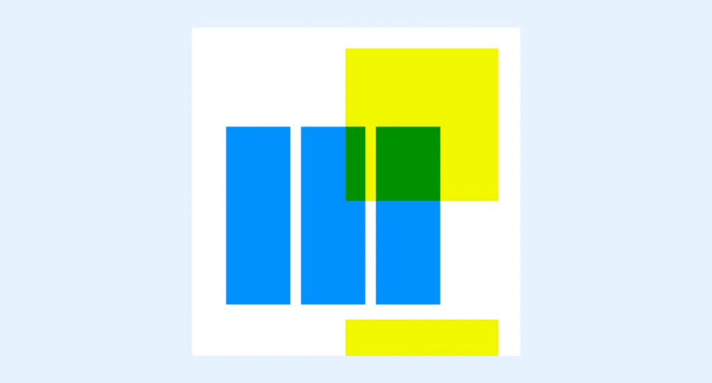
In the journey to create the visual identity for the second season of Airbnb Design Talks, chaos took center stage, challenging designer Meredith Schomburg to unravel the complexities of disorder in the design process. Given the paradoxical task of designing a system around chaos, Schomburg was quickly captivated by her initial ideas. However, she soon realized the need to navigate the chaotic nature of the design process and avoid letting the allure of the initial concept overshadow the depth that comes from exploring different creative directions.

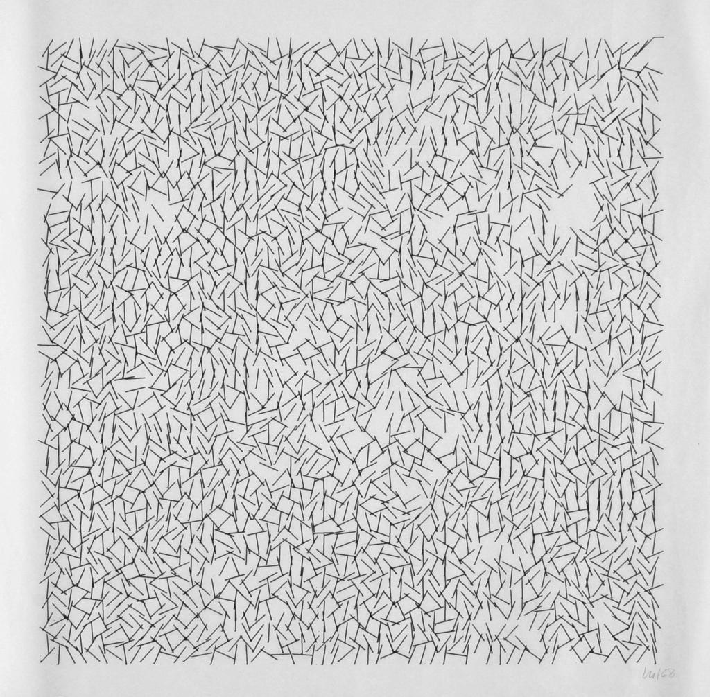
The first design attempt resulted in a visually chaotic collage. Utilizing basic Photoshop filters distorted images, and the suggested event materials displayed the speaker’s name written in nearly illegible handwriting. The aim was to generate visual chaos through the amalgamation of random elements on a page. While it showcased the theme, it lacked the inherent order that the season was meant to celebrate. Schomburg emphasizes the challenge of resisting the rush to implement the first idea, as it can limit the exploration of alternative concepts and hinder the creative process.

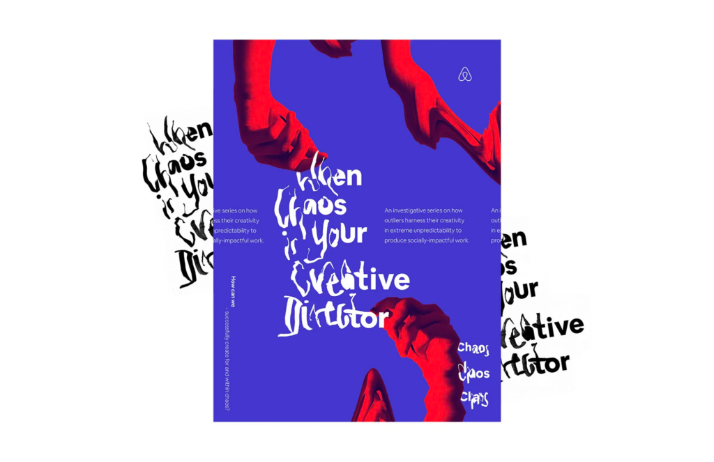
By highlighting the chaos within the design journey, Schomburg emphasizes the importance of giving meaning to the design process. She encourages intentional storytelling within the art direction, ensuring that each concept is guided by principles and defining characteristics that promote clarity and authenticity in the narratives presented. At the second attempt she designed everything to fit the story, showing that even though it seemed chaotic at first, there were hidden patterns underneath – making the refined concept more organized than the random initial direction.

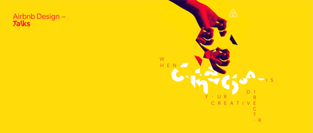
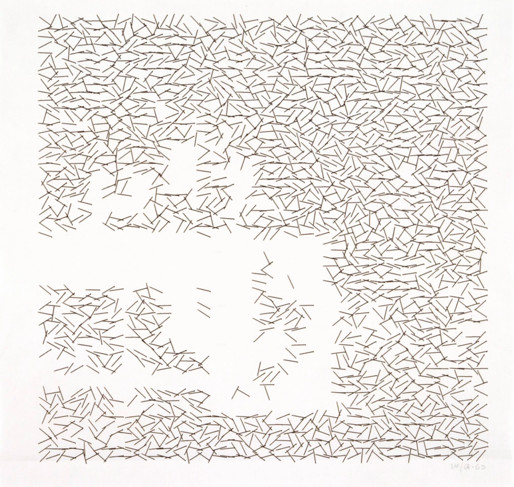
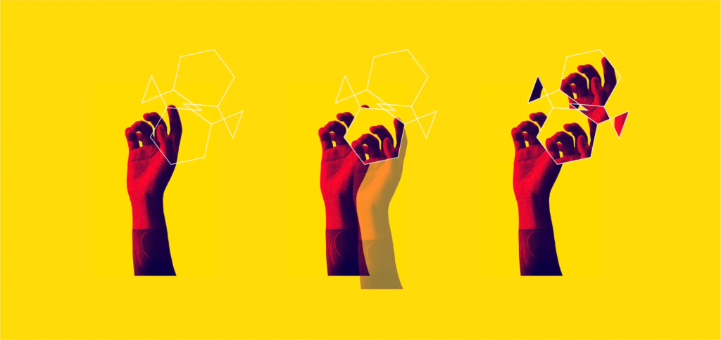
As the project evolved, the team delved into chaos theory and uncovered the presence of underlying patterns within apparent randomness. This revelation inspired a refined concept in which every design element was meticulously aligned with Chaos Theory, revealing order within perceived chaos. The color scheme was a more vibrant adaptation of Airbnb’s brand colors. Pictures, although fragmented and scattered on the page, were arranged based on a collection of geometric fractals inspired by the visual patterns of Chaos Theory in nature.

In conclusion, the case study highlights the importance of navigating the chaotic design process, slowing down to explore alternative concepts, and bringing intentional meaning to the creative journey. It encourages designers to embrace chaos, allowing for a more deliberate and purposeful approach to creating authentic and impactful visual identities.1

Chaotic Maximalism – Design Trend for Gen Z

In the ever-evolving world of design trends, the concept of chaotic maximalism has emerged, challenging the traditional norms and boundaries of graphic design. Unlike the minimalist preferences of Millennials, Gen Z’s rejection of set rules has paved the way for a trend that embraces an explosion of color, pattern, and visual elements – chaotic maximalism.

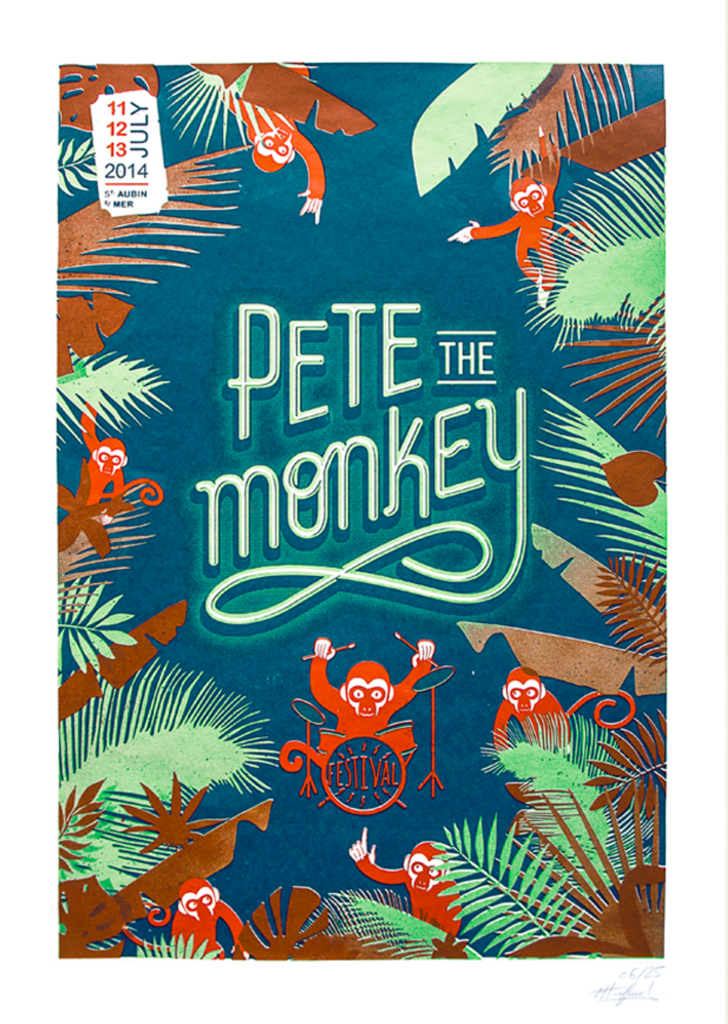
Emerging from the postmodern movement as a reaction to the rigid principles of modernism, chaotic maximalism celebrates diversity and individual expression by incorporating elements from different styles, eras, and cultures. This trend defies conventional design rules, opting for an overwhelming abundance of visual elements, including vibrant colors, playful patterns, collage, and meticulous attention to detail.

In the Chaotic Maximalism trend, designers blend diverse influences from different historical and contemporary eras, resulting in a collision of creative styles. Vibrant color schemes with clashing hues and surprising combinations attract attention, while playful patterns, collages and layering create visually dense and intricate designs.

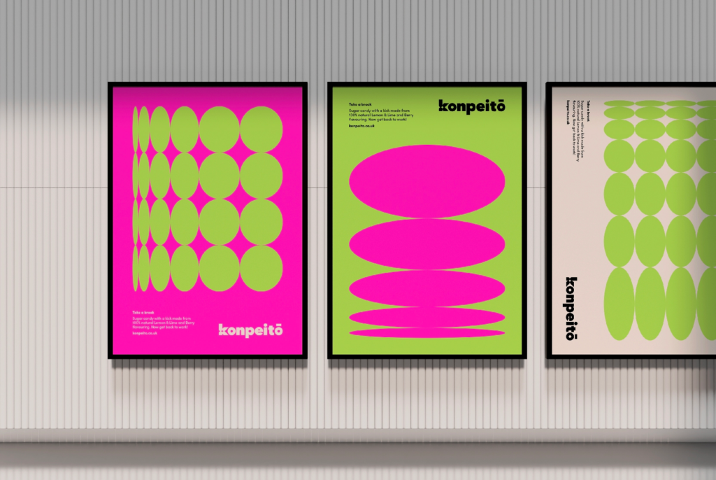
The article of JUMP Brand Communications Agency showcases the design team’s exploration of chaotic maximalism through a creative brief focused on candy packaging, presenting striking examples of their work.

Konpeitō

Inspired by Studio Ghibli, Hannah Jauneika contrasts chaotic maximalism with serene scenes, using a vibrant color palette and incorporating the star shape of konpeitō.
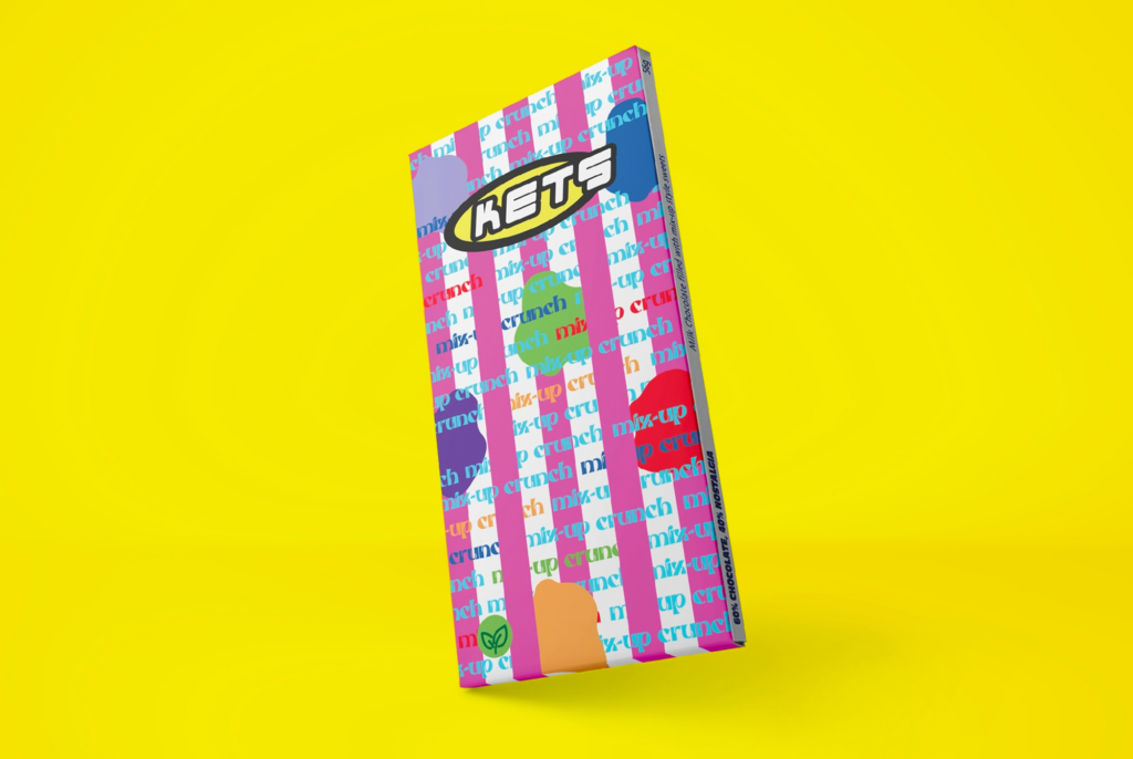
Mix-Up Crunch

Tapping into childhood nostalgia, Alana Whenary’s Y2K-style design integrates vibrant colors and playful elements from classic TV shows like Scooby-Doo.
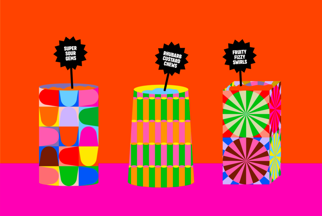
Candyland

Gemma Turnbull envisions Candyland as a fantasy pick ’n‘ mix emporium, incorporating vibrant patterns inspired by traditional sweet bags.
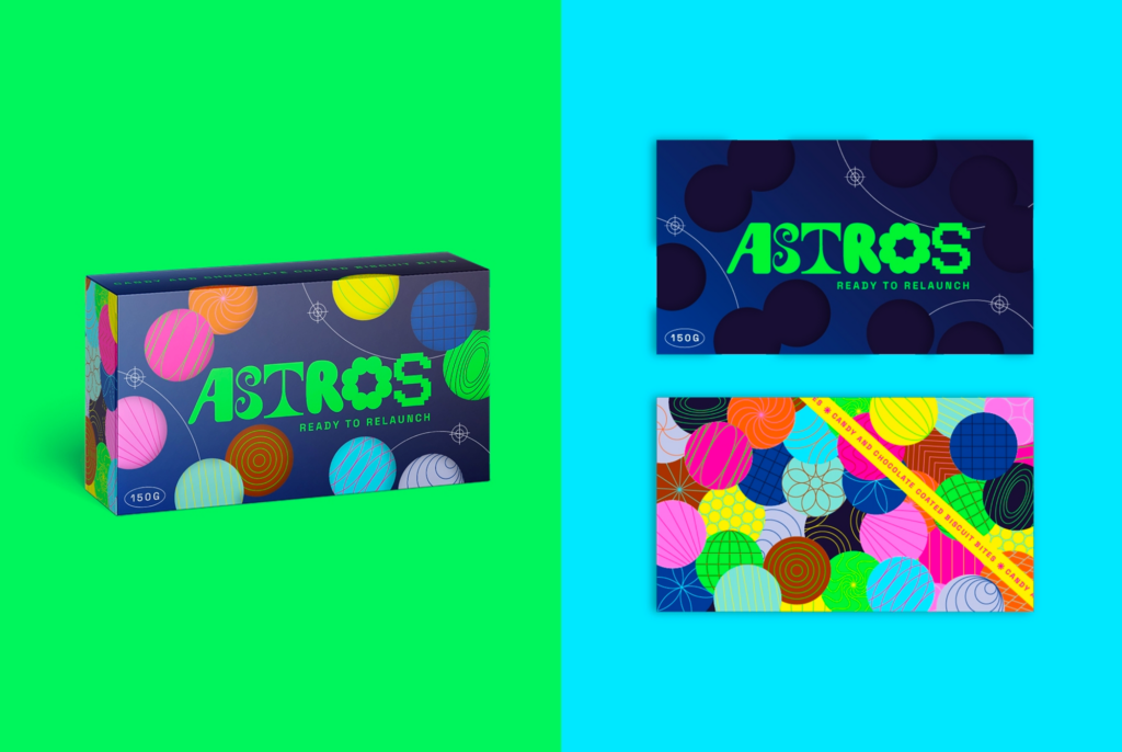
Astros

Laura Haverson’s Astros concept draws inspiration from outer space, creating a collective solar system that aligns seamlessly with chaotic maximalism. 2


Invention, it must be humbly admitted, does not consist in creating out of void, but out of chaos.

– Mary Shelley

Sources:

  1. https://airbnb.design/designed-chaos/ ↩︎
  2. https://www.wesayhowhigh.com/blog/article/graphic-design-trends-2023-chaotic-maximalism-candy-packaging ↩︎

How to Use Randomness in Graphic Design Processes

In graphic design, the mix of order and chaos is interesting and exciting. From abstract design to interactive user experiences, the strategic use of randomness has the power to captivate and engage audiences by adding an element of surprise, chaos, and energy to visual compositions. In this blog entry, I will explore how designers can use randomness and chaos to create creative and interesting graphic design projects. In researching this topic, I wanted to get some ideas from the concept of randomness in graphic design and explore its role in creating visually compelling and dynamic designs. To gain insight into the potential of randomness to enhance rich and innovative user experiences, I explored how randomness can be used as a design resource. I also investigated the incorporation of randomness into the composition of artwork, with a focus on its contribution to the creation of unexpected and surprising outcomes.

Randomness in Abstract Design

Abstract design is an art style that breaks away from traditional forms and embraces free-flowing and organic elements. It creates beauty through unexpected combinations of colors, lines, and shapes, and can be seen in various mediums such as painting, printmaking, and digital art. In digital art, randomness emerges as artists use algorithms and code to generate unpredictable patterns and shapes. Too much structure can make abstract design boring and predictable, so finding the right balance is crucial to creating engaging and effective artwork. As an example from one of my previous blog posts, Jackson Pollock, often called the „Father of Abstract Expressionism,“ provides a notable example of randomness in abstract design. His famous drip paintings from the mid-1940s feature random drips and splashes of paint, resulting in a chaotic and energetic composition. Incorporating random elements adds depth and complexity to the artwork, making it more engaging and dynamic. 1

Randomness as a Resource for Design

The research paper „Randomness as a resource for design“ argues that randomness can be used as an innovative design resource for supporting rich and novel user experiences. Randomness in design does not follow any rule, method, direction, or pattern. If a project calls for randomness, it is best to start with materials that are conducive to spontaneity. Designing with type requires adept handling of the hierarchy, refining and designing the display elements for focal emphasis and also refining the quiet details. Random compositions exhibit visual qualities that are not patterned, aligned, or horizontal. Instead, they tend toward compositions that exhibit overlapping, cropping, angling, and textures. This approach allows for the creation of a dynamic and fresh composition.2

Randomness in the Composition of Artwork

The use of randomness in the composition of artwork has been a subject of interest for many artists. Great artwork requires great attention by the artist. Even so, many artists acknowledge that randomness and spontaneity also play a role in great works. Some visual arts have also utilized randomness, and programmatic artwork may provide an interesting way forward. Not only is it easy to introduce randomness at any point in the composition, but the randomness itself can be controlled in many ways. Furthermore, random experiments can be rapidly replayed. This allows the artist to observe the outcome and take an iterative approach. In some ways, the artist is merely setting up a perfect environment to discover great works of chance.

In his article Tyler Hobbs talks about how artists use randomness in their art to make unique and interesting creations. In his conclusion, understanding and purposefully using randomness can help create special works of art.

How artists use randomness varies. Some carefully control every part, creating polished works (Figure 1), while others intentionally leave things imperfect and spontaneous, adding a touch of chance (Figure 2).

Figure 1
Figure 2

Hobbs also suggests that a type of art called programmatic artwork, seen in things like Sol LeWitt’s wall drawings, is a good way to explore randomness. It allows artists to add randomness at different points and control it. It also allows them to quickly try out different random ideas to see what works best.

In Hobbs’ own work he talks about, the Quilt and Continuity series, randomness is an important part. In the Quilt series (Image 1), a random starting point guides each new layer, and in the Continuity series (Image 2), semi-random shapes and layers are influenced by a chosen point. 3

The randomness scale for these series shows a lot of variation, like the following Figure shows.

Conclusion

In conclusion, the strategic use of randomness in graphic design projects, particularly in abstract design, as a resource for design, and in the composition of artwork, can lead to visually compelling and dynamic outcomes. By embracing randomness as a creative tool, designers and artists can infuse their work with a sense of dynamism, playfulness, and innovation, ultimately creating designs that resonate with audiences on a deeper level.


Sources:

  1. https://blog.designs.ai/2023/02/10/exploring-the-world-of-abstract-design-tips-and-techniques-for-designers/ ↩︎
  2. Tuck Wah Leong, Frank Vetere, and Steve Howard. 2006. Randomness as a resource for design. In Proceedings of the 6th conference on Designing Interactive systems (DIS ’06). Association for Computing Machinery, New York, NY, USA, 132–139. https://doi.org/10.1145/1142405.1142428 ↩︎
  3. https://tylerxhobbs.com/essays/2014/randomness-in-the-composition-of-artwork ↩︎

Controlled Chaos in Graphic Design – Examples

In this blog post, I want to explore the interesting concept of controlled chaos in design, highlighting the innovative approaches of French studio Parallèle Graphique and Thomas Kurppa, co-founder of Stockholm-based agency Kurppa Hosk. These designers skillfully navigate the delicate balance between order and disorder, transforming seemingly chaotic elements into compelling and purposeful designs. Controlled chaos in design involves the intentional arrangement of different elements to create visually striking compositions that may initially appear disorderly, but ultimately achieve a harmonious and coherent result. I’ll explore how both Parallèle Graphique and Thomas Kurppa achieve this balance, infusing their designs with a unique blend of creativity and structure.

Parallèle Graphique

French design studio Parallèle Graphique is known for its captivating approach, often described as “controlled chaos”. The trio – Marceau Truffaut, Chloé Plassart, and Thomas D’Addario – joined forces after collaborating on BimBaam!, and recognizing the challenges of navigating the design industry individually. Their collective approach, established in 2014, has allowed them to tackle diverse projects ranging from brand identities to web design.

A standout project is the redesigned identity for Le Biplan, a small concert hall in Lille, where they ingeniously adapted to a small budget. The resulting global identity, with a custom typeface and monthly updated trifold brochure, showcases purposeful chaos within dense information.

In a different vein, Parallèle Graphique’s work for the Pete the Monkey music festival in Normandy, which supports a Bolivian monkey sanctuary, demonstrates their versatility. The custom font and hand-drawn monkeys, along with silk-screened posters, demonstrate their commitment to high-impact design.

Beyond client projects, their passion for screen printing extends to an online store that offers illustrative screen-printed posters. Each member contributes a unique style, from Truffaut’s heavy metal influences, to Thomas‘ street and pop designs, to Plassart’s feminine touch of ornamentation and stylized lettering.

As the team grows, it is hoped that they will retain their distinctive ability to harmonize disparate elements into purposeful designs and remain calmly centered in the midst of their design storm. This promising trio brings a dynamic and unique perspective to the world of graphic design.1

Thomas Kurppa

Thomas Kurppa, co-founder of Stockholm-based agency Kurppa Hosk, took a unique path to graphic design, first immersing himself in the electronic music scene of the 90s. Kurppa moved from producing electronic music to experimenting with album covers and flyers. This curiosity led him to design school, where he delved into the history of design, especially the modernist influences in underground music.

Now running his own agency, Kurppa’s design philosophy is centered on mathematics and geometry, fascinated by the fundamental role of numbers and codes in nature. The interplay between control and chaos defines his bold work, which is particularly evident in his type-centric designs.

One notable project, „Spread The Sign,“ created in collaboration with Leo Drakenberg, aims to provide a universal platform for sign language. Using a strict geometric system, Kurppa challenges preconceptions about design for the hearing impaired, seeking a playful and unpretentious expression within a solid structure. The design features bold pictograms contrasted with muted information, using a stark black, white and orange palette to create a visually striking and accessible brand for both the target audience and those unfamiliar with hearing impaired culture.

Beyond client projects, Kurppa explores letterforms and type, sharing his experiments on Instagram. This serves as a creative playground, allowing him to stretch ideas without the constraints of formal client briefs. Drawing parallels between letterforms and chair design, Kurppa emphasizes the importance of functionality and the dynamic nature of design. He strives to continually learn and evolve, embracing experimentation as a means of pushing the boundaries of design.2


Sources:

  1. https://eyeondesign.aiga.org/controlled-chaos-parallele-graphique-keeps-order-in-their-wild-design-house/ ↩︎
  2. https://www.itsnicethat.com/articles/thomas-kurppa-graphic-design-170120 ↩︎

Order in Graphic Design – Part 2: Balance

In this blog entry I want to look into how designs can be organized and how order can prevent a design from looking random. The focus is on the significance of balance in graphic design and methods for achieving it.

Balance in design ensures that elements in a composition are distributed and visually weighted to achieve cohesion and satisfaction. It plays a crucial role in providing stability, structure, and emphasis, contributing to the overall dynamics of a design. This principle aims to arrange visual elements in an aesthetically pleasing manner, not necessarily symmetrically, but in a way that prevents any single element from dominating the design. The goal is to create a unified and naturally pleasing visual experience. There are several forms of balance in graphic design, each with its own advantages and disadvantages. The choice among these types depends on the specific message and mood you are trying to convey.

Symmetrical (Static) Balance

Symmetry, the most common form of balance in design, involves organizing elements equally on either side of a central axis, whether horizontal or vertical. While considered predictable by some, this method is widely appreciated for its visual appeal, providing a sense of organization and harmony on a subconscious level. Despite its perceived predictability, symmetrical balance has endured over time, proving to be one of the most effective ways to create a sense of comfort and solidity on a page.

The key feature of symmetrical balance is the mirroring effect created by the elements on either side of the imaginary line through the center of the design. This mirroring creates a stable visual composition with an even distribution of visual weight. Drawing a straight line through the center in any direction reveals a consistent balance that contributes to an orderly and aesthetically pleasing appearance. While some may find symmetrical balance unexciting, its enduring popularity is a testament to its ability to create a visually stable and comforting design.

Image source: https://www.pluralsight.com/blog/film-games/understanding-balance-graphic-design#:~:text=What is the principle of,diagonally%2C or background versus foreground

In the first image, both sides have the same visual weight, creating a perfectly balanced design. But in the second image, when one side becomes lighter and the other remains dark, the dark side feels heavier. Symmetrical balance is good for clear communication, but it may not make a design interesting. It’s important to find the center of the design and use different techniques to distribute weight evenly on each side.

Asymmetrical (Dynamic) Balance

Asymmetric balance in graphic design occurs when elements have unequal visual weight, adding a dynamic and compelling quality to the composition. Unlike the predictability of static balance, asymmetry sparks viewer engagement by inviting a subconscious search for counterweights, drawing attention to often-neglected areas of the design. Intentional imbalance introduces tension and movement, making it an ideal choice for creative or intricate projects. Striking a delicate balance becomes paramount, allowing one side to carry a noticeable weight while maintaining an overarching sense of balance. This thoughtful interplay not only attracts attention, but also infuses vitality into the design, making Asymmetrical Balance a compelling tool for designers seeking to enhance visual appeal. The greater the asymmetry, the greater the inclination of the viewer to investigate its origin. Individuals will naturally look at such a picture with more attention than usual. However, maintaining a sense of proportion is crucial; an overly eccentric composition may not always be well received.

Image source: https://254-online.com/balance-principle-design/

Radial Balance

Radial balance in design involves the arrangement of visual elements that radiate outward from a central point, typically at the center of the composition. Although not as commonly used, this approach offers a distinct advantage by easily capturing attention and establishing a clear focal point, often placed at the center of the design. Achieving radial balance requires placing objects, colors, or textures equidistant from this central point, promoting a symmetrical distribution of visual weight. When multiple axes converge on a single point within a composition, this is known as radial balance. The underlying goal is to draw the viewer’s attention to the central area, creating a sense of cohesion and symmetry within the design. This deliberate arrangement can enhance visual appeal by providing a clear point of emphasis and balance, although it is used less frequently than other balance techniques.

Image source: https://medium.com/outcrowd/balance-in-composition-how-to-balance-design-185afda003d7

Mosaic Balance

Mosaic balance, also known as crystallographic balance, is a style reminiscent of the chaotic yet harmonious paintings of artists such as Jackson Pollock. In this approach, there are no prominent focal points, and all elements are equally responsible for creating a visually cohesive whole. Despite the initial appearance of visual noise due to the lack of hierarchy, mosaic balance arranges elements in a random or chaotic manner, creating a sense of diversity, complexity, and richness. This type of balance lends itself to designs that aim to present a variety of information or images in a collage or mosaic style. The uniqueness of mosaic balance lies in its ability to create harmony without emphasizing any single element or allowing it to dominate the overall composition.

Image source: https://www.smashingmagazine.com/2015/06/design-principles-compositional-balance-symmetry-asymmetry/


Sources:

https://medium.com/outcrowd/balance-in-composition-how-to-balance-design-185afda003d7

https://www.pluralsight.com/blog/film-games/understanding-balance-graphic-design#:~:text=What%20is%20the%20principle%20of,diagonally%2C%20or%20background%20versus%20foreground.

https://254-online.com/balance-principle-design/

https://designshifu.com/what-is-balance-in-graphic-design/

Order in Graphic Design – Part 1: Grid Systems

An observation from my recent blog post is that designs that are perceived as well spaced and balanced are less likely to be immediately recognized as random. Human perception tends to associate randomness with more chaotic or irregular arrangements, and when elements are evenly spaced or exhibit a sense of order, they may not conform to our typical expectations of randomness. Therefore, well-balanced and organized designs are often not immediately perceived as random because of this cognitive bias.

In the first part of exploring how designs can be organized and how order can help for a design not to look random, I would like to research a bit of the basics of grid systems.

What are Grid Systems?

A grid system in graphic design is like an invisible framework of vertical and horizontal lines. These lines help organize and control where text and images go on a page, creating a structured layout. People may call it different names like standard size systems, program layout, or scale layout design, but it’s all about arranging things neatly on a page.1

In his book Grid Systems in Graphic Design, Josef Müller-Brockmann discusses the use of the grid as an organizing system that reflects a designer’s constructive and forward-thinking mindset. It embodies a professional ethos that strives for clarity, functionality, and aesthetics akin to mathematical thinking. Constructive design that adheres to formal principles contributes to the larger culture and influences societal tastes. Working with the grid is a commitment to universal laws, systematization, objectivity, and the integration of color, form, and material. It reflects a positive, forward-looking attitude and emphasizes the importance of education and a constructive approach to creative work. Each visual creation reflects the designer’s character, knowledge, skills, and mentality. (Müller-Brockmann 1996, p. 10) 2

Different Types of Grid Systems3

Baseline Grid

A baseline grid consists of evenly spaced horizontal lines that guide the placement of text, and is often used with column grids to ensure uniform alignment of text lines across a page.

Column Grid

This grid divides a page into vertical fields, aligning objects to these divisions. It’s commonly used in newspapers and magazines to organize layout designs.

Modular Grid

A modular grid, an extension of the column grid, adds rows to create modules that guide layout decisions. It’s often used in magazines and corporate reports.

Manuscript Grid

A manuscript grid, often used in classic books, is a simple one-column grid that dictates the placement of text on a page. It’s traditional, and facing pages in these books typically mirror each other in layout.

Pixel Grid

A pixel grid is a microscopic grid of millions of pixels on digital screens. When designers zoom in on a Photoshop document, they might see this grid, allowing them to edit images pixel by pixel.

Hierarchical Grid

A hierarchical grid is a flexible grid designed to meet specific content needs. It can be irregular, completely free-form, or composed of multiple overlapping grids and additional elements.

Benefits of Grid Systems4

  • Organize content: Grids help maintain alignment, structure, and cleanliness in designs by organizing various elements such as imagery and typography.
  • Design balance: Essential for achieving balance, grids contribute to a consistent and even design, whether following symmetrical or asymmetrical layouts.
  • Design efficiency: Grids speed and enhance the design process by guiding the placement and scaling of elements, speeding up the overall design process.
  • Pleasing design layout: Margins and gutters within grids help organize designs for a clean and open visual presentation. Following grid rules, such as the rule of thirds, contributes to aesthetically pleasing designs by guiding the placement of key elements.
  • Breaking the grid for impact: While grids maintain clean designs, intentionally breaking the grid can create unique and eye-catching effects that draw attention to specific elements.
  • Diagonal layouts: Grid systems are versatile, allowing designers to experiment with different layouts, including diagonal angles, for a modern and experimental look.
  • Universal applicability: Grids are not limited to specific design mediums; they can be used in various areas of design, from magazine layouts to logos and illustrations.

Sources

  1. https://uxdesign.cc/the-role-of-grid-systems-in-graphic-design-6dc6d09481ff ↩︎
  2. Müller-Brockmann, Josef. Grid Systems in Graphic Design : a Visual Communication Manual for Graphic Designers, Typographers, and Three Dimensional Designers = Raster Systeme Für Die Visuelle Gestaltung. 4., rev. ed.., 1996. ↩︎
  3. https://uxplanet.org/grids-in-graphic-design-a-quick-history-and-5-top-tips-29c8c0650d18 ↩︎
  4. https://medium.com/@ishaashokshah/importance-of-grid-system-in-graphic-design-bf02494d2a76 ↩︎

The Illusions in Randomness

In my research, I have tended to ask the questions „What makes randomness feel and look random?“ and „Can randomness be seen as not random?“ In this blog entry, I will explore the clustering illusion and the illusion of randomness.

The Clustering Illusion

When looking at clouds, it becomes clear how easily recognizable shapes such as people, animals, or objects appear. Called the „clustering illusion,“ this is the human tendency to perceive patterns in random data. Our evolutionary development has honed our ability to identify specific objects, including faces, potential threats in shadows, and familiar objects. Once the brain becomes adept at recognizing certain patterns, it tends to see them everywhere.1

The clustering illusion extends beyond earthly observations to illustrate the human tendency to see random events as more orderly or uniform than they really are. A pertinent example is the perception of stars in the night sky, where certain areas appear densely populated while others appear empty. This illusion arises from the tendency to assign a physical explanation to this non-random distribution, despite the fact that the positions of the stars are inherently random.

The left image below shows an example of a truly random star field, while the right image shows a manually generated star field that appears too uniform to be realistic, but is more in line with human expectations of randomness. In the example on the right, each star is randomly positioned within its own 20 × 20 pixel square, resulting in a more uniform but unrealistic result.2

Image source: https://tomroelandts.com/articles/the-clustering-illusion

The Illusion of Randomness

Richard A. Muller illustrates the illusion of randomness by generating two sets of star patterns. Using a computer, he first creates a plot with completely random locations, resulting in a seemingly uneven distribution of stars. To counteract this perception, Muller then divides the space into 100 smaller boxes and randomly places a star in each box, creating a more uniform appearance. Surprisingly, when asked which pattern looks more random, most people choose the second plot, which is actually the non-random one. The uniform distribution makes it look more random, challenging our intuitive understanding of randomness in seemingly clustered patterns. Muller emphasizes that truly random patterns can appear clustered, leading to the need to make them more uniform to convey a sense of randomness, as in many depictions of stars in artwork.3

Image source: https://muller.lbl.gov/teaching/Physics10/old physics 10/chapters (old)/4-Randomness.htm

What makes randomness feel and look random?

Understanding randomness can be challenging because of the limitations of our intuition. Asan example, consider the image below, with three sets of 132 points representing the nests of Patagonian seabirds, the nest sites of ant colony, and randomly generated coordinates.

Image source: https://behavioralscientist.org/yates-expect-unexpected-why-randomness-doesnt-feel-random-sense-patterns/

Identifying the truly uniform random distribution can be difficult, as our perception of randomness tends to lean toward well-spaced arrangements. Surprisingly, the leftmost image with uniformly distributed points is often perceived as less random than the other two images, which represent the locations of ant and seabird nests. This cognitive bias led to research into metrics that objectively determine spatial randomness, removing human perception from the equation. While our brains may struggle with randomness, recognizing it is crucial in various situations. This finding not only challenges our preconceived notions, but also underscores the importance of using objective metrics to reveal the true nature of randomness in spatial patterns.4


Sources

  1. https://medium.com/@nexy.io/clustering-illusion-1055023fec59 ↩︎
  2. https://tomroelandts.com/articles/the-clustering-illusion ↩︎
  3. https://muller.lbl.gov/teaching/Physics10/old physics 10/chapters (old)/4-Randomness.htm ↩︎
  4. https://behavioralscientist.org/yates-expect-unexpected-why-randomness-doesnt-feel-random-sense-patterns/ ↩︎

Randomness and Computers: Does True Randomness Exist?

In this blog entry, I would like to explore how computer-generated randomness actually works and whether true randomness exists.

Randomness has a long history, as evidenced by practices such as the drawing of lots from a helmet described already in the ancient Greek epic poem Iliad. In 17th-century discussions that predate Newton, the distinction between events perceived as unpredictable and those that are truly random was recognized in the exploration of the relationship between chance, cause, and necessity. This philosophical inquiry led to metaphysical questions about human agency. Although contemporary scientific consensus defines randomness as a sequence without repetition, bias, or pattern, our beliefs about chance, cause, and effect often clash with empirical realities (Lostritto, 2015).

Randomness, a concept deeply embedded in both the natural and digital worlds, takes on unique dimensions when encountered in the controlled environment of a computer. In this exploration, we delve into the intricacies of true randomness and pseudorandomness, examining their implications, applications, and the underlying mechanisms that drive their generation.

True random numbers

In the field of computing, achieving true randomness is an elusive goal. True random numbers, unlike their deterministic counterparts, result from unpredictable physical processes such as radioactive decay, atmospheric fluctuations, or electrical noise. These numbers, which have no discernible pattern, provide a level of unpredictability that is critical in fields such as cryptography and simulation. Unlike pseudorandom numbers, which follow a repeatable sequence based on a seed value, true random numbers offer an inherent unpredictability that adds a layer of security and authenticity to various computational processes (Owais, 2023).

Pseudo-random numbers

While the deterministic nature of computers creates a challenge in generating true randomness, pseudorandomness steps in to fill the need for unpredictability. Pseudorandom numbers are generated by a series of mathematical operations initiated by a seed value. Despite being called „random“, these numbers are actually predictable – a property rooted in the repeatability of the mathematical operations (Lostritto, 2015). Commonly used in everyday computing, pseudorandom numbers play a role in simulations, randomized algorithms, and various applications where a semblance of randomness is required (Owais, 2023). Understanding the balance between predictability and randomness in the pseudorandom domain is critical to optimizing algorithms and ensuring the reliability of computational results.

In 1946, John von Neumann and Stanislaw Ulam used ENIAC to create the first pseudorandom number using an algorithm called the middle square method. This method involves selecting a „seed“, a truly random number, and performing calculations by multiplying it by itself, taking the middle of the result, and repeating the process. However, the randomness of these pseudo-random numbers is tied to the initial seed, resulting in a predictable sequence if the same seed is chosen. The length of the repeating pattern, called the period, depends on the length of the seed. Despite their predictability, pseudorandom numbers serve the practical purpose of providing the randomness necessary to generate unpredictable sequences. The complexity of the seed affects the unpredictability of the sequence, with a more complex seed leading to a more unpredictable result, though still within practical limits (Owais, 2023).

Generative art and randomness

Generative art is a creative approach that uses randomness in code to varying degrees. Whether prominently featured or subtly integrated, randomness plays a crucial role in shaping these works of art. In essence, generative art is created through programming, incorporating random elements that result in unique visual outputs each time the program is runned. By giving up control and allowing random forces to influence the creative process, generative art brings a dynamic and ever-changing quality to visual expression (Ferraro, 2021).

Generative artist Jared Tarbell highlights the importance of randomness in programming, emphasizing that the execution of a program is typically predictable. By introducing randomness into the creative process, artists can experience unexpected results, fostering a sense of surprise even for the creator. Tarbell suggests that embracing randomness allows for unpredictable outcomes that may not be achievable through controlled efforts, similar to the spontaneity found in contact improvisation, a dance form in which performers respond to the environment presented to them, resulting in sequences unattainable through deliberate planning (Ferraro, 2021).

Examples for artworks using computer generated randomness

Vera Molnár: Interruptions

In this collection, the artist, Vera Molnár, begins with a grid filled with straight lines of equal length. The lines are randomly rotated, creating an intricate pattern that suggests various forces disrupting a regular structure. In addition, the artist introduces „interruptions“ by randomly erasing sections of certain lines, creating voids that are shaped by both the missing parts and the surrounding elements. (src: https://dam.org/museum/artists_ui/artists/molnar-vera/interruptions/ )

Jared S Tarbell: Truchet Tile Multiscale

In this series, the artist begins with Truchet tiles, square design elements arranged in a grid with random rotations. The sketch adds a layer of complexity by incorporating tiles at different scales. The entire composition is made up of black and white ellipses, with arcs formed by multiple ellipses rotated around a radius. Notably, this tile set scales seamlessly with no visible seams, creating a unique and visually appealing pattern. (src: https://www.infinite.center/2021/01/25/truchet-tile-multiscale/ )


On this website you can see more generative artworks where randomness plays a key role: https://www.lerandom.art/


Sources:

Lostritto, Carl (2015): The Value of Randomness in Art and Design. In: https://www.fastcompany.com/3052333/the-value-of-randomness-in-art-and-design

Owais, Mohd (2023): Random Numbers Generators: How computers think randomly? In: https://medium.com/@mohammdowais/how-computers-think-randomly-80fa37183949

Ferraro, Marc (2021): Random Rules — Why you should check out generative art. In: https://marc-ferraro.medium.com/random-rules-why-you-should-check-out-generative-art-61948b54da87

DAM: Interruptions (1968-1969) In: https://dam.org/museum/artists_ui/artists/molnar-vera/interruptions/

Tarbell, Jared S. (2021): Truchet Tile Multiscale. In: https://www.infinite.center/2021/01/25/truchet-tile-multiscale/


Chaos Theory and Design

Understanding Chaos Theory: Small Actions, Big Effects

Chaos theory is a complex mathematical concept that seeks to comprehend the profound impact of small actions. Some believe it elucidates random occurrences, particularly in finance or weather prediction. Despite initial predictability, chaotic systems eventually manifest as unpredictable.1

Found in mechanics and mathematics, chaos theory explores seemingly random behavior governed by deterministic laws. The term „deterministic chaos“ encapsulates the paradoxical connection between randomness and predictability. Traditionally, randomness was perceived as apparent and linked to the world’s complexity. Recent studies reveal that even seemingly simple systems can behave unpredictably due to extreme sensitivity to initial conditions.2

In chaos theory, the evolution of systems undergoes unexpected shifts from order to disorder. This nonlinear system explores connections in seemingly random events, focusing on rules governing nuances, sensitivities, and unpredictable changes.

Patterns Across Scales

Introduced by mathematician B. B. Mandelbrot in 1975, fractal geometry emphasizes self-similar patterns across different scales. Despite appearing irregular, fractals share some similarity with the overall pattern. Their repeating pattern across scales aids in creating hidden order models and rules, utilized in mathematical graph theory for graphics.

Chaos in Graphic Design: The Art of Unpredictability

Chaos theory, exploring complex and unpredictable systems, influences graphic design through nonlinear graphics created with computers. Chaos graphics redesign text, images, and colors in two or three-dimensional space, leading to ever-changing visuals due to the unpredictable design process.

Designers learn to create using different shapes and ideas, like breakup, gradient, radiation, and duplication. Rules follow a certain pattern and are organized in a specific space, appearing somewhat disorderly in chaotic areas. Technical support enables designers to create fractal forms. Famous buildings like the Bird’s Nest and Water Cube in Beijing exemplify chaotic graphics, appearing disorderly yet constructed with scientific calculations.

Chaos in Design Thinking

Design creativity, a non-linear and chaotic storm of thoughts, involves a constant collision of innovative sparks. Chaos graphics blend logical, associative, divergent, and reverse thinking, resulting in unexpectedly beautiful outcomes. When designers adapt, think unconventionally, draw insights, and use exaggeration and transformation, their designs are filled with inspiration, uniqueness, and creativity.

Abstract and Concrete Chaos Graphics

Analyzing chaotic graphic design rules reveals two types: abstract chaos graphics and concrete chaos graphics. Designers can create different styles through stacking, separating, intersecting, mutually cutting, and combining functions by reorganizing graphics, changing scales, transforming dimensions, and playing with colors.3


Sources

  1. https://www.investopedia.com/ask/answers/08/chaos-theory.asp ↩︎
  2. https://www.britannica.com/science/chaos-theory ↩︎
  3. Chen, Shouming: Application of Chaos theory in creative graphic design. In: 2011 IEEE 2nd International Conference on Computing. Control and Industrial Engineering, Wuhan, China, 2011, pp. 302-305, doi: 10.1109/CCIENG.2011.6008018. ↩︎

Randomness in Art

Many artists base their work on randomness and spontaneity, which often makes the end result surprising and fresh, while the process itself is adventurous and inspiring for the artist. As a next step in my research, I explored some artists in whose work randomness appeared.

Jackson Pollock (1912-1956)

Abstract painting is abstract. It confronts you. There was a reviewer a while back who wrote that my pictures didn’t have any beginning or any end. He didn’t mean it as a compliment, but it was.

Jackson Pollock

Jackson Pollock, the renowned American artist, is closely associated with the concept of randomness in art. Using his self-developed „drip painting“ technique, he elevated the act of painting itself to the center of his artistic pursuits.1 By intentionally dripping and splashing paint onto the canvas, he forged unpredictable patterns that allowed for the unscripted manifestation of color and texture. It’s also worth noting that throughout his artistic process, his canvases were typically laid horizontally on the floor rather than upright on an easel. In addition, the tool he used, whether a brush or other tool, rarely made direct contact with the surface of the canvas.

However, anyone attempting to recreate a Pollock-esque composition soon realizes that the technique requires concentration, intention, and a technical understanding of how paint moves, splatters, and adheres to the canvas. It requires an understanding of the unique texture of paint and its response to gravity. Every flick of Pollock’s wrist as he applied paint to the canvas demonstrated precision. Despite the appearance of complete randomness, there was nothing arbitrary or accidental about each spill and splash.2

Number 5, 1948 by Jackson Pollock | Image source: jackson-pollock.org

Sol LeWitt (1928-2007)

LeWitt, a pioneer of minimalism and conceptual art, often employed random algorithms and guidelines in the creation of his artworks. He was a strong believer in minimalism, so much so that most of his famous works weren’t made by him. Instead of selling regular paintings on canvas, he sold „codes“ or procedures with clear instructions. A draftsman would follow these instructions, but his own skill and judgment were key in determining how the final artwork would look. This is exemplified in „Wall Drawing #85,“ where other artists followed a straightforward set of instructions that are open to personal interpretation, producing results that are consistently distinctive and unexpected. These instructions were: “A wall is divided into four horizontal parts. In the top row are four equal divisions, each with lines in a different direction. In the second row, six double combinations; in the third row, four triple combinations; in the bottom row, all four combinations superimposed.”3

Wall Drawing #85, 1971 first drawn by Sol LeWitt | Image source: https://massmoca.org/event/walldrawing85/

An other example is the “Wall Drawing #289”. Instructions: „A 6-inch (15 cm) grid covering each of the four black walls. White lines to points on the grids. Fourth wall: twenty-four lines from the center, twelve lines from the midpoint of each of the sides, twelve lines from each corner.“4

Wall Drawing #289, 1976, first drawn by Jo Watanabe | Image source:https://massmoca.org/event/walldrawing289/

Jean (Hans) Arp (1886–1966)

Artists of the Dada movement, such as Arp, turned away from the conventional and embraced randomness, chance, and spontaneity as essential elements of their art. Arp’s abstract forms reflect the randomness found in nature. Arp liked Taoist ideas about going with the flow and finding harmony in opposites. He felt that artists should be like messengers for nature, letting go of control and letting chance guide their creativity. This approach, he thought, provided a sense of liberation and artistic freedom.5 In his „Collage According to the Laws of Chance“, he dropped pieces of paper onto the canvas and glued them down where they landed, letting chance shape the work.6

According to the Laws of Chance,1933, Jean Arp | Image source: https://www.tate.org.uk/art/artworks/arp-according-to-the-laws-of-chance-t05005

  1. https://muvesz.ma/a-veletlen-szerepe-a-kreativ-folyamatban-a-muveszet-mint-inspiracio-es-spontaneitas/ ↩︎
  2. https://www.artdex.com/myth-genius-jackson-pollock/ ↩︎
  3. https://generativelandscapes.wordpress.com/2014/08/14/procedural-art-sol-lewitt-example-3-1/ ↩︎
  4. https://massmoca.org/event/walldrawing289/ ↩︎
  5. https://expressivemonkey.com/element-of-chance-2/ ↩︎
  6. https://www.tate.org.uk/art/artworks/arp-according-to-the-laws-of-chance-t05005 ↩︎

Topic Exploration

Randomness and (grid) systems in graphic design

Grid systems are often used as an important design principle in the field of graphic design and typography. One frequently used variant of this is the golden ratio. This harmonious proportion, which is found in many natural forms and works of art, is often perceived as aesthetically pleasing. Research on the golden ratio in graphic design and typography focuses on how this proportion can be used to improve visual aesthetics, promote balance in designs and enhance the impact of messages. Questions can be asked such as: Does a design created using the golden ratio work better and is a design that is intentionally not created this way perceived as less effective?

In contrast to using grid systems, one can also use randomness. You take a blank sheet of paper and start designing without any helpful grids to help with the aesthetic arrangement of visual elements. Here, research could investigate how randomized design is perceived. Are there differences between designs with human-generated randomness and computer-generated randomness?

Nature can also stand as a common aspect of the two themes: Golden ratio is often discovered in shapes in nature and random events are also easily found in nature.

Useful literature for further research:

____________

Face as an element in graphic design

The face is one of the first recognizable symbols that children draw and create. They are fascinated by facial expressions and draw their first portraits, emphasizing faces over bodies, especially the eyes. Before children can read words, they develop a visual vocabulary to understand faces. Portraits and their expressions are an early method of communicating stories. A portrait is more than a drawing of facial features; it also shows and conveys personality. ‚Theory of Mind‘ is the scientific term for ’sympatheia,‘ denoting the ability to see oneself in another and experience what they experience. People also recognize faces in everyday objects where they do not exist.1

Visual communication is widespread in our world: emojis and emoticons often replace written language. Miklós Kiss’s project ‚Emograms‘ is a response to the development of mobile and computer-based communication. In a time when we often rely on emojis and icons instead of words, Kiss reintroduces lost words into these symbols. Thus, Emograms were created, establishing a connection between lost expressions and modern communication.2

As an example, individual facial features, especially their shapes, can have effects as visual elements in design: in the field of print design, one can depict the expressiveness of the mouth using typography. By integrating mouth-inspired shapes and elements into the letters of their typography, a unique personality and visual expressiveness can be imparted.3 But even with simpler geometric shapes, facial expressions can be replicated: Molly Bang’s book ‚Picture This‘ demonstrates how abstract design principles in art can tell human stories. Diagonal lines in portraits, such as slanted glances or facial expressions, indicate movement and tension in the image.1 The research on this topic aims to determine the effects of using face-like elements in graphic design (such as branding, typography, and posters) and how to apply them correctly.

____________

Optical illusion in graphic design

Op art was a style of visual art in the 1960s, but still has an impact on visual design and graphic design today. The use of optical illusions and illusions influence how people perceive and understand visual information. But how can they be used in graphic design and especially in areas such as branding? Optical illusions have different types and can be created by numerous methods.4 Through the targeted use of visual tricks, designers can direct attention, evoke emotions and reinforce messages.

Research can also investigate the psychological and cognitive processes behind human perception. Physiological illusions are created by excessive stimulation of the eyes and brain, such as the ‚afterimage illusion‘, which continues to create visible images after the original has disappeared. Cognitive illusions are based on unconscious inferences of the brain and include ambiguity illusions, paradox illusions, distortion illusions and fictional illusions. Optical illusion can also be used to create the illusion of movement: this gives the impression of movement in static images, as in the ‚rotating snake‘ illusion. Research into these illusions allows us not only to better understand human perception, but also to develop innovative design strategies that can push the boundaries of visual representation.

____________

Literature:

  1. https://catherineannemoore.medium.com/facial-expression-as-key-to-narrative-portraiture-6c1dd2e7655f ↩︎
  2. https://emograms.medium.com/story-of-emograms-30333e65a6c ↩︎
  3. https://mmg-1.com/the-power-of-the-mouth-communicating-beyond-words-in-graphic-design-and-filmed-presentations/ ↩︎
  4. https://www.creativereview.co.uk/optical-illusions-design-book/ ↩︎