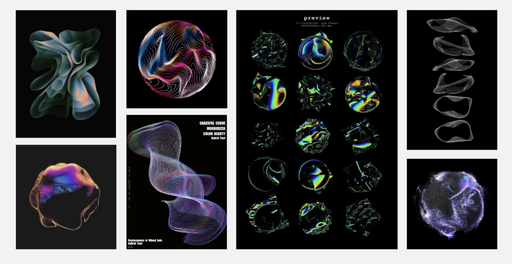
After deciding on my topic, I gathered some tutorials from YouTube to help with my data visualization project. I aimed to create something using lines so I could showcase the differences between various languages.
Moodboard for visualization

I believe using line shapes will effectively highlight the audio differences between different language inputs. Lines also have a clean, aesthetic look that I think will result in a visually appealing project. However, with my limited knowledge in TouchDesigner, I am not sure if I can achieve the exact outcome I envision. Therefore, I will experiment with some tutorials and see which ones work best. I’m really excited to dive into TouchDesigner and learn more!
First Attempt – Successful!
I followed this tutorial and found the beginning challenging because it focused on making the project audio-reactive from the start. My first step, however, was to create the visual aspect. The initial outcome didn’t quite meet my expectations as it resulted in a line that moved randomly. Randomness might not be ideal for my project since I want to compare different letters clearly.
Above, you can see my initial outcome. With some modifications and added audio reactivity, it might work for the prototype phase. I’m satisfied with the progress so far, but I plan to either refine this outcome further or try other tutorials. I believe having multiple visualization options will be beneficial during the testing phase.
Next Step
I will continue working through more tutorials, focusing on making the visualizations audio-reactive. Then, I’ll choose the one that fits the best! My goal is to create a dynamic, clear and aesthetic visualization that shows the differences between various languages through their audio characteristics.