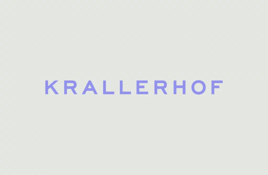
My first experiment deals with the effect of typography in branding. I chose an existing hotel branding for this. As I am inspired by the work of Moodley, an agency from Graz, I looked there for suitable branding and finally found what I was looking for.

I decided on the new branding for the Krallerhof. The Krallerhof has been around since 1956 and Moodley has helped the family hotel to reposition itself on the market with a new brand strategy and a revised corporate identity.

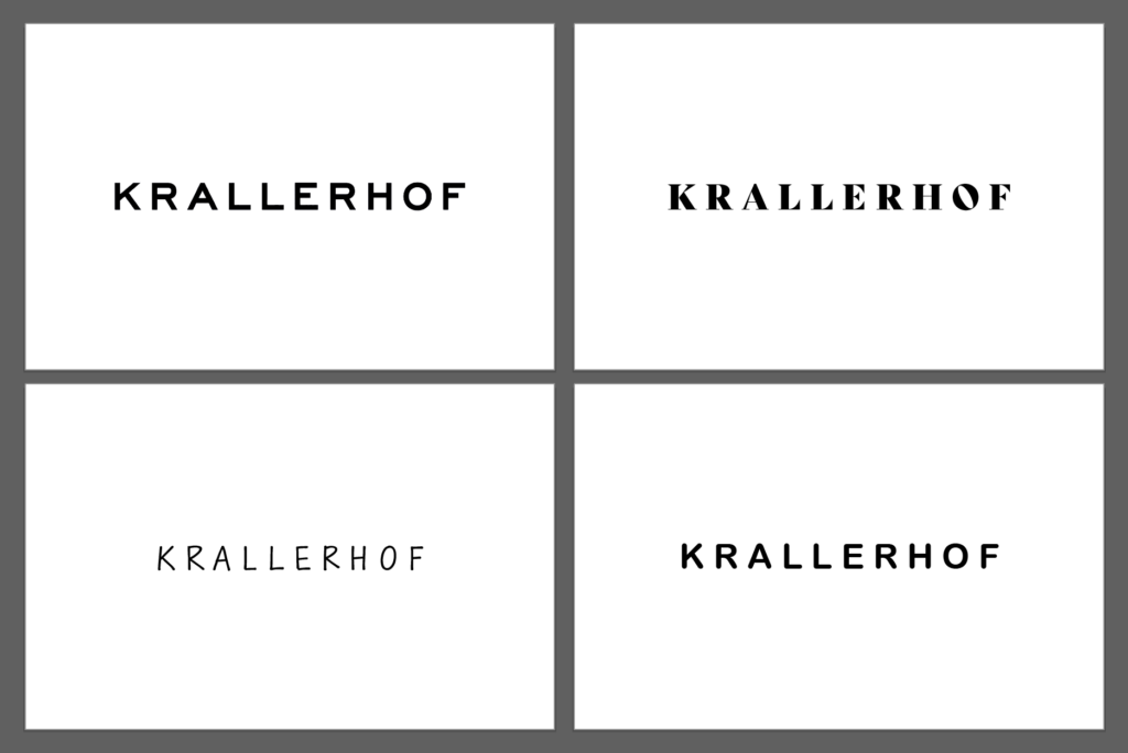
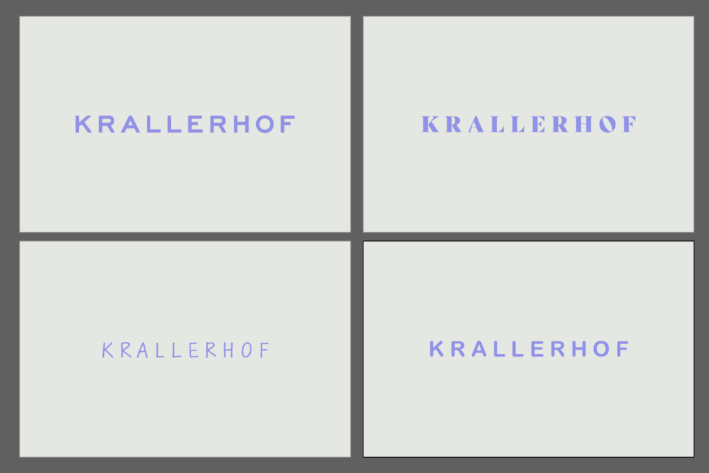
For the experiment, I added three further variants to the existing logo. I made sure to only change the font. No other objects were added. The original logo uses a sans serif font. For the other variants, I therefore opted for a font with serifs, a handwritten font and a rounded sans serif. I made sure that the spacing is similar for all variants and that a logo is not judged differently because of this factor.
In the next step, I present the different variants to a few people and ask them about certain parameters. This is intended to provide conclusions about the perception of a logo and thus about the brand identity without knowledge of the company. In the first step, the interviewees are presented with a black and white variant. In the next step, the variant with the original colors follows in order to determine whether a change in perception occurs.
