16 // Experiment 1.3: Effect of typography (evaluation)

My survey produced the following results:

General questions about typography

  1. Which logo appeals to you the most?
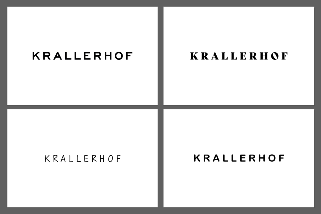
    The original logo (Sans Serif) was preferred by most participants, which could be due to its clear and modern design.
  2. How professional does each logo variant look?
    Original logo (Sans Serif): Scored an average of 4.5 out of 5. It was rated as the most professional.
    Serif font: Averaged 3.8 out of 5 points. It was perceived as professional but more traditional.
    Rounded Sans Serif: An average of 3.5 out of 5 points. This variant was perceived as friendly and modern, but slightly less professional.
    Handwriting: Average 2.9 out of 5 points. Handwriting was considered the least professional, but personal and inviting.
  3. What emotions does each logo variant evoke in you?
    Original logo (Sans Serif): Trustworthy, modern, professional.
    Serif font: Traditional, elegant, sophisticated.
    Handwriting: Personal, friendly, individual.
    Rounded Sans Serif: Modern, friendly, accessible.

Specific questions about typography

  1. In your opinion, which logo best conveys the brand of an upscale hotel?
    The original logo (Sans Serif) was seen by the majority as the logo that best conveys the brand of an upscale hotel.
  2. Which logo do you find most inviting?
    The rounded Sans Serif was perceived as the most inviting, closely followed by the original logo.
  3. Which logo variant looks the most modern?
    The original logo (Sans Serif) and the rounded sans serif were seen as the most modern variants.
  4. Which logo variant looks the most traditional?
    The serif font was rated as the most traditional variant.

General questions about color

  1. Has your perception of the logo changed with the addition of colors?
    About 70% of participants stated that their perception has not changed.
  2. If so, how did the perception change?
    Those who did notice a change mentioned that the colors made the logo appear more vibrant and inviting.

Specific questions about color

  1. Which color logo appeals to you the most?
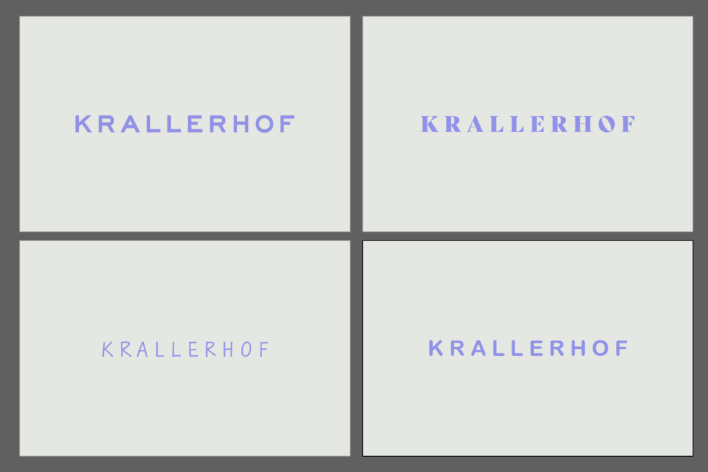
    The original logo (Sans Serif) in color was again the most preferred.
  2. How professional does each color logo variation look?
    Original colored logo (Sans Serif): Scored an average of 4.5 out of 5. It was still rated as the most professional.
    Serif font in color: Averaged 3.8 out of 5 points.
    Rounded Sans Serif in color: Average 3.5 out of 5 points.
    Handwriting in color: Average 2.9 out of 5 points.
  3. What emotions does each color logo variant trigger in you?
    The colored logos triggered similar emotions as their black and white counterparts, but an added sense of vibrancy was often mentioned.
  4. In your opinion, which color logo best conveys the brand of an upscale hotel?
    Mostly the original colored logo (Sans Serif).
  5. Which color logo do you find most inviting?
    The rounded Sans Serif in color was perceived as the most inviting, followed by the original logo.
  6. Which logo variant looks the most modern?
    The original colored logo (Sans Serif) and the rounded Sans Serif were seen as the most modern variants.
  7. Which logo variant looks the most traditional?
    The colored serif font was rated as the most traditional variant.


Summary:

The survey shows that the original logo (Sans Serif) performed best in both black and white and in color and was perceived as professional, modern and trustworthy. The use of color did not result in a significant change in perception for most participants. The serif font was perceived as traditional, while the rounded Sans Serif was perceived as inviting and modern. Handwriting scored lowest in terms of professionalism, but was rated as personal and friendly.

15 // Experiment 1.2: Effect of typography

To test my first experiment, I created a short online survey. The respondents were asked the following questions in addition to the images I posted in the last blog post:

General questions about typography

  • Which logo appeals to you the most? (selection)
  • Please rate how professional each logo variant looks. (Scale from 1 to 5, where 1 = not professional and 5 = very professional)
  • What emotions does each logo variant evoke in you? (open question)

Specific questions on typography

  • In your opinion, which logo best conveys the brand of an upscale hotel? (selection)
  • Which logo do you find most inviting? (selection)
  • Which logo variant looks the most modern? (selection)
  • Which logo variant looks the most traditional? (selection)

General questions about color

  • Has the addition of color changed your perception of the logo? (Yes/No)
  • If yes, how has the perception changed? (open question)

Specific questions about the color

  • Which color logo appeals to you the most? (selection)
  • Please rate how professional each color logo variant looks. (Scale from 1 to 5, where 1 = not professional and 5 = very professional)
  • What emotions does each color logo variant trigger in you? (open question)
  • In your opinion, which color logo best conveys the brand of an upscale hotel? (selection)
  • Which color logo seems most inviting to you? (selection)
  • Which logo variant looks the most modern? (selection)
  • Which logo variant looks the most traditional? (selection)

The results will be announced in the next blog post.

14 // Experiment 1.1: Effect of typography

My first experiment deals with the effect of typography in branding. I chose an existing hotel branding for this. As I am inspired by the work of Moodley, an agency from Graz, I looked there for suitable branding and finally found what I was looking for.

I decided on the new branding for the Krallerhof. The Krallerhof has been around since 1956 and Moodley has helped the family hotel to reposition itself on the market with a new brand strategy and a revised corporate identity.

For the experiment, I added three further variants to the existing logo. I made sure to only change the font. No other objects were added. The original logo uses a sans serif font. For the other variants, I therefore opted for a font with serifs, a handwritten font and a rounded sans serif. I made sure that the spacing is similar for all variants and that a logo is not judged differently because of this factor.

In the next step, I present the different variants to a few people and ask them about certain parameters. This is intended to provide conclusions about the perception of a logo and thus about the brand identity without knowledge of the company. In the first step, the interviewees are presented with a black and white variant. In the next step, the variant with the original colors follows in order to determine whether a change in perception occurs.

09 // Typography in the brand identity

After my last blog post, I came across an exciting website that once again deals explicitly with the power of typography in brand identity. This post therefore serves to supplement the content of the last post entitled „Typography and branding“ and to reiterate important content.


Image source: https://fastercapital.com/de/inhalt/Typografie–Auswahl-der-richtigen-Schriftarten-fuer-Ihre-Markenidentitaet.html

Typography plays a decisive role in shaping brand identity, but often influences the perception of a brand unnoticed. It can convey emotions, create credibility and set a brand apart from the competition. The choice of fonts, styles and sizes makes it possible to establish a clear brand personality. A comparative example illustrates that elegant serif fonts convey a sense of elegance, while rounded sans serif fonts create a more playful appearance.

Additionally, typography plays a crucial role in improving readability and creating a visual hierarchy. Using different font sizes and styles allows designers to clearly communicate information and draw attention. Consistent brand fonts across different touchpoints contribute to brand recognition, resulting in a strong visual identity for well-known brands such as Coca-Cola and Google.

Another aspect is differentiation from the competition. By choosing unique fonts, brands can make a lasting impression and stand out in a crowded market. Chanel is cited as an example, using a custom-designed font that is immediately associated with its luxury positioning.

Overall, the text emphasizes the crucial role of typography in brand identity design. Through the purposeful selection of fonts, brands can communicate their personality, build credibility, improve readability and successfully differentiate themselves in a competitive market.


Works Cited for the entire article:

FasterCapital. “Typografie Auswahl Der Richtigen Schriftarten Für Ihre Markenidentität.” Www.fastercapital.com, 7 Dec. 2023, fastercapital.com/de/inhalt/Typografie–Auswahl-der-richtigen-Schriftarten-fuer-Ihre-Markenidentitaet.html. Accessed 25 Jan. 2024.

08 // Typography and branding

The scope of typography extends far beyond letters and words – it influences the way we perceive brands. This blog post is about the world of typography and how it interacts with branding. For example, you can ask yourself the question: „How do they influence a brand’s identity and what decisive influence do they have on visual perception?“

Analyzing typography in the context of branding is central to my master’s thesis. The choice of typeface is not a trivial decision, but has a significant impact on the personality and character of a brand. An in-depth understanding of typography makes it possible to strategically design the visual identity of a brand and convey a message.


Typography is a crucial visual element that encompasses the art and technique of typeface and text design. It not only serves aesthetic appeal, but also contributes to the legibility and comprehensibility of information. In the context of brand identity, the choice of font plays a decisive role. Famous brands such as Apple, Nike and Coca-Cola have chosen iconic fonts that have contributed significantly to their recognizability.

When choosing the right font for a brand, several factors need to be considered, including the target audience, industry, cultural context and company values. A well-chosen font can help convey a brand’s personality, values and vision. For example, bold fonts exude energy, while soft fonts can convey calm and elegance.

The importance of font combinations is emphasized, as a single font is often not enough to cover all aspects of brand communication. Complementary fonts, hierarchy and function as well as consistency are important principles when combining fonts to create a harmonious visual aesthetic.

Typography must be consistent across different media and platforms, be it in print media, web design, social media or virtual backgrounds. Each medium requires customized typography to ensure optimal readability and consistent brand communication.

Overall, typography plays a crucial role in shaping the visual identity of a brand and influences the first impression as well as the perception by the target group.


Works Cited for the entire article:

“Die Rolle Der Typografie in Der Markenkommunikation.” Www.designmadeingermany.de, 25 Apr. 2023, www.designmadeingermany.de/weblog/typografie/#:~:text=Typografie%20und%20Markenidentit. Accessed 20 Jan. 2024.

01 // Topic identification

In my first blog post, I would like to present and roughly explain my three proposed topics. Before I started looking for topics, I decided on design areas from communication design that particularly interest me. I chose the areas of typography, packaging design and branding. At the end of the blog post, I will present my current favorite and describe it.


Topic 1: The role of fonts in the visual identity of brands.

This topic looks at the importance of typography in shaping the visual identities of brands. In exploring this topic, I will examine how choosing the right fonts has a significant impact on the perception and success of a brand. In addition to the aspects of font choice in branding, the influences on brand personality, target group appeal and brand recognition will also be examined. Possible challenges and opportunities in this area are also analyzed.

Bibliography and references:

_Typography Essentials: 100 Design Principles for Working with Type“ von Ina Saltz

_Thinking with Type: A Critical Guide for Designers, Writers, Editors, and Students von Ellen Lupton

_Brand Bible: The Complete Guide to Building, Designing, and Sustaining Brands von Debbie Millman

_Visuelle Kommunikation als strategisches Instrument der Marken- und Unternehmenskommunikation von Alexander Berzler

_Understanding Role of Fonts in Linking Brand Identity to Brand Perception von Vikas Singla & Nidhi Sharma

_Visual branding: A guide to designing visual identity von Ly Dang

Topic 2: Recycling and upcycling in packaging design: sustainable approaches to packaging solutions.

This topic examines the increasing importance of recycling and upcycling in the design of sustainable packaging solutions. The importance of environmental protection and sustainability, also in design, is continuously increasing. In my thesis, I will examine the concept of recycling and upcycling in packaging design and explore practical approaches to environmentally friendly packaging solutions. There will also be a focus on the creative redesign of packaging materials, material selection, ecological impact and the influence on brand communication. My work aims to get closer to the goal of sustainable packaging design for a sustainable future.

Bibliography and references:

_Designing Sustainable Packaging von Scott Boylston

_Sustainable Packaging von Dr. Subramanian Senthilkannan Muthu

_Sustainable packaging design: A holistic methodology for packaging design von Erik Svanes, Hanne Møller, Marit Kvalvåg Pettersen, Hanne Larsen

_Consumer response to sustainable packaging design von Nigel D. Steenis

_Sustainable packaging as a tool for global sustainable development von Natalia Kozik

_Packaging Sustainability von Wendy Jedlička

Topic 3: Multi-sensory branding: How all the senses can be used to create a brand experience.

This topic looks at the world of multi-sensory branding and how all the senses can be used in the design of a holistic brand experience. As our attention span is limited by the increasing digital world, the use of the senses for brands is becoming more important. This thesis will look at the integration of different elements in brand communication and design. The thesis aims to find out how companies can appeal to the senses of their target group to build strong emotional connections to their brands and intensify the brand experience.

Bibliography and references:

_Brand Sense: Warum wir starke Marken fühlen, riechen, schmecken, hören und sehen können von Martin Lindstrom

_Sensory Marketing: Research on the Sensuality of Products von Aradhna Krishna

_Brand Seduction: How Neuroscience Can Help Marketers Build Memorable Brands von Daryl Weber

_Sensory Marketing – A review and research agenda von Ruchi Garg, Rachna Bhatia, Ritu Chhikara, Aakanksha Kataria

_The impact of sensory branding (five senses) on consumer von Saffer Uddin

_Sensory Branding von Alirezaeslambolchi & Shimafarhadi und Seyed Erfan Alhosseini Hamedani


I chose the first topic for my research in the first semester. However, I have decided to focus not only on typography but on branding in general. So for my further research, I would like to look at the following topic: The role of branding and its influence on the visual identity of brands.

In my research, I will examine the multifaceted design of the visual identity of brands, taking into account a holistic branding approach. The focus is not only on the font but also on various elements that together shape the perception and success of a brand. In addition to a comprehensive consideration of branding, the influences on brand personality, target group appeal and brand recognition are explored in detail. The work also highlights possible challenges and opportunities in the context of branding to provide a holistic insight into the complex aspects of visual brand design.