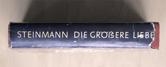
Languages which use letters based on the latin alphabet are set in two separate alphabets: uppercase and lowercase. We set text usually either in mixed-case or in uppercase/small cap letters. At any time we can switch between the two without touching the content of the text. This however, is not possible in Austria and Germany where the lowercase alphabet consists of 30 letters (Basic latin + ä, ö, ü, ß), but the uppercase alphabet has just 29 letters (Basic latin + Ä, Ö, Ü). Until the 1940s German was usually set in blackletter and such texts were never set in uppercase, because of the wide and decorated design of these uppercase letters. And since there is also not a single word that starts with an ß (Eszett), there was simply no need to have an uppercase version. The sharp „ß“ traditionally did not have a specific uppercase form. Typically, in uppercase writing, „SS“ was used instead. But this has turned around. Today, we hardly set German text or names in blackletter and the use of uppercase/small caps is still popular for various reasons. So there is an obvious gap in the German alphabet.

A design for a capital Eszett by the font foundry “Schelter & Giesecke” (1912)
The existence of this gap was acknowledged a long time ago. In 1903 a commission of German, Austrian and Swiss printers and font foundries announced that the letter ß should also be included in any non-blackletter typefaces. A capital version was also discussed but the commission could not agree on one design at this time. So it became common practice to replace the letter ß with SS or SZ in uppercase text. This however was never meant as a real solution to this problem. In 1919 the German Duden explained:
“The use of two letters for one phoneme is just an interims solution, that must be stopped, once a proper letter for the capital ß has been designed.”
The typographic society of that era yearned for a standardization of the capital „ß“, but the topic couldn’t reach a broader audience. Historically, there was no universally accepted uppercase form for the sharp „ß.“ Experiments in this direction were individual efforts by typographers who faced the challenge of translating the characteristic elements of the lowercase „ß“ into larger forms. This often involved the curved arch and round shape of the lowercase „ß.“ However, these experiments were not standardized and did not gain broad acceptance. Each typesetter tended to find their own creative solution, leading to a variety of experimental forms. Some attempted to retain the rounded character of the lowercase „ß,“ while others flattened the arch or made other adjustments.

Capital Eszett on a German orthography book from 1965

A novel using a Capital Eszett, printed in 1971
Creative Experiments by Renowned Typesetters in the 20th Century
Wilhelm Deffke, a renowned German graphic designer, created the „Deutsche Anzeigenschrift“ in the 1920s, a typeface that included an uppercase form for the sharp „ß.“ Deffke aimed to transfer the elegant line work of the lowercase „ß“ to uppercase letters. While his approach showcased creative innovation, this specific form did not gain widespread use. Deffke was known for his modern and experimental designs in the interwar period.
Rudolf Koch, an exceptional calligrapher and type designer, experimented with various forms of the sharp „ß“ in uppercase during the 1920s and 1930s. Koch’s designs demonstrated calligraphic approaches as he sought to translate the aesthetics of the lowercase „ß“ to uppercase. Despite his artistic efforts, his experiments did not achieve broad acceptance.
Paul Renner, the creator of the famous „Futura“ typeface, also attempted to develop an uppercase form for the „ß.“ In some variations of his typeface, elements of the sharp „ß“ were incorporated into uppercase letters. Renner, a pioneer in modern typographic design, was known for his efforts towards a clear and geometric typographic aesthetic.
Eduard Ege, a typesetter, ventured to establish an uppercase form for the „ß“ during the Weimar Republic. However, his efforts remained largely unnoticed and had minimal impact on the typographic practices of his time.
These designers were trailblazers in their quest for a coherent typographic language, attempting to transfer the nuances of the sharp „ß“ to uppercase letters. Although their experiments did not achieve the widespread acceptance they may have hoped for, they nonetheless contributed to the development and diversity of type design.
Links