In my last blog post, I showed you the new visuals and features. Today, I conducted user testing to find out how the visualizations are perceived. Even before completing the visualizations, I had concerns that using abstract visuals might not achieve my goal. However, due to time constraints, I had no other choice but to proceed with this approach.
My Assumptions Before User Testing
As mentioned before, while creating the visuals, I noticed that the topic of CO2 emissions is very complex. This is because the human eye cannot see the emissions and, therefore, cannot form a mental image of them. My current approach is to make these emissions more tangible using abstract visualizations, mainly particle systems. However, this abstract approach turned out to be incorrect. I realized that I had over-interpreted the visuals and expected too much from the users. I essentially lost sight of the users and went into the project with overly high expectations. The visuals I created cannot be interpreted correctly without prior knowledge and are therefore ineffective. The abstract representation is not the right way, and I need to return to the basics to create understandable visualizations.
User Testing
I asked a friend from my student dormitory to test the prototypes. The test subject is a 21-year-old male of German origin, studying psychology in his second semester. Before the testing, I introduced him to the topic and the prototype. Then, I asked him to input different values using the controller and interpret them for me. Here’s what came out of it:
Galaxy: The poor state of the galaxy was perceived as good because the representation was smaller than the neutral and positive states. The size played the main role, while the rotation force was in the background. However, the visualization was not meaningful.
Plasmasphere: Out of the three representations, the participant found the plasmasphere the most emotional. The different states were correctly perceived. The movements towards the camera looked threatening, making the participant think, „Oh no, what have I done?!“ The positive state was acceptable, but it would have been perceived as more peaceful without the red elements.
Flowers: Contextually, the flowers were the most appropriate, but the state changes were too extreme. If a solution could be found for this, this approach would probably be the best, even though the plasmasphere was more emotional.
Summary
In summary, the abstract approach to visualizing CO2 emissions was not effective. The user testing revealed that the visuals were often misinterpreted, highlighting the need for more straightforward and basic representations. This feedback is crucial for refining the visualizations to make them more accessible and understandable.
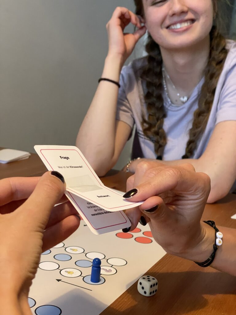
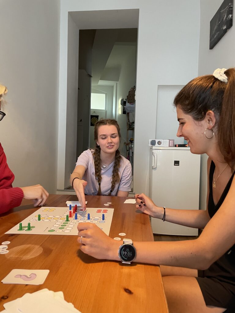
Recently, I also conducted the first user testing for my adaptation of the classic board game „Mensch ärgere dich nicht“, infused with sustainability elements. The aim was to assess the game mechanics and gather feedback on how well it integrated sustainability concepts. Here’s a rundown of what I discovered during the testing session with three adult players.
What Didn’t Work
Self Throw Dilemma: It wasn’t clear if they HAVE to move their piece for e.g. two spaces, if a card says so (cause it is meant to be a bonus for the player, not a penalty), if they would need to kick out their own player. Could they just accompany another player of their own or not execute the move at all? Or are they allowed to use another piece of their own to fulfill the moving?
Integration of Energy-Saving Fields: The energy-saving fields weren’t integrated enough into the game, leading to questions about their role and impact.
Incoherent Rewards: The distribution and significance of rewards based on the complexity of questions or actions on the „Good News“/“Bad News“ cards weren’t clear or consistent.
Broad Questions: Some sustainability concepts/questions were perceived as overly broad, with lots of potentially correct answers.
Observations
Rules Clarification: Many questions arose about the general rules of „Mensch ärgere dich nicht,“ especially when sustainability elements were introduced.
Answer Ambiguity: Uncertainty arose when a potentially correct answer conflicted with the actual answer on the card.
Penalty Questions: Players questioned what happens if they don’t have enough points but are required to give one away.
Positive Feedback
Overall Enjoyment: Carla expressed (more than once) liking the game, indicating initial appeal despite the need for refinements.
Clear Structure: Players appreciated the clear distinction between questions and actions that simply occur during gameplay.
Humorous Element: The rule requiring players without enough points to take an extra round added a humorous twist that kept the game engaging.
Enhanced Engagement: Max found the game more exciting than traditional „Mensch ärgere dich nicht,“ appreciating the sustainability angle.
Ideas for Improvement
Example „Auto-in-die-Schule“ Card: There was the idea to really ask players if they drove to school with the car instead of just deciding for them and giving them sustainability points.
Multiple Choice Answers: Introducing ABC answer choices for questions could enhance player engagement and clarity.
More Penalties: Considering adding more penalties, e.g. forcing a player to sit out the next round.
Excess Points Utilization: Allowing players to use excess environment points for strategic advantages could add depth to gameplay.
Refining Energy-Saving Fields: Either integrate energy-saving fields more meaningfully and often or reconsider their inclusion.
Mini-Games Addition: Incorporating mini-games like drawing a recycling icon could diversify gameplay and reinforce learning.
Separation of Elements: Separate questions and good/bad news events into specific event fields or other designated spots to better utilize both.
This initial test provided valuable insights into the existing game mechanics. While there are refinements to be made, the positive reception and constructive feedback indicate potential for this game to successfully blend fun with learning about sustainable practices. Because of that and also because I think in a board game I might have more possibilities for adaptions and introducing more elements, I will most probably develop this game further rather that the card game GOPS.
A case study with disabled musicians. Teodoro Dannemann.
I will use this blog post to write about an article published at the NIME conferences. In 2023, Teodoro Dannemann from Centre for Digital Music on Queen Mary University of London did a case study with disabled musicians. As a part of the course Interaction Design 1, I will discuss my thoughts about his article.
I chose Dannemanns article because it has a certain relevance to my design and research topic. The aim of the study is to explore the possibility to design new or modified instruments, focusing on a character of disability. The researchers went through three stages to fulfill the needs of musicians with different disabilities:
A semi-structured music jam session and subsequent analysis
Undergraduate students, researchers and lecturers assisted to arrange jam sessions for four children from the Teletón rehabilitation center (hereafter referred to as the performers). The performers got the opportunity to choose which instrument to play, and worked in teams together with coordinators. Some of the coordinators worked as tempo leaders, and some as normal musicians. The performers actions were observed and recorded.
In the beginning of the session, each group created a musical score based on a template (see picture below). The performers were welcome to freely create their own unique notation language. The group started the jam based on their home-made score. After a while, the tempo leaders initiated improvisation for ten minutes.
In the end of each round, the facilitator talked to the group to learn what they liked about the jam, what problems they faced, and their overall interaction experience. Then, teams were told to make a slightly more complicated score and start jamming again. This process was repeated three times.
Obtain individual performers profiles from the data collected
Each group of coordinators discussed the obtained data. Based on the results, they created profiles for each performer comprising the four dimensions: (1) movements and embodiment, (2) musical preferences, (3) difficulties, and (4) capabilities. This helped them organize the collected data and get an overview of the needs of each performer.
Prototype music instruments
A team of designers got the task to elaborate a proposal of one or two instruments for each performer. They based the prototypes on the data gathered in each individual performer profile. The instruments needed to take into account not just the specific needs of each performer and their musical and performance styles, but they also had to be feasible in terms of time (around two months for construction) and budget constraints. Each team got feedback from coordinators and tutors, and iterated the prototypes up to the final delivery event. Each performer was handed their corresponding instrument and got one hour to explore its possibilities. In the end, all participants of the project gathered for a final jam session with additional instruments.
In the end of the written article, final results are being discussed. They describe two cases of designed instruments, corresponding to two very different performers. The first of the two performers ended up getting a digital cello that could be played with one arm, and a 3D-printed prosthetic forearm. The performer showed a special interest for the prosthesis. However, it was found that the forearm socket needed more fine tuning for them to be able to exert more pressure against the cello. The other performer received a one-handed flute. Even though the performer was really excited about the idea, they were most interested in using the flute to make all sorts of unusual sounds and effects. So, the team ended up making a special „magic flute“. This flute was set up for the performer to easily change how it sounds using a computer, so they could try out different sounds. The design team also put together a simple guide to help the performer get started with fun activities. This would help them focus better on specific tasks and get into a rhythm.
My thoughts
I find the study meaningful and inspiring. It pertains to such an important topic, and the results are effective. I think the article communicated the research and outcomes in an organized manner. Each step in the study is described thoroughly, and the author evaluate how the steps could have been possibly done different. Dannemann is aware of weaknesses in the study, but I also noted down some concerns.
Firstly, I think the performers should have been involved more in the prototyping phase. This is mentioned by the author in the paragraph: FINAL REMARKS: A CRITICAL REFLECTION. Based on the feedback the performers gave in the delivery event, it becomes clear that there should have been conducted user tests in an earlier stage. Especially concerning the prosthetic forearm that needed more fine tuning. If they tested the prototype iteratively on the real end-user, the prothesis could have worked properly against the cello. Each person with disabilities is different, so it is crucial to involve the designated end-user in an early stage.
I am also curious about the instrument’s limitations. Does a one arm flute offer the same possibilities as a normal flute? It is designed for such a small user group, and I imagine how difficult it is to create it without any other limitations. It would be interesting to read more about every instrument they made and how they differ from the standards.