IMPULSE #1: Mari-Ell Mets on Accessibility

In the beginning of our third semester, we as Interaction Design students once again had the privilege to attend the main conference of the World Usability Congress 2024, held on October 16th and 17th at the Stadthalle Graz. This event provided us with an excellent opportunity to deepen our understanding of usability and accessibility, as well as to draw inspiration from industry experts. The two days were packed with enlightening keynotes and interactive workshops, covering a wide range of topics central to the field of user experience design.

For my part, I primarily chose to attend sessions focused on accessibility, a subject that has always held particular significance to me. Among the various presentations, one talk stood out the most: „Websites and Apps for Everybody“ by Mari-Ell Mets, the Head of Accessibility at Trinidad Wiseman. Mets’ speech left a profound impression on me due to its relevance, practical insights, and passionate advocacy for inclusion in digital design.

Key insights from Mari-Ell Mets‘ talk

Mets began her presentation by emphasizing that accessibility is a cornerstone of high-quality web design. She supported her point with a striking statistic: every fourth European is classified as a person with special needs. This highlights the sheer scale of users who face disadvantages when websites and apps fail to meet accessibility standards. Mets further outlined key European regulations governing digital accessibility, including:

  • EU Directive 2016/2102 on the accessibility of websites and mobile applications of public sector bodies,
  • EU Directive 2019/882 on accessibility requirements for products and services, and
  • EN 301 549, the European standard on accessibility requirements for ICT products and services.

These legal frameworks underline the necessity for designers and developers to prioritize accessibility. However, it was Mets’ practical advice that truly resonated with me. She shared 10 accessibility rules that, when applied, can resolve 80% of common usability issues in websites and apps. The simplicity and effectiveness of these rules made them particularly impactful.

Applying accessibility principles to my prototype

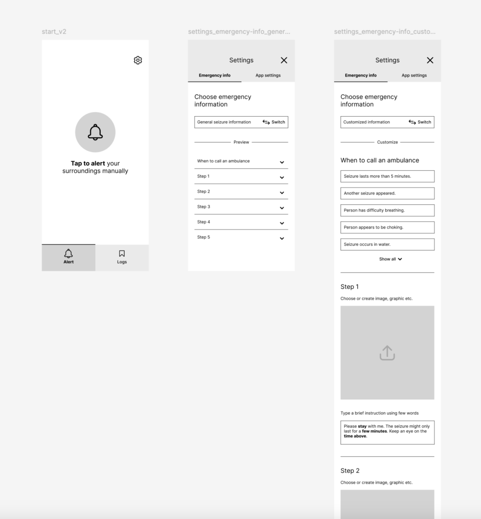
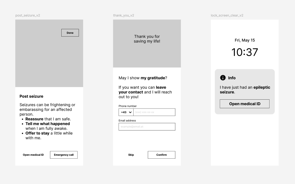
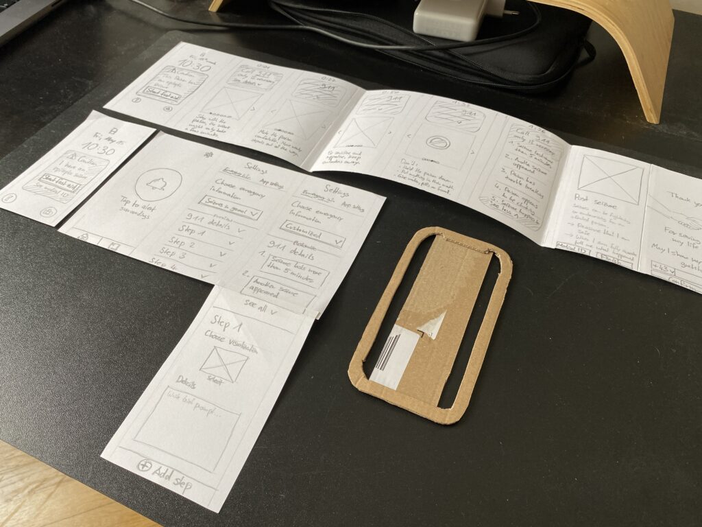
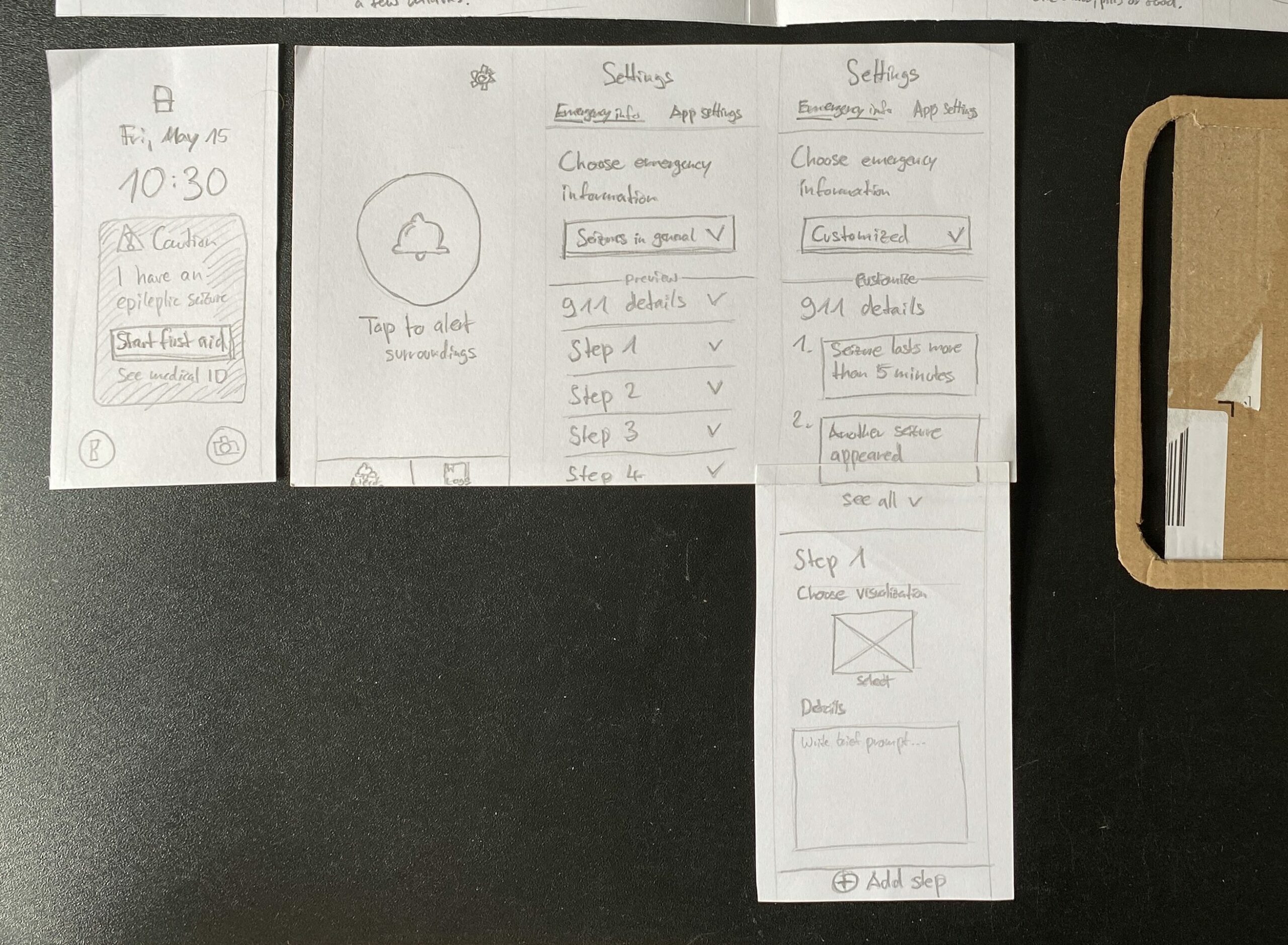
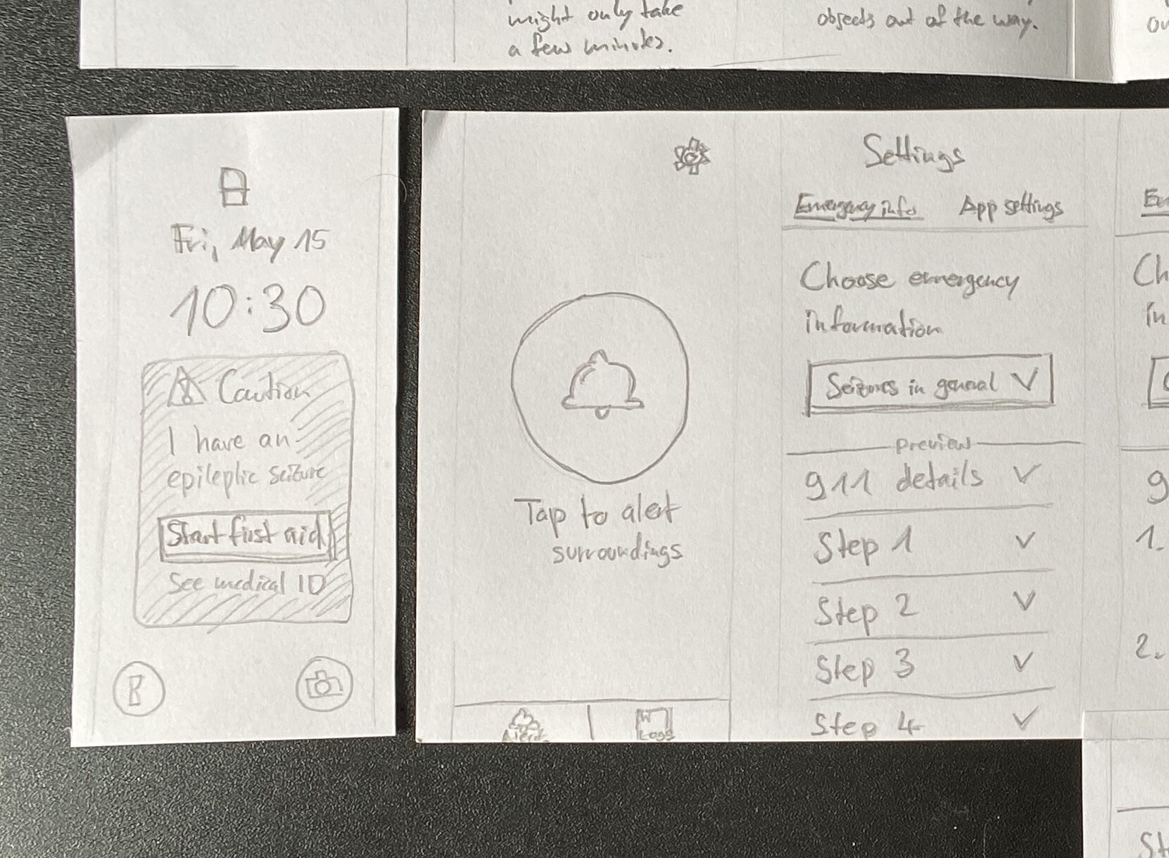
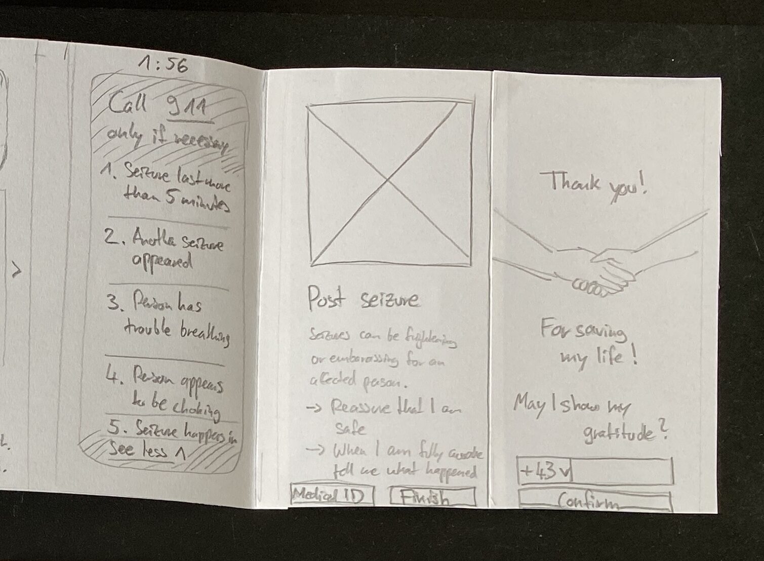
Mets‘ accessibility guidelines felt directly applicable to my ongoing project, which I developed as part of the Design & Research module at FH JOANNEUM. Over the last two semesters, I have been working on a mobile app concept aimed at assisting untrained first aiders in public spaces. The app provides step-by-step instructions on how to secure and help a person experiencing an epileptic seizure. Given that first aiders can be anyone in a public area, my app must cater to a diverse user base, including those with special needs. Mets‘ principles offered a concrete framework to refine my design.

No moving content

One of Mets‘ rules highlights the importance of avoiding autoplaying content, such as sounds, animations, or videos. If moving content is used, it should serve a clear purpose, and users must be able to pause it.

For my app, this means ensuring that emergency steps and instructions are presented clearly and with minimal motion. Movement can serve as a helpful explanatory tool, such as an animation showing the recovery position, but it should not overwhelm users or cause distractions. To address this, I plan to: Justify the use of movement in each case to ensure it enhances comprehension. Keep animations subtle and purposeful to reduce cognitive load, especially for sensitive users. Include an easily accessible pause button for any moving content.

Contrasted color

Color contrast plays a pivotal role in ensuring text readability and emphasizing interactive elements. Mets warned against placing text on images, as this can reduce contrast and make text difficult to read. She recommended using contrast-checking tools to ensure compliance with accessibility standards.

As my prototype progresses to a high-fidelity design, I will focus on selecting appropriate color schemes that enhance usability. Given the app’s life-saving nature, its design must remain minimalistic and user-friendly. High-contrast color combinations will ensure that all users, including those with visual impairments, can easily read text and identify critical elements like buttons and icons.

Clear error messages

Error messages are another critical aspect of accessibility. Mets stressed that they should be specific, clearly indicating what went wrong and offering solutions. For example, errors should have precise labels, point to the problematic area, and be compatible with screen readers.

In my app, this principle will guide the design of features like the medical ID form and emergency call options. If an error occurs—such as a failure to submit an emergency form—the user should receive an immediate and clear explanation with steps to resolve the issue. Additionally, I plan to implement screen-reader compatibility for error notifications, ensuring that users with disabilities are adequately informed.

Broader implications for design

Mets’ talk served as a timely reminder that accessibility is not a niche concern but a universal requirement. It goes beyond catering to individuals with disabilities and improves the overall user experience for everyone. Features like clear navigation, sufficient contrast, and error notifications benefit all users, regardless of their abilities.

Reflecting on her presentation, I was reminded that accessibility isn’t just about meeting regulations—it’s about embracing an inclusive mindset. By ensuring that websites and apps are accessible, designers actively contribute to breaking down barriers and creating a more equitable digital landscape.

Conclusion

Attending the World Usability Congress 2024 was an inspiring and educational experience, particularly Mari-Ell Mets’ session on accessibility. Her practical advice directly applies to my work, offering valuable insights to improve my app prototype. By implementing Mets’ accessibility rules, I can ensure that my app is not only functional but also inclusive and user-centered.

In a world where digital experiences are increasingly integral to our daily lives, designing for accessibility is no longer optional—it is essential. Mets’ presentation reaffirmed my commitment to creating designs that are not only innovative but also meaningful and inclusive. This learning experience will undoubtedly have a lasting impact on my approach to design.

Resources

World Usability Congress. „Agenda 2024.“ Accessed November 5, 2024. https://worldusabilitycongress.com/agenda-2024/?agenda=83CALT.

European Union. Directive (EU) 2016/2102 of the European Parliament and of the Council of 26 October 2016 on the Accessibility of the Websites and Mobile Applications of Public Sector Bodies. Accessed November 5, 2024. https://eur-lex.europa.eu/eli/dir/2016/2102/oj.

European Union. Directive (EU) 2019/882 of the European Parliament and of the Council of 17 April 2019 on the Accessibility Requirements for Products and Services. Accessed November 5, 2024. https://eur-lex.europa.eu/eli/dir/2019/882/oj.

#20 | Demonstration video & reflections

At the end of this semester I would like to give a short demonstration of how my prototype works. Therefore I created a short video that shows the functionality of the prototype.

Reflections

All in all, I enjoyed the process of Design & Research this semester. This time the work was more hands-on, consolidating my research from the first semester into a rough prototype. I was able to overcome my initial doubts as to how I could make a valuable contribution to my chosen topic, as there are already existing solutions. The potential I saw in my idea was confirmed by the feedback interview I conducted with the Institut für Epilepsie in Graz.

As one can see, this prototype is at a very early stage. It needs to be refined based on future feedback, in it’s interaction logic and real content, as well as in the sound and visual design to address emotional perception as well. This prototype could be an test object in evaluation practices such as expert reviews, interviews and tests to further develop this concept.

Resources

Freesound.org. Downtown Vancouver BC Canada by theblockofsound235. Retrieved June 26, 2024, from https://freesound.org/people/theblockofsound235/sounds/350951/

Freesound.org. VIZZINI_Romain_2018_2019_Emergency alarm by univ_lyon3. Retrieved June 26, 2024, from https://freesound.org/people/univ_lyon3/sounds/443074/

Freesound.org. Busy cafeteria environment in university – Ambient by lastraindrop. Retrieved June 26, 2024, from https://freesound.org/people/lastraindrop/sounds/717748/

#19 | Thoughts on auditory cues

So far, I’ve spent most of my time on the structure of the app, which dictates what the sound needs to support, but I haven’t worked on the auditory cues yet. These cues should support first responders when they are unable to look at the phone while following instructions. As this semester is coming to an end, this will not make it into my final prototype, instead I have started a free association to extend the visual cues with auditory cues.

What is needed?

My first thoughts were three requirements: An alert-like sound to draw attention to the device, a voice that gives instructions as shown in the emergency steps, and loop functionality.

One requirement for the alarm tone is that it must be audible to everyone, everywhere, as much as possible. Some emergency situations may involve difficult sound environments, so the frequency and volume of the sound should be chosen appropriately.

The second requirement is a voice that gives instructions and supports the visual information on an auditory level. The first idea for customized emergency information about one’s specific condition was to have the voice recorded by the person with epilepsy itself. But this would increase the interaction costs, because users would have to double the information input: textual and verbal. Even if the concept would be extended to support more than one language, the effort would increase and become less feasible for people due to lack of language skills. Second, it is uncertain whether the recording quality and the way each user speaks are sufficient to be clearly understood.

For this reason, a generated voice based on text input would be more appropriate for such a concept. AI-based speech engines have gotten better over time and are able to convert text to speech with very little processing time. The technology is there and the results sound more natural and authentic than ever before. In the case of user-created emergency steps, the speech must be generated in the background after the text is entered, so that it can be played back without delay in the moment the emergency steps are opened.

The loop functionality requires infinite repetitions so that the sound does not have to be restarted manually, but it should also allow muting when not necessary or too intrusive.

Audio timeline

I also thought about when the sound should be used.

After an alarm is triggered automatically by sensors or manually by the affected person and the timer is running, the alarm sounds. This continues until a first responder initiates the emergency steps by pressing „Start first aid“.

Next, a voice reproduces what is displayed on the screen in a well-pronounced and clear way. This is played in a loop until a user swipes to see the next emergency step. In this way, each piece of information is extended aurally until the emergency steps are completed by the user.

The information on the following screens does not require further auditory cues.

#18 | Prototyping tailored emergency information

Now for the most important feature: Allowing people with epilepsy to tailor emergency information to their own form of the disease could actually make a difference, since epilepsy can manifest itself in many ways. I iterated on this for the digital prototype.

Start an alert manually

As I found out in my interview with the Epilepsy Institute in Graz, the use of sensors to detect an incoming seizure should be more precise and reliable. Also, many people do not feel the so-called aura before a seizure. For this reason, a warning to bystanders should be triggered automatically. But providing a manual way to start the alarm could make additional detection devices unnecessary for some people with epilepsy. So I rewrote the label on the app’s start screen to add the „manually“ hint.

Providing general and customized emergency information

In order to differentiate between the default pre-made content for general seizure care and the ability to display customized emergency information, I changed the selection component. I replaced the dropdown, mainly for multiple options, with a single switch between default and custom states to simplify the interaction.

The default „General seizure information“ cannot be customized, but is displayed if selected. Once a user selects „Custom Information“, each emergency step can be changed visually and textually in the input fields. At this point, the default information serves as a starting point so the user doesn’t have to start writing from scratch and can keep some information. In addition, users can optionally upload graphics or capture photos to visually support the points they are making.

Amount of emergency information

While designing the emergency information settings, I asked myself how much information should be displayed in the settings and what’s the maximum amount of information that people with epilepsy should create.

Because of the tricky circumstances in emergency situations that require short instructions, I decided to limit the number of steps to five and the ambulance information to no more than the default nine. The content of five steps is more likely to be remembered, but uncertain under these circumstances. Also it is easier to navigate between less steps. It is always possible and preferable to choose less information.

Aspects to be discussed and next steps

For the sake of customization, many unanswered questions came up during the prototyping process.

  • Custom emergency information: How do we bold text or add bullets? Do we need these aspects here?
  • User profile: Where do we customize information about the person with epilepsy, such as their name, picture, and how they want to address first responders before the emergency steps are displayed?
  • Organization of custom emergency steps: How do we delete or rearrange emergency steps? How do we reset custom emergency steps to the default content?
  • Thank you screen: Should the thank you screen be customizable and where can it be edited?

Answering these questions may be necessary in the future, but in order to validate this app concept, to see if potential users will even understand it and get value out of it, I will leave it at that for now.

#17 | Prototyping gratitude advancement

In order to improve the interaction and overall experience between the person with epilepsy and their first responder, I introduced a new idea in the paper prototype: Once the emergency steps are complete, first responders can optionally leave their contact information in case the person is unconscious or is taken by ambulance. Using the contact information, the person with epilepsy can contact them afterwards to show their gratitude. I iterated on this for the digital prototype.

Types of contact

The first thing I considered for this feature was how to get back to your first responder and what type of contact would be best for that purpose. As it is likely that both people will be strangers, the contact method should be as low-threshold as possible when it comes to personal data. Either leaving a phone number or an email address would meet these requirements from my point of view. Since the input is not mandatory, I gave the possibility to skip this step with a button.

Thoughts on individualization

During this iteration, a thought emerged. Reaching out personally could be one option, but leaving a personal message such as a video or voice recording could be another. The first option would require less effort in terms of how people with epilepsy have to set up their app, but the latter option could provide more direct feedback. However, a recording of any kind would need to be more generalized, as the circumstances of incidents can vary. For this reason, I decided to go with the first option, which seemed simpler.

End of usage

The last consideration was how to end the use of the app for a first responder after they have started the process, followed the emergency steps, completed the process, and optionally left contact information. Now that the first responder’s task is complete, their access to the smartphone should be minimized. This could be done by returning to the lock screen. If the person with epilepsy needs to rest for a while, or if medical professionals take over after the incident, it is still useful to provide access to the medical ID and make it visible on the lock screen.

Next steps

So far, I have focused mainly on the practical use of this prototype. But for a holistic user experience, the emotional aspect needs to be added in any case. This could be done by getting more graphical and defining the overall visual design.

#16 | Prototyping emergency steps

I iterated on my paper prototype by working on the emergency steps and putting more thought into it. For advanced interactivity, I decided to use Figma as a digital prototyping tool.

Added Done button

First, my paper prototype did not yet include an interaction to end an alert after a person with epilepsy has had a seizure. Considering all the possible interactions that need to be displayed on these screens, I decided to place a button next to the elapsed time and named it „Done“. Since this interaction is related to the whole screen and the elapsed time, this seemed to be the right area.

This position could also prevent people from unintentionally ending the emergency information. It is still questionable whether this button is needed on every single screen throughout the steps, but I think it makes sense.

However, the main interactions of displaying the medical ID or making an emergency call can remain in the bottom area this way.

Added confirmation to end emergency steps

To prevent unintentional exits, I also added a confirmation dialog to make sure people know when and if they really want to end the emergency steps.

Thoughts about displaying a person’s name

At the same time, I was thinking about where to display the name of the person with epilepsy. By giving first responders the ability to refer to a person with epilepsy by their name, I assume they will have a more personal address. Since the emergency step screens already have a lot of elements on them, I decided to display the name once at the beginning before going into the emergency steps.

Added overlay for „When to call an ambulance“

I also added a collapsible element to the prototype that contains information about when it is actually necessary for first responders to call an ambulance. This can be opened at any time during the emergency steps. This should prevent the user from making premature emergency calls that are not necessary in every situation. I tried to keep the information short and easy to scan.

Next steps

At this stage of the prototype, two supporting aspects of the emergency steps are still missing: Visual support through graphical material for each step, and auditory cues to make the whole process more noticeable and usable when not looking at the phone. These features will need to be added in further development.

#15 | Feedback interview paper prototype

In order to validate my first prototype idea, our lecturer Birgit Bachler encouraged me to get in touch with a nearby interest group in Graz: Institut für Epilepsie IFE.

In the course of a 45-minute meeting, I was able to demonstrate my paper prototype on site and ask questions about my research results and the experience of my contacts. Regina and her colleague were very interested in my project.

Starting an alert to bystanders

Speaking from experience, Regina and her colleague told me that working with sensors to detect an aura before a seizure is much more feasible for a person who is going to have a seizure. Many people do not recognize the onset of a seizure, and when they do, it takes too long to manually activate an alert in the open app. Examples of such inputs are Fall Detection and Brainwave Detection.

Visibility of wearable devices

Some of the studies I found suggested making electronic devices less visible. Contrary to what I found in my literature review, Regina and her colleague never met people who were reluctant to wear conspicuous devices for fear of stigmatization. Instead, they are happy to have them.

Advancement: Expressing gratitude to bystanders

Regina and her colleague responded positively to my planned feature that would allow people to reach out to their supporters by leaving contact information. They had never seen such a personal approach in any device and thought it was a nice idea for human relations.

Advancement: Tailored emergency information

Throughout the conversation, we talked about different types of epileptic seizures, especially those that are not really addressed by technological solutions. They explained that tonic-clonic seizures are most associated with spasmodic movements, but seizures that are expressed through confusional states are often overlooked. When I explained my idea for an individualized feature, Regina and her colleague were excited about the idea: Allowing people with epilepsy to view emergency information tailored to their own form of epilepsy could potentially provide more targeted first aid.

Choice of medium

When I asked my contacts about an appropriate medium for my endeavor, they confirmed that a mobile application is indeed appropriate from their point of view. It doesn’t require anything more than a smartphone, which many people already have. Also, most of the people they treat are used to the existing technological solutions, which in most cases include a smartphone. In fact, they gave me a printed version of a seizure care pass where people can write individual instructions for their own condition. The downside is that this document can easily be overlooked by first responders and the content is less appealing to read.

Log feature

When Regina and her colleague mentioned that some users would appreciate having a log where they could see past incidents, I showed them the feature in my paper prototype.

Conclusion

In the end, I was provided with a lot of informational material, a warm handshake, and the possibility to always reach back to Regina and her colleague. Overall, this step was really valuable to me and it did not take much effort to get quick and useful feedback, even when using a low-fidelity paper prototype to demonstrate ideas.

Next steps

Next, I would like to incorporate the feedback I received from the Institut für Epilepsie into the development of my prototype and possibly contact them if I need more expert opinions.

#14 | Paper prototyping Ad-Hoc First Aid Care

With regards to the example of Aura: Seizure First Aid mentioned in the last blog post, I iterated on a paper prototype regarding „Ad Hoc First Aid Collaboration with the Public“. This prototype had its origin in an exercise at the very beginning of the course Design & Research 2.

Underlaying concept idea

The present prototype represents a mobile app, which has to be manually activated by persons with epilepsy in case of emergency, if they notice an upcoming aura. Surrounding bystanders are then addressed by visual and auditory cues to pay attention to the smartphone.

Having a look on the smartphone, bystanders are shown what’s the matter with the person and how to help. This follows a general set of emergency information which is applicable to nearly every type of epileptic seizure. Also bystanders receive information about when it is necessary to call an ambulance.

Advancement: Tailored emergency information

One of the biggest advancements might be the possibility to individually customize emergency information to an affected person’s specific condition. For this I added customizability to the app’s settings. Besides the general emergency information, which is set as a default, users are able specify the shown information steps to their own needs. A visual representation (picture, pre-made illustration etc.) and a short textual instruction in a few sentences can be chosen, and further steps can be added.

Advancement: Findability of medical ID

Another addition is a lock screen widget, once an alert has been activated by the person with epilepsy. In case of a locked phone, this piece helps to give an understanding and access to the first aid instructions as well as the medical ID. The latter is a often hidden feature on mobile operating systems, which gets more visible with the widget once an alert has been started.

Advancement: Expressing gratitude to bystanders

Lastly another advancement could be an extended way to end the app experience, when a seizure has been overcome: Besides communicating appreciation and recognition for the provided help, bystanders can optionally leave their contact details (e.g. a mobile number) for the affected person. Afterwards the rescued person is able to get in touch with its helper.

Auditory cues

As recommended by experts mentioned in the previous blog post the auditory level should play an important role as well, when it comes to the smartphone’s findability and support to follow first aid instructions. Obviously a paper prototype can not provide sound due to its material. This is where a, at least partly, digital component have to come in.

Next steps

Iterating and extending the paper prototype was quiet easy and quick. However its detail has to undergo refinements and the eventualities for various circumstances have to be considered. At this point it makes sense to transfer this haptic paper prototype into a digital prototype, to be able to add interactivity and sound.

#13 | Evaluation of existing solutions

As stated in blog post #11, the previous thoughts on my research journey were accompanied by doubts about the relevance and ability to make a serious contribution to the current state of research. To overcome these doubts, I allowed myself to dig deeper into the application areas mentioned that I could possibly focus on:

  1. Ad Hoc First Aid Care Collaboration with the Public
  2. Semi-Ad Hoc Care Collaboration During Transportation
  3. Prior Education for Secondary Caregivers at Workplace/School

The „Ad Hoc First Aid Care Collaboration with the Public“ approach still interests me the most and is the area that is most in demand according to the experts1. This is why I started here.

Ad Hoc First Aid Care

In my research last semester, I realized that there are very few solutions when it comes to mobile applications and wearable technology. Some seem to be poorly designed, others are still in the concept stage, or seem to be no longer in operation. I looked at the following solutions in particular:

  • Seizure First Aide by the Epilepsy Foundation Minnesota2
  • Dialog by the artefact group3
  • Aura: Seizure First Aid by PT. Supremasi Astadaya Sentosa4
  • Medistat Seizure SOS by Saksham Innovations Private Limited5

For the evaluation, I made a comparison of how these solutions matched the results of my previous research. Early on, I realized that the only serious candidate I could consider, according to my findings and the experts‘ recommendations, was Aura: Seizure First Aid. By coincidence, the designers had the same idea for the app as I did and were inspired by the same content provided by the Epilepsy Foundation.6

Evaluation of Aura: Seizure First Aid

Aura: Seizure First Aid’s core features include the following:

©️ PT. Supremasi Astadaya Sentosa

This application addresses the following findings and recommendations as follows:

Conclusion

All in all, Aura: Seizure First Aid already meets the majority of my findings. The app is reduced to providing a general step-by-step approach to securing a person with epilepsy with a great user experience. The affected person has to start an alarm by simply tapping on the app. Their smartphone will then alert nearby bystanders to help and make a decision if an ambulance is needed. As soon as the seizure is over, the process ends with thanking the first responders for their help.

Because epilepsy comes in many different forms, it is highly individualized for each person. Participants in the study expressed a desire to provide bystanders with individually relevant information. Therefore, a mobile app could also allow users to customize the information displayed.

In addition, the general public rarely knows where to look for medical information about a person experiencing a seizure. Therefore, making the information more visible and accessible could be another addition. This could start on the lock screen of the phone.

Stories from people with epilepsy reveal a desire to thank bystanders after they have helped. Sometimes this is not possible because the person has not regained consciousness yet. Providing an extended way to contact helpers after a seizure could be another meaningful contribution.

Next steps

Taking into account my findings, the given app can be extended to meet the needs of a similar target group that values customizability when it comes to shared emergency information. This could be an approach where I can start working on a paper prototype.

Resources

  1. Aehong Min, Wendy Miller, Luis M. Rocha, Katy Börner, Rion Brattig Correia, and Patrick C. Shih. 2021. Just In Time: Challenges and Opportunities of First Aid Care Information Sharing for Supporting Epileptic Seizure Response. Proc. ACM Hum.-Comput. Interact. 5, CSCW1, Article 113 (April 2021), 24 pages. https: //doi.org/10.1145/3449187 ↩︎
  2. Seizure First Aide. Apple App Store. Epilepsy Foundation Minnesota. Retrieved May 20, 2024, from https://apps.apple.com/us/app/seizure-first-aide/id1018276687 ↩︎
  3. Dialog. Artefactgroup. Retrieved May 20, 2024, from https://www.artefactgroup.com/case-studies/dialog/ ↩︎
  4. Aura: Seizure First Aid. Apple App Store. PT. Supremasi Astadaya Sentosa. Retrieved May 20, 2024, from https://apps.apple.com/us/app/aura-seizure-first-aid/id1564615234
    ↩︎
  5. Medistat Seizure SOS. Apple App Store. Saksham Innovations Private Limited. Retrieved May 20, 2024, from https://apps.apple.com/ro/app/medistat-seizure-sos/id1630889725 ↩︎
  6. Seizure Recognition and First Aid Certification. Epilepsy Foundation. Retrieved May 20, 2024, from https://www.epilepsy.com/recognition/seizure-first-aid ↩︎

#11 | Procedure in the Second Phase

In the first semester I was able to get an insight into how epilepsy first aid could be supported by technology. To take things further, I would like to start with a brief reflection on how the findings and recommendations of this research can be further processed for a real-world prototype and what the next steps might be.

Thoughts on research journey

After taking some time to reflect, I began to doubt how my previous research could lead to a meaningful contribution, since this topic is very focused on a specific use case (emergency) for a specific disease pattern (epilepsy), and there seem to be some promising solutions already out there.

To come to a conclusion, I see three options on how to proceed:

  • Option 1: Continue with my topic and start prototyping ideas. This would mean no more research than usual.
  • Option 2: Stay close to my previous research, but eventually choose a different use case or project approach. If necessary, look for similar areas where my research knowledge can be applied. In case of a change of direction, this could mean additional research.
  • Option 3: Completely change the topic. This would mean the highest amount of (new) research needed and could possibly lead to time constraints.

Weighing the options, a path between options 1 and 2 seems to make the most sense: The first step would be to recall my research findings (pain points, recommendations, etc.).

Next, I should try to evaluate how existing solutions align with what I have learned about the pain points of the target audience and the recommendations of the experts (option 1) to see if there is room for improvement or if a custom concept is even needed.

At the same time, I should be open to following other project ideas if the room for a serious contribution is too small or non-existent (option 2).

Given that this research phase is focused on prototyping, it is of course important to gain more insight into users and stakeholders.

Project approaches to follow

During my previous research, I found expert advice on areas of possible projects1. These include:

  1. Ad Hoc First Aid Care Collaboration with the Public
  2. Semi-Ad Hoc Care Collaboration During Transportation
    • Finding a Person in Charge & Care Information Sharing When Utilizing Public Transportation
    • Seizure Monitoring & Information Sharing While Driving
  3. Prior Education for Secondary Caregivers at Workplace/School
    • Information & Responsibility Diffusion
    • Facilitating Education & Stigma Reduction Strategies

Where to start

After a second look at what I’ve found out, I want to start evaluating existing solutions for „Ad Hoc First Aid Collaboration with the Public“, which according to the experts is the area that is most in demand. At the same time, it has my greatest interest.

Resources

  1. Aehong Min, Wendy Miller, Luis M. Rocha, Katy Börner, Rion Brattig Correia, and Patrick C. Shih. 2021. Just In Time: Challenges and Opportunities of First Aid Care Information Sharing for Supporting Epileptic Seizure Response. Proc. ACM Hum.-Comput. Interact. 5, CSCW1, Article 113 (April 2021), 24 pages. https: //doi.org/10.1145/3449187 ↩︎