//19 Qualitative Interview about “Merging Digital and Analogue” tools

I continue my research on the topic of Merging Digital and Analogue with a qualitative interview. In this interview I asked questions about the use of digital and analogue tools to understand if there is an interest from users to merge these two further.

Transcript

Introduction

Hello, I am Laura Galvanetto, a communication design student studying at FH Joanneum.
Today I will interview you on the topic of “Merging Digital and Paper”. This interview is part of my research for my Master Thesis. I will write down your answer, and I could include the interview in my Master Thesis.

Questions, answers, insights

Do you enjoy more using analogue or digital tools?

I use in university mostly digital tools, so when I can I choose she prefers analogue tools.

Observations: friendly and open face expression

Do you enjoy using a mix of the two for helping you in a task? For example, learning something, design something ecc.

Yes, I do. For instance, I use digital tools like youtube and search engines to research, but I enjoy using paper for writing down my findings, as I find analogue note-taking to be faster.

Observations: small pause at the beginning

Do you enjoy using  QR Codes?

Sometimes I do, it depends if they work well. Sometimes it is frustrating when they do not work right away.

Observations: Detailed answer and while she speaks about her frustration also face expression indicates it

Do you know what NFC (Near-field communication) is?

No, I do not know.

Observations: Iooks confused

Would you like digital tools to integrate better in books?

Yes, that would be great for learning. Especially it would be interesting to me to learn languages.

Observations: thinks a bit before talking

Do you have good examples of integration of digital and analogue?
I like to have a calendar in both a digital and analogue format, this mix help me remember what I have to do and in this way I have always my calendar readily accessible.

Observations: Smile, starts talking about her personal experience detailed

Closing

Thank you for your answers and your time. I find your contribution valuable to the advancement of my research.

20/ Plans for the next steps:

Currently, the project lacks a sufficient level of artistic expression. To elevate its artistic quality, it’s essential to delve deeper into experimental and innovative approaches. This aligns with the belief that photography is an art form deserving of respect and thoughtful treatment.

Exploring Artistic and Experimental Approaches:

  1. Study Artistic Movements and Techniques:
    • Research various artistic movements in photography, such as surrealism, abstract photography, and avant-garde techniques. Understanding how these movements pushed boundaries can inspire new ways to approach my work.
  2. Focus on Conceptual Photography:
    • Developing projects that convey strong concepts or narratives. Conceptual photography often requires thinking beyond the literal image to evoke deeper meanings and emotions.
  3. Engage with Contemporary Art Trends:
    • Keeping abreast of current trends in the art world. This could involve following contemporary artists, attending exhibitions, and participating in workshops to gather fresh perspectives and ideas.

The Balance Between Enhancement and Destruction:

It’s important to achieve a delicate balance between enhancing a photograph and overdoing it to the point of destruction. This can be achieved through careful consideration and research.

  1. Understand the Intent:
    • Each enhancement should have a clear purpose that aligns with the overall vision of the project. Random or excessive alterations can detract from the original essence of the photo.
  2. Historical Context:
    • Research the history of photography to understand the evolution of photographic techniques and the philosophical underpinnings of different eras. This can provide insight into how to appropriately apply enhancements.
  3. Technical Mastery:
    • Master the technical aspects of both traditional and modern photographic techniques. This knowledge allows for precise and intentional modifications rather than haphazard changes.
  4. Feedback and Reflection:
    • Regularly seek feedback from peers, mentors, and audiences. Reflecting on this feedback can help identify when enhancements are successful and when they might be veering towards destruction.

Researching the History of Photography:

  1. Chronological Study:
    • Starting with early photographic techniques like daguerreotypes and calotypes, then moving through to modern digital photography.
  2. Technological Advances:
    • Examining how technological advances have shaped photography. This includes the transition from film to digital, the advent of color photography.
  3. Cultural and Social Impact:
    • Investigating how photography has influenced and been influenced by cultural and social changes.

I will have a strong focus on this sentence:

“When the finished product is something other than a computer screen it harkens back to the day when photography was a craft. It’s not just about the image, although the image is the king, it’s about the object itself and that you made that object” – Mark Osterman, Process Historian

19/ Making 3D relief with printed photography

Creating 3D reliefs with printed photography is a project that can be done at home with relatively simple materials. This process involves transforming flat images into three-dimensional artworks by layering different elements of the photo to give a sense of depth and dimension. Here’s how I approached this project using two images with strong subjects: a person and a pair of dogs. I created three distinct layers for each image to enhance the visual effect and make the final piece interactive.

1) Woman Photo

First Layer: The Original Photograph The foundation of the 3D relief is the original photograph of a woman. This layer serves as the backdrop for the entire piece, providing the base image from which other elements will be lifted to create depth.

Second Layer: Silhouette of the Woman The second layer involves cutting out the silhouette of the woman from a duplicate of the original photograph. By raising this silhouette slightly above the base layer, I created the first level of depth.

Third Layer: The Woman’s Glasses To add even more detail and a sense of realism, the third layer focuses on a smaller, specific element of the woman: her glasses. By isolating and elevating the glasses, we create a focal point that draws the viewer’s eye.

2) Dogs Photo

First Layer: The Original Photograph Similar to the first project, the original photograph of the two dogs forms the base layer. This image provides the overall context and scenery for the artwork.

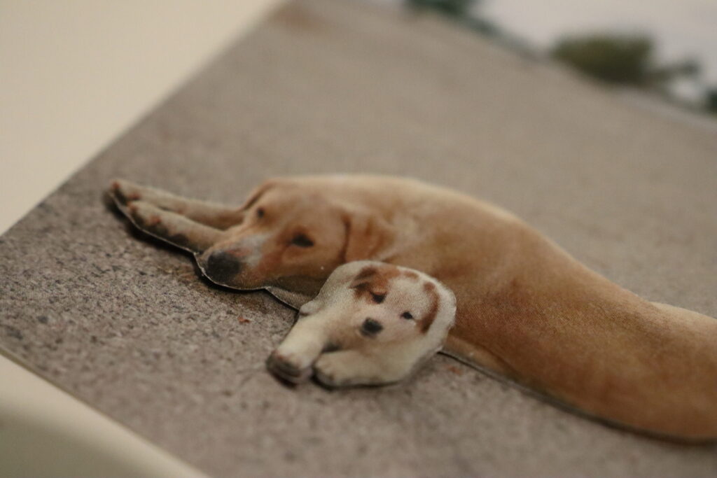
Second Layer: Silhouette of the Two Dogs The second layer in this piece is the silhouette of both dogs. Cutting out their combined shape and putting it above the original photograph starts to give the image depth. This separation emphasizes the subjects, making them stand out from the background.

Third Layer: Silhouette of the Small Dog For the final layer, I chose to isolate the smaller dog and elevate it above the silhouette of both dogs.

Conclusion

Observers can move around the photos, exploring different angles and perspectives. This interactivity invites viewers to engage more deeply with the artwork, as they discover new elements hidden within the layers. This project can enhance the appreciation for photography but also allow you to explore the creative possibilities of three-dimensional art.

I personally believe that this project straddles the line between serious and casual. The 3D relief technique evokes a collage-like aesthetic, which can vary in effectiveness depending on the photograph used. For instance, applying this method to a photo of a woman wearing glasses doesn’t seem to show as interesting results as it does with a photo of dogs. The technique appears to be more suited to still images, where the layers can enhance the subject matter more effectively. Therefore, it’s important to choose the right kind of photo to fully benefit from the 3D relief effect.

18/ Exploring the tactile experience in photography through different paper types

In this project, I delved into the tactile dimensions of photography by experimenting with various paper types. Here, I share my findings and reflections on how different papers contribute to the overall photographic experience.

1. Regular 120g Matte Paper: A Subtle Touch

I began with a standard 120g matte paper, expecting it to provide a basic tactile foundation without overshadowing the image itself. Indeed, this paper proved to be neutral in terms of touch. It creates a smooth, unremarkable surface that doesn’t distract from the photograph. However, its subtlety can be a double-edged sword. On one hand, it ensures that the viewer’s focus remains on the image, but on the other, it lacks a distinctive tactile appeal. This type of paper might be best utilized in combination with other tactile techniques, such as embossing or varnishing, to enhance its sensory impact without overwhelming the photograph.

2. Textured Paper: Front Versus Back

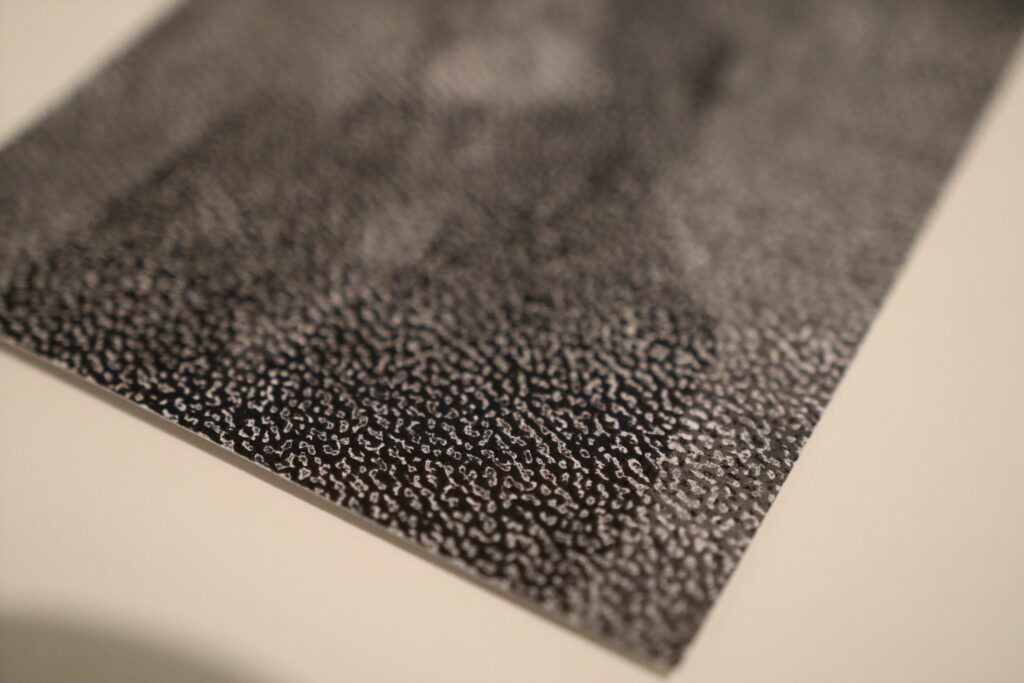
Next, I experimented with a paper that has a texture. Initially, I printed on the textured side, only to find that the ink failed to settle uniformly across the surface. The resulting image showed an inconsistent pattern where the ink skipped over the valleys of the texture. While this effect might appeal to some for its unique, abstract quality, I found that it compromised the integrity of the original photograph.

Conversely, when I printed on the smoother side of the textured paper, leaving the textured side as the back, the results were much more satisfactory. The image retained its clarity and detail, while the reverse side provided an intriguing tactile experience. Interestingly, the texture on the back added an auditory element when handled, producing a gentle, soothing sound which reminded me of wind or waves. This unexpected sensory layer could engage viewers more deeply, inviting them to explore the photograph with both sight and touch (maybe with some instructions).

3. Yellowish Paper: A Shift in Tone and Texture

Finally, I tested a 100g yellowish paper with a lined texture on the back. As anticipated, the yellowish hue imparted a warm, vintage tone to the photographs. This color shift can evoke a sense of nostalgia or timelessness, depending on the subject matter. However, the thinness of the paper presented a drawback; the photographs felt somewhat insubstantial and cheap.

For projects aiming to convey a sense of uniqueness and quality, opting for a heavier paper with a more substantial feel would be advisable. Yet, this paper’s characteristics might be deliberately chosen for projects where a more ephemeral or everyday quality is desired.

Reflections and Future Directions

This exploration underscored the importance of considering both the visual and tactile qualities of paper in photographic projects. Each type of paper offers distinct advantages and challenges, influencing how a photograph is perceived and experienced.

For future projects, I plan to experiment with a wider variety of paper weights and textures. Additionally, exploring the auditory dimensions of paper, as discovered with the textured back paper, opens new opportuinities for engaging viewers.

The Future of Analog Art and Design in the Age of AI

In an era where artificial intelligence (AI) is revolutionizing industries and reshaping creative processes, the role of analog art and design methods stands at a critical juncture. As AI becomes increasingly capable of generating art, music, and designs, questions about the value of handmade craftsmanship and the human touch are more pertinent than ever. This shift has sparked discussions about the authenticity of creativity and the future direction of traditional artistic practices.

Amidst the rise of AI-generated content, the allure of analog artistry lies in its human essence. Whether it’s the strokes of a brush on canvas, the intricacies of hand-lettering, or the tactile quality of handcrafted objects, analog methods embody a unique authenticity and emotional connection that technology cannot replicate. These qualities resonate deeply with audiences seeking genuine, meaningful experiences in an increasingly digital world.

There’s a growing sentiment among artists and designers advocating for the preservation of human creativity and craftsmanship in the face of AI’s expanding capabilities. The „anti-AI“ movement highlights concerns about the potential homogenization of creativity and the loss of individual expression in a world dominated by algorithms. It underscores the importance of nurturing and celebrating diverse artistic voices and preserving the intrinsic value of human-made art and design.

Bridging Analog Traditions with Digital Technologies

Rather than viewing AI as a threat, many artists and designers are exploring how digital technologies, such as Augmented Reality (AR), can complement and enhance traditional analog methods. AR, for instance, offers a bridge between physical and digital realms, allowing artists to imbue their handmade creations with interactive, immersive elements. Imagine a hand-painted mural that springs to life with AR animations or a sculpture that tells its own story through virtual overlays.

The convergence of analog traditions and digital innovations presents exciting opportunities for creative exploration. Artists can experiment with blending traditional techniques with AR to create dynamic, multi-dimensional artworks that engage and captivate audiences in novel ways. This fusion not only revitalizes traditional art forms but also expands the possibilities of storytelling and visual communication in the digital age.

As we navigate the evolving landscape of art and design, embracing both analog heritage and digital advancements is key to fostering innovation and preserving artistic integrity. By embracing the human touch in artistry and leveraging digital tools thoughtfully, artists and designers can redefine creativity, elevate craftsmanship, and forge new paths that honor tradition while embracing the future.

The future of analog art and design in the face of AI is not about resistance, but about evolution and integration. It’s about celebrating the unique qualities of handmade craftsmanship while harnessing the potential of digital technologies to enrich and expand creative expression. As we continue to explore these intersections, let’s embrace the journey of discovery and chart a course that honors the past, embraces the present, and shapes the future of artistic innovation.

9. Auswertung der Umfrage

Hintergrund der Umfrage

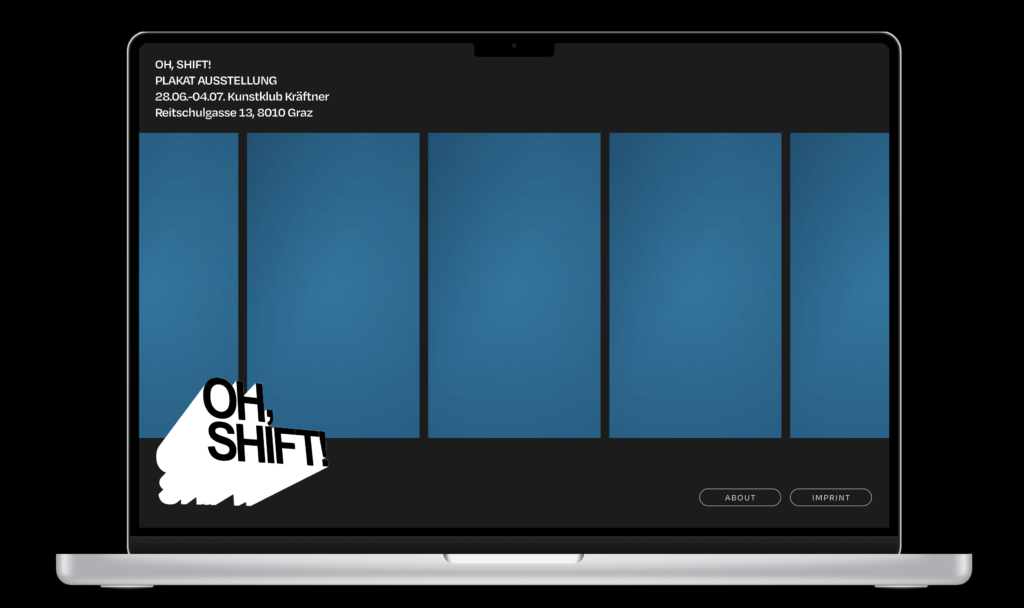
Die Umfrage wurde durchgeführt, um Feedback zur Website der Ausstellung „Oh, Shift!“ zu sammeln. Ziel war es, die Meinungen der Nutzer hinsichtlich des visuellen Designs, der Navigation und der allgemeinen Benutzererfahrung zu verstehen. Insgesamt nahmen 16 Personen an der Umfrage teil.

Demografie der Teilnehmer

  • Alter:
    • 18-25 Jahre: 10 Teilnehmer:innen
    • 26-35 Jahre: 4 Teilnehmer:innen
    • 55-60 Jahre: 1 Teilnehmer:in
    • 61-70 Jahre: 1 Teilnehmer:in
  • Tätigkeit in der Designbranche:
    • Ja: 8 Teilnehmer:innen
    • Nein: 8 Teilnehmer:innen

Visuelles Design der Website

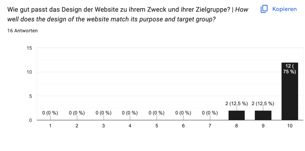
Zielgruppe

Navigation der Website

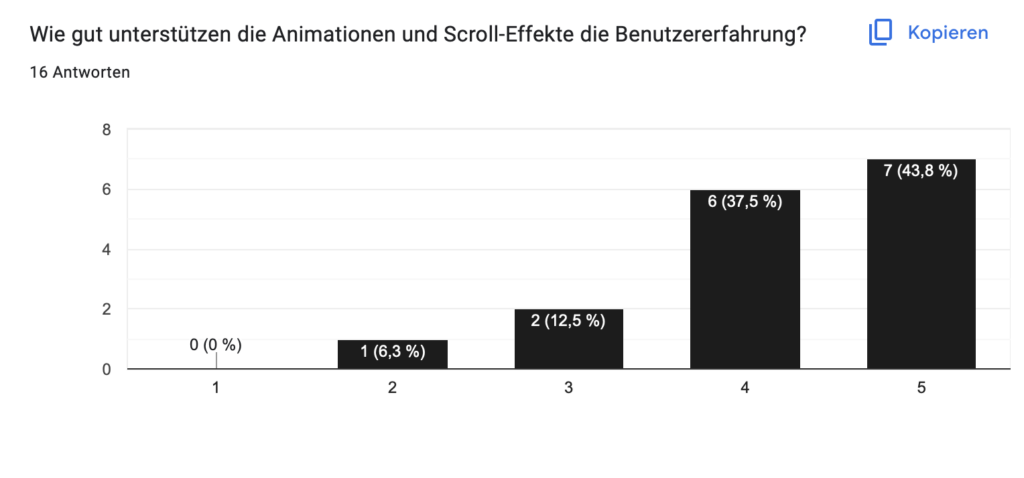
Unterstützung durch Animationen und Scroll-Effekte (5= Sehr gut, 1= Schlecht)

Lieblingspart der Website – Top 3

  • Das unendliche Scrollen
  • Die automatisch abspielenden Videos
  • Cusom Cursor
  • Animationen

Verbesserungsvorschläge

  • Größere Darstellung der Poster auf der Website.
  • Einige technische Probleme beim Zurückkommen auf die vorherige Seite, speziell auf Mac-Geräten.

Fazit

Die Umfrage zeigt, dass die Mehrheit der Teilnehmer sehr zufrieden mit dem visuellen Design und der Navigation der Website der Ausstellung „Oh, Shift!“ ist. Die Animationen und Scroll-Effekte wurden ebenfalls positiv bewertet. Die wichtigsten Verbesserungsvorschläge betreffen technische Aspekte und die Darstellung von Inhalten. Insgesamt scheint die Website bei den Nutzern gut anzukommen. Ich habe gelernt, bei der Umfrage auf die Reihenfolge zu achten, in welcher mit gut bis schlecht bewertet wird. Diese sollte immer gleich sein und sich so wenig wie möglich ändern.

Link: http://www.oh-shift.art

8. Erstellung einer Umfrage

Um die Wahrnehmung meiner Website durch verschiedene Zielgruppen besser zu verstehen und gezielte Verbesserungen vornehmen zu können, habe ich eine Umfrage entwickelt. Die Ergebnisse dieser Umfrage sollen aufzeigen, wie unterschiedliche Nutzergruppen die Website wahrnehmen, welche Bereiche besonders gut ankommen und wo Optimierungspotenzial besteht. Insbesondere interessiere ich mich dafür, wie die interaktiven Elemente und Scroll-Effekte auf die Teilnehmenden wirken.

Ziele der Umfrage

Die Hauptziele der Umfrage sind:

  • Zielgruppenanalyse: Ermitteln, wie verschiedene demografische Gruppen die Website wahrnehmen.
  • Visuelles Design: Feedback zum ästhetischen Erscheinungsbild der Website sammeln.
  • Usability: Verstehen, wie intuitiv die Navigation und Benutzerführung ist.
  • Funktionalität: Bewerten, wie gut die Animationen und Scroll-Effekte die Benutzererfahrung unterstützen.
  • Verbesserungspotenzial: Konkrete Vorschläge für Optimierungen identifizieren.

Fragen

  • Alter
  • Bist/warst du in der Designbranche tätig?
  • Wie ansprechend findest du das visuelle Design der Website?
  • Wie intuitiv war die Navigation auf der Website?
  • Wie gut passt das Design der Website zu ihrem Zweck und ihrer Zielgruppe?
  • Wie gut unterstützen die Animationen und Scroll-Effekte die Benutzererfahrung?
  • Was ist dein liebster Part der Website?
  • Was könnte man verbessern?

Durchführung und Auswertung der Umfrage

Die Umfrage wird online durchgeführt, um eine breite und diverse Teilnehmerbasis zu erreichen. Nach der Datenerhebung erfolgt die Auswertung, um Muster und Trends in den Antworten zu identifizieren. Besonderes Augenmerk liegt dabei auf den Unterschieden zwischen verschiedenen Altersgruppen und zwischen Fachleuten und Laien.

Ergebnisse und Maßnahmen

Die Ergebnisse der Umfrage werden zeigen, welche Aspekte der Website besonders gut ankommen und welche Bereiche Verbesserungspotenzial haben. Auf Basis dieser Erkenntnisse können gezielte Maßnahmen ergriffen werden, um die Website weiter zu optimieren. Insbesondere die Bewertung der interaktiven Elemente und Scroll-Effekte wird wertvolle Hinweise liefern, wie diese Elemente die Benutzererfahrung verbessern oder stören.

7. Befragungen im näheren Umfeld, Änderungen

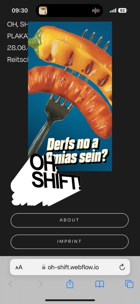
Ich besitze ein iPhone 14 pro, meine Mutter ein iPhone SE. Nachdem ich sie die Website testen lies, hatte sie, sowie andere Menschen mit einem iPhone mit Homebutton ein paar Dinge zu kritisieren, welche ich wie folgt der Usability wegen veränderte.

Vorher – Nachher iPhone SE

Vorher – Nachher iPhone 14 Pro

Durch die Anordnung von Logo und Buttons (ich habe mich aufgrund der limitierten Inhalte der Seite bewusst gegen ein Burger Menu entschieden) war es vor allem auf kleineren Displays nicht so einfach zu scrollen. Auch die Plakate wurden am kleineren Display immer teilweise verdeckt, sowie die Informationen oben im Eck, sodass die Seite sehr überladen und unangenehm zu bedienen war. Mit dem kleineren Logo und den Buttons können diese trotzdem noch ausreichend gut bedient werden und die Section nimmt weniger Platz am Display ein. Außerdem habe ich die Abstände der Poster angepasst, sodass sie nun mehr Platz für die Infos freigeben und auf allen Displaygrößen gut zu sehen sind.

6. Learnings bei der Umsetzung

Die Gestaltung einer Website ist eine komplexe Aufgabe, die weit über visuelles Design und Benutzerfreundlichkeit hinausgeht. Ein zentrales Element, das oft übersehen wird, ist die technische Machbarkeit. Meine Arbeit an diesem Thema hat mir verdeutlicht, wie wichtig es ist, die Grenzen und Möglichkeiten der Webentwicklung zu verstehen und zu berücksichtigen.

Grenzen des Webdesigns

Die technischen Grenzen des Webdesigns werden durch verschiedene Faktoren bestimmt:

  • Browser-Kompatibilität: Nicht alle Browser unterstützen die neuesten Webtechnologien, was Einschränkungen bei der Umsetzung moderner Designs mit sich bringen kann.
  • Performance: Aufwändige Animationen und Grafiken können die Ladezeiten einer Website negativ beeinflussen, was die Benutzererfahrung verschlechtert.
  • Sicherheit: Komplexe Funktionalitäten erfordern zusätzliche Sicherheitsmaßnahmen, die den Entwicklungsaufwand erhöhen.

Möglichkeiten des Webdesigns

Trotz dieser Grenzen bietet die moderne Webentwicklung zahlreiche Möglichkeiten:

  • Responsive Design: Websites können so gestaltet werden, dass sie auf allen Geräten gut aussehen und funktionieren.
  • Interaktive Elemente: Animationen, Übergänge und dynamische Inhalte können die Benutzererfahrung verbessern und die Website ansprechender gestalten.
  • Personalisierung: Mithilfe von Datenanalyse und KI können Inhalte individuell auf die Nutzer zugeschnitten werden.

Herausforderungen und Lösungsansätze

Technische Umsetzung: Einige Designideen erwiesen sich als schwer umsetzbar, was zu Anpassungen und Kompromissen führt Um diese Herausforderungen zu meistern, ist es für zukünftige Projekte mit diesem Thema sinnvoll, zunächst auf Prototypenbasis zu arbeiten. Tools wie Figma ermöglichen es, Designs zu erstellen und zu testen, bevor sie in die Entwicklung gehen. So habe ich trotzdem die Möglichkeit zu testen, stoße jedoch nicht an meine Grenzen in Webflow o.Ä.

Zusammenarbeit mit technischen Experten

Ich könnte eventuell auch mit einer studierenden Person mit dem richtigen Hintergrund zusammenarbeiten und so die technische Komponente miteinbeziehen. “Ist die Umsetzung realistisch”

Fazit

Die Gestaltung einer Website erfordert eine ganzheitliche Betrachtung, die Design, Usability und technische Machbarkeit gleichermaßen berücksichtigt. Die Zusammenarbeit mit technischen Experten und die Nutzung von Prototyping-Tools wie Figma können den Entwicklungsprozess erheblich verbessern. Diese Erfahrungen haben meine Sichtweise auf Webdesign erweitert und gezeigt, dass die besten Ergebnisse durch interdisziplinäre Zusammenarbeit und gegenseitiges Verständnis erzielt werden.

5. Umsetzung der Page mit Webflow

  1. Grober Prototyp in FigmaDie Zeit drängt, also habe ich damit angefangen, mir einen Crashkurs in Webflow auf Youtube anzusehen. So empfand ich die Gestaltung eines groben Prototypen in Figma als die geeignete Variante mit dem Projekt zu starten. Ich möchte hier jedoch nur das Layout verstehen, um dieses dann gut in Webflow umsetzen zu können.
  1. Aufbau der Page in WebflowWie beim programmieren, muss man in Webflow anfangen, die Seite grob zu strukturieren. Hierfür habe ich einen Prototypen in Figma gebaut, welcher am Ende nicht mehr so aussah wie die finale Website.

Nach dem Bauen des Prototypen fielen mir Dinge auf, die so nicht funktionierten.

  1. Der horizontale Scroll war sehr unangenehm anzusehen, da sich die Poster alle gleichzeitig bewegten, so sah die Seite überladen aus
  2. Der horizontale “Gallery” look funktioniert nicht so wie ich es mir gewünscht hätte, er wirkt wie ein billiges gallery-template auf mich.
  3. Die Anordnung fand ich gut, jedoch wirkte das Logo zu groß und die Buttons im Verhältnis zu klein
  4. Mir entstand zu wenig tiefe, da ich viele überlappende Elemente verwenden wollte, um diesen “cool-but-trashy” Effekt zu unterstreichen.
  5. Die fertige Seite, welche Punkte habe ich abgearbeitet?

oh-shift.webflow.io

  • ✓ Klare Gestaltung → Nur die wichtigsten Elemente befinden sich auf der Website, hierarchisch funktioniert sie für mich gut.
  • ✓ Minimalistisch → Wenige Elemente: Die Poster stehen im Fokus
  • ✓ Micro-Interactions → Ich habe hover Effekte, sowie einen custom Cursor, welche diese Unterstreicht eingefügt.
  • Schwarz/Weiß → Poster sind sehr verschieden, sie sollen der Main Focus sein

Außerdem habe ich einen infinite Scroll Effekt hinzugefügt, welcher auf meinen Inspo-Seiten im Vordergrund stand und einen sehr schönen und außergewöhnlichen Effekt auf der Website erzeugt.

(Ich wollte Bildschirmaufnahmen hochladen, aber WordPress lässt mich nicht, also bitte selbst ausprobieren! 🙂 )