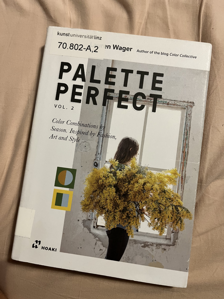
#5 Interlibrary loan for my masterthesis: „Palette Perfect Vol. 2“ von Lauren Wager

Colors are one of the most powerful tools in design. They evoke emotions, set moods, and shape the identity of any project. In her book „Palette Perfect Vol. 2,“ designer Lauren Wager takes us on a journey through the world of color palettes, demonstrating how to use them effectively for creative projects.

What’s the Book About?

This book is all about the art of combining colors to create specific moods and feelings. It features a stunning collection of color palettes, ready to be applied across various design contexts, including graphic design, interior design, fashion, and photography. Each palette is thoughtfully presented with accompanying images and concise descriptions, allowing readers to experience the emotional essence of each color combination.

Who Is This Book For?

„Palette Perfect Vol. 2“ is perfect for designers, artists, and creatives seeking inspiration. Whether you’re working on a branding project or redecorating a space, this book offers a treasure trove of ideas for incorporating colors in ways that elevate your work.


A Closer Look at the Book

The Emotional Power of Colors

Lauren Wager showcases how colors can communicate emotions and moods:

  • Soft, warm tones like beige and blush exude calmness and comfort.
  • Bold, vibrant contrasts like turquoise and yellow convey energy and creativity.
    Each palette is thoughtfully curated and paired with visual examples to bring these feelings to life.

Applications Across Design Fields

The versatility of the palettes makes them suitable for a wide range of projects:

  • Fashion Design: For clothing, accessories, or entire collections.
  • Graphic Design: Perfect for logos, websites, or printed materials.
  • Interior Design: To craft spaces with cohesive and inviting atmospheres.
  • Photography: As a guide for harmonious color compositions in images.

Strengths and Limitations

What Stands Out?

  • Visual Inspiration: The palettes are not only stunning but also spark new creative ideas.
  • Clear Structure: The thematic organization makes it easy to navigate and find what you need.
  • Practical Focus: Real-world examples show how the palettes can be applied in different projects.

Where It Falls Short

While the book offers plenty of visual stimulation, it lacks in-depth theory on color psychology or the cultural significance of colors. It’s more of an inspirational guide than a deep dive into the science behind color.


Final Thoughts: A Must-Have for Creatives

„Palette Perfect Vol. 2“ is an inspiring book with a meticulously curated collection of color palettes. Lauren Wager has created a resource that speaks to designers and artists alike. It’s ideal for those looking to use colors intentionally to convey moods and emotions in their work. While it’s not a scientific reference, it’s a must-have for anyone seeking visual inspiration.

Book Details

Lauren Wager: Palette Perfect Vol. 2. Hoaki Books S.L., 2022.

# 4 Video: Kelli Anderson – artist, designer, paper engineer

In this talk, Kelli Anderson, an artist, designer, and pioneer in the field of paper engineering, delves into the hidden potential of everyday materials—specifically paper. Anderson reveals how simple, low-tech materials can be powerful tools for interacting with and understanding complex aspects of our reality. Her unique approach shows that even humble materials can engage meaningfully with physical forces like sound, light, and time. This interaction often makes abstract concepts tangible and easier to grasp, bypassing the “black-box” nature of much modern technology, which often conceals how it functions and distances users from understanding its inner workings. Instead, Anderson’s work brings us closer to the mechanics of our world in a hands-on way.

Anderson’s career highlights include a series of fascinating projects that challenge conventional uses of everyday materials. Notably, in 2008, she collaborated on a recreated version of The New York Times filled entirely with articles from a utopian future. This project, designed as a form of “art intervention,” used design to imagine alternative possibilities and inspire conversations around what a better world might look like. This unique endeavor won the Ars Electronica Prix Award of Distinction, further cementing her reputation as a groundbreaking designer.

In 2011, she garnered widespread attention with her creation of a paper record player. This innovative piece of work, featured in media outlets like Mashable, Wired, and NPR, demonstrated how paper could be crafted into a working music player, challenging assumptions about the limitations of paper as a medium. This project, among others, is part of Anderson’s broader mission to highlight how we can see and interact with the world differently by rethinking the potential of familiar materials.

Anderson’s recent endeavors include experimenting with risograph animation, a printing technique that allows her to create unique, animated images by using paper as a direct interface with physical phenomena. By pushing the boundaries of what paper can do, Anderson encourages her audiences to question and reimagine the everyday tools and objects around them. Her artistic philosophy suggests that by reengaging with materials in this direct, hands-on way, we can reconnect with the “real” forces shaping our world—forces that technology sometimes hides behind layers of abstraction.

Additionally, Anderson’s workspace reflects her dedication to hands-on exploration: she works in a live/work studio filled with equipment from a bygone era, including a 1919 letterpress and other unconventional contraptions. This space enables her to keep exploring and testing the possibilities of “outdated” technology, aligning her artistic process with her belief in transparency and physical interaction. Anderson’s work is a testament to the power of minimalistic, tactile design and its ability to cut through modern complexities, helping us see the world—and our own human experience—in fresh, surprising ways.

Through her design philosophy, Anderson challenges viewers to reconsider how they engage with both art and technology. Her work ultimately aims to make the invisible forces around us more accessible, asking us to see not only how objects function but also what they reveal about human potential and creativity. Her talk is likely to inspire creatives and audiences alike to think beyond digital solutions, reconnect with material realities, and explore the unexpected potential of the “low-tech” world.

With support from institutions like the University of Michigan Library and the Ann Arbor District Library, and partnerships with media outlets such as Detroit Public Television and PBS Books, Anderson’s message reaches a wide audience. The Penny Stamps Speaker Series, which hosted this event, emphasizes freedom of speech and artistic expression, aligning well with Anderson’s mission to use art as a means of exploring ideas freely and meaningfully. Her work ultimately encourages a more thoughtful and engaged relationship with the objects and technologies that shape our lives, suggesting that by re-engaging with tangible materials, we might uncover surprising truths about ourselves and the world around us.

#2 Experiencing Klanglicht 2024 – A Journey into Dreams

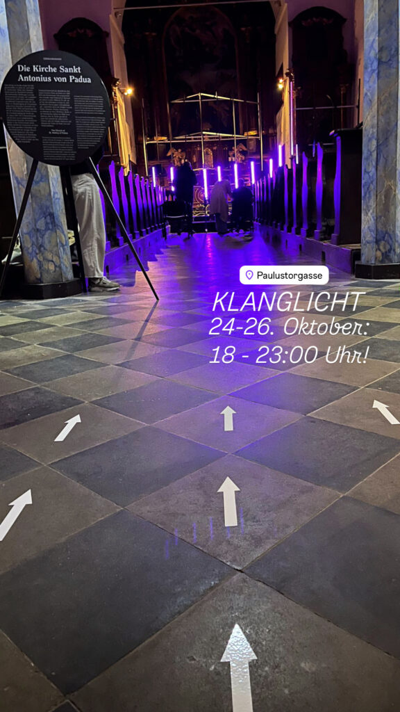
For three magical nights, from October 24 to 26, 2024, Klanglicht transformed Graz into a city of light, sound, and dreams. This year’s festival theme embraced the concept of dreams—those mysterious journeys of the mind that take us to hidden desires, profound longings, and fleeting utopias, both day and night. Through 18 unique art installations, renowned artists from Austria and around the world presented interpretations of dreams, each piece inviting visitors to enter their own inner landscapes.

Klanglicht 2024’s artworks ranged from the poetic and subtle to the surreal and powerful, weaving a tapestry of light and sound that filled the streets, courtyards, and buildings of Graz. From the Joanneum Quarter, up to the Schlossberg, along Herrengasse, and within venues like Schauspielhaus Graz, Next Liberty, and the Graz Opera House, the city itself became a dreamscape. For those three nights, Klanglicht invited the audience to dive into a dialogue with art and their own imaginations—a reminder to keep dreaming, if only for a moment.

As a communication designer, I had the unique opportunity to contribute to this year’s Klanglicht experience. Alongside three other designers, I was part of the design team that created the wayfinding system for one of Klanglicht’s most atmospheric venues: the Antonius Church. Our work included posters, postcards, and directional signs that helped guide visitors through the space, adding a layer of clarity to their dreamlike experience. It was incredible to see how these design elements played a role in shaping people’s journey through the installations, allowing them to focus on the art while feeling oriented and welcomed.

Since its founding in 2015, Klanglicht, organized by Bühnen Graz, has brought the magic of light and sound out of the theater and into public spaces. This year’s edition continued that tradition, blending elements of joy, critique, allure, and abstraction, offering a kaleidoscope of emotions and ideas. For me, being involved in the design process added a whole new dimension to experiencing the festival. It was fulfilling to see our work as part of this stunning event and to witness the impact of art on people as they journeyed through Klanglicht’s dreamworld.

If you missed it this year, I can only recommend marking your calendar for next October. Klanglicht 2024 was truly unforgettable—a festival that encourages us all to keep dreaming, both in and beyond the light and sound of Graz.

#1 Nacht der Museen

On October 5, 2024, it was that time again: the „ORF Long Night of Museums“ drew culture enthusiasts and night owls alike into museums and cultural institutions all over Austria. From 6 p.m. to midnight, they opened their doors, offering a diverse program. This year, my tour led me to the print workshop Druckzeug, a true highlight for anyone who appreciates the art of printing.

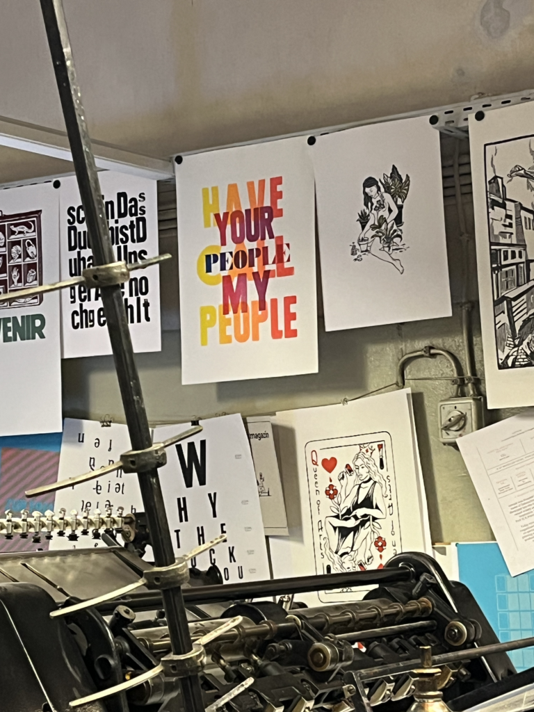
The atmosphere at Druckzeug was unique. From the moment I stepped into the workshop, I felt the charm of the historic printing machines and the passion of the team for the age-old technique of letterpress. As part of the event, I attended a fascinating lecture on the history and artistry of letterpress, gaining deeper insights into this traditional craft. It was truly impressive to see just how much precision and skill go into this technique—a striking contrast to the digital world that surrounds us today.

The highlight of the evening was watching the master printers at work. With a blend of routine and dedication, they demonstrated the process: loading the paper into the machine, adjusting the printing plates, mixing the inks, until a beautifully crafted print emerged. It felt like watching a piece of history come to life. After the demonstration, I couldn’t resist purchasing a beautiful print as a souvenir of this special evening.

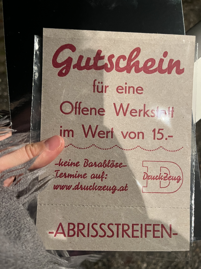
The night held one more surprise: a raffle with various prizes. To my amazement, I actually won a voucher for the next open workshop at Druckzeug! I’m already looking forward to visiting again and maybe even trying my hand at printing myself.

The „Long Night of Museums“ was an unforgettable experience in many ways. The chance to wander through different cultural institutions at night, the variety of programs, and the unique atmosphere made it a truly memorable evening. For anyone who loves art and culture and appreciates special glimpses like this, don’t miss this event next year!

Until next time at the „Long Night of Museums“—I’ll definitely be back!

#3 Kritische Bewertung einer Masterarbeit

Masterarbeit von Theresa Wind zu Trends und Anforderungen an Corporate Design im Kontext von E-Commerce

(1) Gestaltungshöhe

Die Gestaltung der Arbeit ist gut strukturiert und visuell ansprechend. Die Arbeit nutzt präzise gestaltete Diagramme, um Corporate Design-Konzepte zu veranschaulichen. Die Qualität der Grafiken zeigt die gestalterischen Fähigkeiten der Autorin, was zur Verständlichkeit und ästhetischen Wirkung der Arbeit beiträgt.

(2) Innovationsgrad

Der Innovationsgrad ist solide, wenn auch nicht überdurchschnittlich hoch. Die Arbeit behandelt moderne Trends im E-Commerce-Design und setzt diese in einem Corporate Design Manual für einen Online-Shop um. Obwohl der Fokus auf aktuellen Design-Trends liegt, enthält sie eher eine praktische Anwendung bestehender Theorien als völlig neue Ansätze.

(3) Selbstständigkeit

Die Autorin hat die Arbeit eigenständig und mit einem hohen Maß an Selbstständigkeit verfasst, was durch die eidesstattliche Erklärung bestätigt wird. Die Arbeit zeigt eine umfassende Recherche und Analyse, sodass sie methodisch gut aufgebaut ist und persönliche Einblicke in die Praxis des Corporate Designs einbringt.

(4) Gliederung und Struktur

Die Arbeit ist klar und gut strukturiert. Sie folgt einem logischen Aufbau, der die theoretischen Grundlagen zu Corporate Design und E-Commerce einführt und diese dann praktisch auf den Online-Shop anwendet. Der Leser wird Schritt für Schritt durch das Thema geführt, was die Verständlichkeit erhöht.

(5) Kommunikationsgrad

Die Sprache ist klar und verständlich, mit nur wenigen Fachausdrücken, die für Branchenkenner sofort nachvollziehbar sind. Der Kommunikationsgrad ist insgesamt hoch und die Ausführungen sind sachlich, sodass die Zielgruppe problemlos folgen kann.

(6) Umfang der Arbeit

Der Umfang ist angemessen, weder überladen noch zu knapp, und umfasst sowohl theoretische Hintergründe als auch praktische Anwendung. Die Balance zwischen Theorie und Praxis ist gelungen.

(7) Orthographie sowie Sorgfalt und Genauigkeit

Die Orthographie und sprachliche Sorgfalt sind weitestgehend gut, allerdings könnten einige Passagen gestrafft werden, um eine höhere Prägnanz zu erreichen. Inhaltlich ist die Arbeit jedoch sehr genau und belegt jede Aussage mit fundierten Quellen.

(8) Literatur

Die Literaturauswahl ist vielfältig und deckt alle wesentlichen Aspekte ab, die für das Thema Corporate Design und E-Commerce relevant sind. Die Arbeit basiert auf aktuellen Studien und anerkannten Fachbüchern, was die wissenschaftliche Fundierung unterstützt.

Experimenting with Colors #17

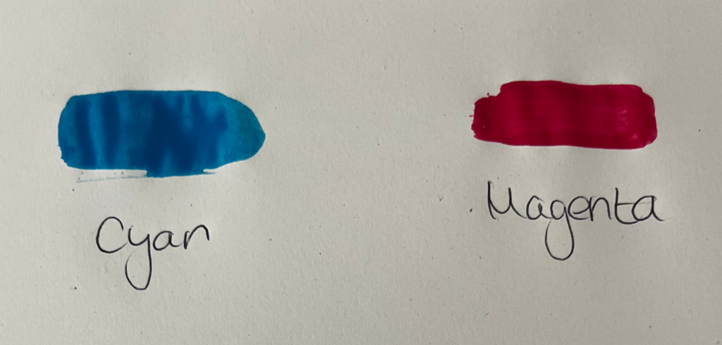
Mixing Cyan and Magenta

Cyan, which is created by mixing blue and green, when combined with magenta, yields shades of red. Initially, the mixture may appear as a cool, bluish-red tone, but as more magenta is added, the color deepens into richer shades of red. Depending on the proportions of cyan and magenta used, the resulting red can range from vibrant and intense to deeper and more burgundy-like. Experimenting with different ratios of cyan and magenta allows for the creation of a diverse range of red hues.

Experimenting with Colors #16

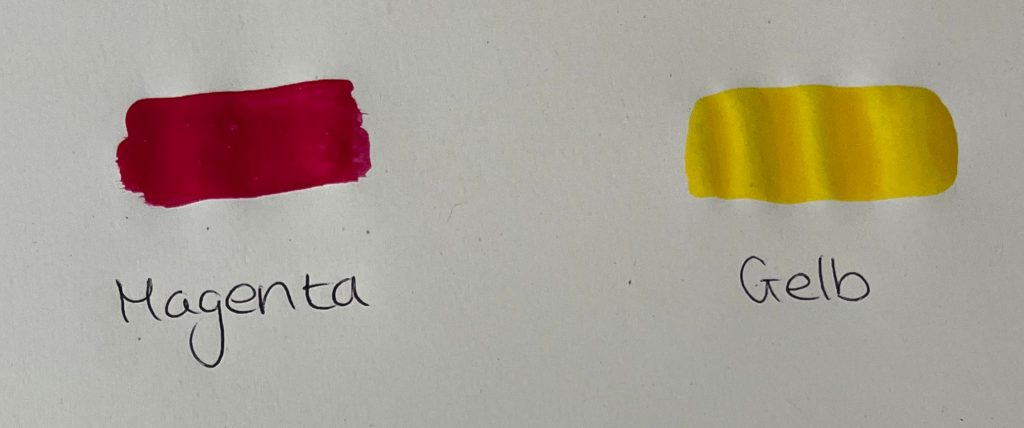
Mixing Magenta and Yellow

Magenta, a color derived from red and blue, when mixed with yellow, produces a vibrant range of red-orange hues. Initially, the combination may result in a vivid reddish-orange tone, but as more yellow is introduced, the color becomes brighter and more reminiscent of tangerines or sunset hues. Adjusting the ratio of magenta to yellow allows for control over the intensity and warmth of the resulting red-orange color.

Experimenting with Colors #15

Mixing Red and Yellow

Mixing red and yellow together yields shades of orange. Initially, the mixture may appear as a bright vermilion hue, but as more yellow is added, the color transitions to warmer tones of orange. Depending on the proportions of red and yellow used, the resulting orange can range from vivid and fiery to softer and more subdued. Experimentation with different ratios of red and yellow allows for the creation of a spectrum of orange shades.

Experimenting with Colors #14

Since I’ve decided to delve deeper into the color red, I’ve conducted a few experiments on color mixing with the color red.

Mixing Red and Blue

When mixing red and blue together, you’ll observe a gradual transition from the original colors to shades of purple. As more blue is added, the resulting color becomes cooler and tends towards violet. Conversely, adding more red will warm up the mixture, producing deeper shades of magenta. Through experimentation with different ratios of red and blue, you can achieve various tones of purple, ranging from vibrant violets to rich magentas.

sRGB #13

sRGB stands for „Standard Red Green Blue“ and refers to a standardized color space that is widely used in many applications and devices. Originally developed for use in digital displays and web graphics, sRGB is now a widely accepted standard for color representation in various applications and devices.

The sRGB color space defines a limited palette of colors that can typically be displayed and processed by most computer monitors, digital cameras, printers, and web browsers. It was designed to ensure consistent and predictable color reproduction across different devices and to ensure that images and graphics appear similar regardless of where they are viewed.

Compared to larger color spaces such as Adobe RGB or DCI-P3, sRGB covers a smaller range of hues. However, it is sufficient for most everyday applications and provides good color accuracy and consistency.

sRGB is often used as the standard color space for displaying content on the web. When creating images or graphics for the web, it is common to save them in the sRGB color space to ensure they are correctly displayed by most web browsers.

It is important to note that color reproduction in sRGB can also depend on the calibration of the screen or printer. Accurate color calibration and profiling of devices are necessary to ensure that colors in the sRGB color space are accurately reproduced.

Source: https://www.prad.de/lexikon/srgb/