07 craftivism

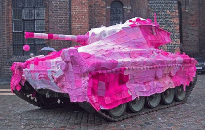
In the late 90s the contemporary craft & craftivism emerged and gained recognition as a political movement. The term craftivism is a blend of the word craft and activism. Cravtivism pieces can be different things like contemporary art pieces, public knit-ins, yarnbombing, ethical fashion, indie craft sales,  or many other things. It is a form of peaceful protest through crafts. “creativity can be a catalyst for change”. One cravtivism project was the Pussyhat project. A group of knitting-activists knittet pink hats to wear during the womans march in Washington after Donald Trump was elected president. The name pussyhats references Trumps comment „you can do anything“ to women – including „grab them by the pussy“. (https://www.bbc.com/news/world-us-canada-38666373)

Nelson Knit-out in the Park

“From 2003-2008, a diverse group of international knit and crochet hobbyists participated in the microRevolt project– the Nike Blanket Petition, a 15-foot wide handmade blanket of the Nike swoosh. Each 4 x 4 inch square creates the Nike logo, acting as a signature for fair labor policies for Nike garment workers. Over the five-year period, „anti-sweatshop“ squares were stitched into the quilt, representing people petitioning from over 30 countries.” (https://post-craft.net/nike_blanket.html)

„craft hard die free“ (https://books.google.at/books?id=XZEFEAAAQBAJ&printsec=frontcover&hl=de#v=onepage&q&f=false)

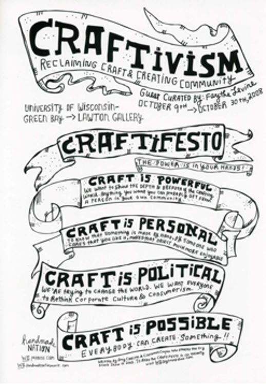
The craftivism movement wants to counter the idea that activism is violent and destructive. In 2003 a craftifesto was created, stating that craft is political. ”We’re trying to change the world. We want everyone to rethink corporate culture and consumerism.” (chrome-extension://efaidnbmnnnibpcajpcglclefindmkaj/http://www.lisasolomon.com/reviews/reviews/craftivism_catalogue.pdf)

Craft was purposefully staged as antagonistic and radical during the 2000s, for example in exhibitions like confrontational clay (2000) and radical lace and subversive knitting (2006). With the increasing visibility of crafts in public spaces, museums and media, the idea of contemporary crafts being a form of political action and democratic participation started spreading in the west. Craft communities positioning themselves with anti-capitalist values also strengthened the associations of self-sufficiency and sustainability with crafts. But it is important to note that craftivism is not necessarily a global movement of many individuals coming together for a common political cause. The values of craft groups range from ultra-conservative to anarchist.

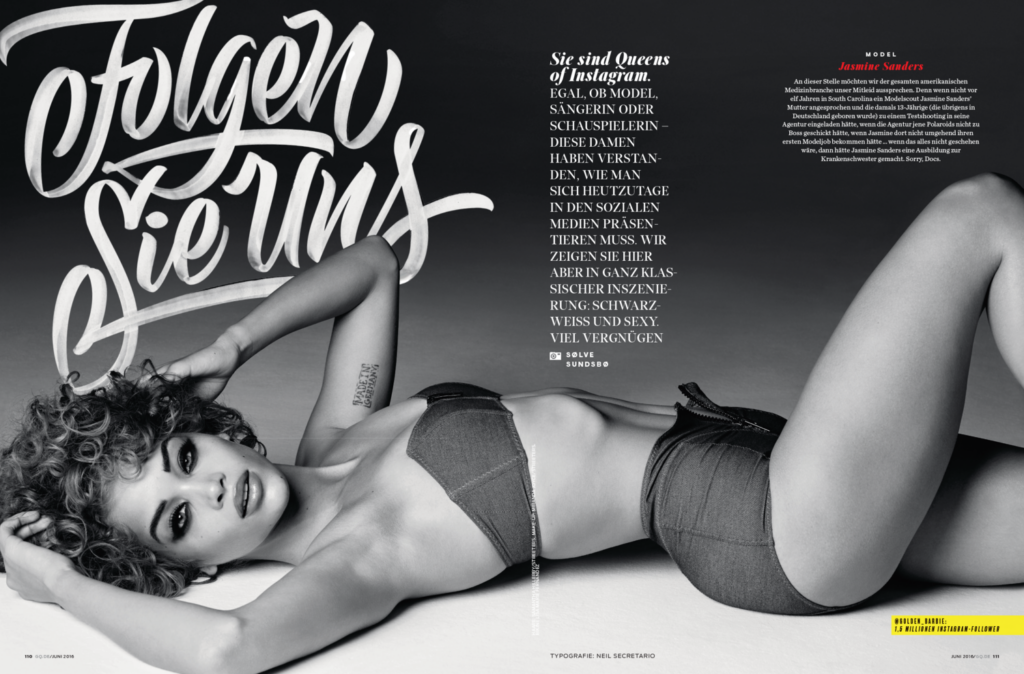
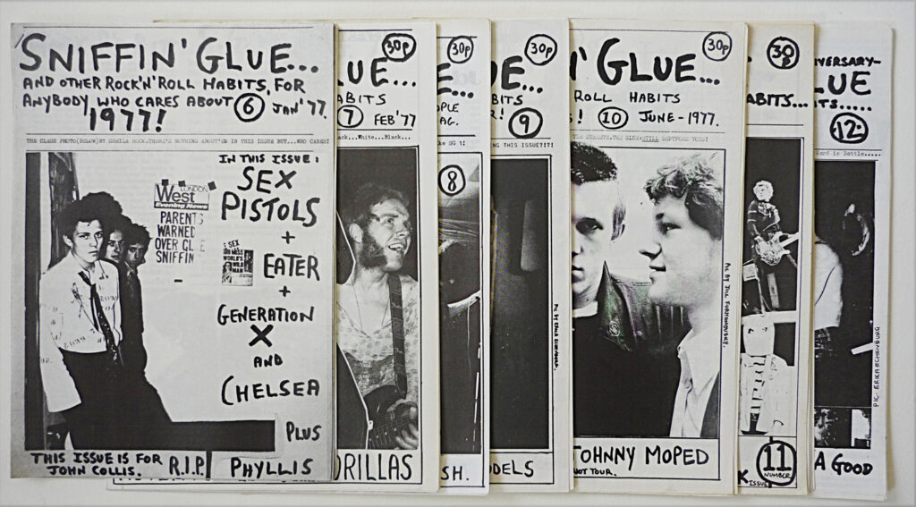
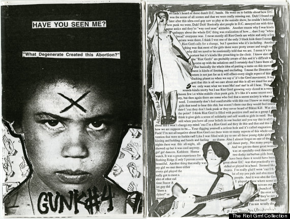
There should be a clear distinction between political and commercial craft projects, but the lines get blurred. For example the north-american indie craft movement became increasingly more commercial. It emerged out of the riot grrl zine scene. The craft scene generally draws from punk and diy-aesthetics. It has grown from local craft groups into massive enterprises like etsy. Marketing turned indie crafts into a mass produced goods.

Now the focus lies more on individualism and self-expression, which turns crafts into a sort of lifestyle-activism. “[It] is used to curate and communicate a politicized sense of individuality through good taste, and craft expresses personal and economic freedom of choice in a broadly disempowering sphere of market capitalism. The marketplace becomes an arena where conscious consumers exercise the power to choose unique objects that reflect their progressive values.” (https://books.google.at/books?id=XZEFEAAAQBAJ&printsec=frontcover&hl=de#v=onepage&q&f=false)

06 Examples

I was curious about who is currently engaging in the style of handmade design. After some research I found some designers that are currently doing projects using hand-made aesthetics.

  • Neil Secretario

He is a graphic designer and lettering artist who draws logos, custom letters and type for international companies like Conde Nast, Intercom and GQ Magazine.  

  • Mike Perry

He is a multi-dimensional artist who has won an Emmy for Motion Design. He creates lots of different kind of art, including some graphic design jobs for big companies like Hérmes and he also did some book designs for Livraria Lello.

  • Lauren Hom

She is a designer and hand-lettering artist, who amongst other things, does hand-lettering with foods to create a special aesthetic that looks very time-consuming and hand-made.

  • June Digann

She is a designer and illustrator who focuses on traditional and digital mediums. For example she designed limited edition of Toblorone packaging with hand-drawn illustrations on it amongst other things.

  • Jon Contino

He is a graphic designer and illustrator who is known fpr his handdrawn lettering and vintage-looking designs.

https://www.neilsecretario.com/

https://www.mikeperrystudio.com/

https://www.homsweethom.com/work

https://www.junedigann.com/

www.continostudio.com

05 Zine Aesthetics

The hand-mad design style was especially popular during the zine movement in the 1960s – 1990s. Because these zines were not driven by a capitalistic approach, they could experiment with new aesthetics freely.

“Sniffin’ Glue(1976–77)is a great example of new aesthetics that would ultimately penetrate a world saturated in modernist design tropes.”1

The methods used by zine producers had to be quite cheap, which also paved the way for a DIY-aesthetic. The results were designs that did not fit the popular media of the time.

The many different aesthetics that zines used inspired art and clothing, and also defined topics of discussion for this generation. In this instance the hand-made design style was a way to boycott formality and celebrate individuality. It criticizes the narrow definition of success in our society. “Replication of aesthetics that defy an adherence to modernist standards of ‘good’ design, art, and writing, makes space for designers today to continue to question conventions of popular culture, as to not slip into patterns that perpetuate exclusivity.” ¹

  1. https://scholar.utc.edu/cgi/viewcontent.cgi?article=1341&context=honors-theses ↩︎

https://www.theguardian.com/music/gallery/2013/jun/30/punk-music

https://www.huffpost.com/entry/the-riot-grrrl-collection-book-feminist-punk_n_3562407

04 – analogue = hand-made?

After my research on the historical context, I feel the need to define and categorize the term “hand-made design” a bit more. In the beginning I saw it as an aesthetic that is defined by small imperfections and lots of details, for example in texture, that hint towards a production technique that requires human hands. But I want to explore what exactly this entails.

One way of defining it is by focusing on analogue techniques as a requirement for hand-made design. The designer Mark Fox believes that when everyone uses the same digital tools, the results will all look similar. „Design has been homogenized by the mass adoption of the Mac. It’s a powerful and omnipotent machine, but in the end, it is a simulation of the real tools.”1 When using the real tools, the created graphics have character and show evidence of a human hand. Digital programs on the other hand always create the same clean lines, “tricking the designer into thinking that their work is ‘finished’ when it is just ‘polished,.”¹

Letterpress is one example of an analogue tool for graphic design that is experiencing a bit of a comeback. Even though it is more time consuming and labor intense than newer methods, it creates details that can’t be achieved digitally. During the process of letterpress printing there are some constraints. The composition is created by using physical objects, even for the white spaces. And features like weight, shape and color have to be chosen carefully and intentionally. “Rather than stifling creativity, the materials’ physical constraints stimulate it, encouraging problem-solving by using the tools at your disposal.”2

So the difference in using digital or analogue techniques can not only be seen in the aesthetic of the result, but impacts the whole process, and therefore the quality of the design in general, even if you ignore the imperfect aesthetic. The designer is forced to take his or her time and create everything physically.3

Another limiting aspect of digital creation is the problem around accessibility. The files that are saved now, might be outdated in ten years because of possible changes in technology. This also hints towards the fact that all these programs rely on code, which creates clear boundaries as to what a designer can create. And coders become a necessity, that designers rely on. This can narrow the range of results that can come out of a digital creation.¹

There is also the common mix of analogue and digital. For example, the designer Tjitske Oosterholt says that she likes to start out with analogue tools and later manipulate the results digitally to create her designs.4

What the categorization into analogue tools also doesn’t include is graphic tablets. Nowadays hand-drawn sketches can be created on a digital drawing tablet. The programme might clean up the lines a little bit if the designer chooses it, but this still can create hand-made, imperfect human design – even though it has been created digitally. Therefore I think it would be wrong to exclude digital techniques in general from the definition of what hand-made design is.

  1. https://medium.com/re-form/in-pursuit-of-digital-analog-design-education-9b24b518857 ↩︎
  2.   https://www.pixartprinting.co.uk/blog/letterpress-printing-return/ ↩︎
  3. https://www.bbc.com/future/article/20180427-why-analogue-design-still-endures
    ↩︎
  4. https://trendland.com/tjitske-oosterholt-digital-art/ ↩︎

03 – Historical placement

In order to contextualize the handmade design trend, I want to look at historic developments in graphic design to get a better understanding of its origin.

For about a century a modernist approach has influenced popular design. Modernism took over between the 1920s and 1960s. It is deliberately rejecting styles of the past like Art Nouveau and Art Deco and instead emphasizing the use of new materials and techniques. It is supposed to reflect modern society through bold colors, simple shapes and modern fonts. Shortly before this movement, Art Nouveau, which used expensive and labor-intense techniques, was popular. “[…] despite the attempt to move away from the artistic heritage, Art Nouveau had certain plastic borrowings from the artistic styles of the previous times in its graphic language.1

In 1915 the constructivism movement was founded. It focused on construction and science rather than artistic expression and aimed to influence all mass-produced objects. “Art was to be built.”2 The artists used geometric, simplistic shapes that could be created with utilitarian instruments like compasses and rulers, to break down art into its most fundamental parts. The designs were supposed to speak to political concerns of citizens and fulfill the demands of communist culture. “However, in general the society was not ready to accept the radical artistic techniques of the constructivists.”¹ Art deco, with its opulent and luxurious feel, became a reaction to constructivism.

In the second half of the 20th century, Functionalism, or as it was called, the ‘international style’, which consistently professed the ideas of Modernism, became more popular”¹ This style emerged from a need of big companies wanting to create their own corporate styles. “It was thought that the search for a new global style was over, and now everything would be done in one way for a long period.”¹ Whilst the international style has stayed popular for a long time, modern society demands a diversity of styles and is not satisfied with just one.

After modernism, came post-modernism. An ironic approach which referenced modernist styles. “The only thing that Postmodernism requires from the designer is the use of modern technologies.”¹

The emergence of the world wide web in the 1990s further impacted popular design styles. In the beginning a functionalist approach was necessary, due to the graphic restrictions of the web. The design was subordinate to the technology which led to the so-called hyper-functionalism. Later swiss style became popular in web design, as it allowed company-styles to be integrated in a still very functional website design. The “New wave” style contrasts the functional and rational rules of the swiss school of design. Computer technologies opened new expressive capabilities, like new fonts and chaotic compositions that indicate an intentional ignorance to logical design schemes. They enable experimental designs and a “Hi-tech” style. This style is characterized by vector illustration, animation as well as 3D graphics. Theses graphic elements and techniques are still very popular. “To achieve their purpose, they mostly use straight lines and forms; gray, white, black silver-metallic colors; rulers, frames; elements of technical and information graphics (icons, arrows, etc.); they also use non-standard materials (for example, business cards are printed on transparent plastic, etc.) when copying the media carriers.” ¹ The high-tech style produced some more avant-garde designs on the internet during the late 90s. These designs had a maximalist approach of graphics, used cultural codes, montages, chaotic structuring and for example pixelated images to hint towards the technological limitations of the medium. The so-called trash-style reflected a desire to add a human touch. The design style let the viewer see, this design was consciously created by a human.

This historical context shows that modernist ideas in graphic design are staying relevant no matter different tendencies and smaller trends that appear. What I find interesting, is that over the years a human and hand-made style did not seem to be relevant at all. It even appears that a more hand-made artistic approach, and the use of outdated technology, has not been popular ever since modernism started. Even though there was a desire to show human-qualities in the design – especially during the establishment of computers – this was done using mainly new, digital techniques (trash style, new wave). And before the digitalization, it seems like the design was strongly moving towards, perfect looking, clean designs (constructivism, modernism, swiss school of design, …), even though analog techniques may not have allowed an execution without small flaws. The use of modern techniques and technologies seem to have dominated throughout all these developments. This might be why the current trends towards using older techniques in different fields, are hard to explain. Be it in graphic design, photography or even audio – old technology is having a comeback even though its use is more expensive and time-consuming. This trend is not necessarily logical or functional. For example, in the audio-field vinyl has had a significant comeback. After being neglected in the 1990s, its sales are now higher than the newer format of CDs. It is the first recording format to return dominance from near-extintion.3 Since similar tendencies can be seen in photography and design, this might become a significant trend in the future. But its source is hard to define.

  1. https://www.internationalcircle.net/wp-content/uploads/2022/01/IC_Circular-13-article-Kolisnyk-Kolosnichenko-Pashkevych-V2.pdf ↩︎
  2. https://www.artsy.net/article/artsy-editorial-constructivism-brought-russian-revolution-art ↩︎
  3. Mall, Andrew (2021): Vinyl Revival. In: Journal of Popular Music Studies. Band: 33, Nr. 3,
    S.73 ↩︎

02 Broad Research

To delve deeper into the topic, I looked at some examples of handmade designs that I found online. Among others I found a Logo-Design that was handcrafted as a wooden stamp and therefore has a recognizably handmade and imperfect look to it. I also found the branding for a food brand, which includes a hand drawn Logo typeface as well as an imperfect circle as a logo element and I found a typeface, where the letters are hand embroidered. This again leads to the question of when handmade gets too much and is therefore hard for the recipient to decode.

During this research I noticed that this handmade design was often part of a Corporate Design and used specifically for branding. I consider this to be one way of limiting my topic to something fitting for a thesis, but for now I want to explore this design-style in a broader sense. Especially since I know that a lot of old, analog media are currently experiencing a revival, like analog-photography and vinyl, I think there are a lot of different aspects to explore here.

I also noticed that the brands using this design-style, where mainly smaller and produce handmade products themselves, which made me think about big brands that use a handmade design style. For now, I could only think of stüssy. Even though a lot of big brands such as Disney or Ray Ban use hand lettering, the logos have been cleaned up on a computer so well, that they don’t have this feeling of real handwriting anymore. This is interesting, especially because the Disney Logo Font is inspired by the autograph of Walt Disney.

I was also still wondering since I started to deal with this topic if it really is a trend. Since trends happen quickly, I looked for articles instead of scientific proof first and found a lot of magazine-type texts online, saying that not only hand drawn illustrations are a current graphic design trend this year, but also natural-looking design as well as references to traditional media with visible imperfections. (e.g.: https://www.adobe.com/express/learn/blog/graphic-design-trends). Therefore I find it interesting how this trend will evolve further.

01 Brainstorming: Handmade Design

Imperfect and handmade-looking design can be found in a lot of places. I noticed it for example as handwritten menus on the windows of cafes; as scribbled illustrations on websites or as logos; as handwritten annotations on flyers or posters; quirky stamps; and there is even a tattoo trend that seems to lean towards imperfect sketches instead of clean lines or realistic depictions.

This leads to some questions: what is so fascinating about visuals that have a handmade and analog quality to them when there are easier and more accurate ways to create visuals by using computerprogramms?
Could this be seen as kind of a counter-movement to artificially generated and machine made visuals that represent our quickly changing world?

And is this an actual trend that can be statistically proven, like the vinyl revival, or is it a style of design that has always been around with a steady popularity?

How important is the exclusivity-factor, and the „one-of-a-kind“ quality of this design-style? Does it matter if it is actually handmade or is the effect the same if they just seem that way? This could even be applied to analog photography, because for example there are many popular editing-presets that transform a digital picture into one that has analog-looking flaws like light leaks and therefore make it seem more personal and individualistic.
The consumer can then more easily imagine the process of how the flaw and therefore how the image was created in comparison to a flawless digital-looking picture. It’s the same for using handwriting instead of a font. How important is this factor for the appeal of handmade design?
Basically: what effects can handmade visuals create that differently produced ones cannot?

From a more design-focused and less of a social-lens it could be interesting to look at different ways of creating these handmade visuals. What are possible techniques that can be used? And with which other design styles are they combinable? Should handmade design elements be used sparingly only for accents, or can they dominate a design while it still remains balanced and functional?
How important is the level of perfectionism. How messy and imperfect can the designs get before they are not taken seriously anymore? And can the designs be too perfect and therefore not be recognized as actually handmade?

And lastly how could this trend evolve further?