Visualize Value – A prime example of how to visualize abstract concepts

Having assimilated various methods and information pertinent to my thesis, I am eager to conduct an analysis of the Instagram page @visualizevalue. In my view, this platform has adeptly encapsulated wisdom and disseminated it to a global audience in a remarkably refreshing and easily comprehensible manner. My scrutiny will delve into their use of colors, shapes, and typography, with the intention of uncovering the underlying reasons behind their remarkable success.

So first of all who is behind Visualize Value?
Visualize Value is a family-owned and operated business, located in Nashville, Tennessee. The founder of the company is called Jack Butcher. Butcher spent a decade working as a creative director for Fortune 100 advertising in New York City, handling multi-billion dollar brands. Despite the excitement, he found this corporate environment to be the antithesis of freedom. In pursuit of a more liberated lifestyle, Jack ventured into entrepreneurship by establishing his own advertising agency, only to discover that it brought even less joy and freedom.

After two years of trial and error, Jack successfully transitioned to highly-specialized consulting and a product business that offered both enjoyment and scalability. The key to this transformation was the concept of „productizing himself.“ This led to the creation of Visualize Value, a project that allowed him to build a network of mentors, establish a $1 million per year product business, and develop a media platform with an audience exceeding 500,000 people.

Reflecting on this journey, Jack admits that he wouldn’t have believed such success was possible just 18 months ago. Now, he dedicates all his time to creating tools and resources that simplify the processes of learning, teaching, building, and selling. Prior to serving people like himself, Jack’s creative efforts were directed toward clients in a different sphere.
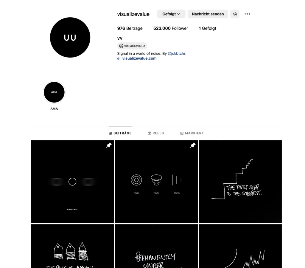
Source: Instagram @visualizevalue

Analyzation

Colors
They mostly use a black background and the elements or the typography is in white.

Black and white are often considered a highly effective color contrast in design and aesthetics. This classic color combination provides a strong visual impact, clarity, and a sense of simplicity. It is versatile and can be easily incorporated into various design contexts.

In terms of accessibility, black and white can be a good choice because of the high contrast they offer. This high contrast is particularly beneficial for individuals with visual impairments or color vision deficiencies. Black text on a white background, for example, provides a clear and readable visual experience for most people.

However, it’s essential to consider that the effectiveness of color contrast and accessibility can vary depending on the context and the specific needs of the audience. Some individuals may find other color combinations or contrast ratios more suitable for their particular visual requirements.

When designing for accessibility, it’s crucial to adhere to guidelines such as the Web Content Accessibility Guidelines (WCAG), which provide recommendations for creating content that is more inclusive and accessible to a diverse range of users. These guidelines include considerations for color contrast, text legibility, and ensuring that information is perceivable by all users, regardless of their abilities or disabilities.

Visual Elements
The Visualize Value Instagram posts consistently employ geometric shapes to convey their messages. Their design language incorporates circles, lines, triangles, graphs, arrows, rectangles, and easily recognizable iconic symbols.

The use of simple design elements, such as geometric shapes and iconic symbols, by Visualize Value can be attributed to several strategic considerations that enhance the effectiveness of their communication. Here’s an argumentation for why simplicity works well for them:

  1. Clarity of Message:
  • Simple design elements contribute to clarity in communication. Geometric shapes and iconic symbols are universally understood, transcending language and cultural barriers. This simplicity ensures that the message is quickly and easily comprehended by a diverse audience.
  1. Visual Consistency:
  • Consistency in visual elements creates a cohesive brand identity. By consistently using simple design elements across their content, Visualize Value establishes a recognizable and memorable visual identity. This consistency helps in building brand recall and trust.
  1. Accessibility:
  • Simple designs are often more accessible to a wider audience. They are visually straightforward and can be easily perceived by individuals with varying levels of visual ability. This aligns with accessibility principles, ensuring that their content is inclusive and reaches a broad spectrum of users.
  1. Scalability:
  • Simple designs are scalable across different platforms and mediums. Whether viewed on a small mobile screen or a larger desktop monitor, the clarity of geometric shapes and symbols is maintained. This scalability ensures that their content is effective and engaging across various devices.
  1. Focus on Content:
  • By keeping the design elements simple, Visualize Value directs the viewer’s focus toward the content itself. The emphasis is on the message, ideas, and insights they share, rather than on intricate or distracting visuals. This approach aligns with their goal of delivering valuable content without unnecessary embellishments.
  1. Timelessness:
  • Simple design tends to be timeless. By avoiding overly complex or trendy elements, Visualize Value ensures that their content remains relevant over time. This is important for a brand that focuses on providing enduring insights and wisdom.

In summary, Visualize Value’s use of simple design elements serves to enhance clarity, establish a strong brand identity, ensure accessibility, facilitate scalability, maintain a focus on content, and achieve a timeless quality in their visual communication. It aligns with their mission of delivering clear and valuable insights to a diverse audience.

Typography
Visualize Value employs a font that exudes a techy and somewhat typewriter-inspired aesthetic. Jack Butcher, in a X-post, mentioned their use of the T.26 Carbon font licensed from Adobe Fonts. More recently, they’ve introduced a handwritten font, a departure from their previous style, and, in my personal view, slightly distracting.

Upon closer examination of their page, a notable feature is the use of a relatively small font size. While this choice may pose potential accessibility concerns, it aligns with their overarching philosophy. The decision to employ a subtle and unobtrusive typeface appears intentional, possibly aimed at ensuring that information takes center stage over design aesthetics. This approach reflects a conscious effort to prioritize a seamless learning experience, minimizing potential distractions that could arise from a more prominent or eye-catching typography. However, it’s worth considering alternative strategies to maintain accessibility while preserving the focus on information, such as exploring font options that balance readability with an unobtrusive design.

Optimizing Communication in a World of Limited Attention: Jack’s Approach to Visual Storytelling and Reader Engagement
Jack has a penchant for employing visuals to narrate stories, as the title suggests. People naturally excel at internalizing pictures, and in today’s environment of constrained attention spans and an abundance of information, efficiency becomes imperative.

Customers lead busy lives, grappling with an abundance of information within finite time constraints. A substantial portion of individuals who click may not delve into the entire content; they typically click, browse briefly, and swiftly move on.

This is entirely acceptable. Recognizing that readers are essentially customers investing their valuable time, my responsibility is to provide the utmost value in return.

In addressing readers where they are, my task involves identifying the most efficient ways to 1) entertain, 2) engage, and 3) educate. This doesn’t always hinge solely on the use of words; sometimes, the most effective communication is achieved through the integration of visuals and images.

Notes & Observations summed up:

  • Consistency in Design and Wording: Black background, white font, lots of blank space, simple sayings(Helps the user focus on the content, builds his brand, speeds up his design process)
  • Common Visuals: Humans are predictable and like things that are pleasingly familiar, with a gentle touch of surprise. (Jack as well plays on common stories and visuals, which makes it easier to learn and remember them)
  • Clarity & Sharp Design to help teach and explain things to people
VARK learning style model

In the dynamic landscape of education, acknowledging and accommodating diverse learning preferences is crucial for effective teaching. If I want to bring an abstract topic such as Philosophy closer to a broader mass, I have to understand how people learn new things and which models exist. One prominent model for understanding these preferences is the VARK learning style model by Fleming, which identifies four distinct learning modes: visual (V), aural (A), read/write (R), and kinesthetic (K).
Short Overview of all Types

Visual Learners (V): Learn best by seeing graphic displays such as charts, diagrams, illustrations, handouts, and videos. They care about beauty and aesthetics, need to see information to appreciate it better, and pay close attention to body language.

Auditory Aural Learners (A): Learn best by hearing information. They tend to get a great deal out of lectures and are good at remembering things they are told. They prefer group discussions, lectures, Podcasts, and talking things through or talking out loud, as well as talking to oneself when studying.

Reading and Writing Learners (R): This type of learner prefers information that is displayed as words and text. They learn with manuals, reports, essays, and assignments. Also, they prefer working with PowerPoint, the internet, lists, diaries, dictionaries, thesauri, quotations, and words.

Kinesthetic Learners (K): Learn best by touching and doing. Hands-on experience is very important for that learning type. They prefer experiences, examples, practice or simulation, demonstrations, case studies, practice & applications. The key is the reality or concrete nature of the example. If it can be grasped, held, tasted, felt, it is considered experienced. They enjoy applied activities such as painting, cooking, mechanics, sports, and woodworking.

VARK Questionnaire Study

This study aimed to explore the learning preferences of first-year undergraduate medical students using the VARK questionnaire version 7.1.

Methodology:
Permission was obtained to distribute the 16-point multiple-choice VARK questionnaire to the targeted student cohort. The results were then analyzed to unveil patterns in learning preferences.

Key Findings:
Out of the respondents, 86.8% demonstrated multimodal learning preferences, indicating a combination of two or more styles. In contrast, 13.8% exhibited unimodal preferences, with kinesthetic being the highest at 7.7%. Notably, there were no participants identified as visual unimodal learners.

The most prevalent preferences were found in the bimodal category, with AK (33%) and AR (16.5%) being the highest percentages. Additionally, the ARK trimodal preference was observed in 8.9% of the participants.

Total individual scores in each category revealed auditory (A) and kinesthetic (K) preferences as the highest, while the visual mode (V) scored the lowest overall. No significant differences in preferences were observed between genders.

Conclusion:
This study emphasizes the diverse learning preferences among medical students, highlighting the necessity for educators to tailor their teaching methods accordingly. The findings suggest a departure from traditional, teacher-centric lecture methods towards a more interactive, student-centric multimodal approach. Implementing various modes of information presentation is essential to capture the attention and maintain the motivation of students with varying learning styles. This shift aligns with the evolving landscape of education and promotes an inclusive and effective learning environment.

sources:
Prithishkumar IJ, Michael SA. Understanding your student: using the VARK model. J Postgrad Med. 2014 Apr-Jun;60(2):183-6. doi: 10.4103/0022-3859.132337. PMID: 24823519.

thinkdev. (2022, February 5). VARK Styles of Learning [Video]. YouTube. https://www.youtube.com/watch?v=FBqtJJt_EZo

Gestalt Principles

In the 1920s, German psychologists Max Wertheimer, Kurt Koffka, and Wolfgang Kohler formulated the Gestalt Principles with the aim of comprehending how individuals organize and interpret the complex stimuli they encounter visually and auditorily.

Their focus was on unraveling the mystery of how people make sense of seemingly chaotic sensory inputs. To address this, they identified a set of principles that elucidate the innate human tendency to impose order on disorder. Essentially, the mind processes visual and auditory stimuli by perceiving a collection of individual elements as a unified whole.
Gestalt Principles found swift adoption among graphic designers who leveraged them to craft visually appealing designs characterized by strategically placed elements.

Essential to visual design, Gestalt Principles encompass over ten interrelated principles, with some being more commonly applied than others.

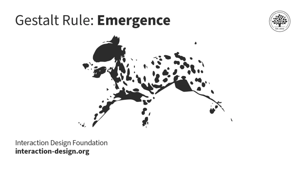
1. Emergence: Central to Gestalt thinking, the principle of emergence reflects our ability to perceive and understand the world without the need for exhaustive analysis of every minute detail. This rapid cognitive processing is crucial for survival, as spending excessive time analyzing our surroundings would have left our ancestors vulnerable to swift attacks from wild animals. We connect the dots and the Dalmatian emerges from the seemingly random scene.

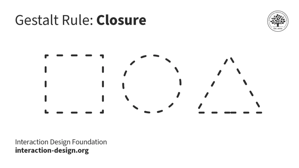
2. Closure: We prefer complete shapes, so we automatically fill the gaps between elements to perceive a complete image. That’s how we can see the whole first. You can use closure creatively to gain users‘ trust and admiration. Users will appreciate it when they see pleasing „wholes“ made from cleverly placed elements like lines, dots, or shapes.

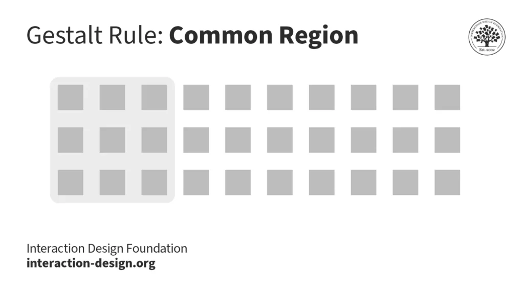
3. Common Region: We categorize elements within a shared enclosed area as a single group. To incorporate this principle into your interfaces, organize related objects together within a defined space to visually indicate their separation from other groups.

4. Continuity or Continuation: The Gestalt principle of continuity asserts that we tend to group elements that appear to form a continuous path in a specific direction. When observing a design, the human eye naturally tracks paths, lines, and curves, favoring a sense of uninterrupted visual flow over disjointed objects. Even when an obstacle conceals the path or visual elements intersect, the human eye persists in following the trajectory.

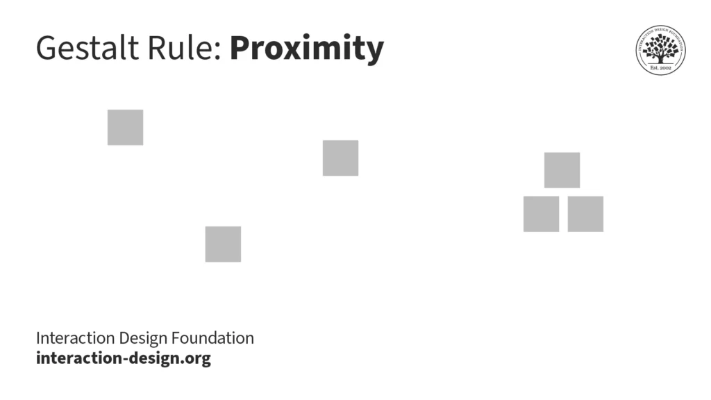
5. Proximity:We categorize elements that are closer together, distinguishing them from those positioned farther apart. When you assemble elements into groups within your design, users perceive them as a cohesive entity on the screen.

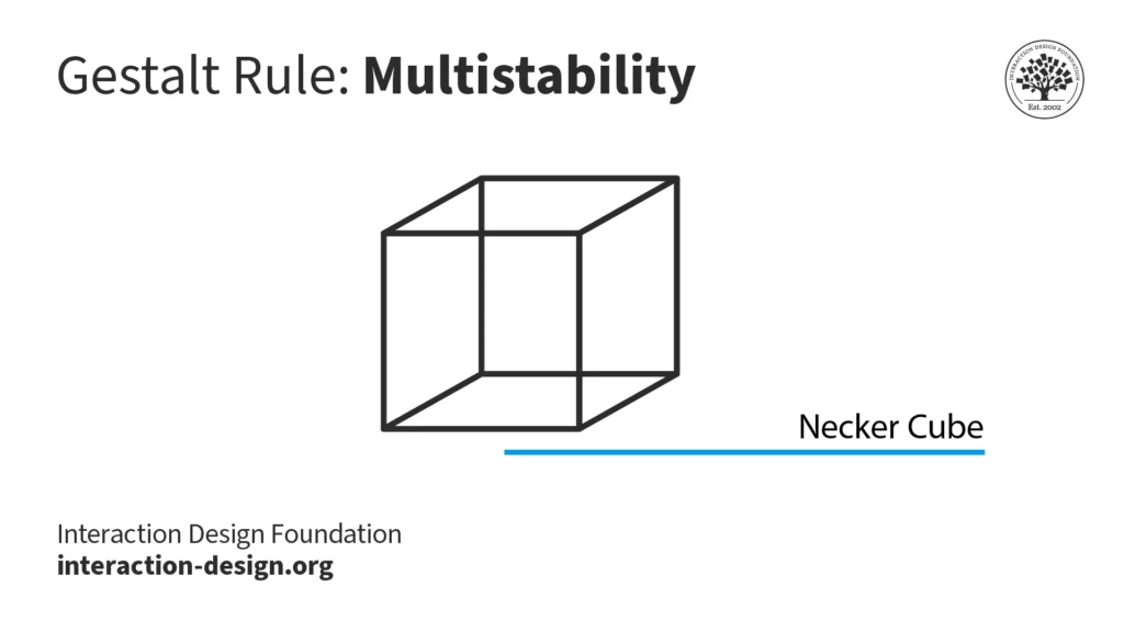
6. Multistability: When images possess ambiguity and offer two or more valid interpretations, we undergo the experience of alternating between these meanings. It’s not possible for us to perceive all the potential versions simultaneously. This phenomenon of transitioning between interpretations is referred to as multistability.

In the Necker cube optical illusion, you can interpret it as a three-dimensional cube with the „front“ face either toward the lower left or the top right. A third interpretation is that intersecting lines create a diamond in the center. Often, when we interpret the image one way, we find it hard to see the other interpretations.

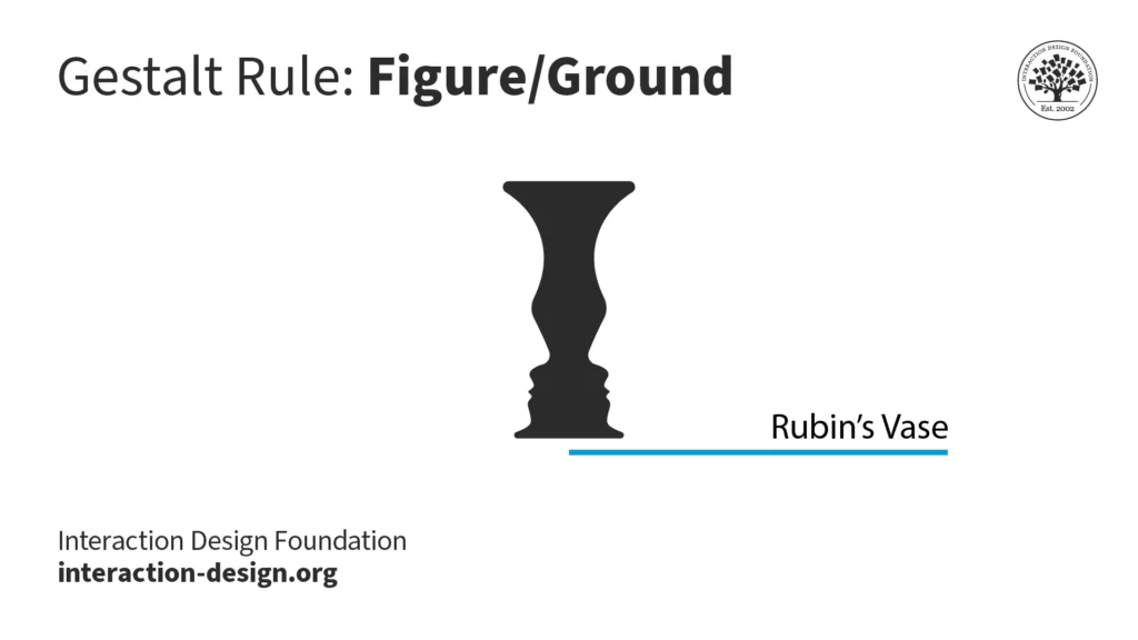
7. Figure/Ground: Our aversion to uncertainty leads us to seek out elements that convey solidity and stability. Except in cases of ambiguity, such as the iconic Rubin’s Vase, our initial perception tends to focus on the foreground of an image. The concept of figure/ground can be applied in various ways, primarily through contrasting elements—like employing light text (figure) against a dark background (ground). Effectively utilizing figure/ground, along with considerations like color theory, aids in guiding users through tasks and reducing cognitive load.

Rubin’s Vase is a classic illustration that demonstrates the principles of figure/ground and multistability. If you consider a white background, you see a black vase in the foreground. And if you consider a black background color, you see two faces looking at each other.

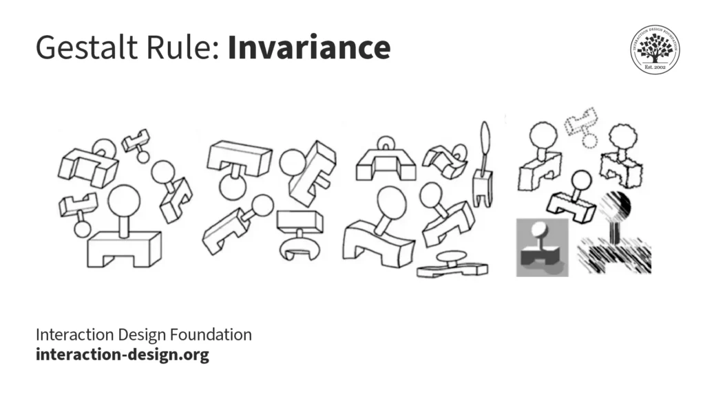
8. Invariance: The Gestalt principle of invariance elucidates our ability to perceive fundamental shapes as unchanged despite undergoing various transformations. These transformations encompass rotations, movements, changes in size, stretching, different lighting conditions, and alterations in parts. This principle plays a pivotal role in facial recognition. Through invariance, we can identify our friends and family members from a distance, different perspectives, or even when they make amusing facial expressions.

9. Pragnanz: Pragnanz captures the human inclination to simplify complexity. In a world where our senses are consistently inundated with stimuli, and our attention and processing capacity are limited, Pragnanz aids us in perceiving order and regularity amidst the visual competition.

When we see the Olympic rings, we see five interlocked rings instead of „C“ and lens shapes. The circles are simpler shapes to process than the C or lens shapes.

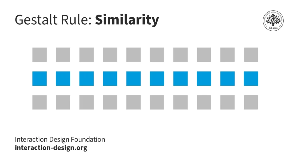
10. Similarity: When items, objects, or elements exhibit shared superficial characteristics, we interpret them as belonging to the same group. The principle of similarity is evident in branding and design system guidelines.

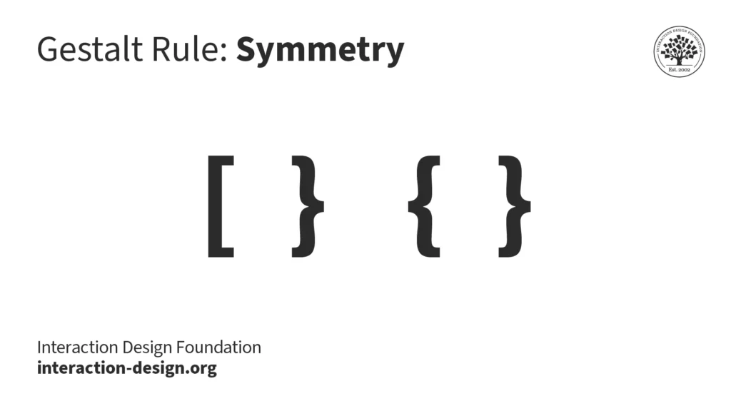
11. Symmetry and Order: Humans tend to see visual elements as grouped when they are arranged symmetrically. The natural world is filled with symmetry (or near symmetry), and our brains tend to favor symmetrical forms. Grid systems that evenly divide the space help designers implement symmetry and order in user interfaces.

Which of these shapes would you group together? Chances are, you’ll pick the matching square brackets instead of the mismatched curly and square bracket combination.

12. Common Fate: This principle denotes the human inclination to perceive visual elements moving in the same direction or synchronously as part of a group. Movement isn’t limited to actual motion; cues such as arrows or rotation angles can signify the perceived direction of movement among the elements.

Sources: Interaction Design Foundation – IxDF. (2016, August 30). What are the Gestalt Principles?. Interaction Design Foundation – IxDF. https://www.interaction-design.org/literature/topics/gestalt-principles

Part 2: Visualization (Vis) of Data

Visual Encoding
How to systematically analyze idiom structure?

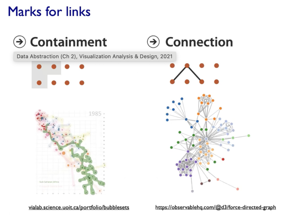
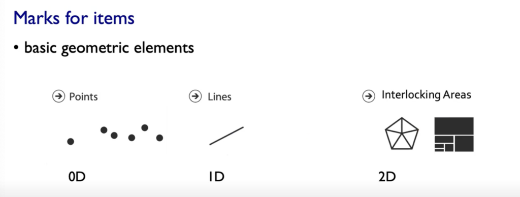
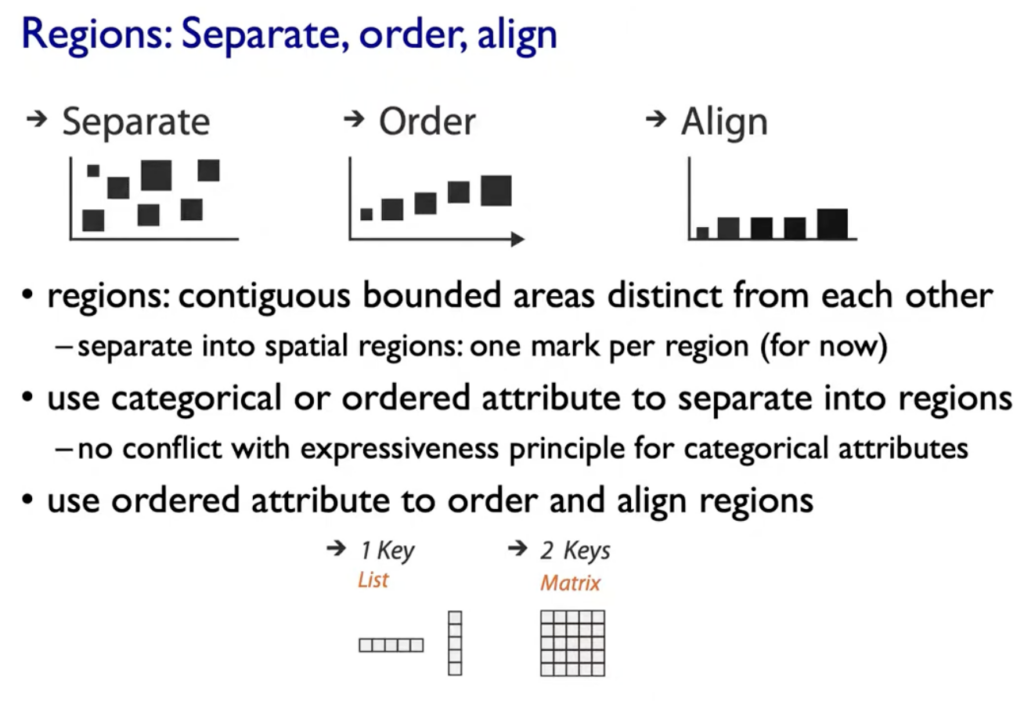
  1. Marks: represent Items or links, basic geometric elements or 3D Marks, can used to represent links (eg. Containment or Connection)
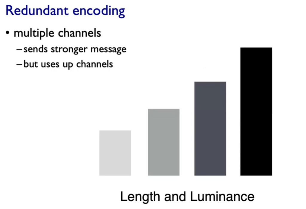
  2. Channels: Change appearance of marks based on attributes

Expressives & Effectiveness: When to use which channels

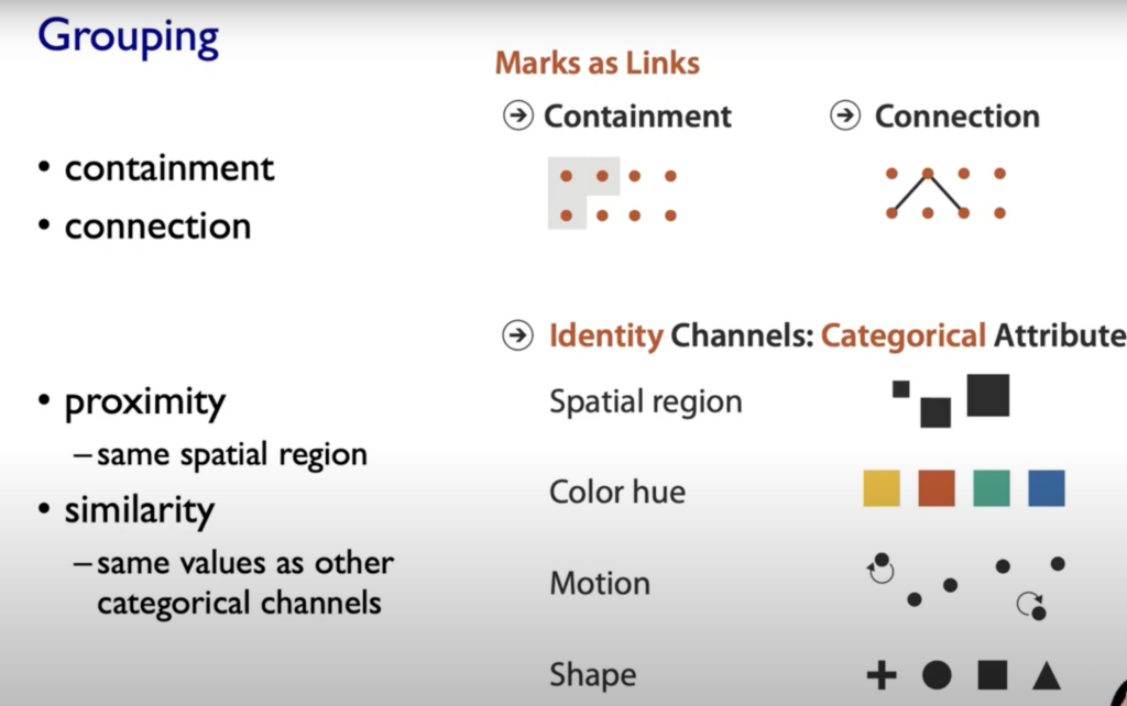
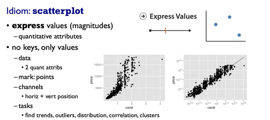
On left side (Magnitude Channels) your brain automatically thinks „how much reder is that or “ and „how much curvier ist that“. The Identity Channels (on the right side of the graphic below) convey Identiy eg. „What color is it“, „What motion is that“.

Spatial Postions are ranked really high on both Channels (Identity and Magnitude) and also the grouping of elements.

Popouts & Perception

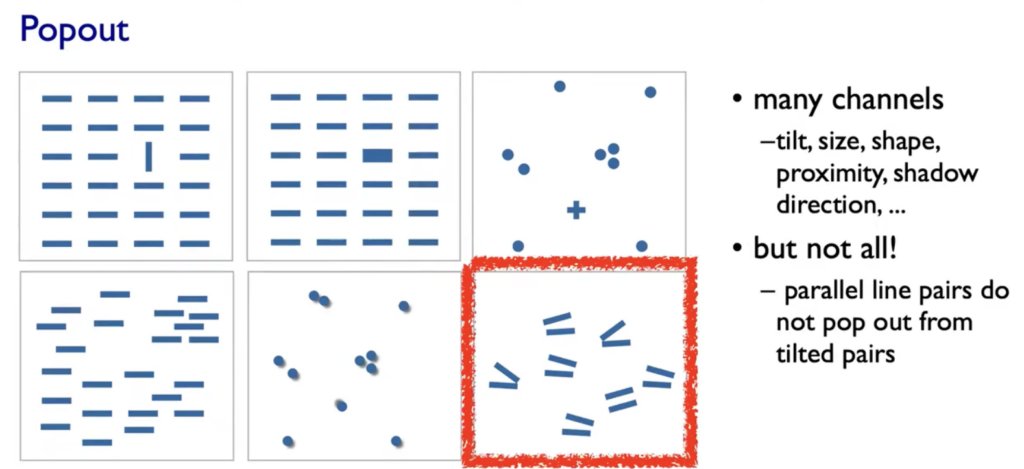
Our visual System is always parallel processing on many individual channels & serial search for (almost all) combinations. The perceptual system mostly operates with relative judgments, not absolute.

  • Aligment
  • Distractors
  • Distance
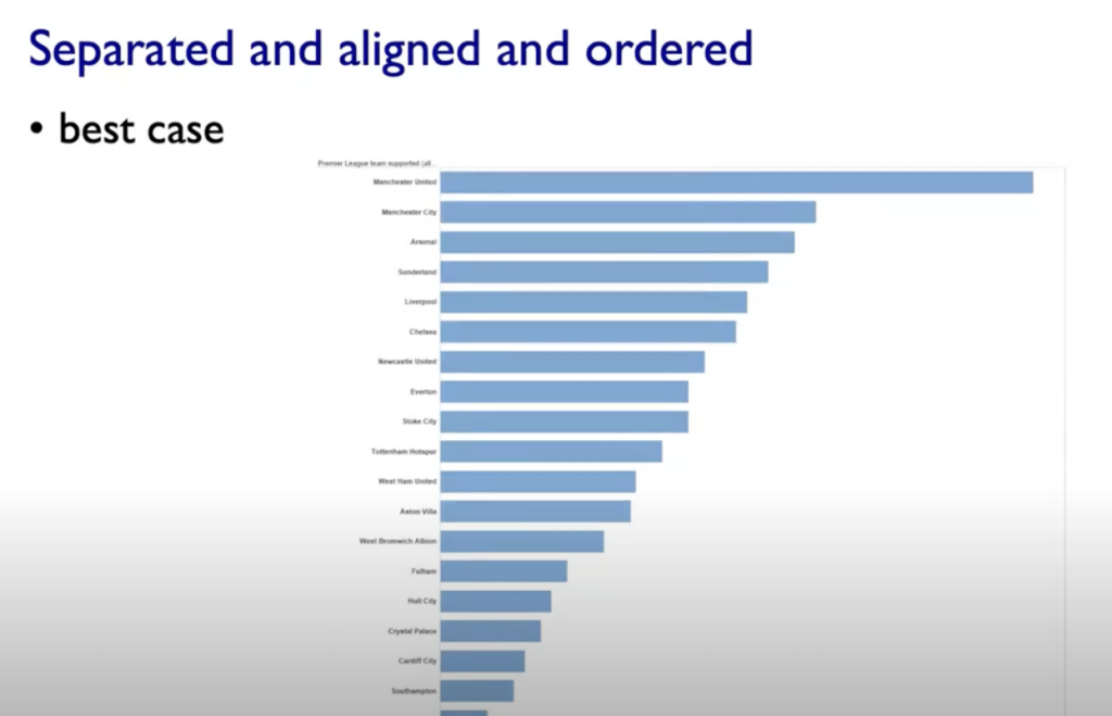
  • Common Scale/Alignment

Rules of Thumb

-unjustified 3D all too common in the news and elsewhere
– we don’t really live in 3D; we see in 2.05D (We can’t look through objects, we have to look around and move our body)
-perspective distortion: Perspective distortion happens when the size or shape of objects appears different than they actually are, based on the viewer’s position or the focal length of a camera.
-unjustified 2D: Especially if reading text is central task
-animation: great for choreographed storytelling, great for transitions between two states (Remember: Harder to compare visible item to memory of what you saw; with static side-by-side view you can compare easier)
– Overview First, zoom and filter, details on demand (Shneiderman)
– Responsiveness is required: 0.1sek perceptual processing(see the mouse), 1sek immediate response (fast response after mouseklick),10sek brief tasks
-Function first, form next: Focus on functinoality
– Axis: Label them; meaningful & useful title, legends

Tables

Color in Visualization
– Human perception built on relative comparisons
– limited number of discriminable bins (Rainbow is a poor default, nonlinear)
– make sure it is intrinsic (intrinsic ordering our Perception does e.g Hues, should be linear)
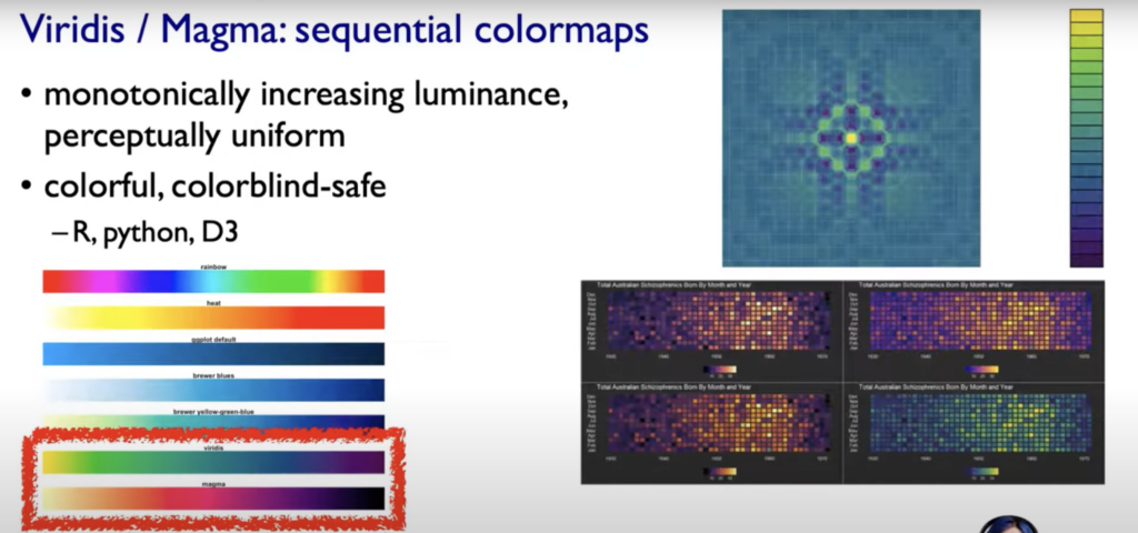
– For visual creator: fewer hues, fine structure (multiple hues with monotonically increasing luminance). Eg. Vridis/Magma Colormaps (see below)

Source:

Tamara Munzner. (2021, 06. November). Visualization Analysis and Design, 2021, All Lectures[Video]. YouTube. https://www.youtube.com/watch?v=KCqgErJbeXY

Part 1: Visualization (Vis) of Data

Tamara Munzner says the definition of visualization is: „Computer-based visualization systems provide visual representations of datasets designed to help people carry out tasks more effectively.“
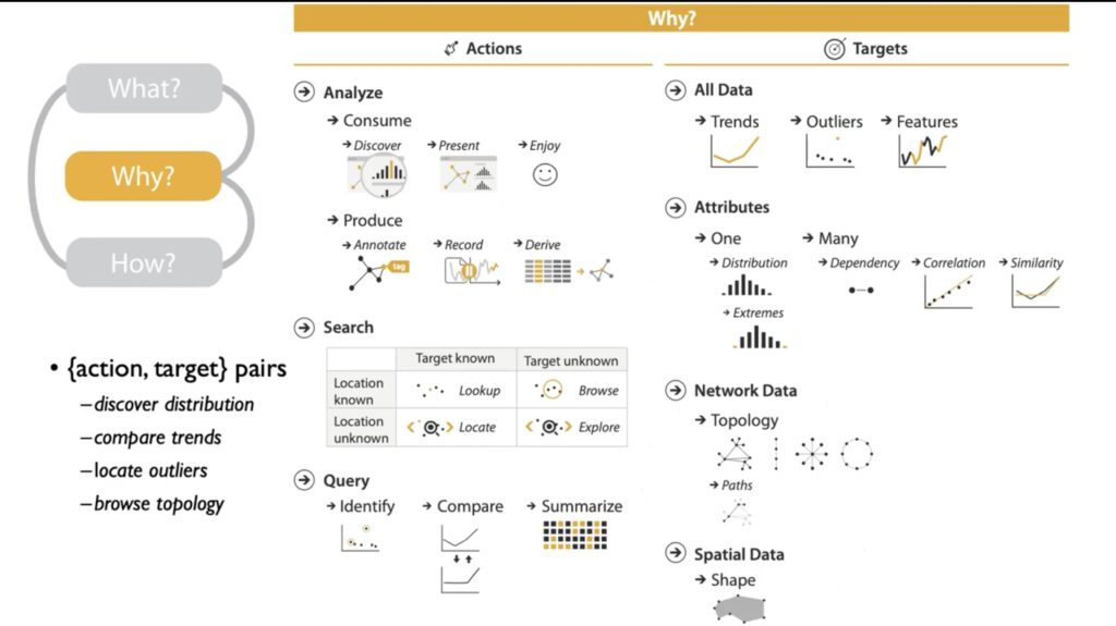
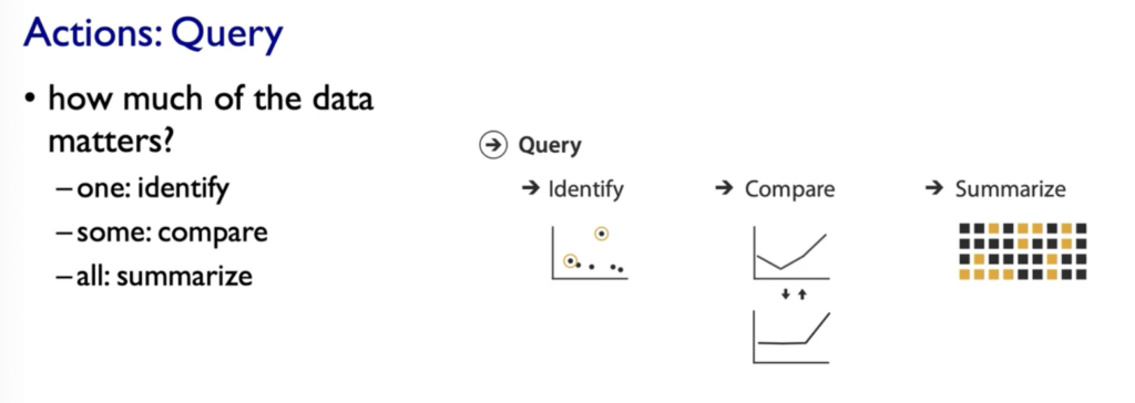
Why? Is It interesting?: Data and People in the same sentence

We do not need visualization when…: 
A) …fully automatic solution exists
B) …fully automatic solution exits and is trusted

Why use external representation?

  • external representation=replace cognition with perception
  • Replace cognitive Acts with perceptional acts in order to free up cognition for more interesting higher level questions 

Example Table full of Numbers:
– Goal is understand some overall structure of those Gene Expression levels
– to read a number, remember it, read the next number, remember that, compare to the other……… (We pretty fast would run out of short-term slots storage in our head) -> Cognitive Act that is quite demanding

Versus Replacing the cognition with perception

Why depend on vision?

Human visual system is high-bandwidth channel to brain. Overview possible due to background processing (subjective experience of seeing everything simultaneously, significant processing occurs in parallel and pre-attentively).

Why represent all the data?

Summaries often lose information, details matter. Visualization can confirm expected and find unexpected patterns. Also it asses validity of statistic model.

When we have data we need some real-world meanings (Semantics)

Resources Limitations?

  • Computational limits
  • Display limits: 1. pixels are precious & most constrained resource, 2. information density (ratio of space used to encode info vs unused whitespace, tradeoff between clutter and wasting space, find sweet spot between dense and sparse)
  • Human limits: human time, human memory, human attention (focus- attend)

Why analyze?

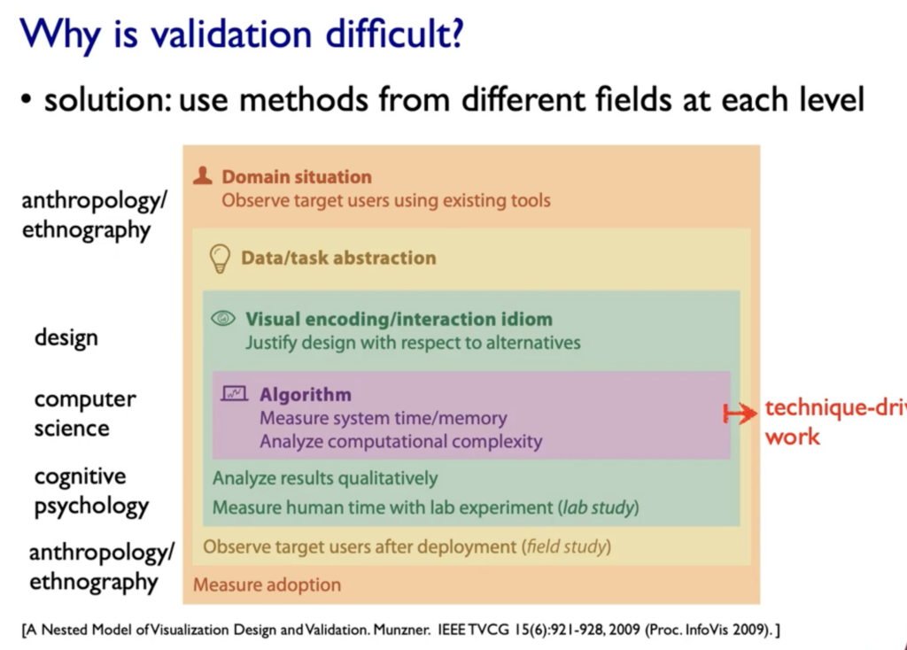
Imposes Structure on huge design space: Scaffold to help you think systematically about choices, analyzing existing as stepping stone to designing new, most possibilities ineffective for particular task/data combination

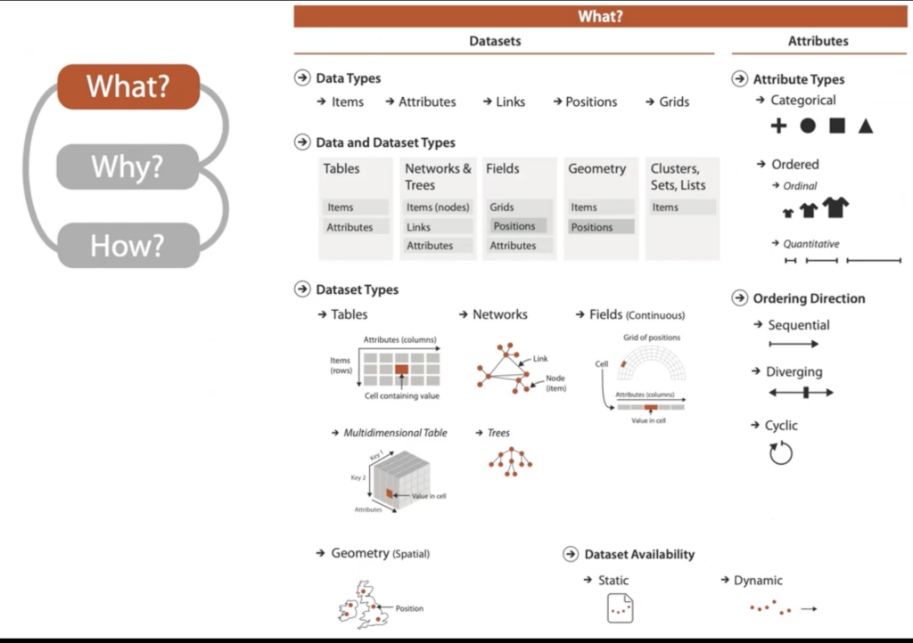
Dataset types

Tips: Figure out your Dataset Typ and understand mental construction (Semantics)

(Cyclic: e.g Seasonal Data or Direction of wind)

HOW TO START:

  1. Who Are The Target Users: ?
  2. What is Shown: Data Abstraction
  3. Why is the user looking at it: Task Abstraction
  4. How is it shown: Visual Encoding(how to draw it) & Interaction (how to manipulate) -> Part 2

Source:

Tamara Munzner. (2021, 06. November). Visualization Analysis and Design, 2021, All Lectures[Video]. YouTube. https://www.youtube.com/watch?v=KCqgErJbeXY

Overview of ten key philosophers

The article Zehn Denker kompakt (Maus, 2008) provides an overview of key philosophers from Plato to Wittgenstein. Here are the key points for each philosopher:

Plato (427-347 BC):

  • Biography: Disciple of Socrates, founded the Academy in Athens.
  • Core Thesis: Allegory of the Cave – Search for unshakable principles and Ideas.
  • Relevance Today: Call to seek truth beyond media, trust in the soul.

Aristotle (384-322 BC):

  • Biography: Student of Plato, tutor to Alexander the Great.
  • Core Thesis: Realism, emphasis on facts, systematization of science.
  • Relevance Today: Emphasis on knowledge for gaining understanding and maximal happiness.

René Descartes (1596-1650):

  • Biography: Mathematician, founder of analytical geometry.
  • Core Thesis: Mathematical method, systematic doubt, „Cogito, ergo sum“ („I think, therefore I am“).
  • Relevance Today: Emphasis on analytical thinking, courage for radical doubt.

Immanuel Kant (1724-1804):

  • Biography: Königsberg professor, intensive thinker.
  • Core Thesis: Critique of Pure Reason, emphasis on reason and ethical foundation.
  • Relevance Today: Ethical basis for a decent life, importance of reason.

Georg Wilhelm Friedrich Hegel (1770-1831):

  • Biography: Berlin professor, state philosopher.
  • Core Thesis: Dialectic – Thesis, Antithesis, Synthesis, search for the law of the world spirit.
  • Relevance Today: Belief in the power of the spirit, possibility of uniting opposites.

Arthur Schopenhauer (1788-1860):

  • Biography: Loner, misanthropic.
  • Core Thesis: Everything is suffering, redemption through detachment from the will.
  • Relevance Today: Pessimism but also a source of freedom through detachment from the will.

Søren Kierkegaard (1813-1855):

  • Biography: Nervous thinker, existential philosopher.
  • Core Thesis: Radical subjectivity, freedom through decisions.
  • Relevance Today: Emphasis on individual freedom and the necessity to make decisions.

Karl Marx (1818-1883):

  • Biography: Critic of capitalism, author of the „Communist Manifesto.“
  • Core Thesis: Economic relations determine history, class struggle, communism.
  • Relevance Today: Analysis of economic structures, relevance for understanding society.

Friedrich Nietzsche (1844-1900):

  • Biography: Sensitive character, creator of the Übermensch.
  • Core Thesis: Revaluation of all values, „God is dead,“ Übermensch.
  • Relevance Today: Critique of traditional values, challenge to create new values.

Ludwig Wittgenstein (1889-1951):

  • Biography: Constructivist, lived simply, intense thinking phases.
  • Core Thesis: Language analysis, focus on clear core statements about facts.
  • Relevance Today: Philosophy decluttering, emphasis on clear language, avoidance of metaphysical questions.

Source:

Maus, Stephan (26.11.2008, 17:16). Zehn Denker kompakt. Stern. https://www.stern.de/panorama/wissen/mensch/philosophie-zehn-denker-kompakt-3749076.html

Why do we need Philosophy (from a designer’s perspective)?

Philosophy serves several important functions in human intellectual and cultural development. While it may seem abstract at times, its abstract nature is a product of its pursuit of fundamental questions about existence, knowledge, values, reason, mind, and language. Philosophy is important for designers for several reasons, as it can significantly enhance their approach to problem-solving, creativity, and the overall design process. Here are some key reasons why philosophy is valuable for designers:

  1. Critical Thinking: Philosophical training encourages critical thinking and the examination of assumptions. By questioning and analyzing concepts, arguments, and beliefs, individuals can develop better reasoning skills and make more informed decisions.
  2. Ethical Considerations: Design choices can have significant ethical implications, especially when it comes to user experience, environmental impact, and societal well-being. Philosophical inquiry into ethics can guide designers in making responsible and morally sound decisions.
  3. Understanding User Experience: Philosophy can help designers understand the human experience on a deeper level. Exploring questions related to perception, consciousness, and meaning can inform design choices that resonate with users on a more profound level.
  4. Aesthetic Exploration: Philosophical discussions on aesthetics and beauty can inspire designers to think more deeply about the visual and sensory aspects of their work. Understanding different theories of aesthetics can broaden a designer’s perspective on what is considered visually appealing.
  5. Cultural and Social Awareness: Philosophy often intersects with cultural and social issues. Designers who engage with philosophical ideas can develop a heightened awareness of cultural contexts, social norms, and diverse perspectives, leading to more inclusive and culturally sensitive designs.
  6. Interdisciplinary Insights: Philosophy is interdisciplinary and can connect with various fields such as psychology, sociology, and technology. Designers who draw on philosophical insights can create more holistic and integrated solutions by incorporating knowledge from different disciplines.
  7. Problem Framing: Philosophers are skilled at framing and reframing problems, a skill that is crucial for designers in defining design challenges and understanding the underlying issues they aim to address. Philosophy can help designers articulate and approach problems in a more nuanced way.
  8. Innovation and Creativity: Philosophy encourages thinking beyond conventional boundaries. Designers who engage with philosophical ideas may be more inclined to think creatively, challenge assumptions, and push the boundaries of traditional design thinking.
  9. Communication Skills: Philosophical training often involves effective communication of complex ideas. Designers who can articulate and communicate their design rationale, principles, and concepts more clearly can foster better collaboration with team members and stakeholders.
  10. Long-Term Vision: Philosophy often deals with long-term and timeless questions. Designers who incorporate philosophical thinking into their practice may develop a more forward-thinking and visionary approach, considering the enduring impact of their designs.

In summary, philosophy enriches the designer’s toolkit by fostering critical thinking, ethical awareness, cultural understanding, and interdisciplinary insights. By engaging with philosophical ideas, designers can enhance their ability to create meaningful, innovative, and ethically sound designs that resonate with users and contribute positively to society.

Translating philosophical concepts

Translating philosophical concepts into visual designs can be a creative and effective way to communicate complex ideas to a wider audience. Here are some tips on how to make philosophical concepts visible through infographics, posters, or graphic design:

  1. Simplify and Clarify:
    • Identify the core elements of the philosophical concept and simplify them. Break down complex ideas into clear, digestible components.
    • Use straightforward language and avoid jargon. The goal is to make the concept accessible to a broad audience.
  2. Visual Metaphors:
    • Employ metaphors or analogies that can represent the key aspects of the concept visually. Analogies can bridge the gap between abstract ideas and concrete images.
    • For example, if discussing the concept of interconnectedness, you might use a visual metaphor like a web or a network of nodes.
  3. Iconography:
    • Create or choose icons that symbolize different elements of the concept. Icons can serve as visual shorthand, making it easier for viewers to grasp the meaning.
    • Ensure that the chosen icons are universally recognizable and aligned with the essence of the philosophical concept.
  4. Flowcharts and Diagrams:
    • Develop flowcharts or diagrams to illustrate the logical flow or connections between different components of the concept. Visualizing relationships can enhance understanding.
    • Use arrows, lines, and shapes to guide the viewer through the sequence of ideas or the structure of the concept.
  5. Color and Typography:
    • Use color to evoke emotions or highlight specific elements of the concept. Choose a color palette that complements the mood or theme of the philosophical idea.
    • Experiment with typography to emphasize key words or phrases. Different fonts and sizes can convey hierarchy and importance.
  6. Narrative Storytelling:
    • Tell a visual story that unfolds as viewers progress through the infographic or poster. Use a sequence of images to guide them through the development or evolution of the concept.
    • Incorporate captions or brief explanations to provide context and continuity.
  7. Contrast and Emphasis:
    • Create visual contrast to highlight important elements. Use contrast in color, size, or style to draw attention to key points within the design.
    • Ensure that the most critical aspects of the concept are visually prominent.
  8. Interactive Elements:
    • If possible, add interactive elements to engage viewers. This could include clickable sections, pop-ups with additional information, or animated sequences that unfold as the user interacts with the design.
  9. Cohesive Design:
    • Maintain a cohesive design throughout the infographic or poster. Consistent use of colors, fonts, and styles helps create a unified visual language that enhances overall comprehension.
  10. User Testing:
  • Before finalizing your design, gather feedback from potential viewers. Conduct user testing to ensure that the visual representation effectively communicates the intended philosophical concept.

Remember that the goal is not only to make the concept visually appealing but also to enhance understanding. Balancing creativity with clarity is key to creating effective visual representations of philosophical ideas.

To make philosophy more accessible and relevant, focus on:

  1. Practical Applications: Highlight real-world applications and how philosophical concepts can address everyday challenges, making the subject more relatable.
  2. Interactive Platforms: Utilize interactive and engaging platforms, such as apps or social media, to encourage participation and discussion around philosophical ideas.
  3. Visual Representation: Create visually appealing and easily understandable infographics, videos, or other visual content to convey complex philosophical concepts in a more accessible manner.
  4. Conversational Tone: Use a conversational and approachable tone in written or spoken communication to demystify philosophy and make it more inviting to a broader audience.
  5. Relate to Modern Issues: Connect philosophical discussions to contemporary issues, showing how philosophical thinking can provide insights and solutions to current societal challenges.
  6. Collaborative Learning: Foster a sense of community and collaborative learning through forums, discussion groups, or workshops where people can share their perspectives and learn together.
  7. Multimedia Platforms: Utilize various multimedia platforms, such as podcasts and online courses, to cater to different learning preferences and reach a wider audience.
  8. Storytelling: Use storytelling techniques to narrate philosophical ideas, making them more engaging and memorable for a diverse audience.
  9. Integration with Other Disciplines: Emphasize the interdisciplinary nature of philosophy, showing its connections to fields like science, technology, art, and psychology.
  10. Accessible Language: Avoid unnecessary jargon and use language that is clear, concise, and easily understandable, making philosophical concepts more approachable.

By combining these strategies, you can help people perceive philosophy as a relevant and accessible tool for personal growth, critical thinking, and navigating the complexities of modern life.

Source:

ChatGPT

The Power of Images Explained Through a PR Example: Why We Prefer to Look Than to Read

A glance at today’s communication landscape reveals that pictures can speak more than a thousand words – and for good reason. In a world where attention spans are diminishing and visual stimuli are on the rise, images are gaining increasing importance in PR. The article Bildeigenschaften – wir schauen lieber als wir lesen (Adlmaier-Herbst 2013) illustrates why people prefer images and underscores their crucial role in public relations.

The loss of interest without images is a common phenomenon, whether it’s reading brochures or browsing the internet. Reading requires effort, and more and more people are reluctant to invest that effort. The visual element is gaining ground because it is perceived and processed more quickly. In presentations, we often remember only images and key phrases, not text deserts. Images have the unique ability to convey emotions more vividly and memorably than texts.

The advantages of images in PR are diverse. They stand out, activate quickly, are easily absorbed, and processed. A glance at an image is enough to form an initial impression, and we can remember images well even after brief observation. Images can convey emotions better and evoke intense experiences by engaging different senses. They are more convincing than text and can influence attitudes, opinions, and even behavior.

Particularly interesting is the unconscious processing of images, which strongly influences opinion formation. Politicians are evaluated in seconds based on visual impressions, regardless of their political expertise. (experiment by social researcher Siegfried Frey, showed students from Germany, France and the USA 180 film clips of 60 politicians from the TV news in the three countries. The clips contained short speech excerpts from these politicians, with the sound switched off. In just a few seconds, the test subjects formed a comprehensive judgment of the politicians. It did not matter whether they knew the politician or not.) This emphasizes the importance of unconscious processes in PR.

In the future, PR will need to focus more on these unconscious processes to fully understand the impact of images. The power of images in PR is not only evident but also profound, and it is up to communication professionals to skillfully harness this power. In a world of rapid consumption, images capture attention that text alone often cannot reach.

Let’s look at some numbers:

In a mere 0.1 seconds, our minds can conjure a rough impression beneath an image. Within a single second, we can swiftly recognize 5 images in rapid succession – a feat not achievable with a critical mindset. Devoting just 2 seconds to observing an image is adequate for secure later recognition. Therefore, for swift and effective communication, the emphasis should be on visuals.

When we contrast the reception of images and texts, an image advertisement captures attention for approximately 1.7 to 2 seconds. Within this brief period, observers grasp around 5 percent of the information; comprehending the entire content would demand 35 to 40 seconds. What is assimilated within the initial 2 seconds? A staggering 76 percent pertains to the image, 16 percent to the headline, and a mere 8 percent to the text. Viewers absorb 50 to 70 percent of the visual information but only 2 percent of the textual information – roughly equivalent to 6 to 7 words.

Insight for my research project: If I want complex content or content in general to be not only understood but also remembered, it would make sense to present it using graphics/pictures. As this article shows, many people prefer visual elements because they are processed faster and require less energy. The advantages of images are their eye-catching nature, quick impact, easy absorption, persuasive power, longer-term retention, and ability to convey intense emotions.

Source:

Adlmaier-Herbst , Prof. Dr. Dieter Georg (2013, February 7th). Bildeigenschaften – wir schauen lieber als wir lesen. https://edition.cnn.com/entertainment/game-of-thrones-timeline-history-cec/index.html.

Christoph Biemann’s 43-minute lecture on „How to explain complex topics in an easily understandable way“ :

A Summary by Hannah Milchrahm

Christoph Biemann is a German author, director and actor. He is one of the presenters of the TV show „Sendung mit der Maus“ and one of the experts on the quiz show „Frag doch mal die Maus“.
To explain complex topics in a way that is easy to understand, Christoph Biemann emphasizes several key points:

  1. Start where understanding already exists and „pick up“ the audience by incorporating familiar elements (e.g. Sendung mit der Maus wanted to teach children about Chernobyl. To „pick up“ the children, they began the episode with a reference to a playground and said: „Unfortunately, you can no longer play on this playground“ (because the playground was in Chernobyl). The children were immediately picked up with what they „knew“ and became attentive.
  2. Take the audience on a journey by telling a story and asking the right questions. Use mirror neurons to evoke empathy and use heroes to shape the story.
  3. Pay attention to dramaturgy and use analogies to make complex concepts more accessible.
  4. Recognize that people, especially children, are naturally open to learning.
  5. It is essential to familiarize yourself thoroughly with the subject in order to explain it well and simply. A deep understanding of the subject matter is a prerequisite.
  6. Ask yourself what can be left out and what is crucial to get the main message of the topic across.

Hydrogen drive explained simply (KLUG – Klimawandel und Gesundheit. , 2022, 24:40–25:50).


Personal insight that I gained from Mr. Biemann’s lecture

If I want to present a complex topic in a simple and understandable visual way, I have to be a professional in the field. Because you should be so well versed in the subject that you can explain it well (and simply) so that even children can understand it.
My problem: very complex (scientific) concepts that were originally planned automatically fall out of my list (unless the level of complexity is not too high) & I will most likely go for a topic that is less science-based and more philosophy-based. In this regard, I have already thrown myself into the first philosophical doctrine, Stoicism.

Another aspect emphasized by this lecture is that in order to make complex topics simpler and easier to understand, one should make use of simple elements (see above, explanation of hydrogen propulsion using simple means). In terms of design, this means: Icons & simple graphics


KLUG – Klimawandel und Gesundheit. (2022, 02. Juni). 5. PHA #5 Transformative Kommunikation II: „Wie erkläre ich komplexe Themen leicht verständlich?“[Video]. YouTube. https://www.youtube.com/watch?v=KCqgErJbeXY

Different Topic Exploration

Topic 1:

Enhancing Understanding of Philosophical Concepts and Scientific Research through Visual Representation

In this topic, I could delve into how visual representations, such as infographics, posters, and illustrations, can help make complex philosophical concepts and scientific research more understandable for the general population. This could be exemplified using specific cases like Boxbreathing, Nietzsche’s Nihilism, swarm behavior, and more. I would analyze how the use of such visual representations contributes to improving comprehension. Additionally, I could explore the influence of platforms like Visualize Value and how they effectively visualize these concepts. Final product could be a guide: making complex content understandable

Example: explanation of a wormhole

The Telegraph. (2014, 03. November). Science behind Interstellar explained: what actually is a wormhole? [Video]. YouTube. https://youtu.be/jwxdsDP5nO4

Example: Visualize Value

Nov 15, 2022 by Jack Butcher (2019). Visualize Value. https://doi.org/10.1177/15270025000010030486

Topic 2:

The Evolution of Graphic Design in the Fashion Industry: Influence and Significance

For this topic, I could investigate the role of graphic design in the fashion world and its impact on the industry’s development. This would encompass tracking historical developments in graphic design within the fashion sector and how they manifest in editorial work, social media, and merchandising. I might also analyze prominent designers and brands that stand out in the fashion industry due to exceptional graphic design, and investigate how these design principles affect brand perception and success

Topic 3:

How can meditative art in graphic design help promote mindfulness and inner calm, and what effects does visual meditation have on emotional wellbeing and cognitive performance?

Visual implementation: posters, analysis of apps such as Calm/Headspace and analysis of Monet’s Water Lillies, analysis of how different layout or color can create calm or restlessness.
Area of research: meditation (origins, historical), artists who have also seen mediation as useful, meditation and performance enhancement