IMPULS #3 – Gespräch mit Gabriele Lechner

Am 13. November 2024 hatte ich die Möglichkeit, meine Ideen für die Masterarbeit mit Gabriele Lechner zu besprechen. In einem sehr konstruktiven Gespräch ging es nicht nur um das Thema, das ich mir ausgesucht hatte, sondern auch um den methodischen Ansatz und das mögliche Feedback, das mir helfen sollte, die nächsten Schritte klarer zu definieren.

Mein Thema im Detail

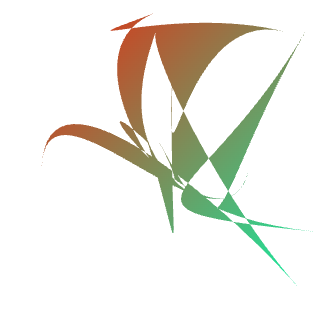
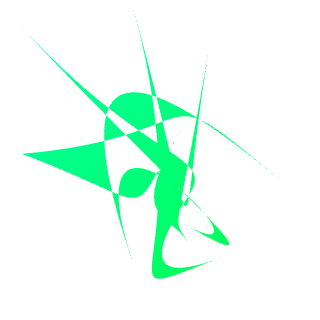
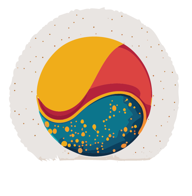
Ich habe Frau Lechner mein Thema vorgestellt: „Ordnung und Chaos in Grafik Design“. Für mich ist es eine faszinierende Herausforderung, zwei gegensätzliche Konzepte wie Ordnung und Chaos miteinander zu verbinden und im Kontext des Grafikdesigns zu untersuchen. Ich hatte jedoch Zweifel, ob ich mit einem so weiten Thema weiterarbeiten sollte und fragte mich, in welche Richtung ich es am besten lenken könnte.

Frau Lechner fand das Thema äußerst interessant und betonte, dass die Verknüpfung von Ordnung und Chaos im Designprozess noch wenig erforscht sei. Besonders den interaktiven Ansatz, sowohl Designer als auch Nicht-Designer in Experimente einzubeziehen, hielt sie für eine ausgezeichnete Idee. Diese Perspektive könnte helfen, unterschiedliche Wahrnehmungen und Ansätze zu verdeutlichen, was sowohl für die Theorie als auch für die Praxis von großem Wert ist.

Feedback und Überlegungen

Im Gespräch gab es auch wertvolle Hinweise zur Methodik. Frau Lechner hat mir vorgeschlagen, dass ich neben der wissenschaftlichen Recherche auch philosophische Fragestellungen in meine Arbeit einfließen lassen könnte. Ordnung und Chaos sind sehr subjektiv und individuell wahrgenommene Konzepte, weshalb eine philosophische Auseinandersetzung mit diesen Begriffen eine tiefere Dimension in meine Arbeit bringen würde. Sie meinte, dass die Betrachtung dieser Begriffe aus einer philosophischen Perspektive interessante Einsichten darüber liefern könnte, wie Menschen diese Konzepte im kreativen Prozess wahrnehmen und anwenden.

Darüber hinaus fand sie den interaktiven Ansatz mit Designern und Nicht-Designern sehr gut und stellte fest, dass dies eine spannende Möglichkeit sein könnte, unterschiedliche Reaktionen und Einstellungen zu erfassen. Sie hat vorgeschlagen, noch mehr darauf einzugehen, wie diese Konzepte im kreativen Designprozess eingesetzt werden und wie sie zu neuen Perspektiven in der Gestaltung führen können.

Neue Perspektiven

Dieses Gespräch hat mir nicht nur geholfen, Klarheit über meine Vorgehensweise zu gewinnen, sondern auch neue Perspektiven eröffnet, wie ich das Thema weiterentwickeln kann. Besonders die Anregung, philosophische Fragestellungen mit einzubeziehen, hat mich motiviert, mein Thema noch weiter zu vertiefen. Es öffnet neue Räume für kreative und theoretische Überlegungen, die der Arbeit eine zusätzliche Tiefe verleihen werden.

Ich bin nun sehr überzeugt, dass ich das Thema mit einer klareren Richtung und neuen Ideen weiterverfolgen kann. Das Feedback von Frau Lechner hat mir den nötigen Impuls gegeben, um mit frischem Schwung und einer neuen Perspektive in die nächste Phase meiner Masterarbeit zu starten.

IMPULS #2 – KLANGLICHT 2024

Am Samstag, den 26. Oktober 2024, hatte ich die Gelegenheit, das Kunstfestival KLANGLICHT in Graz zu besuchen. Dieses Jahr widmete sich das Festival den äußerst interessanten Welten der Träume – ein Thema, das mich als Grafikdesign-Studentin sofort neugierig machte. Träume bewegen sich oft an der Grenze zwischen Ordnung und Chaos, Realität und Fantasie, und ich konnte es kaum erwarten, diese künstlerischen Interpretationen mit meinem eigenen Master-Thema zu verbinden und Inspirationen zu sammeln.

Licht und Klang im Zusammenspiel

Die Straßen und Plätze der Grazer Innenstadt erstrahlten im Lichterglanz. Jede Installation entführte in eine andere Traumwelt: mal subtil und eher poetisch, mal beeindruckend und voller Kontraste. An dieser Stelle möchte ich meine persönlichen Eindrücke zu einigen der Werke teilen.

REVERSE

Am Uhrturm zeigte Yann Nguema seine Installation „Reverse“ – ein wortwörtlich traumhaftes Spiel mit Raum und Zeit. Fraktale überlagerten sich, um komplexe und leuchtende Bilder zu formen, die sich ständig veränderten. Ich war fasziniert, wie das Zusammenspiel von Chaos und Ordnung zu einer visuellen Sprache wurde. Diese Installation erinnerte mich daran, dass auch im Design das Zusammenspiel von Struktur und Zufall zu interessante Ergebnisse führen kann.

EINDER / surface

In den Kasematten habe ich mir die Installation „Einder“ von Boris Acket angeschaut – eine leuchtende, sich bewegende Welle, die durch ihre Audiokulisse aus synthetischen und organischen Klängen zu eine ruhige aber bezaubernde Erlebnis führte. Die Installation wirkte beruhigend und “verstörend” zugleich. In der Bewegung der Wellen entdeckte ich ein faszinierendes Zusammenspiel von Ordnung und Chaos. Es erinnerte mich daran, wie oft ich im Design Prozesse kontrolliere, aber dennoch Raum für Unvorhergesehenes lasse, um lebendige Ergebnisse zu schaffen.

SOT GLAS

Das physische und sprachliche Labyrinth „Sot Glas“ von Ana Shametaj und Giuditta Vendrame war eine Reise durch traumhafte Schwerelosigkeit und gemeinsames Erleben. Besonders eindrücklich war der Übergang von einem offenen, lichterfüllten äußere Raum zu einem warmen innere “Klangraum”. Es fühlte sich an, als würde man in einen Traum eintauchen, der sich langsam auflöst und neu formt. Diese Mischung aus Persönlichem und Gemeinschaftlichem hat mich dazu inspiriert, über das Spannungsfeld zwischen persönlichem Ausdruck und allgemeinem Verständnis im Design nachzudenken.

CONSTELLATIONS

Die „Constellations“ von Detlef Hartung und Georg Trenz verwandelten die Festungsmauer am Schlossberg in ein Spiel aus Licht und Sprache. Die Verbindung von Himmel und Erde, von Weitblick und Standpunkt, inspirierte mich dazu, darüber nachzudenken, wie wir im Design Räume schaffen können, die zugleich geordnet und frei interpretierbar sind. Es war, als ob die Installation uns fragte: Wo befinden wir uns im großen Ganzen?

SPEKTRUM

Als Communication Design Studentin war ich natürlich besonders gespannt auf „Spektrum“, eine immersive Licht- und Klanginstallation von Studierenden der FH JOANNEUM. In der Antoniuskirche entstanden Räume, die Harmonie und Chaos sowohl emotional als auch visuell miteinander verknüpften. Die Vielfalt und Experimentierfreude der gezeigten Visuals machten diese Installation zu meinem persönlichen Highlight. Sie hat mich inspiriert, meine eigenen Grenzen im Umgang mit Ordnung und Chaos noch weiter zu verschieben – und vor allem mutiger zu sein.

FLORA

„Flora“ an der Fassade des Schauspielhauses war eine interaktive Installation, die man selber über einem Tablet steuern konnte. Abstrakte Linien verwandelten sich in komplexe, ständig wechselnde Formen – manchmal fließend harmonisch, manchmal kantig und chaotisch. Dieses Werk zeigte eindrucksvoll, wie Interaktivität und Technologie die Persönlichkeit der Betrachtenden sichtbar machen können.

VISUAL PIANO IM DOM

Im Grazer Dom faszinierte mich Laurenz Theinerts „Visual Piano“ besonders durch den starken Kontrast zwischen den chaotischen, bunten Projektionen und der klaren, geordneten Architektur der Wände. Die farbenfrohen, sich ständig verändernden grafischen Formen wirkten wie visuelles Chaos, das die präzise Planung des Raumes spielerisch herausforderte.

Dieser Gegensatz regte mich zum Nachdenken über Ordnung und Chaos an, die oft als Gegensätze betrachtet werden, aber in Wirklichkeit miteinander verschmelzen können.

UNVEILED

Ein weiteres Lieblingswerk war „Unveiled“ von OchoReSotto. Die Projektionen in der Grazer Oper spielten mit der Fragmentierung und Rekomposition von Bildern in Kombination mit Musik. Der Übergang von festen Strukturen zu surrealen Landschaften erinnerte mich daran, wie Design oft Realität und Illusion gleichzeitig darstellen kann. Es war ein Spiel mit Wahrnehmung, das meinen eigenen kreativen Prozess reflektierte: Wo endet die Kontrolle, und wo beginnt das Chaos, das wir kreativ nutzen können?

Fazit: Kunst als Inspiration für das Design

KLANGLICHT 2024 hat mich auf viele Arten inspiriert. Die Installationen waren nicht nur beeindruckend schön, sondern regten auch dazu an, über die eigenen Träume, Grenzen und kreativen Prozesse nachzudenken. Besonders die Gegenüberstellung von Ordnung und Chaos in vielen Werken hat mir gezeigt, wie wichtig es ist, im Design sowohl Struktur als auch Freiheit zuzulassen.

IMPULS #1 – Bewertung einer externen Masterarbeit

Autor: Martin Naumann
Titel: Zufall und Design
Erscheinungsjahr: 2023
Institution: Hochschule Anhalt
Studiengang: Intermediales Design


  1. Gestaltungshöhe:
    Die gestalterische Umsetzung der Masterarbeit ist durchweg ansprechend und gut durchdacht. Die visuelle Darstellung der Inhalte ist klar und gut strukturiert, was dem Leser hilft, auch komplexe Themen wie Zufall und Chaos leicht zu verstehen. In der Arbeit werden Gestaltungselemente wie Infografiken, Illustrationen und interaktive Medien genutzt, die visuell ansprechend und funktional sind. Die visuelle Identität der Arbeit ist kohärent, Typografie, Layout und Farbauswahl unterstützen den inhaltlichen Fluss und sorgen für eine harmonische Gesamtästhetik. Insgesamt zeigt die Arbeit eine kreative und professionelle Umsetzung, die sowohl inhaltlich als auch visuell überzeugt. Einziger Kritikpunkt ist das Buchcover, da der Titel auf dem Cover nicht ganz verständlich zu lesen ist.
  2. Innovationsgrad:
    Die Masterarbeit ist innovativ, da sie versucht, Zufall – ein oft chaotisches und unvorhersehbares Konzept – auf Designprozesse anzuwenden und visuell darzustellen. Besonders hervorzuheben ist der innovative Einsatz von Zufallsgeneratoren und KI in Designprozessen, was einen modernen und zukunftsorientierten Ansatz darstellt. Die Herangehensweise, das Unvorhersehbare in den kreativen Prozess zu integrieren, ist inspirierend und bietet einen neuen Blickwinkel im Bereich Grafikdesign.
  3. Selbstständigkeit:
    Die Arbeit zeigt ein hohes Maß an Selbstständigkeit, insbesondere bei der Durchführung der Experimente und der praktischen Umsetzung. Die detaillierte Dokumentation der Methoden und die selbständige Entwicklung der Ausstellungsobjekte zeigen, dass der Autor in der Lage war, komplexe Ideen selbstständig zu erforschen und anzuwenden.
  4. Gliederung und Struktur:
    Die Arbeit ist klar und logisch aufgebaut. Das Inhaltsverzeichnis gibt einen guten Überblick über die Struktur und die einzelnen Abschnitte bauen sinnvoll aufeinander auf. Die Arbeit gliedert sich in sieben Hauptkapitel, die in weitere Unterkapitel unterteilt sind. Der theoretische Teil bietet eine fundierte Einführung in das Thema Zufall, während der praktische Teil die experimentellen Ansätze nachvollziehbar darstellt. Insgesamt ist die Arbeit gut strukturiert und leicht verständlich.
  5. Kommunikationsgrad:
    Die Arbeit ist wissenschaftlich formuliert, aber dennoch gut verständlich. Komplexe Themen werden klar und präzise vermittelt, auch wenn einige Fachbegriffe und Methoden für Leser ohne Vorkenntnisse eine Herausforderung darstellen können. Dennoch ist es dem Autor gelungen, das Thema Zufall und Design verständlich und übersichtlich darzustellen.
  6. Umfang der Arbeit:
    Die Arbeit ist umfangreich und deckt sowohl wissenschaftliche als auch praktische Aspekte des Themas ab. Auf 175 Seiten wird das Thema umfassend behandelt, ohne zu sehr ins Detail zu gehen oder oberflächlich zu bleiben.
  7. Orthographie sowie Sorgfalt und Genauigkeit:
    Die Arbeit ist sauber und nachvollziehbar verfasst. Es sind keine größeren sprachlichen oder formalen Fehler erkennbar, und die wissenschaftliche Genauigkeit ist in allen Teilen der Arbeit gegeben. Die Formulierungen sind präzise, und die Arbeit macht insgesamt einen sorgfältigen Eindruck.
  8. Literatur:
    Die Literaturliste ist zwar umfangreich, jedoch fällt auf, dass der Autor vor allem Online-Quellen verwendet hat, darunter auffällig viele Wikipedia-Artikel. Dies mindert den wissenschaftlichen Anspruch der Arbeit etwas, da tiefergehende Fachliteratur und Bücher aus anerkannten Quellen weniger berücksichtigt wurden.

Experiment 1 – Completing the Poster Experiment

In my previous blog posts, I explored the integration of randomness into design by generating random grids, shapes, and color palettes. Today, I want to share the results of combining these elements into my first experimental poster.

To create the poster, I selected two layout grids and two color palettes from my previous experiments, and used two randomly generated shapes. Here’s a breakdown of the process and the results.

1: Combining color palettes and grids

First, I experimented with applying the color palettes to the chosen grid layouts. This stage was important in understanding how the randomness of the color and the grid structure interacted visually.

2: Integrating shapes

After exploring the color and grid combinations, I further experimented with the first grid and color combination by adding the two randomly generated shapes. This addition brought dynamic visual elements that contributed to the overall theme and composition.

The two shapes I choose form this blog entry.

3: Adding typography and text

For the final touch, I wanted to incorporate typography and random text. I asked ChatGPT to suggest two random Adobe fonts:

  • Headline Font: Veneer
  • Body Text Font: Acumin Pro

The topic I chose for the poster was dance, inspired by the dynamic and fluid character of the shapes, reminding me of dance movements. Here’s the final poster with text added:

Conclusion

The experiment demonstrated that randomness can bring a fresh perspective and unique aesthetic to design. The combination of random grids, colors, and shapes created interesting compositions, while the addition of text using randomly selected fonts added a layer of depth and meaning to the poster. The fluidity and unexpected results of these random elements demonstrated the creative possibilities that can happen when control is loosened and randomness is allowed.

Experiment 1 – Step 3: Exploring Random Color Palettes

Continuing my exploration of randomness in design, I’ll now move on to the next step in my experiment: generating random color palettes. In the previous steps, I delved into creating random grid layouts and experimenting with random shapes. Now I’m going to explore how random colors can affect our design process.

Generating Random Color Palettes

Color can dramatically affect the mood, style and perception of a design. By introducing randomness into color selection, I want to uncover unexpected combinations that can lead to innovative and unique aesthetic results. There are several random color palette generation tools available online, each with its own unique features:

Online Tools for Random Color Generation

  • Coolors.co: A versatile tool that lets you generate palettes with a specific number of colors. You can lock colors you like and generate the rest randomly. This flexibility allows for a blend of control and spontaneity.
  • Colormind.io: An AI-powered palette generator that creates palettes with five colors. It also provides examples of how the palettes can be applied in design, which can be a great source of inspiration.
  • Perchance.org: This generator produces palettes with five colors, and you can decide how many palettes to generate at once. It’s a straightforward tool for quick experimentation.

Experimentation with ChatGPT

In addition to using these online tools, I also experimented with generating random color palettes using ChatGPT. Here are five color palettes generated for the experiment:

  • 3-Color Palette 1:
    • #FF5733 (Vivid Orange)
    • #C70039 (Dark Red)
    • #900C3F (Wine Red)
  • 3-Color Palette 2:
    • #28A745 (Green)
    • #FFC107 (Amber)
    • #17A2B8 (Teal)
  • 4-Color Palette:
    • #343A40 (Dark Gray)
    • #FF6F61 (Coral)
    • #6C757D (Slate Gray)
    • #FFE8D6 (Cream)
  • 2-Color Palette:
    • #1E90FF (Dodger Blue)
    • #FFD700 (Gold)
  • 5-Color Palette:
    • #FF4500 (Orange Red)
    • #32CD32 (Lime Green)
    • #8A2BE2 (Blue Violet)
    • #FFDAB9 (Peach Puff)
    • #8B0000 (Dark Red)

By experimenting with these tools and methods, I can see how randomness in color selection opens up new possibilities for creativity.

Experiment 1 – Step 2: Random Shapes

In the next step of my first experiment, I tried to randomly create and generate different shapes. First, I researched what options I had for this step: I looked at existing shape generating programs and also tried to create something with AI using Adobe Firefly.

Random Shape Generators

The first random shape generator I tried is the website https://randomgen.eu/random-shape-generator/. Here the user has the possibility to choose from different categories: simple, complex, composed, geometric and special shapes. The most interesting category for me was „special“, where the generator creates unique 2D shapes by placing random points on a curve and filling the enclosed areas with gradients.

Adobe Firefly

In my experiment, the shapes I created with Adobe Firefly are more complex than the previous shapes. Even though I wrote in the prompt that the shape should be simple and minimalistic, it still looks quite complex. Also, if I add the word „random“ in the prompt, Firefly creates shapes with some kind of texture, which I thought was an interesting result.

Experiment 1 – Step 1.1: Random Grid Generator

As a first step for Experiment 1 (Introducing Random Elements), I used Processing to create randomly generated grid layouts that I want to use in further steps for the first poster experiment. In the first code, I generated grids with vertical and horizontal lines, and in the second, I added diagonal lines.

Code 1: Random grid with horizontal and vertical lines

This code generates a random grid of vertical and horizontal lines on an A3 poster layout (297mm x 420mm in pixels). It allows the user to create a new grid by pressing the space bar and to save the current grid as a PNG image by pressing the ’s‘ key.

Code:

int numLines = 9; // Number of random lines to draw
int saveCounter = 0; // Counter for saved files

void setup() {
size(420, 594); // Setting up the canvas size for an A3 poster in pixels
generateGrid();
}

void draw() {
// The draw function is intentionally left empty
// because we only need to redraw the grid on specific events
}

void generateGrid() {
background(255); // White background
stroke(0); // Black color for the lines
for (int i = 0; i < numLines; i++) {
drawRandomLine();
}
}

void drawRandomLine() {
boolean vertical = random(1) < 0.5; // Randomly decide if the line is vertical or horizontal
if (vertical) {
float x = random(width); // Random x position
line(x, 0, x, height); // Draw vertical line
} else {
float y = random(height); // Random y position
line(0, y, width, y); // Draw horizontal line
}
}

void keyPressed() {
if (key == ‚ ‚) { // If the spacebar is pressed
generateGrid();
} else if (key == ’s‘) { // If the ’s‘ key is pressed
saveGrid();
}
}

void saveGrid() {
saveCounter++;
String filename = „grid_“ + nf(saveCounter, 4) + „.png“; // Generate a filename with a 4-digit counter
save(filename);
}

Code 2: Random grid with horizontal, vertical, and diagonal lines

This extended code adds random diagonal lines that cross the entire canvas at random angles, while keeping the ability to regenerate and save the grid.

Code:

int numLines = 10; // Number of random lines to draw
int saveCounter = 0; // Counter for saved files

void setup() {
size(420, 594); // Setting up the canvas size for an A3 poster in pixels
generateGrid();
}

void draw() {
// The draw function is intentionally left empty
// because we only need to redraw the grid on specific events
}

void generateGrid() {
background(255); // White background
stroke(0); // Black color for the lines
for (int i = 0; i < numLines; i++) {
drawRandomLine();
}
}

void drawRandomLine() {
float type = random(1); // Randomly decide the type of line

if (type < 0.33) {
// Draw a vertical line
float x = random(width); // Random x position
line(x, 0, x, height); // Draw vertical line
} else if (type < 0.66) {
// Draw a horizontal line
float y = random(height); // Random y position
line(0, y, width, y); // Draw horizontal line
} else {
// Draw a diagonal line at a random angle spanning the entire screen
float angle = random(TWO_PI); // Random angle between 0 and 2*PI
float x1, y1, x2, y2;

if (angle < PI / 2) {
  // Top-left quadrant
  x1 = 0;
  y1 = tan(angle) * width;
  x2 = width;
  y2 = height - tan(angle) * width;
} else if (angle < PI) {
  // Top-right quadrant
  x1 = width;
  y1 = tan(PI - angle) * width;
  x2 = 0;
  y2 = height - tan(PI - angle) * width;
} else if (angle < 3 * PI / 2) {
  // Bottom-right quadrant
  x1 = width;
  y1 = height - tan(angle - PI) * width;
  x2 = 0;
  y2 = tan(angle - PI) * width;
} else {
  // Bottom-left quadrant
  x1 = 0;
  y1 = height - tan(TWO_PI - angle) * width;
  x2 = width;
  y2 = tan(TWO_PI - angle) * width;
}

line(x1, y1, x2, y2);

}
}

void keyPressed() {
if (key == ‚ ‚) { // If the spacebar is pressed
generateGrid();
} else if (key == ’s‘) { // If the ’s‘ key is pressed
saveGrid();
}
}

void saveGrid() {
saveCounter++;
String filename = „grid_“ + nf(saveCounter, 4) + „.png“; // Generate a filename with a 4-digit counter
save(filename);
}

Randomness and Chaos – Introduction to the Experiments

In this blog post, I will outline my plan for the design experiments. These experiments will explore the integration of randomness and controlled chaos, with the goal of gaining insight into their impact on creative outcomes. As a result of these experiments, I plan to create a series of posters that reflect the results and show the creative possibilities of these techniques.

Experiment 1: Introducing Random Elements

In this experiment, I will explore the incorporation of random elements into a design project. I will use various methods to generate random components such as random color palettes, textures, and typography. The goal is to see how these unpredictable elements affect the overall aesthetic and conceptual outcome of the design.

Steps

  • Random grid: Creating and using a randomly generated grid to organize the layout.
  • Random shapes: Experimenting with different randomly selected and created shapes, which I want to include in the random grid layout.
  • Random typography: Experimenting with different randomly selected fonts and typographic treatments.
  • Random color palette: Using tools or blind selection to create a color scheme.

Experiment 2: Controlled Chaos

For the second experiment, I will explore the concept of controlled chaos. I will apply certain boundaries to maintain a level of order while allowing for intentional disorder and chaotic elements. This experiment aims to balance structure and unpredictability, and demonstrate how controlled chaos can lead to innovative and engaging designs.

Steps

  • Grid-based chaos: Designing within a grid, but allowing elements to break free of the structure.
  • Generating pattern: Using algorithms to generate controlled chaotic patterns. Using this elements to create different poster layouts – some with more balance and some with more chaos.

Randomness and Chaos – Experimentation in Design

Last semester, in my previous blog entries, I explored the intersection of randomness and order in art and design. I examined how artists such as Jackson Pollock and Sol LeWitt used randomness creatively and discussed the influence of chaos theory on design, emphasizing the balance between predictability and unpredictability. I also explored the use of true and pseudo-randomness in computer-generated art, and the cognitive biases that affect our perception of randomness. I also looked at the role of grid systems and balance in graphic design, and presented examples of controlled chaos by contemporary designers. My exploration concluded with an emphasis on the innovative potential of including randomness and chaos in design.

Building on my previous explorations, I will now focus on hands-on experimentation with randomness and chaos in design. Through specific experiments, I hope to uncover practical insights and explore the boundaries of creative expression.

I plan to do two experiments. The first will focus on randomness and the second will focus on controlled chaos.

My goal with the experiments is to find out if controlled chaos leads to more memorable and impactful designs compared to strictly ordered designs, and to explore how the use of random elements affects the creative process and the designer’s decision-making. I also want to see if there are specific types of projects or design contexts where random elements are particularly effective or ineffective.