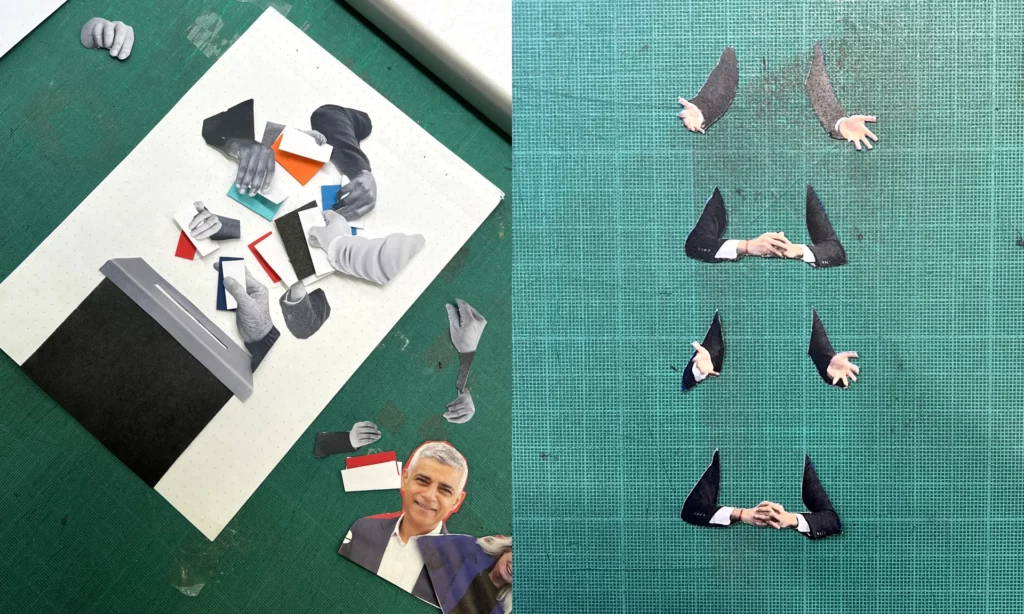
“The rise in disinformation and fakery cemented the idea to do the opposite and lean into the craft of doing things for real.” – Chris Clark

During my free time I stumbled upon an article about how the creative team of the guardian create all their artworks concerning the election by hand, in an imperfect aesthetic. This caught my attention right away, because it fits my topic perfectly. Why would a big newspaper take the time and effort to create handmade graphics?
The creative director of this campaign Chris Clark said: “The main spark of inspiration came from a conversation with a desk editor describing the country as ‘broken’, with nothing fitting or working quite as it should. This in parallel with the rise in disinformation, and fakery either through AI or generative articles really cemented the idea to do the direct opposite and be as honest and transparent in the creative process as we could – to lean into the craft of doing things for real.”
One of the main ideas was to build trust. With all the misinformation and fake news that are spread surrounding elections, it was important for them to create an authentic, trustworthy and approachable atmosphere for the readers.
But by using ripped paper cut outs they also want to visualize a “broken Britain” and how it could be put back together.

They choose to make the graphics by hand instead of faking the look on a computer. Because why fake it if you can make the real thing, and because they were in the privilege of having a good and agile team. The style is influenced by the specific employees and has variations in it. It allows for quick working, that would take much longer on a Mac, the digital design director says. He also mentions that in the beginning it was hard to stop themselves from reworking the results but especially by limiting their time they got much more productive. Now they create up to six artworks a day.
It is not like in digital design, where you usually have a strict style guide, but instead the regular process of it and the methods are what creates consistency. They set up some rules, like using mainly black and white pictures, that they either cut out or rip, but the rest is left open to create the most fitting results for the stories.
When asked how they make the designs look so distinctively handmade, the creative director answered the following: “In not only embracing the imperfections but amplifying them. We’re deliberately not removing any of the damaged paper, worn photocopies or dirty toner, and trying to be as responsive and immediate as possible. We’re often choosing the first composition and giving them very little enhancement from what is captured in the camera. “

This confirms my assumption from last semester, that “handmade” can be a countermovement to new technological developments like AI. With more and more fake images circulation on the internet, and free tools to create these, it makes sense that people feel safer when seeing an analogue image. I found it really interesting that such a big campaign chose the handmade style, but it also confirms the relevance of the topic of handmade design. It’s not only for niche, small businesses to sell on etsy and craft martkets but also for the masses. And yet this campaign also fits right in with my findings about the associations of the handmade look. Craftivism gave handmade visuals a irrevocable connection to politics and morals. This can be seen clearly by this creative campaign of political coverage.