During the World Usability Congress Graz we listened to a talk from Mari-Ell Mets. She is the head of accessibility at Trinidad Wiseman. Her talk inspired me to write up my own „Accessibility Cheat Sheet“ for web design.
Sadly she talked quite fast and I could only partially keep up. These incomplete notes sparked my interest to have a complete list to refer back to in the future. The final check-list is written in german.
Her talk mentioned the following aspects:
10 accessibility rules to fix 80% of accessibility issues
-
- Avoid autoplaying sound, animations or videos
- Add a „Stop“ button for any moving content
- Avoid any blinking and flickering at all costs
- Contrast colors
- Text: at least 4,5: 1 regular text, at least 3: 1 big and bold text
- Use contrasted colours for text and background
- Use contrasted colours for inputs and clickable icons
- Avoid adding text on top of images
- Test with contrast checker (on Chrome, in Figma etc.)
- Adapt to user’s settings
- Support keyboard
- Test with Tab Key, Scroll Page and use elements
- Use native/ semantic html elements as much as possible
- Avoid sliding, dragging and swiping actions
- Make focus visible
- Don‘t hide the focus style
- Keep logical focus order
- Language
- specify the lang attribute
- Change the lang attribute when the language is changed
- When a part is in a different language also add another lang tag
- Info and relationships
- mark headings as heading tags in correct order
- Mark tables with table tags, lists with list tags
- Mark sections (header)
- Test with screen readers
- Test with Users that use screan readers
- Name, role, value
- use native/ semantic Elements
- Research before using ARIA attributes
- Mark visible states also in code
- Test with screen reader and voice commands
- Text alternatives
Research: How to give feedback on accessibility
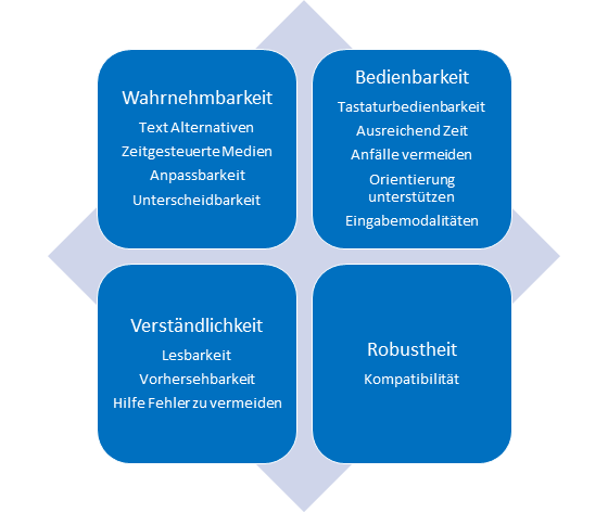
This is the final check-list I wrote up after the conference. I had a look at the german Web Content Accessibility Guidelines 2.1 (WCAG 2.1). The attached article in the link list helped me gauge what I missed at the initial talk by Mari-Ell Mets.
Accessibility Check für Web
- Wahrnehmbarkeit
- [ ] Screen Reader Check
- [ ] Alle Bilder und Grafiken können mit Alt Texten versehen werden
- [ ] Mit personalisierten Browser Settings geprüft
- [ ] Textgrößen sind anpassbar
- [ ] Farb-Kontrast geprüft
- [ ] Informationen werden nicht nur über Farben transportieren
- [ ] Alle Animationen können pausiert/ gestoppt werden
- [ ] Videos werden mit Untertiteln angeboten
- [ ] Screen Reader Check
- Bedienbarkeit
- [ ] Nur mit Tastatur navigierbar
- [ ] Fokus Stil ist sichtbar
- [ ] Logische Fokus-Reihenfolge eingehalten
- [ ] Effekte: Kein Blitzen, Blinken oder Flackern
- [ ] Eindeutige und klare Linktexte
- [ ] Alternativen für komplexe Gesten (Drag, Swipe, Slide…)
- [ ] Nur mit Tastatur navigierbar
- Verständlichkeit
- [ ] Kein essenzieller Text auf Bildern/ Grafiken
- [ ] Bei Bedarf Erläuterungen zu Fachbegriffen, ungewöhnlichen Ausdrücken oder Abkürzungen bereitgestellt
- [ ] Konsistente Darstellung und Navigation
- [ ] Unterstützung Eingabefehler zu vermeiden
- Robustheit
- [ ] Kompatibilität mit Webbrowsern gecheckt
- [ ] Kompatibilität mit Screenreadern gecheckt
Gedächtnisstütze für Alt Texte
- Knapp und präzise: Beschreibe das Wesentliche in wenigen Worten. Beispiel: „Ein roter Stift an einem Arbeitsplatz“
- Kontext beachten: Relevanz des Bildes für den Text klarstellen. Beispiel: Wenn das Bild Teil einer Seite über die Korrektur von Klausuren ist: „Ein roter Stift an einem Arbeitsplatz als Beispiel für das Korrigieren von Klausuren.“
- Wichtige Details hervorheben: Nur relevante Merkmale nennen. Beispiel: „Mann, der mit einem Headset telefoniert, in einem belebten Call-Center.“
- Keine Phrasen wie „Bild von“ verwenden. Beispiel: Anstatt „Bild von einem roten Stift“, einfach „Roter Stift“
- Zielgruppe im Auge behalten: Ton und Stil passend zur Webseite wählen.
Links:
https://www.linkedin.com/pulse/interview-mari-ell-mets-iaap-eu-pakwf