During the World Usability Congress Graz we listened to a talk from Mari-Ell Mets. She is the head of accessibility at Trinidad Wiseman. Her talk inspired me to write up my own „Accessibility Cheat Sheet“ for web design.
Sadly she talked quite fast and I could only partially keep up. These incomplete notes sparked my interest to have a complete list to refer back to in the future. The final check-list is written in german.
Her talk mentioned the following aspects:
10 accessibility rules to fix 80% of accessibility issues
Avoid autoplaying sound, animations or videos
Add a „Stop“ button for any moving content
Avoid any blinking and flickering at all costs
Contrast colors
Text: at least 4,5: 1 regular text, at least 3: 1 big and bold text
Use contrasted colours for text and background
Use contrasted colours for inputs and clickable icons
Avoid adding text on top of images
Test with contrast checker (on Chrome, in Figma etc.)
Adapt to user’s settings
Support keyboard
Test with Tab Key, Scroll Page and use elements
Use native/ semantic html elements as much as possible
Avoid sliding, dragging and swiping actions
Make focus visible
Don‘t hide the focus style
Keep logical focus order
Language
specify the lang attribute
Change the lang attribute when the language is changed
When a part is in a different language also add another lang tag
Info and relationships
mark headings as heading tags in correct order
Mark tables with table tags, lists with list tags
Mark sections (header)
Test with screen readers
Test with Users that use screan readers
Name, role, value
use native/ semantic Elements
Research before using ARIA attributes
Mark visible states also in code
Test with screen reader and voice commands
Text alternatives
Research: How to give feedback on accessibility
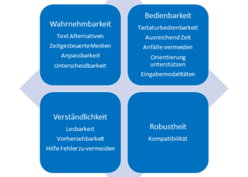
This is the final check-list I wrote up after the conference. I had a look at the german Web Content Accessibility Guidelines 2.1 (WCAG 2.1). The attached article in the link list helped me gauge what I missed at the initial talk by Mari-Ell Mets.
Accessibility Check für Web
Wahrnehmbarkeit
[ ] Screen Reader Check
[ ] Alle Bilder und Grafiken können mit Alt Texten versehen werden
[ ] Mit personalisierten Browser Settings geprüft
[ ] Textgrößen sind anpassbar
[ ] Farb-Kontrast geprüft
[ ] Informationen werden nicht nur über Farben transportieren
[ ] Alle Animationen können pausiert/ gestoppt werden
[ ] Videos werden mit Untertiteln angeboten
Bedienbarkeit
[ ] Nur mit Tastatur navigierbar
[ ] Fokus Stil ist sichtbar
[ ] Logische Fokus-Reihenfolge eingehalten
[ ] Effekte: Kein Blitzen, Blinken oder Flackern
[ ] Eindeutige und klare Linktexte
[ ] Alternativen für komplexe Gesten (Drag, Swipe, Slide…)
Verständlichkeit
[ ] Kein essenzieller Text auf Bildern/ Grafiken
[ ] Bei Bedarf Erläuterungen zu Fachbegriffen, ungewöhnlichen Ausdrücken oder Abkürzungen bereitgestellt
[ ] Konsistente Darstellung und Navigation
[ ] Unterstützung Eingabefehler zu vermeiden
Robustheit
[ ] Kompatibilität mit Webbrowsern gecheckt
[ ] Kompatibilität mit Screenreadern gecheckt
Gedächtnisstütze für Alt Texte
Knapp und präzise: Beschreibe das Wesentliche in wenigen Worten. Beispiel: „Ein roter Stift an einem Arbeitsplatz“
Kontext beachten: Relevanz des Bildes für den Text klarstellen. Beispiel: Wenn das Bild Teil einer Seite über die Korrektur von Klausuren ist: „Ein roter Stift an einem Arbeitsplatz als Beispiel für das Korrigieren von Klausuren.“
Wichtige Details hervorheben: Nur relevante Merkmale nennen. Beispiel: „Mann, der mit einem Headset telefoniert, in einem belebten Call-Center.“
Keine Phrasen wie „Bild von“ verwenden. Beispiel: Anstatt „Bild von einem roten Stift“, einfach „Roter Stift“
Zielgruppe im Auge behalten: Ton und Stil passend zur Webseite wählen.
Mismatch by Kat Holmes – How Inclusion Shapes Design
For this blog post, I reflect on Mismatch: How Inclusion Shapes Design, a book by Kat Holmes. Holmes challenges designers to think beyond the „one-size-fits-all“ mindset and consider how exclusion often stems from poorly designed systems. This book gives great insights into how inclusive design not only addresses the needs of marginalized communities but creates better experiences for everyone, which would also be the goal of my future research and work.
Mismatch as the root of exclusion
Holmes defines a „mismatch“ as the gap between a person’s abilities and the design of a product or environment. These mismatches create barriers that exclude individuals from fully participating in society. She argues that exclusion is often unintentional and comes from design decisions that overlook the diversity of human experiences.
Inclusion amplifies innovation
Holmes emphasizes that designing for inclusion doesn’t just solve problems for a small group, it can lead to innovations that improve experiences for everyone.
Start with people, not solutions
Holmes advocates for a human-centered design approach that prioritizes understanding the needs and experiences of users before jumping to solutions. She stresses the importance of involving diverse voices throughout the design process.
Inclusive design is a practice, not a checklist
Holmes warns against treating inclusion as a one-time task. Inclusive design is an ongoing process of identifying mismatches, testing solutions, and iterating based on feedback.
How this book shapes my approach
The author’s emphasis on identifying mismatches resonates deeply with my goal of creating educational tools that truly meet the needs of children with autism. Her framework provides a clear path forward:
Understand the user experience: Conduct interviews and observations to identify where mismatches occur in current tools and approaches.
Collaborate with users: Involve children and their caregivers in the design process to co-create solutions.
Test and iterate: Treat every prototype as an opportunity to learn and improve, making sure that the tools evolve with the needs of the users.
Think beyond disabilities: Consider how inclusive features can benefit all users, creating tools that are universal in their appeal and usability.
Kat Holmes’ Mismatch is a great reminder that exclusion is a design choice—and so is inclusion. By addressing mismatches, we can create products and environments that actually help and empower users.
References:
Holmes, Kat. Mismatch: How Inclusion Shapes Design. United Kingdom: MIT Press, 2018.
In the beginning of our third semester, we as Interaction Design students once again had the privilege to attend the main conference of the World Usability Congress 2024, held on October 16th and 17th at the Stadthalle Graz. This event provided us with an excellent opportunity to deepen our understanding of usability and accessibility, as well as to draw inspiration from industry experts. The two days were packed with enlightening keynotes and interactive workshops, covering a wide range of topics central to the field of user experience design.
For my part, I primarily chose to attend sessions focused on accessibility, a subject that has always held particular significance to me. Among the various presentations, one talk stood out the most: „Websites and Apps for Everybody“ by Mari-Ell Mets, the Head of Accessibility at Trinidad Wiseman. Mets’ speech left a profound impression on me due to its relevance, practical insights, and passionate advocacy for inclusion in digital design.
Key insights from Mari-Ell Mets‘ talk
Mets began her presentation by emphasizing that accessibility is a cornerstone of high-quality web design. She supported her point with a striking statistic: every fourth European is classified as a person with special needs. This highlights the sheer scale of users who face disadvantages when websites and apps fail to meet accessibility standards. Mets further outlined key European regulations governing digital accessibility, including:
EU Directive 2016/2102 on the accessibility of websites and mobile applications of public sector bodies,
EU Directive 2019/882 on accessibility requirements for products and services, and
EN 301 549, the European standard on accessibility requirements for ICT products and services.
These legal frameworks underline the necessity for designers and developers to prioritize accessibility. However, it was Mets’ practical advice that truly resonated with me. She shared 10 accessibility rules that, when applied, can resolve 80% of common usability issues in websites and apps. The simplicity and effectiveness of these rules made them particularly impactful.
Applying accessibility principles to my prototype
Mets‘ accessibility guidelines felt directly applicable to my ongoing project, which I developed as part of the Design & Research module at FH JOANNEUM. Over the last two semesters, I have been working on a mobile app concept aimed at assisting untrained first aiders in public spaces. The app provides step-by-step instructions on how to secure and help a person experiencing an epileptic seizure. Given that first aiders can be anyone in a public area, my app must cater to a diverse user base, including those with special needs. Mets‘ principles offered a concrete framework to refine my design.
No moving content
One of Mets‘ rules highlights the importance of avoiding autoplaying content, such as sounds, animations, or videos. If moving content is used, it should serve a clear purpose, and users must be able to pause it.
For my app, this means ensuring that emergency steps and instructions are presented clearly and with minimal motion. Movement can serve as a helpful explanatory tool, such as an animation showing the recovery position, but it should not overwhelm users or cause distractions. To address this, I plan to: Justify the use of movement in each case to ensure it enhances comprehension. Keep animations subtle and purposeful to reduce cognitive load, especially for sensitive users. Include an easily accessible pause button for any moving content.
Contrasted color
Color contrast plays a pivotal role in ensuring text readability and emphasizing interactive elements. Mets warned against placing text on images, as this can reduce contrast and make text difficult to read. She recommended using contrast-checking tools to ensure compliance with accessibility standards.
As my prototype progresses to a high-fidelity design, I will focus on selecting appropriate color schemes that enhance usability. Given the app’s life-saving nature, its design must remain minimalistic and user-friendly. High-contrast color combinations will ensure that all users, including those with visual impairments, can easily read text and identify critical elements like buttons and icons.
Clear error messages
Error messages are another critical aspect of accessibility. Mets stressed that they should be specific, clearly indicating what went wrong and offering solutions. For example, errors should have precise labels, point to the problematic area, and be compatible with screen readers.
In my app, this principle will guide the design of features like the medical ID form and emergency call options. If an error occurs—such as a failure to submit an emergency form—the user should receive an immediate and clear explanation with steps to resolve the issue. Additionally, I plan to implement screen-reader compatibility for error notifications, ensuring that users with disabilities are adequately informed.
Broader implications for design
Mets’ talk served as a timely reminder that accessibility is not a niche concern but a universal requirement. It goes beyond catering to individuals with disabilities and improves the overall user experience for everyone. Features like clear navigation, sufficient contrast, and error notifications benefit all users, regardless of their abilities.
Reflecting on her presentation, I was reminded that accessibility isn’t just about meeting regulations—it’s about embracing an inclusive mindset. By ensuring that websites and apps are accessible, designers actively contribute to breaking down barriers and creating a more equitable digital landscape.
Conclusion
Attending the World Usability Congress 2024 was an inspiring and educational experience, particularly Mari-Ell Mets’ session on accessibility. Her practical advice directly applies to my work, offering valuable insights to improve my app prototype. By implementing Mets’ accessibility rules, I can ensure that my app is not only functional but also inclusive and user-centered.
In a world where digital experiences are increasingly integral to our daily lives, designing for accessibility is no longer optional—it is essential. Mets’ presentation reaffirmed my commitment to creating designs that are not only innovative but also meaningful and inclusive. This learning experience will undoubtedly have a lasting impact on my approach to design.
European Union. Directive (EU) 2016/2102 of the European Parliament and of the Council of 26 October 2016 on the Accessibility of the Websites and Mobile Applications of Public Sector Bodies. Accessed November 5, 2024. https://eur-lex.europa.eu/eli/dir/2016/2102/oj.
European Union. Directive (EU) 2019/882 of the European Parliament and of the Council of 17 April 2019 on the Accessibility Requirements for Products and Services. Accessed November 5, 2024. https://eur-lex.europa.eu/eli/dir/2019/882/oj.
From October 14th to 17th, the World Usability Congress was once again held in Graz, and we, the Interaction Design Master’s students from FH Joanneum, had the opportunity to attend on October 16th and 17th. It was my second time at the conference, and I was all the more excited to see familiar faces again, even if it was just DJ Mama Feelgood, a UX employee from Aldi Süd, and speaker as well as digital sustainability expert Thorsten Jonas. As in previous years, I enjoyed not only the good food but also took away many valuable insights from these two days, which I’d now like to share with you.
Before the conference even began, I was pleased to see that accessibility and inclusivity would be major topics this year, with many talks dedicated to these themes. As mentioned in previous blog posts, both accessibility and inclusivity are aspects of digital sustainability, which is the focus of my blog posts and my Master’s thesis. Therefore, I will mainly share insights from these specific talks.
Incluthon (Stefan Barac, Gerhard Kühne & Claudio Zeni)
The first talk I want to cover is Incluthon, with speakers Stefan Barac, Gerhard Kühne, and Claudio Zeni. Although there were some technical hiccups during the presentation, the speakers’ solution to these challenges was all the more likable. The talk focused on accessibility, with an emphasis on visually impaired and blind people. While Stefan and Gerhard discussed hard facts, Claudio offered a glimpse into his life as a blind person, showing us how he planned and booked his journey from Bern to Graz using his smartphone. Key takeaways from this talk included the fact that 27% of Swiss people require accessibility support. As designers, we should remove all unnecessary elements and information and constantly ask ourselves, “Can someone navigate this website, app, etc., without sight?” It was also interesting to learn that Apple’s iPhone is the most popular among visually impaired and blind individuals due to its accessible design, which remains consistent across versions and models, unlike Android.
Accessibility-First Approach to Data Visualization (Kent Eisenhuth)
Kent, a UX lead designer at Google, gave an impressive talk on accessible data visualization, which I’d also like to highlight. Here are some of my main learnings: as designers, we should occasionally go outside and closely observe nature, as it provides the best inspiration. To create the most accessible design, a diverse team that includes individuals using assistive technologies should be assembled. Moreover, accessibility should be the primary focus, followed by design enhancements. It’s also crucial to ensure navigation using alternative keys and shortcuts works effectively. Using logical hierarchies is key—starting with networks, then groups, and finally individual information. Visually, designers should avoid fixating on a single solution; if, for instance, charts don’t work, switch to tables or alternative storytelling methods to present data and information. One particularly intriguing example was data sonification, a new and lesser-known concept that hadn’t previously caught my attention.
Websites and Apps for Everybody – Making Accessibility Easy (Mari-Ell Mets)
The last talk I want to discuss is by Mari-Ell Mets from Estonia. She also addressed internet accessibility, highlighting both the EAA (European Accessibility Act) and presenting 10 rules that can eliminate 80% of internet barriers. She began her talk with an interesting fact: 25% of Europeans have specific needs that we must consider when designing digital products to avoid exclusion. I won’t cover the EU regulations since they are readily available online; instead, I’ll present the 10 rules.
No moving content. No autoplay (or add stop button)
Contrasted color with 4,5:1 for regular text and 3:1 for bold text. Don’t put text over an image.
Adapt to user’s settings and don’t use pixel values in code
Support keyboard navigation and use native / semantic elements
Make focus point visible for keyboard navigation
Specify the language in the code
Visuals and the code must be connected
Use ARIA attributes and mark visible states and values in code
Use clear alt. text for visuals like images and icons
Write clear error messages
Additionally: don’t use accessibility overlay plug-ins!
The World Usability Conference was inspiring, with a strong focus on accessibility and inclusivity—key themes in my Master’s thesis on digital sustainability. Claudio Zeni’s smartphone navigation as a blind user underscored the need for simplified, functional design, while learning about the iPhone’s popularity among blind users emphasized consistent usability. Kent’s “accessibility-first” approach and insights on diverse teams and data sonification broadened my perspective on accessible design. Mari-Ell’s practical guidelines for EU accessibility standards, from color contrast to keyboard navigation, were invaluable, emphasizing simplicity and user-centered code and visuals.
These sessions deepened my commitment to accessible design and provided practical guidelines to incorporate directly into my future work.
I recently attended the World Usability Congress 2024 in Graz, and it was packed with insightful talks about user experience, accessibility, and how we as designers can better connect technology to the people who use it. Two talks, in particular, stood out to me – John Bowie’s presentation on how UX designers see things no one else can see, and Kent Eisenhuth’s talk about accessibility in design. These sessions really got me thinking about how these topics could help me with my master’s thesis.
In this blog post, I’ll show the key takeaways from those talks and explain how they provide crucial input for my thesis, both in terms of research and practical application, since I’ve changed my topic to designing an app which rewards people who make sustainable decisions in their everyday life in a gamified way either with real rewards like e.g. discounts or in a virtual way or both.
John Bowie on UX Challenges and the Importance of Seeing What Others Can’t
John Bowie’s talk hit on something that anyone working in design has probably experienced: the disconnect between engineers, product managers, and UX designers. Engineers and product managers often overlook UX problems because they’re so focused on making the product function. Bowie raised a critical point: How can we help others see what we see? How can UX designers make engineers and product managers aware of user experience issues that might be invisible to them?
He also cited a quote from Alan Cooper’s 1999 book The Inmates Are Running the Asylum:
„Our lives are becoming ever more centered around the whims, quips, decisions, and disasters of the high-tech industry. And these hardware, software, and technology developers don’t think like us. Despite appearances, business executives are simply not the ones in control of the high-tech world – it is the engineers who are running the show. We have let the inmates run the asylum.“
This perfectly captures the reality of how decisions in tech are often made without enough consideration for how real people will interact with products. In my project, where I’m working on making sustainability a part of everyday life through gamification, this insight is crucial. If I don’t stay focused on the user’s experience, my product could fall into the same trap of prioritizing technical functionality over actual usability.
Bowie also introduced the UX Maturity Model, a framework to assess how much an organization values and integrates UX into its processes. This is something that could come in handy for any UX designer trying to push for more user-centered design in their company. The model breaks organizations into six stages, from „Absent“ (UX doesn’t exist) to „User-driven“ (UX is a core part of the company’s culture).
Absent: UX is ignore
Limited: UX work is sporadic and unimportant
Emergent: There’s some UX work, but it’s inconsistent
Structured: UX practices exist but vary in effectiveness
Integrated: UX is widespread and effective
User-driven: UX is central to every part of the organization
For my thesis, this maturity model is a practical way to assess how different apps/websites that I might evaluate over time (or even my own design process) approach user-centered design. Knowing where a sustainability app or product falls on this scale helps me see the opportunities for where they could evolve to better engage with the users and create meaningful behavior change.
One of the most actionable parts of Bowie’s talk was his advice on asking three critical questions when designing for user experience: Relevance, Findability, and Effectiveness. These are things I need to consider when building my own project.
Relevance – Does the information or task help the user move closer to their goal, or is it just a detour? This is key when designing interactions in my app – everything needs to feel like it’s helping the user move forward.
Findability – Can users easily locate the information they need? Are they aware they need it? In my project, if users can’t find the eco-friendly habits or challenges they need to engage with, they’ll likely lose interest.
Effectiveness – Once the user finds what they’re looking for, can they easily use it? This ties directly into the usability of my app – if it’s not easy to use, no one will want to engage with it.
These questions help me keep the user at the center of the design process, ensuring the app stays simple, clear, and intuitive.
Kent Eisenhuth on Accessibility
Kent Eisenhuth’s talk on accessibility was also very interesting. Accessibility is often treated as an afterthought, but he argued that it should be a priority from the start of any design process. This is something I hadn’t considered as deeply before, but Eisenhuth showed how designing for accessibility can actually result in better design for everyone—not just for people with disabilities.
His talk was packed with practical tips on making data visualizations and interfaces more accessible. For example, he recommended using a combination of fills and borders to highlight important information, moving labels next to segments instead of using confusing legends, and using dark mode to reduce visual clutter and help users to focus.
One of Eisenhuth’s most interesting points to me was about data sonification, or using sound to describe charts and graphs. By thinking about different ways to present information – like using sound cues instead of relying solely on visual elements – one can reach a wider audience.
He also mentioned that sometimes, charts and graphs are just not a good solution. In some cases, offering a data table might be a better option for accessibility, as it allows users to navigate the information with ease, especially for people who rely on screen readers.
Conclusion
Both of these talks have helped me see how essential it is to consider every aspect of the user experience – from how users find and interact with information to ensuring the design is accessible for everyone. As I continue developing my thesis on gamifying sustainable habits, these insights will shape both the theoretical framework and the practical elements of my project. Ultimately, the goal is to create an app that not only helps users build sustainable habits but does so in a way that’s engaging, intuitive, and accessible for all.
A website that Kent Eisenhuth mentioned and that I found very interesting and might come in handy at some point to find inspiration, is Google’s open source design system Material 3: https://m3.material.io/
In the ever-evolving landscape of education, the integration of technology into classrooms has opened new doors for enhancing learning experiences. Yet, the challenge remains to create environments that cater to the diverse needs of all students, particularly those with cognitive disabilities such as autism, ADHD, and dyslexia. When reviewing and combining all of my research so far, I came up with an idea of the Interactive Learning Table, a prototype designed to make education more inclusive, engaging, and effective for every child.
Imagine a classroom where each student has access to a desk that not only serves as a traditional workspace but also transforms into an interactive, multi-sensory learning tool. The Interactive Learning Table merges tactile learning methods with cutting-edge technology, providing a dynamic educational experience tailored to individual learning styles.
Storyboard:
Key Features
1. Adjustable Touch Screen
– At the center of the table is a touch screen that can lie flat or be adjusted to an upright position like a laptop.
– This screen serves as a versatile guide for various activities, from displaying visual aids to facilitating interactive lessons.
2. Interactive Surface
– The table looks like a regular school desk but features an interactive surface inspired by the Reactable technology.
– This surface allows for tactile learning methods and games, encouraging hands-on interaction that can reinforce concepts through play and exploration.
3. Support for Different Learning Styles
– Visual Learners: The touch screen offers visual options that complement lectures and tasks with guides, diagrams, and animations.
– Auditory Learners: For children who struggle with reading, a text-to-speech feature highlights text as it is read aloud, providing visual feedback that enhances comprehension.
– Kinesthetic Learners: The tactile surface supports hands-on activities, allowing students to manipulate objects and engage physically with the learning material.
Inclusive Benefits
1. Personalized Learning
– Each table can be customized to suit the learning preferences and needs of individual students, making lessons more accessible and engaging.
– Teachers can create personalized learning plans that leverage the interactive features to support children with cognitive disabilities.
2. Enhanced Engagement
– The interactive elements make learning fun and interactive, keeping students engaged and motivated.
– By incorporating games and tactile activities, the tables turn learning into an adventure, fostering a love for discovery and knowledge.
3. Support for Cognitive Disabilities
– The tables provide essential support for students with autism, ADHD, and dyslexia, who often face challenges with traditional educational methods.
– Features like visual aids, text-to-speech, and interactive games help bridge gaps in understanding and retention, making education more accessible.
Implementation in Classrooms
The vision for the Interactive Learning Table is to have one available for every child in a classroom, ensuring an inclusive learning environment where no student is left behind. Teachers can seamlessly integrate these tables into their lesson plans, using them to complement traditional teaching methods while providing additional support where needed.
1. Teacher Training
– Educators would receive training on how to effectively use the Interactive Learning Tables, including how to customize settings and activities for individual students.
– Ongoing professional development would ensure that teachers stay up-to-date with the latest educational technologies and strategies.
2. Curriculum Integration
– The tables can be programmed with a variety of educational apps and software aligned with the curriculum, covering subjects from math and science to language arts and social studies.
– Teachers can access a library of resources and activities designed specifically for the tables, making lesson planning easier and more effective.
3. Feedback and Adaptation
– The tables would collect data on student interactions and progress, providing valuable insights for teachers to tailor instruction further.
– Regular updates and feedback loops would allow for continuous improvement of the tables‘ features and educational content.
Within the field of inclusive design, innovative technologies are beginning to appear that are intended to meet the specific needs of various user groups. Presenting „Olly“ – a melodic textile tangible user interface (TUI) designed with autism spectrum children’s requirements in mind. Through play, Olly aims to promote social relationships and sensory modulation, drawing on her observations from working with a group of five kids who all have a strong love for music.
Olly’s physical form is an embodiment of accessibility and inclusivity. Olly provides a sensory-rich experience since it is made of soft, tactile materials and has elastic ribbons with analog sensors integrated in them. Children are free to create music by themselves or while collaborating with others, as each ribbon stands for a different musical instrument.
Olly’s interactive feature has been carefully designed to take into account the sensory needs and social dynamics that are common in youngsters on the autistic spectrum. When in solitary mode, kids can play with individual ribbons to discover songs they like. But the real magic happens when you use more than one ribbon at once, as this produces even more complex harmonies. This thoughtful design decision encourages cooperative play while simultaneously acting as a sensory-based self-regulation tool.
During a five-week testing period at a Special Educational Needs (SEN) school, Olly’s effectiveness was closely monitored, and the results were incredibly encouraging. The happiness of children, demonstrated by their smiles, singing, and prolonged eye contact, is evidence that Olly is successful in encouraging social interaction and sensory control. Teachers praised the interface for being inclusive and having the ability to create a warm, friendly, and accessible space for every child. Teachers‘ and teaching assistants‘ comments emphasized Olly’s significant influence on participants‘ experiences and its critical function in promoting happy and cooperative music-making sessions.
While Olly is a positive step in the direction of using technology to support autistic children, there are certain issues that need to be closely examined. It’s possible that the findings may be limited by the short duration of the trial and the small size of the group testing the sample. Moreover, while the results are encouraging, more research is needed to determine the long-term effects of Olly on the development of social skills and sensory modulation in a variety of circumstances.
Olly is proof of the incredible impact that inclusive design can have in improving the lives of kids with autism. Through the combination of music, touch interaction, and social play, Olly breaks down traditional barriers to provide its users with a peaceful and uplifting experience. As we keep looking into the relationship between technology and inclusion, projects like Olly are signs of innovation that point the way toward a more compassionate and empathetic future.
I have been reading the paper “Cyclops: Designing an eye-controlled instrument for accessibility and flexible use” which is written by William C Payne, Ann Paradiso, and Shaun Kane. In this blog post I will write about the paper and my reflections on the topic.
The Cyclops is an eye-gaze controlled instrument designed for live performances and improvisation. It is specially motivated by a need for expressive musical instruments that is accessible for people that rely on eye tracking for computer access, such as people diagnosed with amyotrophic lateral sclerosis (ALS). The instrument contains a synthesizer and sequencer, and is displayed as a 2D canvas on a screen and controlled with eye-tracking.
CHALLENGES
There are multiple challenges of varying size when it comes to eye-tracking being the only controller and interaction method.
Precision: Targets need careful placement, spread out from each other and made bigger. Because of this, the amount of input elements that can be displayed on one screen is reduced.
Timing: Getting to a target on screen means keeping your gaze fixed in one spot, and it’s difficult to difficult to control the timing or rhythm of inputs.
Midas touch: A design challenge when creating responsive gaze-only interfaces is when the user is activating controls accidentally when dwell time is reduced. The dwell time varys widely, depending on what kind of task it is, and it is therefore important that different tasks have different dwell time that is matching the task. The dwell time might also vary from person to person, and that might be more difficult to design for.
Other challenges: Varying accuracy and precision across users, trackers and lightning conditions. Usually more accurate around the center of the screen and less accurate around the edges.
From the users perspective, I think it can be challenging to get used to using such interfaces where the only interaction is eye-tracking. On the other hand, the project aims to help out people who are already used to eye-tracking for computer access, and they are probably already used to this way of interaction. I can imagine that one have to stay extremely focused while interacting, because when not focused and thinking on other things the eyes tend to move around. At the same time, it is like learning any instrument – you’ll need practice to be able to master the instrument. It is still important that the instrument ‘helps’ you along the way, by having different dwelling times depending on the interaction and what is the most natural.
THE INTERFACE
The interface is created with some of these challenges in mind. The musical control is split across three screens which reduces cognitive load and possible unintended interactions. There is a section of the screen that is non-selectable representation of the pitch sequence that can be fixated upon without affecting the output in any way. There is room to grow – there are different screens that the user can select depending on their experience
REFERENCES
William C Payne, Ann Paradiso, and Shaun Kane. 2020. Cyclops: Designing an eye-controlled instrument for accessibility and flexible use. Proceedings of the International Conference on New Interfaces for Musical Expression.
Continuing the notion of my previous blogpost of understanding VR, AR, MR and XR along with their strengths and weaknesses, this post aims to also provide insight into the different problems one may be confronted with when designing for or engaging with these technologies on the regular and how to best solve them. At this point, it is necessary to mention already, that, while this blogpost will provide a broad overview about the different challenges one may face along with some possible solutions, it is in no way a complete guide yet, as my research into this topic is still ongoing and thus, incomplete.
Discomfort, accessibility and other challenges
To provide a widely accessible, engaging and also comfortable and immersive experience it is important to address a multitude of issues that the user may experience, when engaging with VR, AR or MR. By being aware of said issues as well as their implications to the experience and how to solve them, a much more complex and immersive experience can be created.
Motion sickness and other discomforts
Extended exposure to virtual environments, be it via VR, AR or MR, can lead to a wide variety of discomforts, when not handled and prepared for accordingly.
Simulator sickness, which is a special type of motion sickness, occurs, when our visual and vestibular system receive conflicting information. This can happen, for example, when the visual display or overlayed displayed object suggest rapid motion, but the user’s body senses no corresponding movement. The resulting mismatch in information can lead to disorientation, nausea and discomfort.
Furthermore, extended exposure to close-up virtual objects or displays can leade to both eye strain and general fatigue, as the eye has to constantly strain to focus. This strain may be even increased, if the eye has to constantly focus on rapidly moving objects or re-focus due to overlays, interfaces or similar displayed objects moving back and forth or rapidly in and out of focus.
Last but not least, when switching between AR and VR – which may mainly occur when working with MR solutions – ,but also when switching between AR or VR and the real world, user’s may experience a short bout of spatial disorientation. This may happen, when the transition between the virtual and the real environment is either to abrupt or not enough spatial clues are present in either the virtual or the real environment for the user to orient themselves. This can then cause disorientation, dizziness or short emotional distress.
Accessibility and impairments
Another thing to consider when dealing with artificial environments is accessibility for people with certain sensibilities or impairments. To create an inclusive and immersive experience, a number of challenges have to be considered.
As VR and AR experiences currently heavily rely on visual elements and their space cues, it is very easy to exclude users with visual impairments. Whether it be complete blindness, colour blindness or other similar disabilities, a number of things needs to be considered to make the experience as inclusive as possible. In a similar vain, people with auditory, cognitive or motor impairments may have trouble interacting with the created environment as well. Be it challenging motion-based inputs, complex interfaces, information overload or lack of adaptability, users may find an interaction to be needlessly challenging for them and thus feel excluded from the experience, unless ample consideration is given. This, of course, is also true for users with special sensory sensitivities, such as to bright lights, loud sounds or intense vibrations.
As such, accessibility needs to always be considered when designing in and for such environments.
Possible solutions and their integration
These considerations may seem challenging and / or limiting at first, however, they can also be understood as a chance to create a more immersive, comfortable and holistic experience for the user. When designing virtual environments, it is important to constantly question oneself, whether or not ample consideration for the described challenges has been given and remember some of the solutions described below.
Comfort and customisation
To increase the user’s long-time immersion, and comfort while doing so, a number of small changes and customisation choices can already make a huge difference.
One such change is in how the software is structured in the first place. To give an example, by including different options to adjust volume or brightness of the headset, but also providing different levels of haptic feedback, the whole experience can be customised to fit people of different sensibilities. In the same vein, allowing for the adjustment of the displayed colours or sounds or adding audio descriptive elements can also provide more inclusivity for people with auditory or visual impairments. Following this approach, the chance of motion sickness occuring can also be decreased, by allowing the user to choose settings such as movement speed, field of view and add comfort vignettes, that allow the user to find settings, that minimise their overall discomfort when being exposed to VR or MR environments for an extended amount of time.
HaptX haptic feedback gloves
Sony’s accessability controller, compatible with the new PS5 and PS VR
Another way to increase comfort would be by making adjustments to the hardware and how the user may engage with it. Using headsets with reduced latency or the currently trending inside-out tracking, for example, can both reduce motion sickness by boosting the sense of being present within the current environment and also reduce the weight and thus discomfort the user is exposed to long-term while interacting with the digital environment, be it AR, VR or MR. Similarly, combining modern headsets with custom accessibility controllers or even haptic feedback gloves, a variety of different modes of interaction can be provided, that could potentially lead to a more inclusive environment. A few solutions hereby would be tracking gestures of different body parts and allowing for gesture or voice controls as alternative input methods for people unable to use more conventional controllers or adjusting the haptic feedback to provide more or less information depending on the user’s other sensory capabilities.
Control and adaptability
To conclude the described solutions, providing the user with a maximum amount of control, thus allowing them to adapt the experience to fit their specific needs, can greatly boost both inclusivity and immersion. This may seem like an obvious conclusion, at a glance, but the fact that there is still new technologies and ways being developed to create an even better immersive experience for the wide variety of user needs hints at the opposite. As such, it is paramount to always consider your targeted end user while developing and frequently question yourself not only how to best experience a created environment, but also the challenges some users may face when doing so and to react accordingly.
Next steps:
Look into immersive environments and how to create then
Check methods of engagement and interaction within these digital environments
Sensory rooms have become a common and valuable addition to schools, hospitals, and community centers, offering a controlled environment with sensory-focused equipment. These spaces are designed to cater to individuals with learning difficulties, providing tailored sensory experiences. In this blog post, we explore the purposes, benefits, and research surrounding sensory rooms, shedding light on their role in supporting children with learning difficulties in classrooms.
Sensory rooms serve multiple purposes, acting as self-organization spaces, calming areas, and skill training centers. They are inclusive environments where students of all ages and abilities can explore together. The well-designed structure of these rooms allows for the control and monitoring of sensory experiences, addressing challenges such as overstimulation and stress. Moreover, sensory rooms play a crucial role in sensory integration therapy.
These rooms are not limited to students alone; they also benefit facilitators, teachers, parents, caregivers, and therapists. Individuals with multiple disabilities, often experiencing sensory impairments, find relief in sensory rooms by controlling sensory input, eliminating distractions, and helping them make sense of their external environment.
Ongoing research on sensory rooms has demonstrated their effectiveness in reducing and managing stress and aggression. Therapists utilize these rooms for reflective learning during critical incident debriefing, and they have shown success in reducing stereotyped behaviors in adolescents and adults. Additionally, the use of sensory rooms has been linked to increased attention and focus.
Common components of sensory rooms include bubble tubes, fiber optic sprays, beanbag chairs, interactive wall boards, rocking chairs, stereo or MP3 players with headphones, therapy balls, lighting/projectors with various colors and patterns, weighted blankets or lap pads, flowing water fountains, bins with assorted sensory activities, and aromatherapy diffuser kits. Bubble tubes, a prevalent component, provide visual and calming sensory stimulation. They serve as a focal point for attention, aiding in reflective learning and meeting individualized education program (IEP) goals. Projectors in sensory rooms transform spaces, offering scenario-driven environments that enrich multiple senses, promoting engagement and inspiration.
Before designing a sensory room, considerations should include the individual needs of the users, the number of individuals using the room simultaneously, its intended use, and long-term adaptability. Adequate space, proper layout, and attention to details like floor coverings and equipment placement are essential. Staff training is crucial to ensuring a well-utilized and effective sensory room. Schools, especially mainstream ones, can be noisy and overwhelming. Sensory rooms provide a practical solution by offering calming and safe spaces for pupils with autism and special educational needs. These rooms serve various purposes, including acting as therapeutic environments, aiding in physical skill development, and providing spaces for emotional regulation and learning management.
Children on the autism spectrum, those with learning difficulties, developmental delays, sensory impairments, and behavioral issues all stand to gain from the presence of sensory rooms in schools. These spaces cater to diverse learning styles and offer an inclusive, positive learning experience.
The term Special Educational Needs (SEN) encompasses individuals requiring additional support in a learning environment. While mainstream schools accommodate 82% of pupils with SEN, the need for dedicated support resources, including sensory rooms, remains evident. Sensory-friendly environments, such as multi-sensory rooms, immersive sensory rooms, and portable sensory rooms, provide effective tools for supporting children with diverse needs within mainstream schools.
Sensory rooms contribute significantly to the development of confidence, independence, and social skills. They offer an escape from classroom stress, can be incorporated into the learning curriculum, create positive learning experiences, and improve sensory processing.