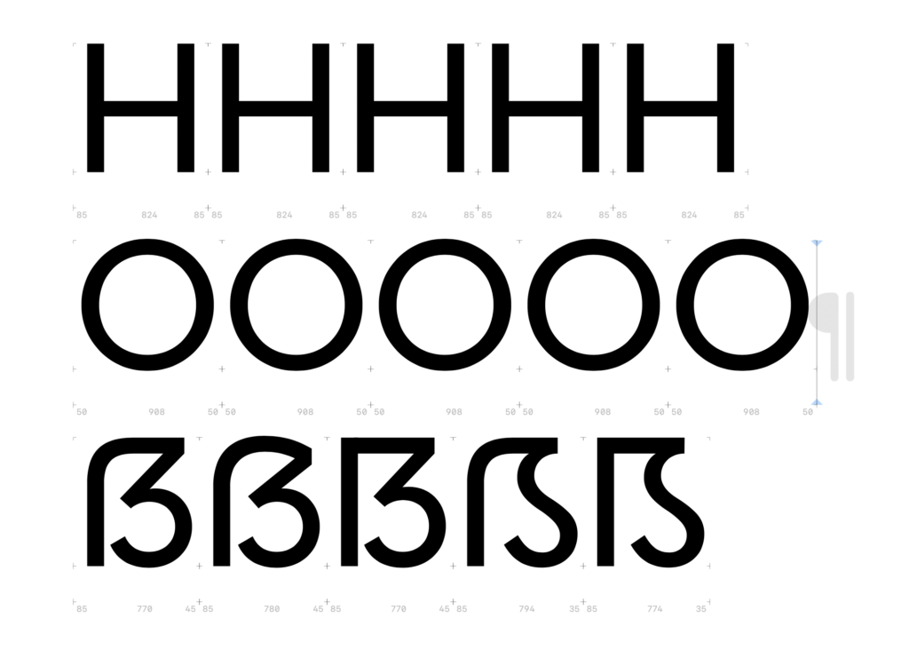
To conduct an experiment on the readability and perception of the sharp S, I need to create the four basic constructions of a typeface. As a starting point, I chose the Mabry typeface from the British type foundry Colophon. I was looking for a classic, dynamic sans-serif typeface with low contrast between thick and thin strokes. For my experiment, I wanted a relatively neutral typeface so that all four basic constructions would suit its design language. Different stylistic periods inherently have different design languages, making some sharp S approaches more or less suitable visually. I wanted to avoid being influenced by a specific design language and instead create neutral sharp S forms. Mabry seemed like the optimal choice as a modern and playful typeface.
First, I adjusted the vertical proportions of the Mabry typeface in Glyphs and then analyzed the stroke contrast of the letters n, o, H, and O to apply these insights to my sharp S variants. After that, I considered several aspects for the design: the width of the letter H, the stroke thickness of the S-curve, and the optical adjustment of the whitespace within the newly designed letter.
Dresden Skeleton (Opt 1: slightly curved)
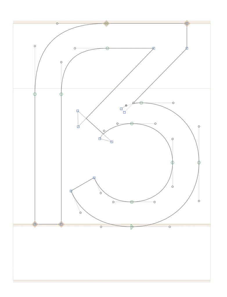
Dresden Skeleton (Opt 2: completely curved)
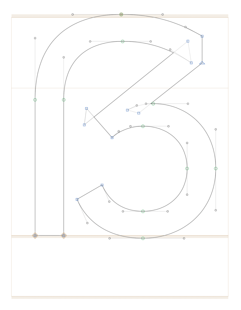
Frankfurt Skeleton
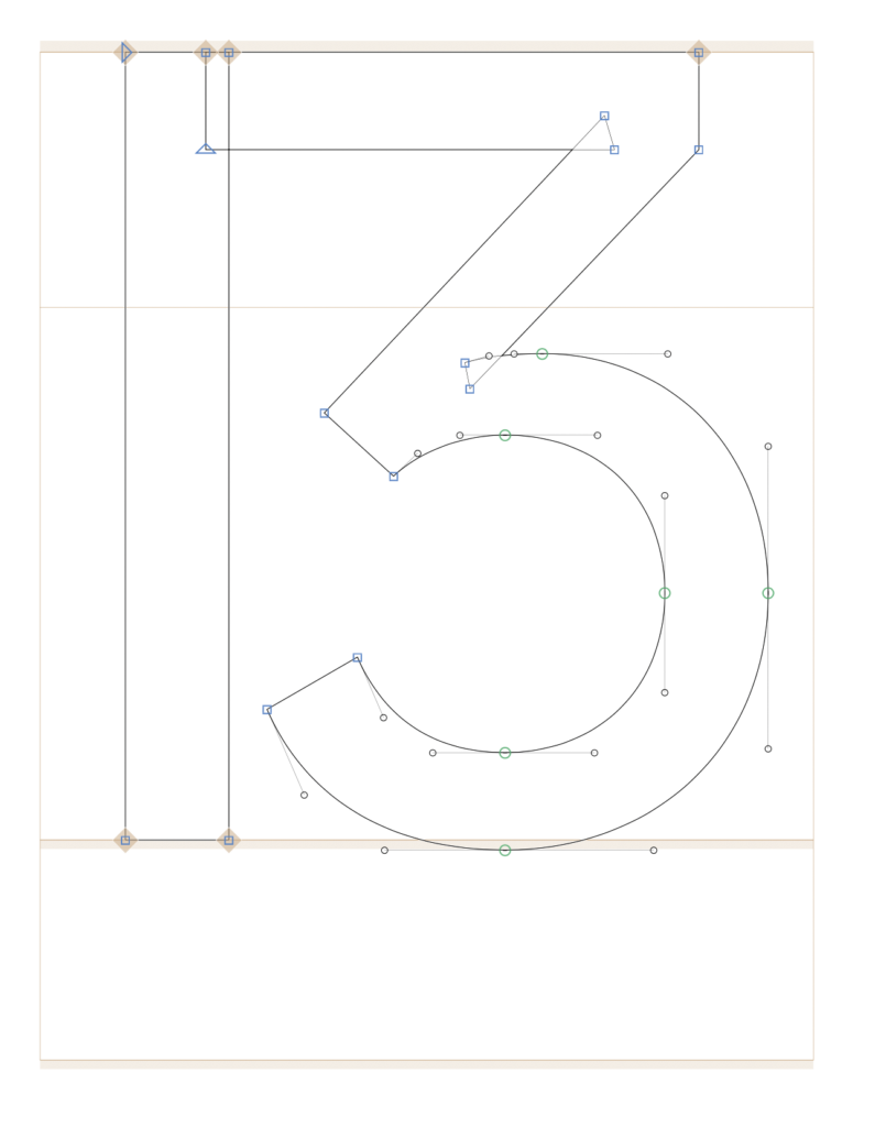
Leipzig Skeleton
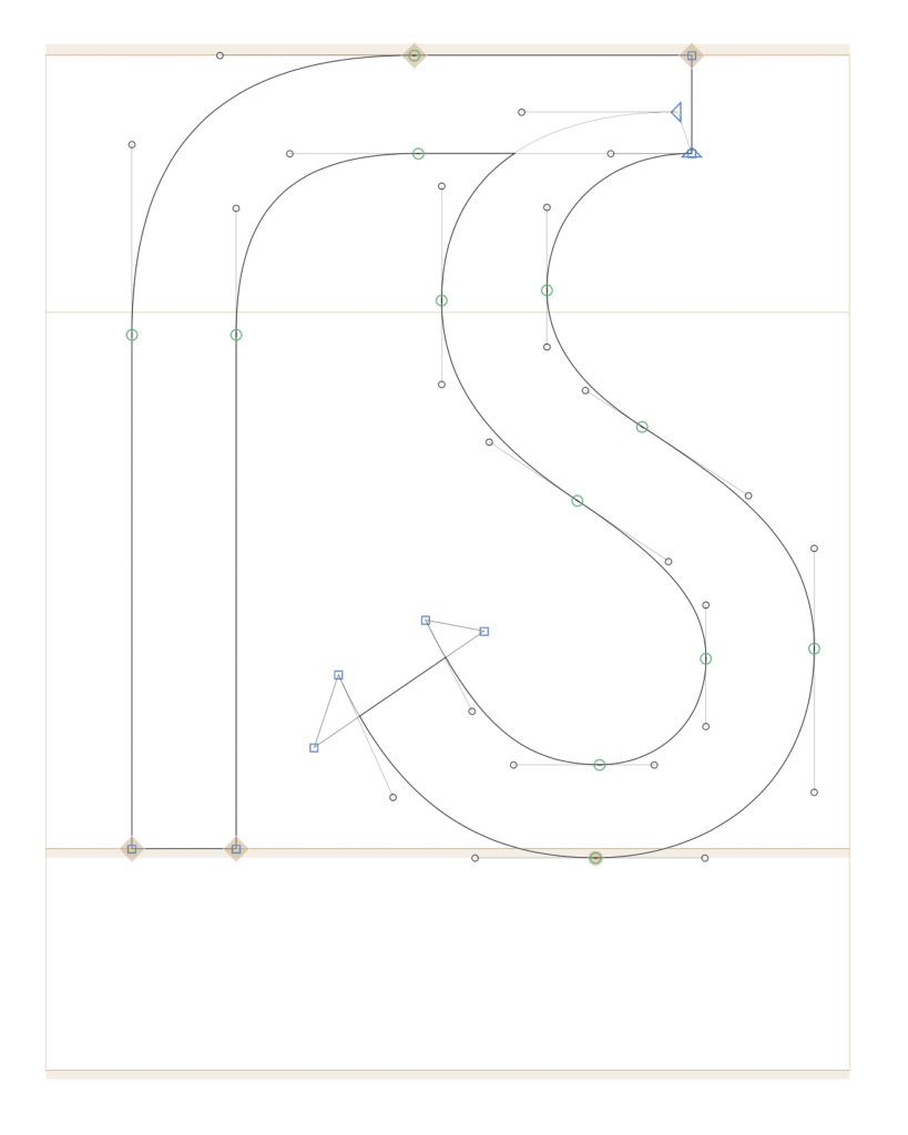
Berlin Skeleton
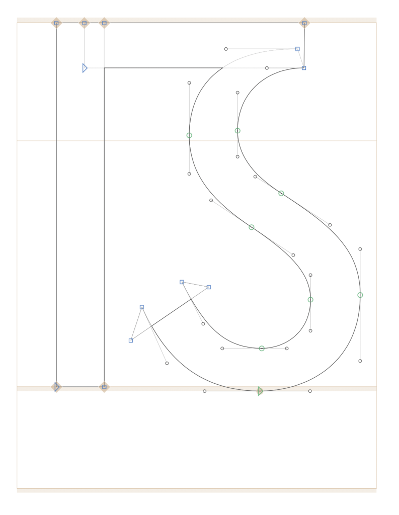
Depending on the aesthetics, I adjusted the width of the Eszett variant, making it slightly narrower or wider. For my experiment, I plan to write five street names using the five different Eszett variants. The participants of the experiment will then choose their favorite letter.
