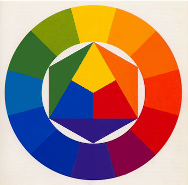
Itten was a Swiss painter and art educator associated with the Zurich School of Concrete Art. In addition to considering the physical-chemical aspects, Itten emphasized psycho-physical perception in his work.
One notable contribution by Itten is his construction of the color wheel:
- He starts with an equilateral triangle featuring primary colors (Yellow at the top, Blue bottom left, Red bottom right), with their mixtures (Yellow with Blue = Green, Blue with Red = Violet, Red with Yellow = Orange) forming the vertices of a hexagon.
- Outside this hexagon, he draws a circle with twelve equal sectors. Each sector is filled with the colors located at the vertices of the hexagon.
- The resulting empty sectors are then filled with tertiary colors, created by mixing a primary color with a secondary color.
- Yellow and Orange = Yellow-Orange
- Red and Orange = Red-Orange
- Red and Violet = Red-Violet
- Blue and Violet = Blue-Violet
- Blue and Green = Blue-Green
- Yellow and Green = Yellow-Green
Johannes Itten’s color wheel represents a systematic and harmonious organization of colors based on both physical and psycho-physical principles.
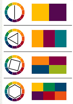
According to Johannes Itten’s teachings, there are seven different colour contrasts in the world of colour:
Color-in-Itself Contrast
The „Color-in-Itself Contrast“ refers to the impact of pure, highly intense colors of the first order such as Yellow, Red, Blue, White, and Black. Itten emphasizes that the use of mixed colors diminishes the clarity and effectiveness of this type of contrast.
The more mixed colors are involved, the weaker the distinctiveness of the contrast. However, when employed strategically, this type of contrast can achieve strong visual impact and long-range visibility. Specific color intensity can convey signaling or indicative meaning.
Itten states, „The effect occurs when pure colors are used in a colorful composition. White and black can enhance the lively effect.“
For example, a carmine-red spot on a Prussian-blue background and a vermilion-red spot on a yellow background will both be perceived as „Red.“ Initially, we perceive the color itself without differentiating between the specific shades of red.
Light-Dark Contrast
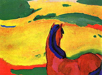
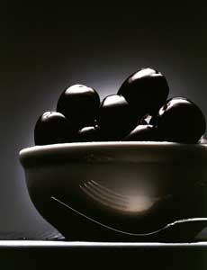
The „Light-Dark Contrast“ is a technique used to evaluate color, encompassing hue, brightness, and saturation. The specific brightness value of a color allows for certain color statements, achieving a spatial effect, or shifting and balancing visual weights. This effect is particularly significant in achieving aerial perspective (sfumato) or in the impact of architectural elements in a landscape.
Compositions built on the Light-Dark Contrast exhibit a noticeable use of a limited color palette with strong tonal variations. Bright tones of objects are embedded in a dark environment, creating a highly sculptural effect. The three-dimensionality is achieved by anchoring the brighter tones and highlights to the foreground, while the darker shadows are tied to the background.
Temperature sensation
The concept of temperature sensation in color may seem absurd at first, but it underscores the interconnectedness of various sensory perceptions. Research indicates that the color tone of workspaces, particularly in the blue-green range, can result in a perceived temperature difference of up to 4 degrees Celsius compared to rooms with a red-orange tint. Participants felt the blue-green room, with an interior temperature of 15 degrees Celsius, as cold, while the same individuals found an orange-red room cold only at 11-12 degrees.
Scientifically, this phenomenon suggests that the color blue-green dampens the impulse of organic circulation, while its counterpart, red-orange, stimulates this activity. In the Western cultural context, it is generally accepted that blue appears cold, while the adjacent group of yellow-orange-red appears warm. However, these classifications are relative, and there can be warm blues and cold reds within their respective color families.
The most significant contrast is achieved with the colors red-orange (warm) and blue-green (cold). Itten notes that all other colors can appear warm or cold depending on their contrast with warmer or colder tones. The Cold-Warm contrast denotes a temperature difference, where a pink spot on an orange or Prussian blue background may appear „cool“ or „warm“ depending on the context.
Complementary Contrast:
Itten emphasizes in his color wheel that complementary colors stand opposite each other. When placed side by side, complementary colors enhance each other’s brightness, while when mixed together, they neutralize to create gray-black.
For Itten, the complementary contrast forms the basis of harmonious design because it establishes a perfect balance in the eye.
Each complementary color pair also possesses its unique characteristic:
Yellow – Violet
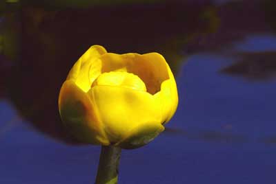
shows an extreme light-dark contrast
Red-orange – blue-green
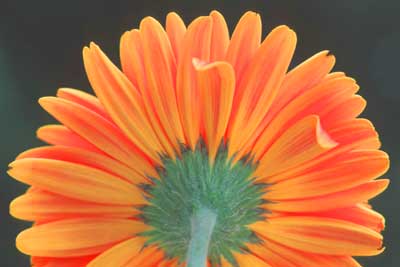
shows the strongest cold-warm contrast
Red – green
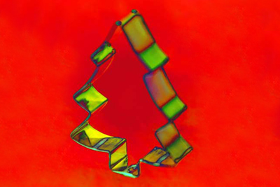
of equal brightness and equal light values.
Complementary contrast
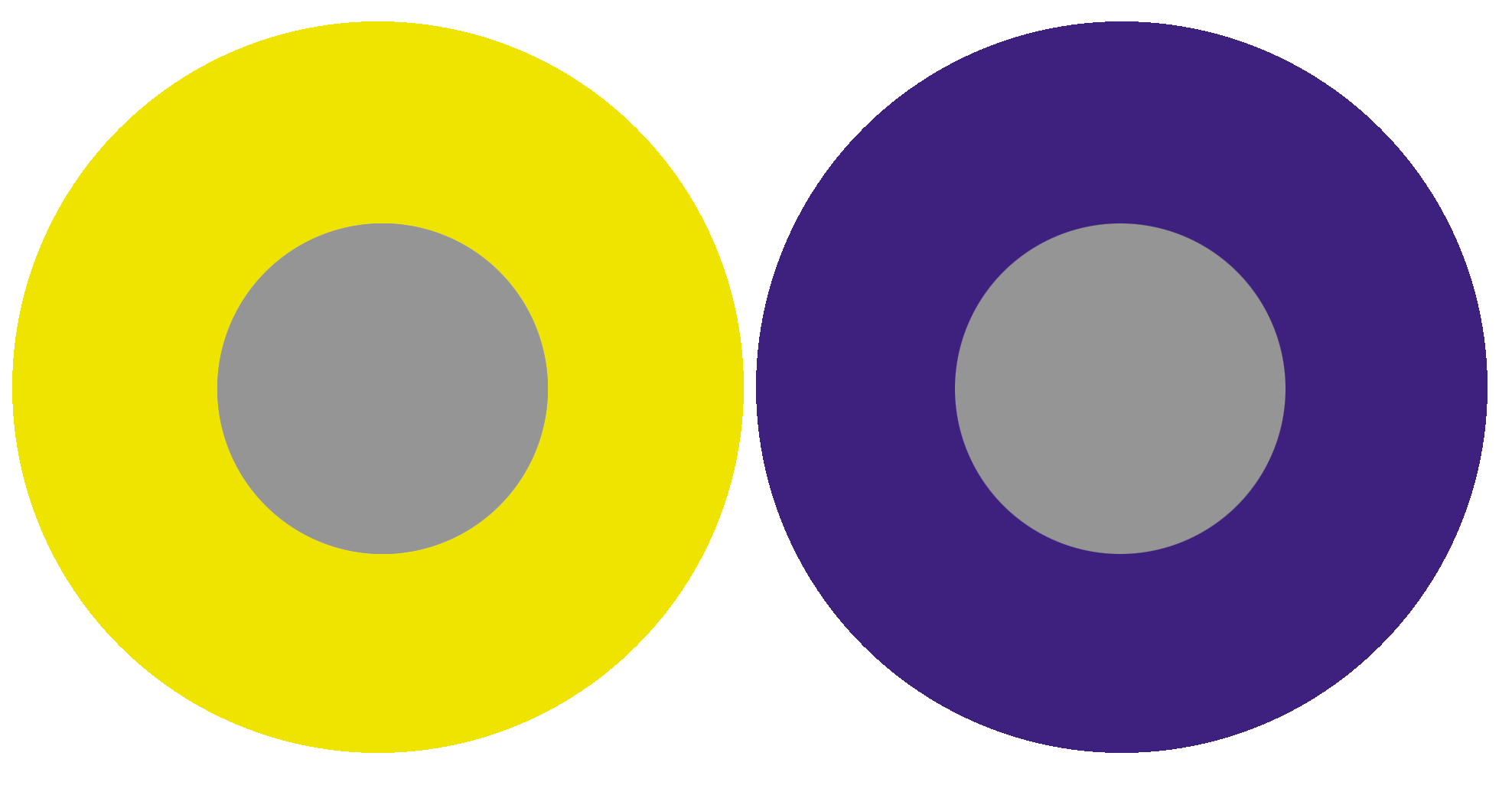
Its effect is based on the complementary contrast, where each pure color physiologically demands its complementary color. If this color is not present, the eye simultaneously generates the complementary color. This fact demonstrates that the fundamental law of colorful harmony inherently includes the fulfillment of the complementary law.
The simultaneously generated color thus arises as a color sensation in the viewer’s eye and is not physically present. Simultaneous effect occurs not only between gray and a pure color but also between pure colors that are not precisely complementary.
„The reality of a color is not always identical to its effect.“
Goethe commented on simultaneous contrast as follows: „The simultaneous contrast makes the color suitable for aesthetic use.“ A significant exception in the realm of simultaneous contrast is the „Bezold Effect,“ according to Matthaei.
Color quality
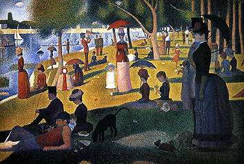
The term „color quality“ in Itten’s view refers to the purity and saturation of color. He describes the quality contrast as the opposition between saturated, vibrant colors and dull, muted colors. Prismatic colors, created through the refraction of white light, exhibit the highest saturation and brilliance.
Colors can be muted in four different ways: brightened by white, darkened by black, neutralized by gray, and broken into a dark gray-black by adding the corresponding complementary color.
Color – Non-color Contrast = Intensity Contrast
„It consists of the contrast between vibrant and dull colors. Dimming can occur with black, white, gray, or complementary colors.“ A subdued red appears „brown“ against vermilion red, but on a gray background, it appears „red.“ This contrast occurs as the color purity decreases from a vibrant color to a non-color. A pure red is more intense than a pure green. Mixed colors lose intensity.
The addition of black (dark) and white (light) produces light and dark-muted colors.
Quantity Contrast
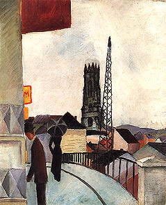
The Quantity Contrast refers to the size ratio of two or more differently sized color areas, in relation to light value and area size. Goethe has established the following approximate values for light values:
Yellow: Orange: Red: Violet: Blue: Green
behave like: 9: 8: 6: 3: 4: 6 The values for complementary color pairs are: Yellow: Violet = 9: 3 = 3: 1 Orange: Blue = 8: 4 = 2: 1 Red: Green = 6: 6 = 1: 1
If these light values are transformed into harmonious area sizes, the light value numbers must be used reciprocally. The three times stronger yellow must therefore occupy an area three times smaller than the complementary violet.
The Harmonic Area Sizes of primary and secondary colors are as follows:
Yellow: Orange: Red: Violet: Blue: Green
behave like: 3: 4: 6: 9: 8: 6
or: Yellow: Orange = 3: 4 Yellow: Red = 3: 6 Yellow: Violet = 3: 9 Yellow: Blue = 3: 8 Yellow: Red: Blue = 3: 6: 8 Orange: Violet: Green = 3: 9: 6
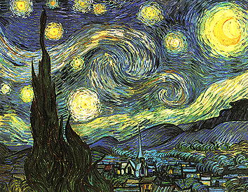
breaking with white makes the color character colder breaking with black loses the radiant character, colors appear pale and paralyzed breaking with gray neutralizes and dulls the colors. They become lighter or darker, but in any case, dimmer adding the complementary color, the tonal values then lie between the two colors.
Sources:
https://www.encaustic-academie.de/johannes-itten/