IMPULSE #8

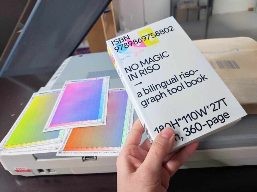
This is a post on the book that is important for my theoretical framework concerned with the contraints of risography – it is limited medium, however that can perhaps make us more creative, while working within it’s boundaries.

Constraints in Creativity: In Search of Creativity Science by Feiwel Kupferberg

Creativity is often imagined as limitless, a process of free expression unbound by rules. However, Constraints and Creativity by Feiwel Kupferberg challenges this idea by showing that constraints—whether physical, knowledge-based, or societal—are essential in shaping artistic innovation.

Constraints as a Driving Force

The book highlights how physical limitations, such as the materials available to artists, directly impact creative decisions. Greek architects, for example, designed slightly bulging columns to counteract optical illusions, showing how understanding constraints can enhance artistic outcomes​. In painting, artists must evoke emotion in an instant, whereas novelists are constrained by time—forcing different creative approaches​.

Knowledge constraints also shape artistic expression. While Greek painters rediscovered naturalistic forms, Egyptian artists intentionally abandoned them for symbolic reasons, reflecting their society’s reverence for the dead​. These constraints—whether imposed by tradition, technology, or artistic intent—guide the evolution of creative practices.

Constraints in Printmaking and Risography

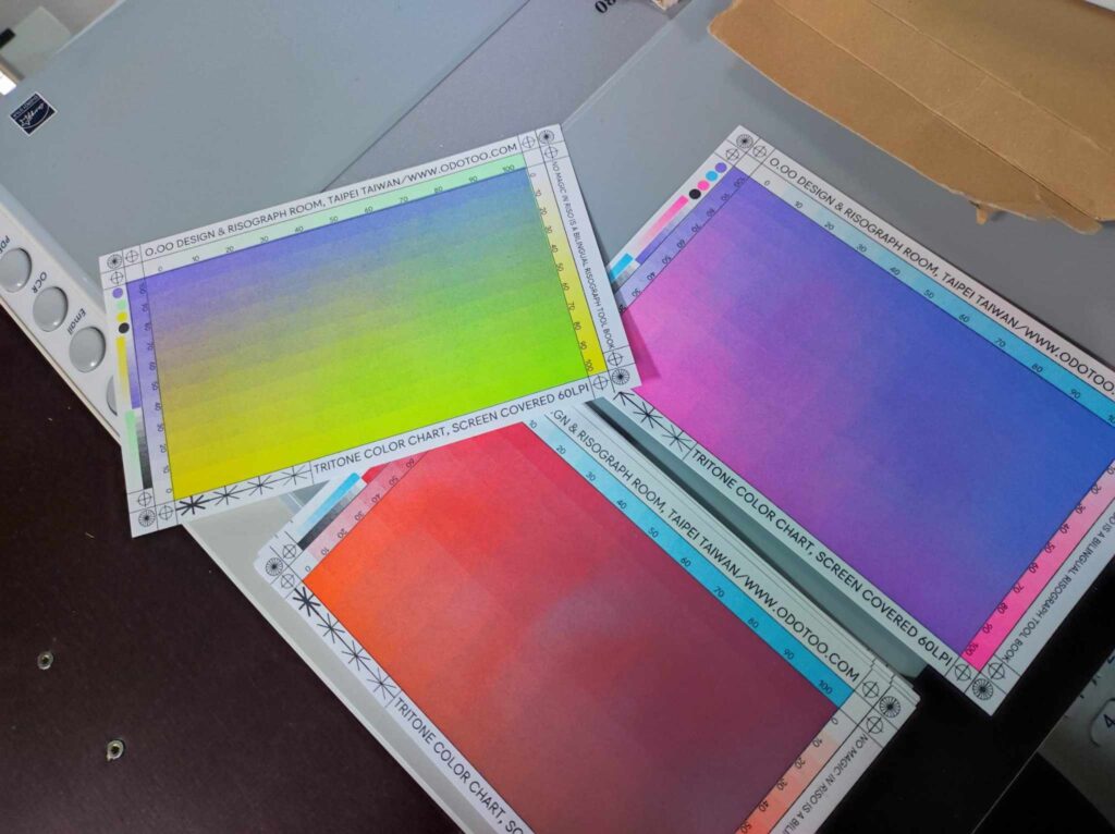
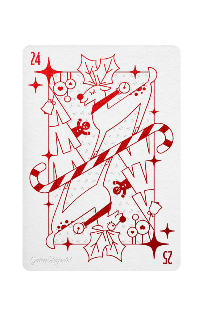
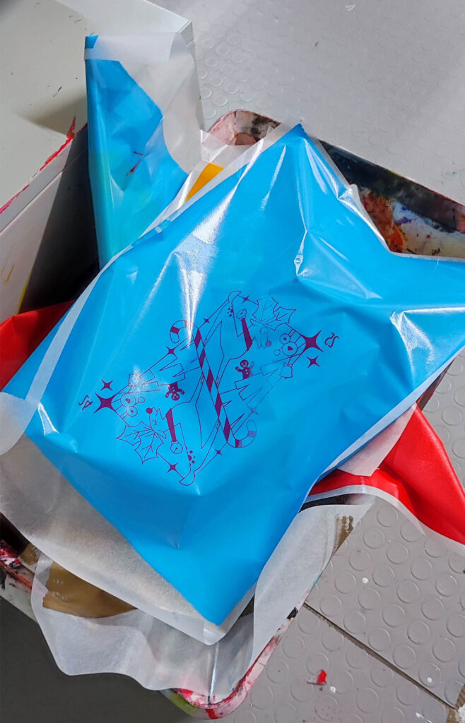
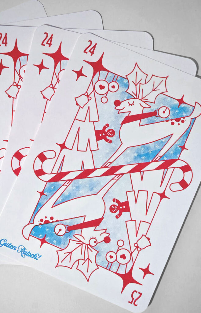
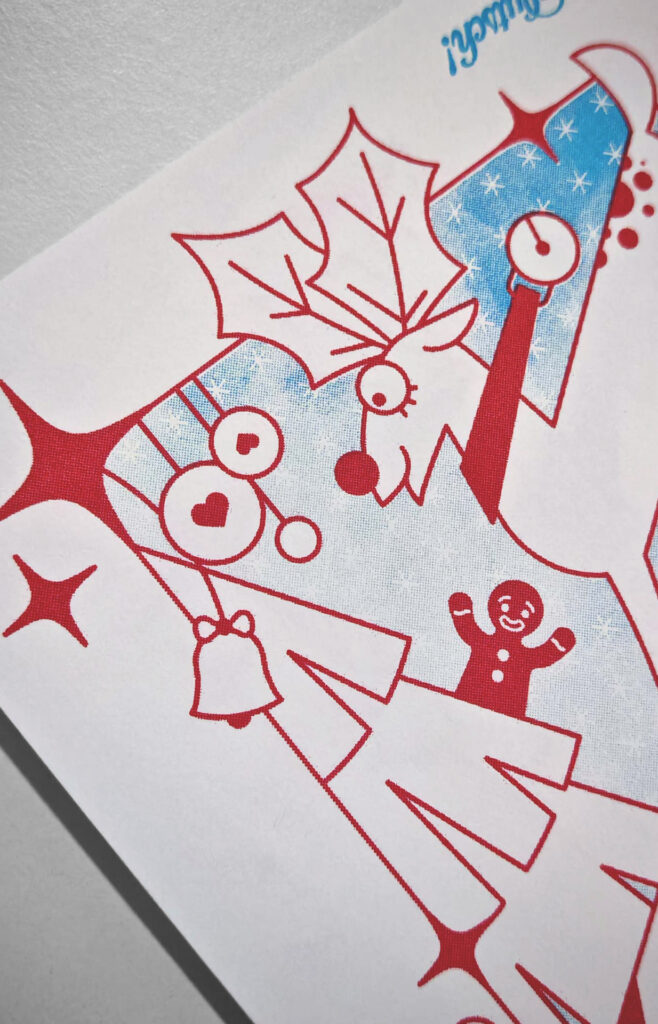
The principles from Kupferberg’s book can be applied to risography. The technique itself is bound by limitations: a limited color palette, the unpredictability of ink distribution, and mechanical constraints of the printer. Yet, these very challenges lead to unique textures, overlapping color effects, and unexpected results that digital printing cannot replicate. Artists working with risography learn to embrace these constraints, leading to distinctive and vibrant visual styles.

Creativity Within Limits

Rather than seeing constraints as obstacles, Kupferberg’s book suggests that they act as creative prompts. Whether in ancient architecture, modern literature, or risography, limitations force artists to develop innovative techniques, rethink their assumptions, and push the boundaries of their craft.

IMPULSE #7

A Look on Risography and Sustainability

Sustainability is a persisting concern of today, and some consider risography to be relatively eco-friendly printing method. Why is that?

Low Energy Consumption

Risography has low energy consumption. Unlike traditional digital or offset printing, which often require high heat or extensive processing, riso printers use a stencil-based method that consumes minimal electricity. This makes it a more energy-efficient alternative for producing prints, zines, and posters.

Soy-Based Inks

Riso printers use soy-based inks, which are much more environmentally friendly compared to petroleum-based inks used in other printing techniques. Soy ink is biodegradable and produces fewer harmful emissions, reducing its environmental impact. It also doesn’t require toner or fusing agents, which further minimizes chemical waste.

Minimal Waste

It is designed for duplicating large batches with minimal material waste. The master stencils used in risograph printing are made of rice paper, which is more biodegradable than plastic-based alternatives. Riso also doen’t use plates or screens, cutting down on excess materials. I have also heard that masters are made of banana peel – this seems to be untrue and the master is in fact rice-based.

Recyclable and Uncoated Paper

Risograph printing works best with uncoated, recycled, or FSC-certified paper. Unlike digital printing, which often relies on glossy or coated paper that is difficult to recycle, risography thrives on rough, natural-textured paper, making it an ideal choice for eco-conscious designers. Many risograph studios prioritize the use of responsibly sourced paper, which further reduces the environmental footprint.

Encourages Small Batch Printing

By it’s nature, it encourages small-batch, on-demand printing. It allows for efficient production runs, ensuring that materials are used responsibly. This is particularly valuable for independent artists, zine makers, and small publishers who want to minimize waste while maintaining high-quality prints. In commercial printeries, small clients, the ones that don’t want a thousands copies printed, are frowned upon. Of course, they don’t generate any real income for the business. But this leads to problems that I have encountered many times as a student needing a preview print of small university project. Problems like being ignored or being received rudely. When I was a baby designer and had no clue about anything, I had a shop tell me on the phone I should come at 7 in the morning, and I did, and then they let me wait until 9, because that’s when the graphic comes to work, and then he arrived and he let me wait another half an hour while he had his coffee, and then he priority took in some other client who just arrived. A short story for you on the side, to appreciate wie cool it is, that being a small client is no issue for riso printers.

A More Sustainable Alternative to Screen Printing

Screen printing is another popular method for independent printmakers, BUT it requires rather extensive setup, chemical emulsions, and water usage. Risography, on the other hand, eliminates the need for these resources while still producing bold, layered prints with rich textures and vibrant colors. It is basically automated screenprinting.

IMPULSE #6

The Books

So, what books are there on risography? Generally, the know-how of this printing method is widely scattered across the internet, but I was interested to see what has been printed. Because books tend to put all the nice info together in one place.

I discovered 4 that I could get.

  • Risomania – The New Spirit of Printing

    I got my hands of the 3rd edition from 2021. Risomania starts of with discussing a past, present and future of stencil duplicating processes. Risograph is a stencil duplicator machine. It talks about its origins, its cousin the mimeograph, and how it all came to be. Then it talks about how it entered the arts and design context. And its most extensive part focuses on the state of the art today, and gives a comprehensive overview of applications of riso printing by todays artists and designers. Most of the risography books focus on that – they serve as a collection to look through.

  • Risography – Loving Imperfections

    This book from 2017 is bilingual (English/Spanish) and it is a comprehensive collection of some of the best known riso artists and studios of today. It helped to identify some of the riso art I have stumbled upon, but didn’t have the information about it. From the artist represented there, I particularly liked Jacqueline Colley’s work. She is a pattern designer and illustator with background in fashion, and her work translated through risograph is rather charming.

  • Riso Art – A Creative’s Guide to Mastering Risography

    Published in 2023, this book is about the only practical guideline for riso printing out there. It shortly covers the history of risograph and then proceeds to explain it’s workings and provides few useful tips and tricks. The rest of the book is dedicated to a gallery of works by various riso studios around the world, but this time with a twist – each is accompanied by a short interview with the people involved, which provides a nice insight into the world of risography.

  • No Magic in Riso

    I so far don’t own this book, as it is on the more expensive side, at about 55 euro for a copy. I have, however, seen it in person. It’s small. It is so small. I mean, I should not have been so surprised, because this one is actually printed on risograph, and that is rather format limited. But it looks so majestic in all the product photos I’ve seen! it was first published in 2019.

It also greatly differs from the rest content-wise. Here, look for yourselves: https://odotoo.com/NO-MAGIC-IN-RISO

This book is a color separation study. It provides a comprehensive overview of methods to approach the color separation process in risography, and comes with a hefty bundle of color charts, that demonstrate quite impressively what can be achieved with riso inks.

A picture for your convenience:

IMPULSE #5

Riso Printing Photos 02

I had another opportunity to do some risoprinting, when I joined Lucia for her workshop she holds with her students every year. Because this wasn’t one of my private printing sessions, I didn’t have time to tweak and adjust on spot depending on results, so I went with whatever I prepared and observed the problems that arose.

I selected 3 of my old photos, of which I thought they might look cool risoprinted with the blue and pink riso inks at FH, and one illustration in 2 colors, of which I don’t have layers separated, so I applied color separation method to it too.

The photos are rather monochromatic, so I expected trouble when color separation. I also struggled to find a good profile to apply here. Just as previously when I needed black+fluo orange profile, and there was none, there was none for medium blue+fluo pink. I substituted it with teal+fluo pink one.

It still required much color tweaking and in the end I think the prints would be best just monochromatic, but this was color separation experiment, and things have been learned from it. Specifically, things about our FH risograph. I had my suspicions before from previous project printed there I wrote about in another blog post, and this session confirmed my suspicions.

The little risograph we have hardly differentiates between 100% to about 80% opacity. The photos, while clearly with a variety of grayscale levels, came too dark.

Lucia, however, does something I didn’t really try much before, and perhaps it would be interesting to see, it it works the same. Why I mostly print straight from computer, she utilizes the risograph scanner. Next time I will test this.

Back to the prints and colors. One photograph turned out great. One okay-ish. One terrible. The illustation is boring. The one good photograph I have also tried in black and fluo pink, because it seemed to me it might be a nice fit for it.

The preparation of layers was even less clean process than my previous photo printing, because of previously mentioned monochromatic nature of the pictures.

IMPULSE #4

Black & White Riso Printing

For the Conception and Creation course this semester, we got an assignment where the final output required was an A4 format, two sheets (8 pages), and it had to be black and white, no shades of gray.

Naturally, I have resolved to create the output with risograph.

We have worked with shapes. First we chose a shape and studied it. We created a concept and created this shape and then we turned it into analog form. Next step was to digitalize the analog form, and keep it black and white only.

I chose a hexagon. Conceptually I framed it as a primordial shape.

The hexagon is a shape that appears and repeats itself often in nature. It is the shape with many natural forms take as its most simplistic building block, and with a single aim – to preserve energy. Hexagon is a stable shape which distributes the weight and pressure evenly. The structure is strong and resistant to distortion.

We can see hexagons in many examples of natural world – in beehives, in bubbles of foamy substances, in basalt pillars. We know hexagon in benzene’s chemical built, the very basis of organic life.

See? A primordial shape.

I shall skip explanation of my analog form, the tests and mishaps and the digitalization, and go straight to the risoprinting.

So, black ink. At 100%? No. We have options, with the risograph.

You can print with graintouch or halftone. And the halftone lpi (lines per inch), you can adjust. Now, 72 lpi is the standard. You can go higher, or lower, and if you go to about 43 lpi, you het this ragged old newspaper look. That is, if you don’t print at 100%, because that really just creates a homogenous black surface area. I needed to achieve a halftone level, where the color does still look black, but the pattern is visible. So not too low, not too high opacity.

So to make the no greyscale black and white less of a bore, I decided to give it a risograph twist and implement the halftone texture at 43 lpi. The tricky part was determining the opacity. Because, as I discovered, the FH risographer doesn’t exactly differentiate between 100% to about 80% opacity.

Or does it?

There is one more thing you can adjust in print settings. The halftone angle. By default it prints at 45 degrees. So, I discovered that no matter the opacity, until I come down to about 70% , I get the same black solid . The jump from 80% to 70% was too strong, and 70% was very grey. Thereafter I decided to test it at different angle.

I set it to 30%. And it made a huge difference. Suddenly the opacity gradation worked.

Which means, in order to not lose their mind, one really need to get to know their riso machine.

IMPULSE #3

Riso Printing Photos 01

In one of my visits to the RISOGRAD, I looked through materials around and something piqued my interest. Riso printed photos!

I haven’t considered it much before. But here I was, looking at some great stuff. So, I had to try it for myself! Spoiler alert: It worked, but not really.

It just isn’t that simple. It looks simple, but it’s not.

First thing I necessarily got into, is color separation.

Woohoo, heard that before? Color separation, color profiles, yay. Well, I haven’t done much with any of it before, so I had a few things to look up.

First, let’s see what does the chat say about these concepts instead of looking up a proper definition:

A color profile is a standardized set of data that characterizes how colors are represented in different devices, such as cameras, monitors, printers, and presses. It ensures consistent color reproduction across various devices. In printing, the most common color profiles are based on ICC (International Color Consortium) standards.

Color separation is the process of dividing a full-color image into its individual components (usually Cyan, Magenta, Yellow, and Black—CMYK) to prepare it for printing. Each component is printed on a separate plate in traditional printing processes like offset printing.

Right. Riso printing community on the internet is wast, and there are many good sources to reach for, and among those is the many, and more, and lots of free color profiles for riso inks.

Here are links to some of those:

https://en.exploriso.info/exploriso-colour-profiles

https://colorshift.theretherenow.com

After I looked at and read what I could find, I chose a project to execute. This semester we had a photopgrahy course with Martin Osterider, so some photographs needed to be printed. I printed than with FH rtisograph and as such chose to go with black colors and fluo orange accents. I needed appropriate color profile, and the closest I could find was black+bright red. I downloaded it, installed it on my computer, and then went on to apply it to my photographs.

It was not a clean process. Some photos worked better, some worse, depending on the levels of red in them. In some cases, I had to go and tweak the original colors a little before separation. For example turn blue playground toy into a red one, to get it as an accent into my orange separation layer. Photoshop, friends, photoshop.

At other times I did the separation, but only kept it for the accent orange layer, trashed the black layer, and used grayscale original photo as a black layer. It really depends on the specific photo, what worked best for it. And then, the real result I only saw once it was printed. Some pictures were not good for this method at all. Some turn out quite well.

Here are some videos on other color separation methods:

IMPULSE #2

RISOGRAD Workshop 7.12.2024

Printing of Christmas Card

I was about to go to the RISOGRAD open workshop with little time to prepare something to print. So as usual, I reached for what was already prepared. In this case, it was a Christmas card I have created for FH Joanneum x Infinitive Factory x INTOUCH – XMAS Card Design Award. It has won third place, yay.

Well, it was prepared for letterpress printing and postprocessing, so, it worked in layers. Very doable in riso too. The design is simplistic, in mind with the letterpress process, it was supposed to have the outline graphic in red metallic foil and blind embossing. For riso, it doesn’t have quite the same charm. None other risograph specialty was utilize, except for using color outside of CMYC spectrum. But in any case, I couldn’t pass on the opportunity to print the design, so I went for it. And it turned out great.

I came to RISOGRAD early, however it is first come first serve type of situation. There were other people before me to print their artworks, so I had to wait. It was a nice waiting. I talked to few people around, god a friend out of it, seen others work. Looked through archives. Learned some things new to me. Fixed my graphic, and went on to print on Saturday eve.

Printing was done on MZ790 risograph machine, which has two drums. I used bright red and aqua ink. For the paper, I went with BIOTOP 200g, A4 format, which was handcut and little unprecise – therefore I printed my A5 card on the A4 with cutmarks to get the right format after.

First, we made a few copies running only the blue layer first, and second layer after, as you would do with one drum risograph. After, we printed them both in one run, utilizing the double-drummness of the machine. By “we”, I mean me and the responsible RISOGRAD person, Chris.

Results had more precise layering with the second method.

And to wrap it up, some fun pictures:

IMPULSE #1

RISOGRAD Workshop 9.11.2024

The First Visit

I discovered RISOGRAD looking for riso printing opportunities in Graz, since my master thesis has a lot to do with risography. RISOGRAD is a printing collective based in Schaumbad – Freies Atelierhaus Graz. They have been out there since 2017. You can find out more about them here.

Their webpage informs that they have these machines: RP3700 (2); MZ790EZ390

And these colors:

Black / Metallic Gold / Burgundy / Green / Medium Blue / Bright Red / Risofederal Blue / Purple / Teal / Hunter Green / Red / Yellow / Orange / Crimson / Fluorescent Pink / Fluorescent Orange / Sunflower / Grey / Aqua / Mint

Their main means of communication is their Instagram profile @risograd; otherwise, this simple email address: info@risograd.org.

I used the first opportunity to visit them, which happened to be an open workshop that takes place once a month on Saturdays, from one to six. During the visit I found out how one can print something with them.

Well, first things first. The machine being used as the main one is MZ790, and it is a double drum machine! The colors available for this one are sunflower, crimson, aqua, hunter green, grey, and black. One of the two RP3700 is alright, the second one got the drum stuck second time within few months. EZ390 does not seem to be operating.

They have a selection of papers you can use, for a price. The papers have different prices per sheet, depending on the type and size of the paper. On the wall they have a table with price list for all the services. Two main things to keep in mind are these:

  1. They kindly ask for a donation of minimum 10€ per project being printed.
  2. Each master costs 2€. Which can make a project expensive-ish, depending on it’s scope, so be mindful of this when printing at RISOGRAD. In case you are not familiar with workings of risograph, let me briefly explain: it is a stencil duplicator, think screen printing, but automated. You create one stencil – a master, for each layer of print. For example let’s say you have a poster which you need to print using 4 colors. Each color would be one layer, one stencil = one master. That would come up to usage of 4 masters. That is, if everything goes well :).

You also pay for inks (per printed sheet), and if you want to commercialize your prints, you also pay little extra for it.

All that being said – it is still pretty cheap and very accessible, and I’d say if you can afford it, donate more. It’s a nonprofit and everyone involved is doing it for no gain; all the money goes towards the operation.

As I was saying goodbye I was told that unfortunately, they might be closing up by the end of the year, since they collectively don’t have that much extra time to put into RISOGRAD. The next workshop was to be on the 7th on December, and there was to be more information, all of which I will cover in my next IMPULSE.