Impulse #4 – SUX-Podcast EP15 „A Fossil-Free Internet by 2030“ with Hannah Smith

Links

The Podcast: https://creators.spotify.com/pod/show/suxpodcast/episodes/SUX-EP-15—A-fossil-free-Internet-by-2030-with-Hannah-Smith-e2k5e7c/a-aba96i5

SUX: https://sustainableuxnetwork.com

The Green Web Foundation: https://www.thegreenwebfoundation.org

Branch Magazine: https://branch.climateaction.tech
Impulse #3 – Wall-E & Blade Runner 2049

Links

Wall-E Trailer: https://youtu.be/alIq_wG9FNk?si=pSYy6B-5ipk2UzuX

Blade Runner 2049 Trailer: https://youtu.be/gCcx85zbxz4?si=d7mosqM8CeagF29f

→ Impulse_02 | World Usability Congress

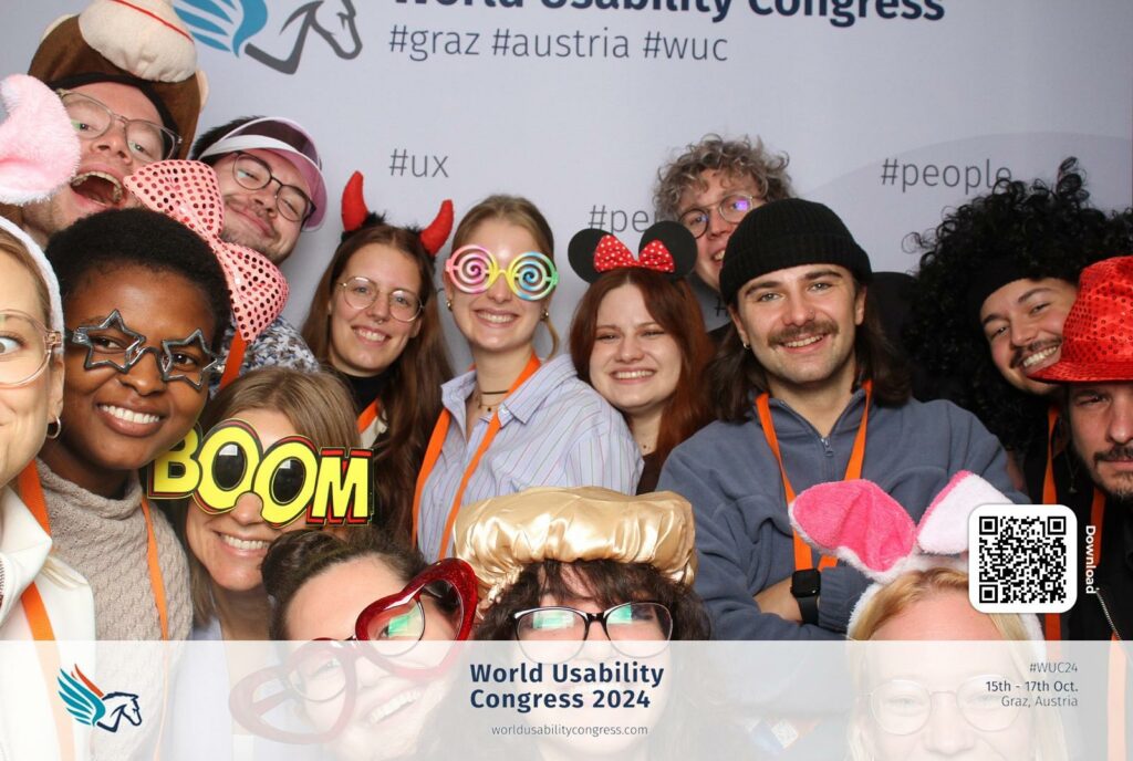
On 16&17th October, we attended the World Usability Congress 2024 as last year. While there were many interesting talks on UX/UI design, most didn’t connect directly with my thesis topic. However, one presentation stood out—Kent Eisenhuth’s Lessons Learned From Our Accessibility-First Approach to Data Visualization. It gave me fresh ideas about how to approach data visualization, and I want to share some of the key points that can useful for me.

  1. Clarity Makes Data More Universal
    Kent emphasized the importance of making visualizations simple and clear. Overly detailed or complex charts make it harder for people to understand the message. This idea connects with my work on language visualization. If visualizing the sounds of words or sentences becomes too busy, it could lose its meaning.
  2. Accessible Visuals Help Everyone
    One takeaway that stuck with me was how accessibility benefits all users, not just those with disabilities. For example, using high-contrast colors, patterns, or clear text labels in data visualization makes it easier for everyone to interpret, even in situations like low light or small screens. I realized this applies to visualizing language sounds too—users should be able to understand the visuals without needing extra effort.
  3. Using Multiple Senses
    Kent talked about going beyond visuals by incorporating sound or touch into data visualizations. This reminded me of the potential for multisensory designs in my language visualization project. For example, visualizing how German or English sounds could include audio feedback to make the experience richer for users.
  4. Focus on the Message
    A big part of accessibility is focusing on what you’re trying to say with the data. Kent showed examples where the message was lost because of too much decoration or unnecessary details. For my work, this means focusing on the core idea: how different languages “look” when spoken, and not getting distracted by extra effects.

Conclusion

Kent Eisenhuth’s talk made me think about how important accessibility is in data visualization and how I can use it in my thesis. Visualizing language sounds in a way that’s clear and easy to understand is essential for making it useful to others. Overall, it was a very inspiring talk!

→ Impulse_01 | Klanglicht

Klanglicht 2024 was both challenging and exciting for me. Having the chance to showcase two projects, I experienced some of the most rewarding but also stressful moments throughout the process. We presented Sonolux Speculative Future in the Young Masters exhibition with Mahtab Jafarzadeh Miandehi, Hannah Albrecht, Francisco Sylla, and David Laßlberger, and Langnicht as part of Spektrum. Klanglicht festival is such an inspiring event for me and my thesis, featuring installations that combine sound and visuals in creative ways.

© Max Kathan

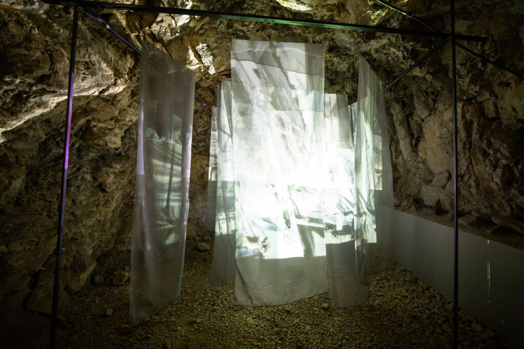
For this project, we created a multi-sensory installation inspired by research into the acoustic ecology of the Hilmteich area in Graz. It explored how urbanization—like the construction of the LKH hospital—impacts this natural space. We imagined speculative futures for Hilmteich, showing two scenarios while reflecting on its current state. This installation was featured in the Young Masters exhibition at Schlossbergstollen.

David and I worked on audio-reactive visuals using TouchDesigner, which was a great way to practice my skills and showcase them in an exhibition. On top of that, we all worked together to construct the installation, which made the whole experience even more challenging but good 🙂

Being part of Young Masters was truly amazing. I’m really proud of our team and what we did!

© Max Kathan

For Spektrum, we transformed the nave of Antoniuskirche in Graz into an immersive media experience. The title reflects the exploration of light and sound spectra, as well as the broader concepts of diversity and range. Our narratives focused on the in-betweens—like emotional and meaning spectra, harmony and chaos, colors and movement.

This was made possible with the guidance of our amazing lecturers: Astrid Drechsler, Daniel Fabry, Michael Kernbichler, Didi Mosbacher, and Roman Pürcher.

Langnicht explores the spectrum between nature and technology. The entire process—from planning to building to the final presentation—was such a mix of excitement, learning, and occasional stress. Our team grew so much during this time, and we created something we’re all really proud of. For me, working with After Effects and contributing to the construction was especially inspiring.

© Max Kathan

Conclusion

I feel really proud and lucky to have been part of Klanglicht 2024! It was an amazing experience to not only showcase our work but also to see and connect with other artists, exchange ideas, and receive feedback from professionals from the field of design. All the hard work, stress, and long hours were absolutely worth it. I’m so grateful for this opportunity and everything I’ve learned along the way! ✨💙

Impulse #2 – SUX-Podcast EP13 – „Changing design towards a better world“ with Don Norman

Links

The Podcast: https://podcasters.spotify.com/pod/show/suxpodcast/episodes/SUX-EP-13—Changing-design-towards-a-better-world-with-Don-Norman-e2gococ

SUX: https://sustainableuxnetwork.com

Don Norman. Design for a Better World: https://jnd.org/books/design-for-a-better-world/

Impulse #01 – World Usability Congress

Links

World Usability Congress: https://worldusabilitycongress.com
European Accessibility Act: https://ec.europa.eu/social/main.jsp?catId=1202
Material Design Accessibility: https://m2.material.io/design/usability/accessibility.html#understanding-accessibility

Evaluation of a master’s thesis

Author: Benjamin Christopher Homm

Title: Gamifcation for Mental Health: Designing a Supportive Treatment Concept for Depression in Young Adults

Issued on: 21.04.2021

Submitted on: 19.10.2021

Institution: Technische Hochschule Ingolstadt

Study Program: User Experience Design

Source: https://opus4.kobv.de/opus4-haw/files/2189/I001006828Thesis.pdf

Even though right now I am focusing more on physical health problems rather than mental health problems, I chose this thesis in particular because it seemed like a well put together thesis that focused on design and the creation of actual prototypes. All the other theses I looked at didn’t really feature design elements.

(1)   Level of design

In terms of aesthetics the work is kept rather simple but keeps a coherent and appealing design throughout. In terms of how design was used in the work, multiple design methods and frameworks were utilized showing a deeper understanding of design and its scientific methods. The author used UX need cards, ideation tools such as mind maps and post it sorting, personas, empathy maps, storyboarding, crazy 8 method, paper prototypes and much more.

(2) Degree of innovation

In this field of mental health problems digital solutions and gamified approaches already exist but it is not very widespread so the topic itself is still very novel. The author definitely found his research gap and was able to conduct new and relevant research and also create a function prototype based upon his new research.

(3) Independence

Though the work is based on a lot of existing research and frameworks, the author did a lot of work on his own. Surveys, user tests and expert interviews were conducted, the findings analyzed, and an app prototype was created. All of this shows a strong self-driven approach to the whole thesis.

(4) Outline and structure

The thesis is structured in a very clear way. First the two main topics of depression and gamification are explored and analyzed. After that the use of gamification for mental health specifically is discussed. After this theoretical part comes the practical part. People suffering from depression are surveyed and the results are used to create personas and storyboards. Expert interviews are also held. Furthermore, potential competitors are analyzed. After doing research the author begins designing and creating a prototype app.

(5) Degree of communication

The author uses concise language as well as specialist terms but makes sure to explain them. Concepts are explained in a easily digestible manner. Furthermore, the goals, process and findings are effectively communicated. It was always clear how the author arrived at his conclusions and it felt like all the information was given and nothing was omitted.

(6) Scope of the work

The scope is comprehensive, addressing depression’s complexities, integrating gamification, and developing a working prototype evaluated across multiple stages, making the project ambitious yet well-contained. The scope of the project was set correctly in my opinion – it wasn’t too ambitious and the most focus was on the research. The prototype is rather simple but well designed and thought out, with appealing visuals.

(7) Orthography and accuracy

As previously mentioned, the author uses concise language but also uses specialist terms. I didn’t find any errors while reading. The writing style could have been more academic at certain points but as a whole I think the work is quite well written.

(8) Literature

The literature used was well chosen and many works were used – 80 references in total are given. Most of them are books or papers though some online resources were also used. The sources range from gamification to depression to design. Because I have done some research into this field already, I was able to recognize some of the most popular sources on these fields and saw that the author used those. Some contemporary sources were also used as evident by the mentioning of covid-19.

To summarize, the work itself is structured in a clear and logical way. The scope was set right, and a lot of research was done which culminated in a successful prototype. I personally quite enjoyed reading this master thesis and would rate it quite highly.

Evaluation of Master Thesis – Down the Rabbit Hole: Visualizing Linguistic Distance and Relationships with Alice in Wonderland

Author: Yi-Chia Cheng
TitleDown the Rabbit Hole: Visualizing Linguistic Distance and Relationships with Alice in Wonderland
Publication: Boston, November 2019
Institution: Northeastern University, Department of Art + Design
Study Program: Information Design + Visualization


Level of Design:
The design of this thesis stands out for its attention to detail and creativity. She uses visually appealing elements like color-coded charts and phonetic mappings, which help make complex linguistic ideas feel approachable. 

Degree of Innovation:
I find the topic very innovative, as Cheng goes beyond traditional ways of visualizing language relationships, such as family trees, and creates new visual methods. Using Alice in Wonderland as a shared text across different languages adds a unique touch and gives a clear reference point for the comparisons.

Independence:
Cheng clearly worked independently, especially with the custom visual tools and color-coded notation system they developed for the analysis. This creative approach goes beyond the standard methods and shows Cheng’s ability to think critically and come up with their own solutions.

Outline and Structure:
The structure of the thesis is clear and flows well. It starts with an introduction and research background, then moves into a case study that breaks down the language comparisons. Each section logically builds on the previous one, making it easy to follow. However, I think some of the visuals could use a bit more explanation to make them clearer for readers who aren’t familiar with linguistics.

Degree of Communication:
Overall, she communicates their ideas well. I like that they use Alice in Wonderland to make the research more accessible and relatable. 

Scope of the Work:
The scope feels ambitious, covering both phonetic and syntactic comparisons across ten languages. This is impressive, but focusing on fewer languages might have allowed for a deeper analysis of each. Still, Cheng does a thorough job within the chosen scope.

Orthography and Accuracy:
The writing seems polished, with no obvious spelling or grammar errors, and Cheng uses technical terms accurately. I did feel that a bit more explanation of certain terms could make the thesis easier for non-expert readers.

Literature:
Cheng includes a solid range of literature, drawing on sources in linguistics and language visualization. I noticed a good mix of both older foundational works and more recent sources. However, adding some more recent studies on visual communication might have given additional depth.

Source: https://repository.library.northeastern.edu/files/neu:m0455c25q/fulltext.pdf