IMPULSE #6

Conducting a Preliminary Group UX Survey Activity for My Master’s Thesis

Introduction
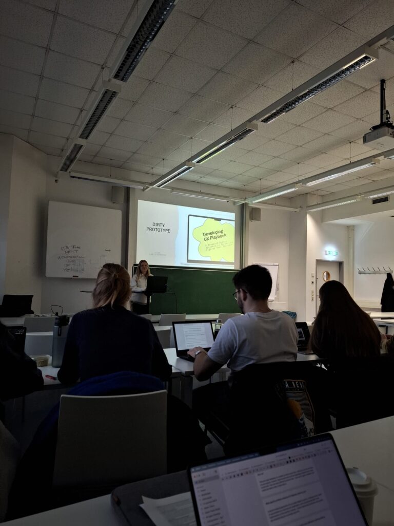
As part of my Master’s thesis, Developing the UX Playbook: A Research-Driven Approach to Optimizing Digital User Journeys, I conducted a group UX survey during class to gather valuable insights from my peers and colleagues. The goal was to explore the challenges designers face in advocating for UX research, assess the demand for a UX Playbook, and understand preferences for its format and features. This collaborative exercise not only provided critical feedback but also validated the relevance of my research questions and objectives.

Why Conduct a Group Survey?

The survey aimed to address these key objectives:

  1. Identify the obstacles UX professionals face when integrating research into workflows.
  2. Determine the value of a structured UX Playbook for improving processes and stakeholder communication.
  3. Gather insights into preferred formats, features, and real-world applications for the Playbook.

Conducting the survey in a classroom setting allowed for immediate feedback and a diverse range of perspectives, with participants varying in experience and professional roles, from designers to developers and researchers.

Key Findings from the Survey

The survey highlighted several critical pain points and needs, summarized as follows:

  1. Challenges Advocating for UX Research
    – Difficulty convincing stakeholders of the value of UX research due to time, budget, and resource constraints.
    – Misconceptions that UX is primarily aesthetic rather than research-driven.
  2. Demand for a UX Playbook
    – Participants expressed strong interest in a tool offering structured guidance and templates for UX research.
    – The Playbook was seen as a valuable aid for advocating research’s ROI to stakeholders.
  3. Current Tools Fall Short
    – Tools like Figma and Miro help with collaboration but lack step-by-step guidance.
    – Many existing tools are theoretical and fail to provide practical application steps.
  4. Preferred Formats
    – Most participants favored a combination of cards, PDFs, and interactive web tools, suggesting flexibility and adaptability to different project types.
    – Other innovative suggestions included digital games and books for increased engagement.
  5. What Makes the Playbook Stand Out
    – Key features desired include customizable templates, real-world case studies, and persuasive arguments tailored to stakeholders.
    – Participants emphasized bridging the understanding gap between designers and clients as a critical success factor.

How These Findings Shape My Thesis

  1. Refining the UX Playbook Concept
    The feedback confirmed the demand for a structured, actionable Playbook that simplifies UX research processes while providing persuasive arguments for stakeholder advocacy.
  2. Designing for Flexibility
    The preference for multiple formats (cards, PDFs, web tools) will guide the Playbook’s development to ensure it meets a variety of use cases and user preferences.
  3. Addressing Stakeholder Challenges
    The Playbook will incorporate ROI-focused arguments and evidence-backed insights to help designers communicate the long-term benefits of UX research.
  4. Iterative Testing and Validation
    The survey results highlight the importance of usability testing during the Playbook’s development to ensure it aligns with real-world needs and workflows.

Takeaways from the Group Survey

The group survey underscored the critical role of user research not only in UX design but also in developing tools like the Playbook. The diverse input from participants helped validate the need for a practical and persuasive resource that empowers designers and bridges communication gaps with stakeholders.

This experience demonstrates the power of collaborative research in shaping actionable solutions for real-world problems. With these findings, I am excited to move forward with prototyping and testing the UX Playbook, ensuring it becomes a valuable tool for designers and businesses alike.

Link to presentation and survey:
https://www.figma.com/deck/8000GnnIX79i1Pe36UXpe4/Playbook-11.12?node-id=1-635&viewport=-92%2C-108%2C0.51&t=4CsTYHWDSlChpfLD-1&scaling=min-zoom&content-scaling=fixed&page-id=0%3A1

Link to Survey Summary:
https://drive.google.com/file/d/1E6TcYw1Bd-nZGiDtmZVfJuY7BYG5qX_y/view?usp=sharing

IMPULSE #5

Reading activity: Applying Insights from Lean UX to My Thesis: Developing the UX Playbook

Lean UX: Applying Lean Principles to Improve User Experience by Jeff Gothelf and Josh Seiden offers a modern, collaborative approach to UX design, particularly suited for fast-paced, agile environments. The book emphasizes continuous feedback, cross-functional collaboration, and focusing on outcomes rather than deliverables—principles that align seamlessly with the goals of my thesis, Developing the UX Playbook: A Research-Driven Approach to Optimizing Digital User Journeys.

In this blog post, I’ll explore how key ideas from Lean UX can inform and enhance my research questions and the development of the UX Playbook.

Core Themes of Lean UX

  1. Outcome-Oriented Design:
    Lean UX prioritizes designing for measurable outcomes rather than static deliverables. This aligns with my thesis objective to define key steps in a research-driven UX process by identifying metrics like user retention, satisfaction, and conversion rates as core success indicators.
  2. Collaboration Across Teams:
    The book emphasizes cross-functional collaboration to ensure that all stakeholders—designers, developers, and business teams—are aligned. This directly informs my research question on how the UX Playbook can bridge the gap between designers and stakeholders, promoting shared understanding and decision-making.
  3. Iterative Processes:
    Lean UX advocates for building and testing ideas in small increments, a concept that can guide the iterative development of the UX Playbook itself. This approach ensures that the Playbook is refined based on real-world feedback from both designers and stakeholders.

How Lean UX Contributes to My Thesis

  1. Bridging the Gap Between Designers and Stakeholders
    One of my core research questions is how the Playbook can act as a tool to connect these groups. Lean UX provides a framework for creating shared understanding through collaborative techniques like problem framing, hypothesis generation, and shared outcomes.

    Application: The Playbook can include sections on conducting collaborative workshops inspired by Lean UX, helping designers and stakeholders jointly define goals and solutions.
  2. Key Steps in a Research-Driven UX Design Process
    The book emphasizes iterative cycles of research, design, and validation—steps that will form the backbone of my Playbook.

    Application: Each step in the Playbook can be structured around Lean UX’s Build-Measure-Learn feedback loop, ensuring research is integrated throughout the process.
  3. Simplifying UX Advocacy
    One challenge I’m addressing is the difficulty designers face in advocating for UX research. Lean UX stresses focusing on outcomes that stakeholders value.

    Application: The Playbook can include „killer arguments“ derived from Lean UX principles, such as demonstrating the ROI of iterative testing or the cost-saving benefits of early research.

Research and Playbook Development Inspired by Lean UX

Practical Tool Design

To align with Lean UX’s collaborative ethos, the Playbook will be designed as an interactive, modular tool:

  • Steps and Techniques: Each module will provide actionable steps for key UX activities (e.g., journey mapping, prototyping, usability testing).
  • Flexibility: The Playbook will allow users to start at any point in the process, similar to Lean UX’s adaptable workflows.

Validating the Playbook

  • Inspired by Lean UX, I’ll test the Playbook iteratively, collecting feedback from designers and stakeholders to refine its usability and impact.
  • Surveys and usability tests will ensure the Playbook addresses real-world challenges and improves communication between teams.

Conclusion

Lean UX offers invaluable insights into creating agile, outcome-focused UX tools. Its principles will guide the structure and content of the UX Playbook, ensuring it not only helps designers navigate the research-driven process but also equips them with persuasive arguments to engage stakeholders. By embedding Lean UX ideas, the Playbook will become a practical, collaborative, and impactful tool for optimizing digital user journeys.

https://contentsquare.com/guides/ux/lean

https://medium.com/10x-curiosity/lean-ux-a-summary-from-the-ground-floor-bc195341dbea

https://careerfoundry.com/en/blog/ux-design/lean-ux-for-beginners

Impulse #5

Temple Grandin: “The Autistic Brain”

As part of my research, I watched Temple Grandin’s talk at the Chicago Humanities Festival about her book The Autistic Brain. She shared powerful insights on autism, different ways of thinking, and how society often overlooks the strengths of neurodivergent individuals. Her talk made me reflect on the role of inclusive education and design, especially in creating tools that support different learning styles.

One of the key points she made is that autism isn’t a single condition—it’s a broad spectrum. Some people on the spectrum struggle with communication and daily tasks, while others, like Albert Einstein or Steve Jobs, may have been considered autistic by today’s standards but thrived in their fields. Grandin pointed out that traits like intense focus, pattern recognition, and logical thinking—often seen in autistic individuals—are what led to major technological and scientific advancements.

She made a really interesting comment:
„If we got rid of all the genetics that make autism, we wouldn’t have computers, we wouldn’t have electricity.“

This really stuck with me because it challenges the idea of autism as just a disorder—instead, it can be a different but valuable way of thinking. The challenge isn’t autism itself but how society fails to accommodate and nurture these unique abilities.

Grandin emphasized that people process information in different ways, and understanding these differences is key to inclusive education. She identified four main types of thinkers:

  1. Visual Thinkers (like herself) – Think in images, great at design, spatial awareness, and mechanics but struggle with algebra.
  2. Pattern Thinkers – See complex patterns, often excel in math, music, and abstract problem-solving.
  3. Verbal Thinkers – Think in words, strong in language-based tasks but may struggle with spatial skills.
  4. Auditory Thinkers – Process information through sounds and spoken words rather than visuals.

This made me think a lot about how traditional education systems fail to recognize these differences. Schools often push one way of learning—text-heavy, memorization-based approaches—which might work for verbal thinkers but leave out students who learn best through hands-on or visual methods.

Her talk reinforced the importance of creating diverse learning tools that cater to different ways of thinking. She talked about how many highly intelligent autistic children struggle in school simply because they aren’t given the right support.

This directly connects to my thesis—designing interactive, sensory-friendly learning tools can help bridge the gap between education and the different ways autistic children process information. Gamified learning, multi-sensory tools, and interactive design could make subjects like math, reading, and social skills more accessible to those who think differently.

The Importance of Pushing Kids to Be Independent

Another takeaway from Grandin’s speech was her concern about overprotection. She shared how her mother encouraged her to step out of her comfort zone, whether it was ordering food at a restaurant or hosting guests. She believes that helping autistic children develop independence early on is crucial, yet many parents and educators shield them too much, preventing them from gaining real-world experience.

This made me think about how learning tools should also help children develop practical skills—not just academic knowledge, but things like communication, problem-solving, and adaptability.

Watching Grandin’s talk was incredibly inspiring. It helped me realize that inclusive education isn’t just about making things easier—it’s about recognizing different strengths and giving all children the chance to thrive.

Some key ideas I want to apply to my work:

  • Designing for different types of thinkers – Creating educational tools that support visual, verbal, pattern, and auditory learning styles.
  • Encouraging independence – Developing tools that not only teach information but also life skills.
  • Promoting neurodiversity awareness – Highlighting the strengths of autistic individuals rather than just their challenges.

Temple Grandin’s perspective reinforced why design matters in education. It’s not just about creating “accessible” tools—it’s about making sure every child, no matter how they think, has the opportunity to learn, grow, and contribute in their own way.

Impulse 06 // Design for the Next 50 Billion Things

Keynote: Calm Technology: Design for the Next 50 Billion Things – Amber Case

For my next blog post, I decided to dive back into the topic of Calm Technology. To do this I watched Amber Case’s keynote at the Embedded Linux Conference: “ Calm Technology: Design for the Next 50 Billion Things“. Amber Case herself is one of the leading researchers in the field of Calm Technology and has not only written a book on the subject but also recently founded the Calm Tech Institute. Her talk refreshed much of what I have been researching over the last two semesters about calm technology, but also gave me a new perspective or two and challenged me to keep exploring this, in my opinion, most important and fascinating design philosophy.

Case began by introducing the concept of modern humans as ‚cyborgs‘ – not in the science fiction sense, but as beings who use external tools to adapt to new environments. This concept immediately resonated with my interaction design studies, as it highlights how deeply technology has become integrated into our daily lives. However, as Case pointed out, the current state of this integration is far from ideal.
The core problem she identified is what she calls ‚interruptive technology‘ – devices and systems that constantly demand our attention, often unnecessarily. From duplicated smartwatch notifications to ’smart‘ fridges that create more problems than they solve, our current technological landscape seems designed to interrupt rather than support. As someone with an interest in calm technology, this observation hit close to home, as I’ve often wondered about the real value these ’smart‘ additions bring to users‘ lives, and whether they need to be as dictating as they are, or if there are other ways. The solution, according to Case, lies in “ Calm Technology“ – a concept developed at Xerox PARC by Mark Weiser and John Seely Brown. The principle is simple: technology should require the minimum amount of attention and remain in the background until needed. This approach feels quite logical and makes perfect sense from a human-centred design perspective, but in our current context of attention-hungry devices it is revolutionary.
One of the most valuable insights for my future work was Case’s emphasis on peripheral attention and ambient awareness. She explained how technology should be designed to operate in our peripheral awareness, similar to how we notice changes in our environment without actively focusing on them. The example of a tea kettle illustrates this perfectly – it doesn’t require constant attention, but communicates effectively when needed.

The presentation also highlighted the importance of using the minimum amount of technology necessary to solve a problem. This principle particularly challenges current trends in interaction design, where we often add features because we can, not because we should. Case’s example of over-complicated smart home systems versus simple, reliable mechanical solutions made me even more certain that the topic I had chosen to research was the right way to go. Perhaps most importantly, Case emphasised the need to consider social norms and the ‚metabolism rate‘ at which people can adapt to new technologies. This insight is crucial to my Masters, as it suggests that successful interaction design isn’t just about creating innovative solutions, but also understanding how those solutions fit into existing social contexts and behaviours. The concept of ‚kairos time‘ versus ‚chronos time‘ provided a powerful framework for thinking about the impact of technology on our experience of time. As interaction designers, we should strive to create solutions that respect and enable moments of flow and meaningful engagement, rather than constantly fragmenting users‘ attention.

This keynote reminded me of how important Calm Technology can be and is for interaction design. It has shown me that perhaps the most sophisticated design solutions are those that know when to step back, remain invisible, and only emerge when truly needed. This is in line with one of my beliefs that products should not scream for attention, but rather receive it because it is useful, practical or wanted. As I continue my studies and begin my Master’s thesis, I will take these principles of Calm Technology with me and explore them to create designs that enhance human capabilities without demanding unnecessary attention.
The challenge for me as an interaction designer is clear: how do we create technology that supports without overwhelming, assists without interrupting, and enhances without dominating? Case’s presentation provided valuable guidance on how to address these questions in my future work and master’s thesis.

IMPULSE #5 Speculative Futures

Introduction

In a world that is constantly changing due to technology, social change and environmental factors, the ability to think about the future is becoming increasingly important. In this blog article I will collect some methods and frameworks to introduce the principles of future design thinking.

Speculative design is a method that enables us to reflect on current issues by imagining future scenarios. Its purpose is not to provide concrete solutions to existing problems, but to explore possible, often way out there future scenarios. This design approach questions existing social, ethical and technological structures. The nature of the scenarios encourages discourse and reflection.

Speculative design

Speculative design is an approach that aims to visualize alternative futures instead of focusing solely on optimizing existing systems. The term was coined by designers Anthony Dunne and Fiona Raby. In their book Speculative Everything (2013), they describe how design can be used as a tool to stimulate discussions about future developments. The focus is not on the benefits of a design, but on its ability to reveal new perspectives.

Instead of looking for practical solutions, speculative design asks “what if?” questions. For example: What if user data belonged entirely to the users, with full control over its use? Questions like this give rise to scenarios that challenge our understanding of progress.

Speculative design offers a framework to:

  • Encourage Social Dreaming
  • Expand Perspectives
  • Foster Critical Thinking
  • Inspire Innovation

Speculative design uses various methods to make future scenarios tangible:

  • Prototypes and artefacts Physical objects or digital concepts are often developed that represent a fictitious future. These artifacts appear real and make it possible to think about their consequences.
  • Design fiction Design fiction combines speculative design with narrative elements. Alternative realities are made tangible through stories, fictional news articles or advertisements.
  • Experiments and installations Interactive installations or simulations allow users to experience new future scenarios and react to them emotionally.
  • Provocative concepts Some speculative designs are deliberately provocative or dystopian in order to trigger discussions about ethical or social issues.

The Future Cone

The Future Cone is a model that categorizes different future scenarios and helps to analyze long-term developments. It is based on the idea that the future is not fixed, but rather a spectrum of possible developments. The model is often used in futurology, speculative design and strategic planning. The model helps not only to predict a “linear” future, but also to consider alternative paths. With the help of the Future Cone, we can ask ourselves: What future do we want? Which trends should we promote or prevent? What unexpected developments do we need to think about? By speculating on different scenarios and asking these questions, we can shape a more conscious, sustainable and inclusive future.

The Future Cone represents the present as a starting point and opens up into the future like a fan. The entirety of the cone represents all potential futures. It divides possible developments into different categories:

Plausible futures (plausible futures)

These futures are based on current trends, scientific findings and technological developments. They are realistic, but not guaranteed. Example: The progressive automation of jobs.

Probable futures (likely futures)

These are the futures that are most likely to occur if existing trends continue unchanged. Example: The further expansion of artificial intelligence in everyday life.

Possible futures (possible futures)

These scenarios include developments that are theoretically feasible but seem less likely because they depend on radical breakthroughs or unforeseeable events. Example: The complete abolition of the monetary system through a new form of economy.

Preferable futures (desirable futures)

This category includes futures that we should actively strive for because they bring positive social or environmental change. Example: A world with sustainable energy and fair distribution of resources.

Criticism

While speculative design offers many benefits, it is not without its critics. Some argue that it risks becoming too abstract or disconnected from real-world concerns and has little impact on everyday life. Others see speculative design only as a creative exercise without bringing about actual change.

Conclusion

Speculative design and similiar methods offer a way to explore trends to promote and prevent for our future. It helps us to define what kind of future we would like to create. It helps to identify opportunities and risks at an early stage.

By opening up new perspectives speculative design can stimulate reflection. Companies, scientists and policy makers can benefit from this method to make sustainable, ethical and future-oriented decisions.

Speculative design is an invitation to actively shape the future. That is why I believe it to be an important practice, even though it does not solve current problems it sparks thought processes. The skillset we are building at FH to create immersive and interactive work in an exhibition setting would apply nicely to such a design process and practice.

Links

https://dunneandraby.co.uk/content/books/690/0

Impulse 05 // Rams (2018)

Rams (2018) Documentary 1080p : Film First Co. : Free Download, Borrow, and Streaming : Internet Archive

As an industrial designer now studying interaction design for my next impulse, I finally decided to watch the film Rams (2018), a documentary directed by Gary Hustwit about Dieter Rams, one of the most influential industrial designers of the 20th century. It was an enlightening experience, and it made me think deeply about the philosophy behind good design and how it applies to the digital world I work in today. Dieter Rams is best known for his work at Braun and Vitsœ, where he designed some of the most iconic products of the 20th century, including radios, coffee machines and shelving systems. His creations were not only visually attractive, but also highly functional. What makes the documentary special is its focus on Ram’s design philosophy, rather than just his products. It explores his principles of ‚less but better‘ and how his work relates to wider ideas of sustainability and responsibility in design.

Rams (2018)

One of the central themes of the documentary is Rams‘ famous „Ten Principles of Good Design“. These principles define what Rams believes makes a design truly great. They emphasise qualities such as innovation, usability, honesty and environmental friendliness. While all ten principles are equally important, a few stood out to me in relation to interaction design and the digital world:

  1. Good design is as little design as possible. In an era of flashy websites and feature-laden apps, this principle is more relevant than ever. Rams believed in stripping away the unnecessary and focusing on what really matters. As an interaction designer, this principle reminds me that simplicity is not about removing features, but about finding clarity. Every element in an interface should have a clear purpose, and anything that distracts from that should be reconsidered.
  2. Good design is unobtrusive. Ram’s products were designed to help the user without calling attention to themselves. His Braun products, for example, were minimalist and elegant, but never screamed for attention. In digital design, this idea can be translated into creating interfaces that are intuitive and easy to use without overwhelming the user. The best designs are often the ones that go unnoticed because they work so well.
  3. Good design is environmentally friendly. Although Rams worked in a time before digital technology, his concern for sustainability is something we need to think about even more urgently today. As designers of digital products, we need to consider the environmental impact of our work – from the energy consumed by servers to the materials used in hardware. Ram’s philosophy encourages us to think beyond the immediate needs of the user and consider the long-term impact of our designs on the planet.

Although Rams worked primarily in industrial design, his principles are incredibly relevant to the field of interaction design. For example, his focus on usability and clarity is very much in line with the concept of user-centred design. Watching the documentary made me think about how I could apply his principles to my own projects, especially as someone who works at the intersection of digital products and physical interfaces.
In the documentary, Rams talks about designing for people rather than trends. This approach seems particularly important in today’s world, where design often prioritises novelty over usability. For example, many apps and devices are packed with unnecessary features that make them harder to use rather than easier. Ram’s philosophy reminds us to put the user first and focus on creating designs that truly improve people’s lives.
Another key takeaway for me was Rams‘ commitment to designing with honesty. He believed that a product should not pretend to be something it is not. In interaction design, this could mean avoiding deceptive patterns like fake loading screens or manipulative notifications. Instead, we should aim to build trust with users by being transparent and respectful.

As someone who researched Calm Technologies for my Master’s thesis, I was particularly inspired by the idea of unobtrusiveness in Rams‘ work. Calm Technology is about creating systems and interfaces that exist in the background and only demand attention when needed. This concept fits perfectly with Rams‘ belief that good design is quiet and unobtrusive.
For example, Rams‘ designs often had a timeless quality. They didn’t rely on trends or gimmicks to stay relevant. In the same way, Calm Technology encourages us to move away from designs that constantly compete for attention. Instead, it asks us to create products that fit seamlessly into users‘ lives, enhancing their experience without overwhelming them.

One of the most striking parts of the documentary was when Rams talked about his regrets about contributing to a world of over-consumption. He expressed concern that his designs, while successful, may have encouraged people to buy more than they needed. This reflection is a powerful reminder of the responsibility we have as designers. Whether we create physical products or digital interfaces, our work shapes how people interact with the world.
In my mind, Rams (2018) was not just a documentary about a designer, it was a call to action. It challenged me to think more critically about the impact of my designs and to aim for simplicity, honesty and sustainability in everything I create. As I continue my studies and work on my thesis, I hope to carry Rams‘ principles even more with me then before and use them as a guide to create meaningful and responsible designs.
I highly recommend watching Rams if you are a designer – or simply someone interested in the role design plays in our lives.

IMPULSE #4 ProtoPie Crash Course

Introduction

Prototyping is one of the important phases in the design process to make ideas tangible. In one of our courses we were tasked to develop a ProtoPie prototype of one of our projects. We chose to develop our concept from the gamification course this semester.

I really loved this approach to high-fidelity prototyping. In my experience Figma sometimes limits what is feasible to showcase in a prototype. ProtoPie allows me to create realistic prototypes that are similar to a final product. In this research article, I will share how I went about getting started in ProtoPie, how I learned the software and how it differs from Figma.

What is ProtoPie?

ProtoPie is a tool that allows you to create interactive prototypes. The prototypes look, feel and behave like a finished software product, even though it is a no-code tool. Unlike static pages a prototypes can simulate real interactions and verify concepts. Button clicks and screen transitions can be simulated in Figma, but ProtoPie offers to simulate complex interactions like voice commands or tilt interactions, for example. You can use your device’s native sensor systems, such as the camera, microphone or even GPS.

How is ProtoPie different from Figma?

Both ProtoPie and Figma are design tools, but they serve different purposes. Figma is my choice when it comes to designing websites, user interfaces and simple prototyping. I love the collaborative aspect of Figma. In ProtoPie we struggled with collaboration. We had to save multiple versions of a file to “collaborate”. One person worked on one part of the prototype, while the other finished a different section and then we combined them. It was not optimal.

However ProtoPie is the better choice for dynamic high-fidelity prototypes. For example, I could build a password validation that shows different reactions depending on the input.

First project

When we started to get to know the software, we decided to do the ProtoPie 101 crash course. It was a really nice e-learning experience. Everything was easy to understand and the accompanying Figma Files were well prepared. The course starts with the basics, which is perfect if you’ve never worked with ProtoPie or other prototyping software beforehand.

I started by learning the core concepts – such as triggers and reactions. They form the basis for interactions. My first project was to import a design from Figma, create a simple button interaction and test it on my smartphone. The Figma to ProtoPie Plugin worked great. The Smartphone App for displaying prototypes was not as user-friendly but worked great after all. By the end of the lessons, I started to get to a hang of it. Most of the advanced features are self explanatory if you understood the basic concepts.

Working with native sensors

After exploring the basic concepts of triggers and reactions, we viewed the list of supported sensors and inputs. Working with native sensors from devices is where ProtoPie really opened up new possibilities to our projects. It means that you can not only create simple touch interactions, but also prototypes that respond to motion, voice, camera or other device inputs. This was a completely new to me, and it sparked new ideas on what is possible with prototyping for projects in my portfolio.

I loved that I could delve into these functions without knowing how to code. For example, I created a prototype that uses my smartphone’s camera input as part of the interaction. I was introduced to voice commands, allowing me to integrate voice control into a prototype – something that is becoming increasingly important in my opinion. I tested this in a simple example where an app responded to the word “start” and then triggered an animation.

After that we focused back on the project we chose to enhance with this ProtoPie prototype. It is an App that connects people through gamified experiences. We compared different sensors and decided to use the native iPhone compass for our game.

Conclusion

The tool helped us complete our concept and make the gamified experience tangible. The hands-on approach made it easy to learn step-by-step and feel successful early on in the learning curve. I want to continue to learn how to use variables and formulas to create more dynamic interactions. I would like to build prototype in the future that makes use of the “Send and Receive” feature. This way I could connect multiple screens together to create a multi-screen experience. I will keep this in the back of my mind for a future project. By the end of the course, I feel like I have a complete toolset in hand for prototypes.

Links

https://www.protopie.io

https://learn.protopie.io/course/protopie-101

→ Impulse_06 | Tutorial (TouchDesigner)

For my sixth Impulse, I wanted to try something online. I was hoping to join a free TouchDesigner workshop, but I couldn’t find one that worked with my schedule. Instead, I decided to follow a tutorial to help me with the voice interaction I’m working on for my thesis.

I chose the Abstract Speech Visualisation tutorial by Bileam Tschepe (Elekktronaut). His explanations were easy to follow, and the way he set up the audio interaction was really inspiring. He broke everything down step by step, which made it much easier to understand, especially for someone like me who’s still learning.

I then followed the tutorial and recreated the patch in TouchDesigner. I played around with some of the parameters and experimented with the settings to see how small changes could affect the visuals. It was interesting to see how different audio inputs created various effects, and I had fun testing different combinations. Below is a recording of my experiment with the patch.

  • Audio Analysis in TouchDesigner – The tutorial showed how to break down audio into frequencies and amplitudes. This was very useful for understanding how sound can control visual elements.
  • Creating Dynamic Visuals: I learned how to use particle systems and shapes to make visuals that respond directly to sound.
  • Visualizing a language in a new way, like the Heptapod logograms, can make us question our usual way of thinking about communication.

So this tutorial helped me to practice TouchDesigner to create visuals that react to voice and sound better. Also, it is very important for my thesis, as I’m trying to visualize the unique characteristics of different languages.

→ Watch the Tutorial: Abstract Speech Visualisation by Bileam Tschepe
→ Learn more about TouchDesigner: TouchDesigner Official Website

→ Impulse_05 | Movie (Arrival)

Since my thesis is about how languages can „look,“ I thought it would be a good idea to rewatch the movie Arrival. I saw it a few years ago, but now I wanted to focus on its connection to language and visualization. Even though the movie is about aliens, it has a deeper message about how language works and how it can change the way we think and understand the world.

The movie is about a linguist named Louise Banks, who is asked to help communicate with aliens that have arrived on Earth. These aliens, called Heptapods, have a unique way of writing and speaking. Louise’s job is to figure out their language so humans can understand what they want. But the story is not just about aliens—it’s also about how learning a new language can affect your mind and even the way you see time.

Attention spoiler alert🚨 One of the most memorable scenes for me was when Louise communicates with the Heptapods by touching the screen. Their written language is shown as circular symbols called logograms. These symbols are not written in a straight line like most human languages. Instead, they are designed to show the full meaning all at once, without following a specific order which is very interesting.

Idea of a nonlinear language really made me think about how I could visualize the sounds and meanings of different languages in my thesis. I also learned the term „logogram,“ which I guess, I didn’t know before. Now I want to research more about how other writing systems work, especially ones that are very different from the alphabets we use every day.

  • The term logogram refers to symbols that represent a word or concept.
  • Language can shape how we think and even how we experience time, which connects to the Sapir-Whorf Hypothesis.
  • Visualizing a language in a new way, like the Heptapod logograms, can make us question our usual way of thinking about communication.

Overall, I really enjoyed watching Arrival again with an observation eye through language. Also it was visually appealing! I would recommend this movie if you are interested in science-fictions and aliens as well 🙂

→ Watch the Trailer: Arrival – Official Trailer

Impulse #4

Otsimo – A Learning App for Children with Autism

As part of my research on inclusive educational tools, I spent time exploring Otsimo, a learning app designed specifically for children with autism and other special educational needs. Since I’m focusing on how digital and physical tools can support individualized learning, I wanted to see how this app approaches engagement, accessibility, and adaptability for neurodivergent learners.

Otsimo is structured as a gamified learning platform, offering interactive activities in fields like language, math, emotions, and daily life skills. The interface is colorful, simple, and distraction-free, which is crucial for children who may struggle with sensory overload. Right from the start, I noticed how the app focuses on clear instructions, minimal animations, and a predictable layout, making it easier for children with ASD to use.

What stood out to me was how customizable the experience is. Parents and teachers can adjust difficulty levels, track progress, and modify settings to match a child’s learning pace. This aligns with what I’ve learned in my research, that flexibility is key when designing educational tools for children with autism. Each child learns differently, and having the ability to adapt the tool to their strengths and challenges is a big advantage.

One of the aspects I loved about Otsimo is how it integrates multi-sensory learning. The app uses:

  • Visual prompts to help children recognize objects, letters, and emotions.
  • Audio feedback to reinforce correct answers and provide gentle guidance.
  • Touch-based interactions that allow children to drag, match, and draw as part of the learning process.

Another feature I found really valuable is the AAC (Augmentative and Alternative Communication) tool included in Otsimo. Many children with autism experience challenges with verbal communication, and this feature allows them to express needs and emotions through symbols and text-to-speech options. It made me think about how digital tools can bridge the communication gap, especially for non-verbal children or those who struggle with social interactions.

In my expert interviews, one of the main issues educators mentioned was the lack of individualized support in classrooms. This kind of AAC tool could be extremely helpful for children in inclusive settings, allowing them to communicate more easily with teachers and peers.

Exploring Otsimo reinforced some key ideas for my thesis:

  1. Personalization Matters – Every child with autism has different learning needs, and tools should be adaptable.
  2. Gamification Works – Learning feels more natural when it’s engaging and interactive.
  3. Multi-Sensory Design is Key – Combining visuals, sounds, and touch-based interactions makes education more accessible.
  4. Technology Can Support Social Skills – Digital tools like AAC devices help children communicate and navigate social situations.

While Otsimo is a great tool, I also started thinking about how physical tools could complement digital learning. For example, could an app like this be paired with tactile learning materials or scent-based elements to make it even more immersive? This is one of the questions I want to explore further in my work.

Trying out Otsimo was a really valuable experience. It showed me how well-designed digital tools can support individualized learning, and it gave me ideas on how I can integrate similar principles into my own research. I still believe that physical interaction is just as important as digital engagement, but Otsimo is a great example of how technology can help make education more inclusive, structured, and engaging for children with ASD.

I’m excited to continue exploring both digital and physical learning tools and finding ways to combine the best aspects of both. This experience definitely gave me new inspiration for my thesis and future design projects!