4) IMAGE RECEPTION INTERFERENCES

Design.tv / IMAGE RECEPTION INTERFERENCES – Transfers of Photography in Design 1960–1990 (Croatia)

I visited this exhibition two years ago, but I recently came across a YouTube video that offers a full explanation of it. What’s interesting is that one of the featured designers, Duško Bekar, makes an appearance in the video.

The exhibition’s curator, Marko Golub, mentions:

„The relationship between graphic design and photography is a very broad topic. Photography is used extensively in graphic design.“

But this exhibition doesn’t just explore the relationship between graphic design and photography—it also delves into the media processes that happen between the two.

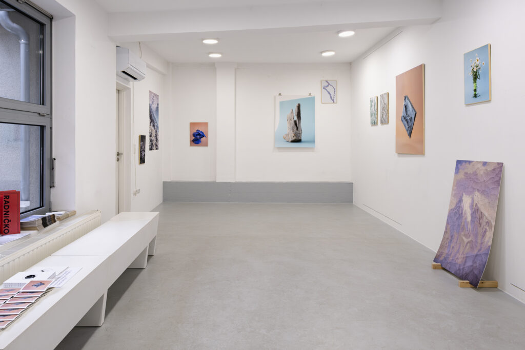
Here are some of the most interesting works featured in the exhibition:


1. Boris Bućan

Bućan’s works often focus on self-referentiality, where the design reflects on itself. For example, one poster visually suggests the concept of photography through its own design (like the edges of the poster mimicking a photograph).

Bućan’s collaboration with Mihajlo Arsovski also stood out. They were among the most creative and provocative figures in graphic design at the time. One of Bućan’s posters for an Arsovski exhibition uses a photo of a billboard for posters—but ironically, none of the posters on the billboard are by Arsovski.


2. Željko Borčić

Borčić plays with the concept of “an image within an image,” creating a self-referential design.
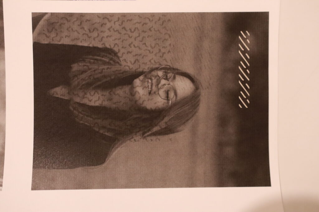

3. Duško Bekar

Bekar’s work features abstract circular forms, created by shining a flashlight onto light-sensitive photo paper. Here, photography—normally used to capture reality—is turned into a tool to create something abstract.
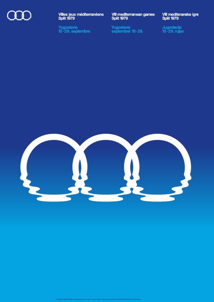

4. Boris Ljubičić

The main poster for the 8th Mediterranean Games in Split (1979) showcases a bold MIS ’79 logo on a gradient blue background. Interestingly, this gradient wasn’t created digitally (computers weren’t widely used in design back then). Instead, Ljubičić used a photographic trick—deliberately blurring two Pantone blue color swatches to create the gradient effect.


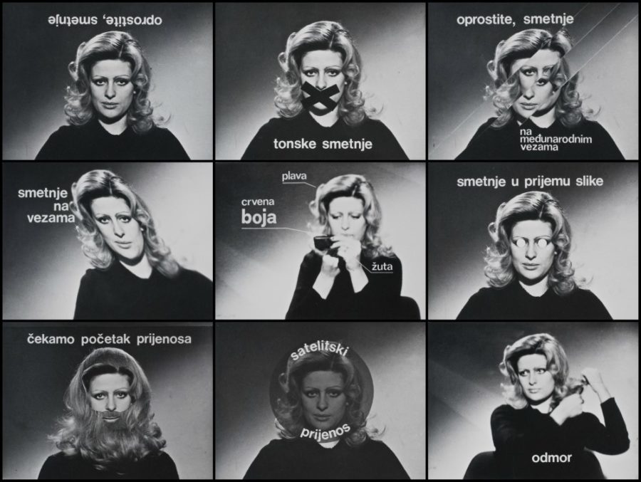
5. Sanja Iveković & Dalibor Martinis

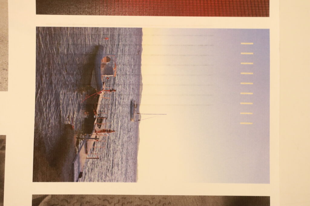
This duo experiments with the visual distortions typical of television screens, playing with the imperfections and glitches of electronic media.


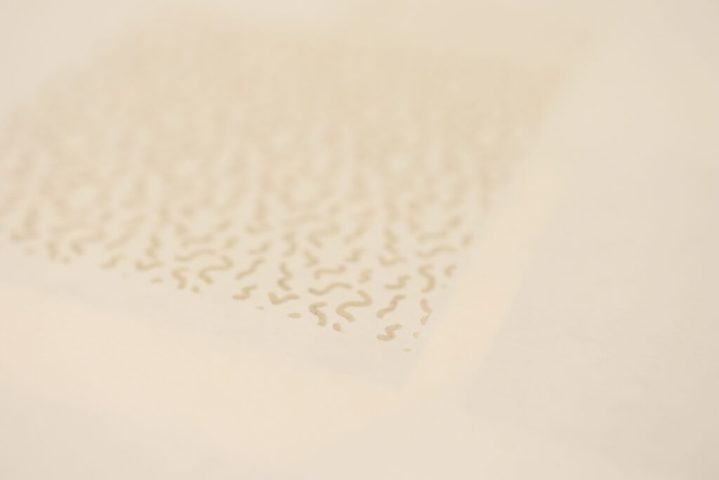
Across the exhibition, you’ll notice how designers use photography in diverse ways—sometimes multiplying a single image in a “pop art” style, other times layering a series of photos to create cinematic effects. Photography itself is also explored in a variety of genres, from documentary and portrait photography to artistic experiments using techniques like high-key lighting, double exposures, wide-angle lens distortions, solarization, and more.

Two key magazines from the period, Danas and Polet, were also crucial in showcasing these creative intersections of design and photography.

This exhibition offers a fascinating glimpse into how photography and graphic design interacted during this period, featuring works by designers like Ivan PiceljMihajlo ArsovskiBoris BućanBoris LjubičićMirko IlićGorki ŽuvelaDalibor MartinisGoran TrbuljakSanja IvekovićSanja Bachrach Krištofić, and Greiner & Kropilak. It also highlights contributions from photographers like Luka MjedaAnte VerzottiSlobodan Tadić TecŽeljko Stojanović – ŽikaBoris CvjetanovićMario Krištofić, and many others.

3) In reality and in the fiction

Photography Exhibition ‘In reality and in the fiction’ of the artist Sanja Merćep.

In the photographic series In Reality and Fiction, Sanja explored the (de)construction of the representation of mountain landscapes by creating a personal perspective on mountain landscapes and documenting various forms of societal imagination of mountains. Focusing on private objects that serve as mediators of her personal mountaineering experience, Sanja depicted the symbolic and imaginary dimensions of mountain landscapes that are less visible in the public sphere. In the second, documentary part of the project, she focused on recording various ways of representing mountain landscapes in different (non)mountaineering contexts, emphasizing their constructed nature.

What I enjoyed most about this exhibition is how Sanja portrayed representations of mountain landscapes. For example, there’s a chipped piece of rock (visible right in the center of the upper image). What I mean by how she depicted it is that she chose to photograph this piece in what is clearly an art studio or a space designed for photoshoots. These photographs of representations almost resemble product photography.

2) Adventures in Latent Space – Exploring LLMs and Real-Time Image Generation

Session 2: Real-Time Image Generation and Interactive Practice

Time: Thursday, 12th December 2024, 6-9pm

Duration: 3 hours

What we did at second session:

  • Overview of Real-Time Image Generation Tools such as DALL-E, Stable Diffusion, and RunwayML
  • Generating images based on text prompts
  • Examples and exercises for creating thematic connections between visual and textual outputs

Outcome of the workshop:

I got a practical understanding of how to navigate and use latent spaces in LLMs and real-time image generation for creative projects. I gained insights into combining AI-driven text and visuals for innovative storytelling and artistic practices, using accessible, open-source models.

My opinion:

I didn’t realize that Real-Time Image Generation even exists, because at first I thought that we will be learning more about general Image Generation with AI tools.

At one point, I was fascinated with some tools and how quickly they process visual data instantly as it is received.

The workshop was interesting but it wasn’t that useful, at least not for my thesis.

1) Adventures in Latent Space – Exploring LLMs and Real-Time Image Generation

I took part in an international online workshop on AI titled ‘Adventures in Latent Space – Exploring LLMs and Real-Time Image Generation’ led by Marlon Barrios Solano.

I was particularly interested in learning more about Image Generation.

Workshop Overview:

Adventures in Latent Space is an interactive, no-code workshop designed to introduce participants to the creative potential of Large Language Models (LLMs) and real-time image generation using open-source models. This workshop aims to provide a hands-on exploration of AI’s latent space through engaging activities and conceptual discussions, perfect for artists, creative technologists, and anyone interested in the intersection of technology and the arts.

The workshop was free of charge.

Duration: 6 hours total, divided into two online sessions (3 hours each)

Session 1: Navigating Latent Spaces with LLMsTime:

Tuesday, 10th December 2024, 6-9pm

Duration:

3 hours

Core Concepts that we learned:

  • Artificial Intelligence (AI): The simulation of human intelligence in machines.
  • Machine Learning (ML): Algorithms that learn from data to make predictions or decisions.
  • Deep Learning: Advanced ML using multi-layered neural networks.
  • Neural Networks, Perceptron, and Latent Space: Key elements of AI architecture and abstract data representation.
  • Natural Language Processing (NLP): AI’s ability to understand and generate human language.
  • Large Language Models (LLMs): AI trained on massive datasets to generate human-like text (e.g., GPT).
  • Generative Adversarial Network (GAN): AI models that create new data by pitting two networks against each other.
  • Transformer & Attention Mechanism: The architecture enabling GPT and similar models to excel in tasks like translation and text generation.

I didn’t expect to learn or to hear about so many AI concepts. What was most useful for me was that I learned how to make my own GPT, which could be useful for my thesis and for finding articles, books and information.

Critical Evaluation of a thesis

Title:

Digital Kaleidoscopes: The Synergy Between Graphic Design and Photography through Visual Perception

Author:

Derek Reynolds

Publication Year:

2013

Institution:

Radford University

Department:

Graphic Design

Evaluation

  1. Design Quality The thesis has a straightforward design, likely made in Microsoft Word. The layout uses white pages and a single font, giving it a simple, academic appearance. Reynolds also held a photography exhibition as part of his project, showing his work in a professional, visually engaging format, which complemented his written research.
  2. Degree of Innovation Reynolds‘ work stands out for its fresh approach, combining photography and graphic design with a focus on patterns, an area not commonly explored in design studies. His approach is personal and creative, using his own photography series to illustrate design principles, which adds a unique, innovative dimension.
  3. Independence The thesis shows independence in both thought and execution. Reynolds developed his own photography series and applied design principles to analyze it, describing in detail how he used various software tools to achieve his results.
  4. Outline and Structure The thesis has a clear and logical structure. However, it could benefit from a brief history of photography’s role in design in the introduction, which would provide helpful context for readers. Reordering some chapters, such as placing „Artistic Inspiration“ before „Manipulation of Digital Images,“ could also improve the overall flow.
  5. Degree of Communication Reynolds writes in a direct and clear style, making complex ideas easy to follow without sounding overly technical. This accessible approach invites readers into the material and keeps the paper engaging.
  6. Scope of the Work The thesis could cover more theory, especially on the topic of patterns, which is a primary focus in his photography series. Adding this would strengthen the connection between his visual work and the theoretical framework.
  7. Orthography and Accuracy Reynolds’ work is accurate and well-cited. He includes references for all important points, ensuring a reliable and well-supported presentation.
  8. Literature Review The thesis includes about 20 sources, a moderate amount, but these are high-quality and mostly drawn from books and articles rather than websites. His references include key figures in design, like David Carson, adding authority to his research.

20/ Plans for the next steps:

Currently, the project lacks a sufficient level of artistic expression. To elevate its artistic quality, it’s essential to delve deeper into experimental and innovative approaches. This aligns with the belief that photography is an art form deserving of respect and thoughtful treatment.

Exploring Artistic and Experimental Approaches:

  1. Study Artistic Movements and Techniques:
    • Research various artistic movements in photography, such as surrealism, abstract photography, and avant-garde techniques. Understanding how these movements pushed boundaries can inspire new ways to approach my work.
  2. Focus on Conceptual Photography:
    • Developing projects that convey strong concepts or narratives. Conceptual photography often requires thinking beyond the literal image to evoke deeper meanings and emotions.
  3. Engage with Contemporary Art Trends:
    • Keeping abreast of current trends in the art world. This could involve following contemporary artists, attending exhibitions, and participating in workshops to gather fresh perspectives and ideas.

The Balance Between Enhancement and Destruction:

It’s important to achieve a delicate balance between enhancing a photograph and overdoing it to the point of destruction. This can be achieved through careful consideration and research.

  1. Understand the Intent:
    • Each enhancement should have a clear purpose that aligns with the overall vision of the project. Random or excessive alterations can detract from the original essence of the photo.
  2. Historical Context:
    • Research the history of photography to understand the evolution of photographic techniques and the philosophical underpinnings of different eras. This can provide insight into how to appropriately apply enhancements.
  3. Technical Mastery:
    • Master the technical aspects of both traditional and modern photographic techniques. This knowledge allows for precise and intentional modifications rather than haphazard changes.
  4. Feedback and Reflection:
    • Regularly seek feedback from peers, mentors, and audiences. Reflecting on this feedback can help identify when enhancements are successful and when they might be veering towards destruction.

Researching the History of Photography:

  1. Chronological Study:
    • Starting with early photographic techniques like daguerreotypes and calotypes, then moving through to modern digital photography.
  2. Technological Advances:
    • Examining how technological advances have shaped photography. This includes the transition from film to digital, the advent of color photography.
  3. Cultural and Social Impact:
    • Investigating how photography has influenced and been influenced by cultural and social changes.

I will have a strong focus on this sentence:

“When the finished product is something other than a computer screen it harkens back to the day when photography was a craft. It’s not just about the image, although the image is the king, it’s about the object itself and that you made that object” – Mark Osterman, Process Historian

19/ Making 3D relief with printed photography

Creating 3D reliefs with printed photography is a project that can be done at home with relatively simple materials. This process involves transforming flat images into three-dimensional artworks by layering different elements of the photo to give a sense of depth and dimension. Here’s how I approached this project using two images with strong subjects: a person and a pair of dogs. I created three distinct layers for each image to enhance the visual effect and make the final piece interactive.

1) Woman Photo

First Layer: The Original Photograph The foundation of the 3D relief is the original photograph of a woman. This layer serves as the backdrop for the entire piece, providing the base image from which other elements will be lifted to create depth.

Second Layer: Silhouette of the Woman The second layer involves cutting out the silhouette of the woman from a duplicate of the original photograph. By raising this silhouette slightly above the base layer, I created the first level of depth.

Third Layer: The Woman’s Glasses To add even more detail and a sense of realism, the third layer focuses on a smaller, specific element of the woman: her glasses. By isolating and elevating the glasses, we create a focal point that draws the viewer’s eye.

2) Dogs Photo

First Layer: The Original Photograph Similar to the first project, the original photograph of the two dogs forms the base layer. This image provides the overall context and scenery for the artwork.

Second Layer: Silhouette of the Two Dogs The second layer in this piece is the silhouette of both dogs. Cutting out their combined shape and putting it above the original photograph starts to give the image depth. This separation emphasizes the subjects, making them stand out from the background.

Third Layer: Silhouette of the Small Dog For the final layer, I chose to isolate the smaller dog and elevate it above the silhouette of both dogs.

Conclusion

Observers can move around the photos, exploring different angles and perspectives. This interactivity invites viewers to engage more deeply with the artwork, as they discover new elements hidden within the layers. This project can enhance the appreciation for photography but also allow you to explore the creative possibilities of three-dimensional art.

I personally believe that this project straddles the line between serious and casual. The 3D relief technique evokes a collage-like aesthetic, which can vary in effectiveness depending on the photograph used. For instance, applying this method to a photo of a woman wearing glasses doesn’t seem to show as interesting results as it does with a photo of dogs. The technique appears to be more suited to still images, where the layers can enhance the subject matter more effectively. Therefore, it’s important to choose the right kind of photo to fully benefit from the 3D relief effect.

18/ Exploring the tactile experience in photography through different paper types

In this project, I delved into the tactile dimensions of photography by experimenting with various paper types. Here, I share my findings and reflections on how different papers contribute to the overall photographic experience.

1. Regular 120g Matte Paper: A Subtle Touch

I began with a standard 120g matte paper, expecting it to provide a basic tactile foundation without overshadowing the image itself. Indeed, this paper proved to be neutral in terms of touch. It creates a smooth, unremarkable surface that doesn’t distract from the photograph. However, its subtlety can be a double-edged sword. On one hand, it ensures that the viewer’s focus remains on the image, but on the other, it lacks a distinctive tactile appeal. This type of paper might be best utilized in combination with other tactile techniques, such as embossing or varnishing, to enhance its sensory impact without overwhelming the photograph.

2. Textured Paper: Front Versus Back

Next, I experimented with a paper that has a texture. Initially, I printed on the textured side, only to find that the ink failed to settle uniformly across the surface. The resulting image showed an inconsistent pattern where the ink skipped over the valleys of the texture. While this effect might appeal to some for its unique, abstract quality, I found that it compromised the integrity of the original photograph.

Conversely, when I printed on the smoother side of the textured paper, leaving the textured side as the back, the results were much more satisfactory. The image retained its clarity and detail, while the reverse side provided an intriguing tactile experience. Interestingly, the texture on the back added an auditory element when handled, producing a gentle, soothing sound which reminded me of wind or waves. This unexpected sensory layer could engage viewers more deeply, inviting them to explore the photograph with both sight and touch (maybe with some instructions).

3. Yellowish Paper: A Shift in Tone and Texture

Finally, I tested a 100g yellowish paper with a lined texture on the back. As anticipated, the yellowish hue imparted a warm, vintage tone to the photographs. This color shift can evoke a sense of nostalgia or timelessness, depending on the subject matter. However, the thinness of the paper presented a drawback; the photographs felt somewhat insubstantial and cheap.

For projects aiming to convey a sense of uniqueness and quality, opting for a heavier paper with a more substantial feel would be advisable. Yet, this paper’s characteristics might be deliberately chosen for projects where a more ephemeral or everyday quality is desired.

Reflections and Future Directions

This exploration underscored the importance of considering both the visual and tactile qualities of paper in photographic projects. Each type of paper offers distinct advantages and challenges, influencing how a photograph is perceived and experienced.

For future projects, I plan to experiment with a wider variety of paper weights and textures. Additionally, exploring the auditory dimensions of paper, as discovered with the textured back paper, opens new opportuinities for engaging viewers.

17/ Testing tactile photography on people

I gave my prototypes of tactile photography to 4 people. Here is what they answered to my questions:

1. Do you like it?

      A: Yes. It’s interesting/cool. You can touch it. I like it more when it is on some parts of the photography and not everywhere. I would touch the parts that are obviously a tactile part.

      B: Yes. It’s interesting that not only you can touch the photography, but you can feel it. I don’t like the dots on the photography – they annoy me. I don’t understand why there are tactile parts on the part of the photography where there’s nothing. It doesn’t make sense (”There are no clouds there on the photo!”).

      C: I do. I don’t like it when the tactile parts are on the back because it doesn’t give me any visual feedback.

      D: Yes. I don’t mind turning the photo. I especially like the experience when it’s incorporated in the photo.

      2. What’s the experience like?

        A: On some it’s interesting, on some it’s not. On some photographs I don’t like how it looks.

        B: It’s something new. Not everyone does this to the photography. It’s more interesting when the tactile part is in front and not in the back.

        C: Good. I like touching this. It adds a new element to the photography.

        D: Interesting. It reminds me of children’s books.

        3. What would make this better?

          A: I would like it more if the touching part would be only on one place on the photo (in the left corner), or on the place where there is actually something on the photo (e.g. on the tree, on the boat).

          B: I wouldn’t put dots on random places, but on some places that makes sense because otherwise it’s confusing.

          C: I don’t like the experience when the tactile parts are on the back. It doesn’t have the same effect.

          D: I like when it’s on the front and on the back, but not on every photo. It would be also interesting if the tactile part would be on visible parts (e.g. on the dog). But it would be also okay if it’s on blank parts as long as it makes sense. I can use my imagination.

          4. Would you prefer an album?

            A: Yes. But the ones that are really interesting and pretty I would rather have in hands. It would be interesting if tactile parts would be exaggerated more. It should stand out so that you want to touch it.

            B: No. I like the idea of having it in hands.

            C: This is more interesting and you can spend more time on touching things. It slows you down and makes you focus on the details

            D: No. I think this is more interesting.

            In conclusion, I should focus on the appearance of the tactile parts of the photograph because I don’t want the photographs to look bad and for people to no longer enjoy them. I believe that the photograph should be primary, and the tactile design should be secondary. It’s interesting how some of the participants like the idea of having tactile experience on the back, and some of them didn’t. Another thing that was thought-provoking is that this experience reminds of flipping through a children’s book. I will take this into consideration and search for some inspiration in children’s books.

            16/ Using a laser cutter to create tactile experience on photography

            For the next experiment, I chose to experiment with the laser cutter we have at university. The main idea was to engrave a pattern onto the paper (photography).

            What I wanted to learn:

            1. How deep an engraving can be?
            2. Is the engraving deep enough to create a tactile experience
            3. How does the engraving affect the photo?

            For the next experiment, I decided to use the laser cutter available at our university. My main idea was to engrave a pattern onto a piece of paper to see what would happen. I wanted to learn three things from this experiment:

            1. The depth.

            First, I wanted to find out how deep the laser cutter can engrave. Knowing this would help me understand what kinds of designs I could make and how precise they could be. I used a 150 g paper.

            Result: The depth of the engraving turned out to be shallower than I expected. Although I can measure the exact depth, it’s clear that it didn’t penetrate as deeply as I had hoped. This might be because the paper I used was relatively lightweight. I suspect that using a heavier paper could result in a deeper engraving. However, I am concerned about how using thicker paper might impact the quality and appearance of the photograph. I aim to avoid paper that is too thick, as it could alter the way the photograph looks and feels. Balancing the paper weight to achieve the right engraving depth without compromising the photo’s integrity is something I need to consider further.

            Another unexpected outcome was that the design became visible on the front side of the photograph due to the paper’s thinness. I’m still unsure how I feel about this. While it adds an interesting element, I’m not entirely pleased with how it changes the original appearance of the photograph.

            1. Tactile experience.

            Second, I wanted to see if the engraving was deep enough to feel with your fingers. If the engraved lines can be felt, it would add a new sensory experience to the photography, making them more interesting to touch as well as to look at.

            Result: The tactile experience is minimal. Because the engraving isn’t very deep, there’s not much to feel with your fingers. When the pattern is visible on the front of the photograph, it suggests that it should be touched. However, if the pattern weren’t visible, I don’t think it would be as apparent to the observer that they should touch it.

            1. Effect.

            Third, I was curious about how the engraving would affect a photo. I planned to engrave a pattern onto a printed photograph to see how the lines and textures created by the laser would interact with the image underneath.

            Result: The engraving appeared on the photograph more prominently than I had anticipated. This was not the outcome I was aiming for, as it significantly altered the original image. Moving forward, if I decide to experiment with the laser cutter again, I recommend using a much more minimal pattern or design for engraving. By doing so, the impact on the photograph should be less intrusive, preserving its original aesthetic while still incorporating the engraved elements. This approach would allow for a subtle enhancement rather than an overwhelming alteration.