My final prototype is a basic MVP of the map I’m designing. It is live on vanlifezone.com/map and contains some basic layers and designs that I’ve integrated.
As it is with most projects when you don’t know much about the topic in the beginning, this was no easy feat and it took a lot of learning along the way. Mapping is so much more complicated than I’ve ever anticipated: Some things that you’d think are tricky are just a few lines of code away, while other things, like displaying icons on the map, require a week of research and coding (and arguing with ChatGPT) to get right. Nevertheless, I’m still super interested in continuing the development of this map, as it combines creativity, data, and coding – a combination I’m passionate about.
An important aspect I have to consider when designing maps for people on the road is the optimization for mobile devices. Van lifers are often off the grid with no cellular connection, or bad cell service and more often than not the usage of a mobile phone is more convenient for using the map, rather than accessing it through a desktop device.
This brings three key considerations to the table which have to be addressed. The first two are technical aspects that will have to be solved with good caching policies and offline functionality. However, since I am mainly focusing on the design of the map, I will omit these considerations for my current research.
I started by researching the current state of popular mapping tools, and how they handle mobile screen sizes and interactions.
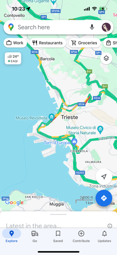
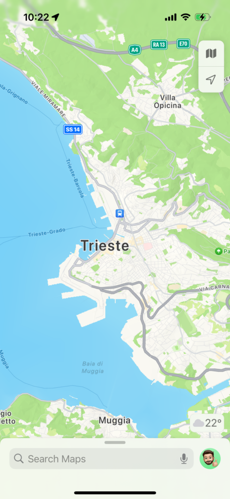
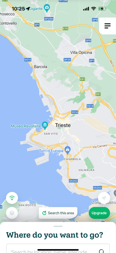
Google maps, the most popular map app, is overly complicated and cluttered (which is typical of Google). I found that a design like this can be too confusing and overwhelming when creating a specialized map app. Apple Maps on the other hand, does a good job at reducing the visible functionality to a usable minimum – maybe too much for a specialized map, though. Lastly, a competitors app does show a good mean between the two, offering relevant information for the typical user of its service, while also keeping the map unobstructed. But there still are some things that could be improved on, like the non-automatic search functionality and the inconsistent design across the interface.
One thing all maps have in common is the detail view for locations. They utilize the bottom sheet, a common design element in mobile apps, to display detailed information about a location. The benefit of this is that the user can easily drag it down to have an unobstructed view of the map, without losing the context they were in. Seeing as the most popular mapping apps use this precedent, I’ve decided to also go with this practice in my design.
I placed the search bar and layer selection functionality at the top so users have an unobstructed view of the map while navigating. When clicking on a location, the bottom sheet comes up with information about the location. It can then be dragged down to have a split view of the map and the location information, while still keeping buttons in view.
In this blog post, I’d like to touch on a general web design practice, that shows it’s important in map design as well. Building a complex map like Vanlifezone’s requires a framework to build with. Although technically possible with vanilla HTML, CSS, and JavaScript, a framework like NextJS takes care of a lot of pain points, like SEO, caching, server-side rendering and client-side loading.
NextJS, the framework I’m building the map with, is based on React, a JavaScript library for building user interfaces. React is built around the concept of components, which can be thought of as reusable pieces of code. Using components, complex user interfaces can be broken down into smaller, more manageable parts.
Similarly, when designing a more complex interface, components should be used for reusability across different areas of the UI. For me, it was important that these components reflect the same code-based React components in the repository. This insures that I can design the UI the same way I code the map.
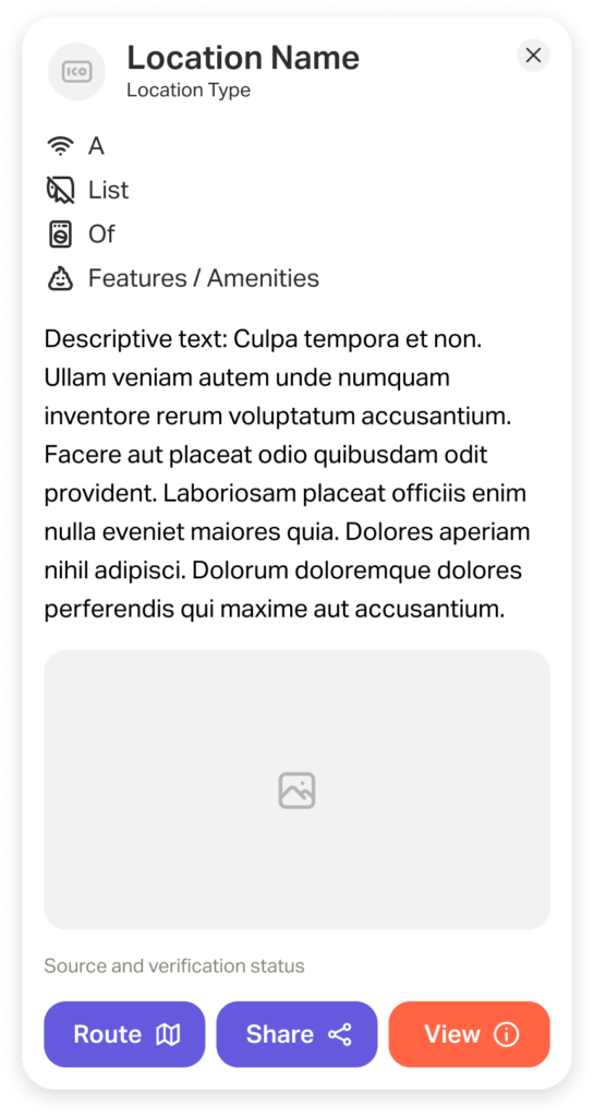
One such example is the location popup card, which shows more detailed information about a location after it is clicked on. Without user testing, I can only make informed assumptions and heuristic evaluations for deciding what type of information to display on this popup. But having been on vanlife adventures myself, I have a decent grasp on what info is necessary during these types of travels.
Of course I also want to keep the goals of Vanlifezone.com in mind, both for building a community of active users and financing the project. Because of this, we have decided that businesses can pay to have their business displayed more prominently on the map, and also have additional information in their popup.
Below is a first version of how this popup looks like – it includes:
Icon/profile picture for the location type
Name of the location
Location type
A list of features and/or amenities
Descriptive text
One or multiple relevant pictures
Source (User, OSM, etc.) and verification status (Paid partner, verified by community, unverified)
A row of buttons for routing to, sharing, or viewing the location in more detail
I am writing this blog post a few weeks after this design has been made, and already there are some considerations for information that might be important to include. During early user testing it was pointed out that pricing information and availability (relating to camp sites) is valuable and often tricky to find, due to seasonal pricing. The amenity could also have better visualizations of the availability of amenities, and contact information could also be useful to include in the popup. This led to a newer version of this popup (still excluding pricing and availability information). Note that the buttons at the bottom are also variable, depending on what information is available.
Of course, this is only the start. As more testing is done, I will have to adapt the design and functionality of this and other components.
In our UX design class we had the opportunity to utilize eye tracking technology for analyzing physical or digital objects and products. I chose to use Vanlifezone.com for this analysis, in order to gain qualitative insights into how users interact with the website.
The user testing aimed to understand user interactions with Vanlifezone.com and identify areas for improvement. We employed eye tracking and the „thinking aloud“ technique. Three participants engaged in a series of tasks designed to evaluate the website’s usability and specific functionalities.
Methodology
Each participant completed a 20-minute guided session with indirect eye tracking activated. They navigated through the website and completed tasks while verbalizing their thoughts. This approach provided both eye tracking data and secondary insights from their commentary. The team consisted of a moderator, a technician, an observer, and a documentarian, ensuring smooth operation and thorough documentation.
Tasks
Participants were asked to:
Explore the landing page to understand the website’s purpose.
Find an article of interest.
Share an article with a friend.
Order a physical copy of the magazine.
Access the Vanlifezone map and its information.
Find camping restrictions at Lunzer See.
Locate the closest campsite and garage for repairs at Lunzer See.
Due to software limitations, tasks involving the map functionality were excluded from the testing process.
David Laßlberger (m, 24): Gamer, indecisive, prefers hotels.
Observations
Engagement with Content: Participants frequently navigated towards articles and magazines, indicating high interest in content. However, all participants experienced confusion regarding the differentiation between „articles,“ „stories,“ and „journal“ sections.
Navigation and Usability: General navigation was found to be less intuitive, with issues like unexpected menu locations, difficulty in closing the menu, and unclear navigational links. Vanessa and Molly had trouble finding how to order a physical magazine, while David found the navigation structure non-intuitive.
Visual Design and Aesthetics: Participants reacted positively to the visual design, although text readability and color contrasts were criticized.
Specific Functionality Issues: Features like „Support Vanlifezone“ or „Distribute Magazine“ were not easily located. The map and magazine ordering features posed significant usability challenges.
Findings
High Engagement with Articles: Participants were drawn to articles and banners, especially those with large graphics.
Navigation Needs Improvement: The website’s navigational structure and menu interactions need enhancement.
Physical Magazine Ordering: There should be clearer paths to find and order physical copies of the magazine.
Text Readability: Improvements in text size, color, and contrast are necessary for better readability.
Content Categories: Clear differentiation between „articles,“ „stories,“ and „journals“ is needed to avoid confusion.
Interactive Elements: Addressing the usability of interactive elements like the map and ensuring all clickable elements meet user expectations would significantly improve user experience.
Conclusion
The eye tracking and „thinking aloud“ analysis of Vanlifezone.com revealed several areas for improvement in terms of navigation, content differentiation, and interactive elements. Addressing these issues will enhance user experience and engagement with the website.
Geocoding is the process of converting addresses into geographic coordinates, which you can use to place markers on a map, or position the map. Reverse geocoding, on the other hand, is the process of converting geographic coordinates into a human-readable address. These processes are essential in various fields, including logistics, real estate, and in the development of applications that require location services.
For my project, I use geocoding in the most common way as it is found around the web. I convert a user’s address query into coordinates, in order to set the maps position to those coordinates.
Integrating Geocoding with UI Elements
When designing a user interface that incorporates geocoding, there are several key considerations to ensure that the user experience is fluid and efficient.
Address Input Fields The design of the address input field is crucial. It should be prominently placed and easy to use. Implementing an auto-complete feature that suggests addresses based on the user’s input as they type can significantly reduce the entry time and improve the accuracy of the data provided.
Feedback and Error Handling Providing clear feedback is essential, especially when the address cannot be geocoded. The UI should inform users of the problem and, if possible, provide suggestions or alternatives. This can involve highlighting errors directly in the input field or offering a list of possible corrected addresses.
Responsive Map Updates The map should respond dynamically as the address is being confirmed. Once the geocoding process is complete, the map should update immediately to show the exact location, ideally with a marker or other visual representation. If the location is broad, such as a city or region, the map can automatically adjust the zoom level to encompass the entire area.
Case Studies Demonstrating the Power of Geocoding
Logistics and Delivery: A leading delivery service company integrated a geocoding API to improve delivery times by 15%, enhancing customer satisfaction and reducing operational costs. This integration exemplifies the impact of efficient geocoding in logistics.
Real Estate: Geocodio powers thousands of real estate applications, providing geocoding services that transform addresses into geographic coordinates. This capability allows for the integration of location data, school districts, and more into real estate platforms, significantly enhancing user experience and operational efficiency.
Public Health: During the COVID-19 pandemic, a public health organization utilized geocoding to map the spread of the disease, effectively allocating resources to heavily impacted areas. This use of geocoding significantly helped in controlling the spread, showcasing its value in public health crises.
Healthcare Logistics: In a critical healthcare scenario, Noatum Logistics managed the timely shipment of syringes from China to Peru for the COVID-19 vaccination campaign, demonstrating the crucial role of geocoding in global health responses.
AI and geocoding
Artificial Intelligence can play an important role in advancing the capabilities of geocoding technologies. By integrating machine learning models, we can significantly enhance the accuracy and efficiency of converting addresses into geographic coordinates. This is particularly valuable in areas with less standardized addressing systems.
One of the most compelling applications of AI in geocoding is in error correction. Machine learning algorithms can learn from vast datasets of addresses and their corrections, enabling them to predict and correct user input errors automatically. This not only improves the user experience but also ensures that the map positioning is as accurate as possible, even when the initial user input is flawed.
AI also enables predictive location services, where the system anticipates the user’s intended destination based on partial address inputs and historical data. This functionality is not only about convenience; it’s about creating a seamless interaction where the map interface feels intuitive and responsive to the user’s needs.
When designing icons, start with a consistent grid to ensure alignment and visual stability. Use simple geometric shapes like circles and squares for a clean foundation. Ensure all edges, lines, corners, and curves are mathematically precise for a polished look. Maintain aesthetic unity with consistent design elements across all icons. Avoid unnecessary complexity – use details sparingly for clarity and recognition. Finally, add distinctive elements to make your icons unique and memorable. This is a short summary of what Smashing Magazine says about icon design. These principles apply to map icons as well and is a good starting point for creating my own icons.
OpenStreetMap Icons
OpenStreetMap has their own design language – it employs simple, straightforward icons that can be easily understood at a glance. They use a variety of shapes and colors to differentiate between different types of locations, such as parks, restaurants, and hospitals. There is a full list and guide on how these are implemented on the OSM Wiki.
While OSM is great for clarity, the design language of their icons and symbols feels a bit outdated compared to today’s design trends. So while it is a great resource for inspiration and checking on norms, I will design my icons differently than those from OSM.
Vanlifezone.com caters to people in the van life community, and the map I am building should display relevant information for this community. These will only be used for the points/nodes layer, since polygon/fill or line layers are better described with a key or accompanying text along the line or outline of the layer.
As you have seen in the previous blog post, I’ve already created a list of layers that I want to map. I searched the web for inspiration and found Apple Map’s solution for icons to be best in conveying information without convoluting the map unnecessarily. They use colored circles which enclose the symbols.
My icons were create from a mixture of custom icons (tent, wrench, storefront, key) and open source icons from tabler-icons.io. Special icons (article, warning, hotspot) are not contained in a white-bordered circle like the other icons. I wanted to differentiate these because on the one hand, they are user generated content, and on the other hand, they have higher importance on the map.
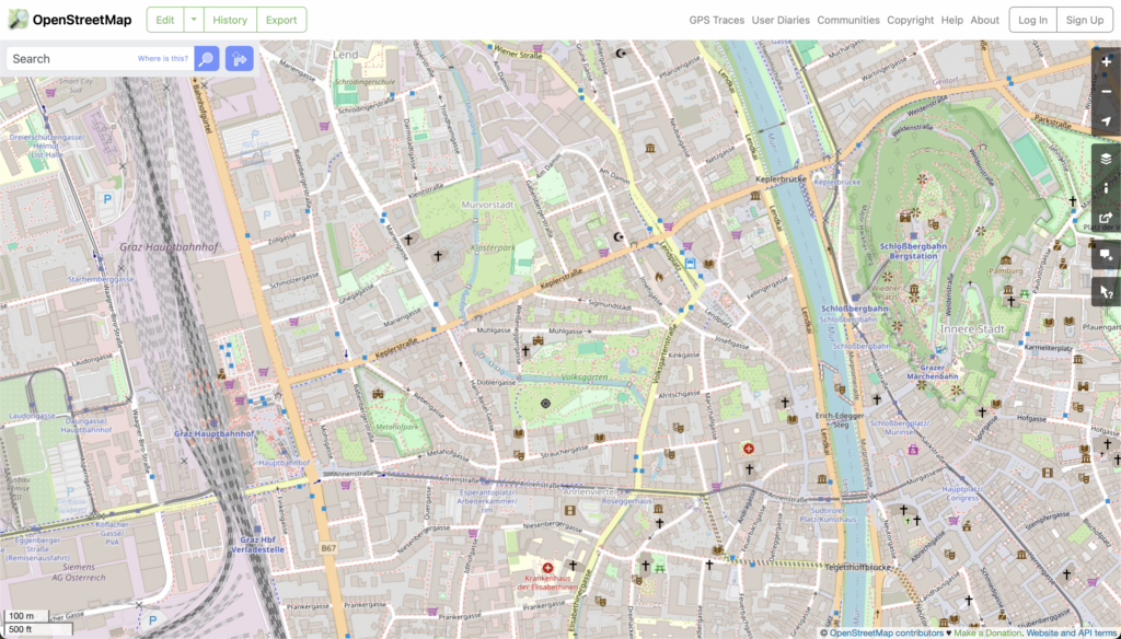
Some basic icons in action on the Vanlifezone map
Icon density, clustering, and zoom levels
Another aspect of implementing icons into the actual web map is the consideration of zoom level for displaying the icons. This is crucial, as showing the icons at a very low zoom level (map is zoomed out far) can be overwhelming for the user, browser, and data transfer bandwidth. Showing icons too late, so at a high zoom level, will not be beneficial to the user, as they would have to zoom in way too far to see relevant information for an area.
I found that a zoom level of 8.5 – 9 is a good middle ground for these two issues.
Another aspect to consider with icon placement is the icon density. If the density of icons on a map is too high, it’s good practice to implement clustering to avoid overwhelming the user. Clustering groups nearby icons together to improve readability and user experience. As the user zooms in, clusters break apart to reveal individual icons, providing more detailed information. The clusters are visualized by a bigger circle, displaying the number of clustered points of interest in the middle.
If clustering wants to be avoided, another solution is to simply not show all icons at once. In Mapbox there is a setting to not allow icon overlap, so as the user zooms in more icons will become visible when more screen real estate is available.
Map layers can come in various formats, each with its own advantages and nuances:
GeoJSON This is a format for encoding a variety of geographic data structures. It supports point, line, and polygon geometries, making it a versatile choice for map layers.
KML Short for Keyhole Markup Language, KML is an XML-based format for expressing geographic annotation and visualization. It is commonly used with Google Earth and other Google tools.
Shapefile This format is widely used in GIS (Geographic Information System) software. It organizes geospatial data into a vector format that can be used to create map layers.
GML Stands for Geography Markup Language, GML is an XML-based format for encoding geographic information, including both the geometry and properties of geographic features.
Choosing the right format for the map layers depends on your specific needs and the tools one is using. For my use case, I’m focusing on GeoJSON. This format comes with good javascript and database support, which are two important factors for the map I am working on. GeoJSON can not only store the geometries of a layer, but also data relating to these layers. This can be anything, but a typical structure for an OSM location may look like this:
As described earlier, map layers can generally be divided up into three different types or geometries:
Point A point is a geographical coordinate – a single location in a coordinate space. It is defined by a pair of coordinates (longitude and latitude). Usage of the point geometry may include representing individual locations such as specific addresses, a landmark, or a point of interest.
{
  "type": "Point",
  "coordinates": [102.0, 0.5]
}
Line(String) A LineString represents a series of connected points, forming a continuous line. It is defined by an array of two or more coordinate pairs. Lines can represent linear features such as roads, rivers, paths, or routes.
Polygon A Polygon represents an area enclosed by a series of connected points, forming a closed loop. It is defined by an array of LinearRings, where the first and last coordinate pairs must be the same to close the loop. The outer LinearRing represents the boundary of the polygon, and additional LinearRings can represent holes or voids within the polygon. Polygons show areas such as country boundaries, lakes, parks, building footprints, and any other spatial areas.
For Vanlifezone, I gathered information from other similar services, google maps, and OSM to create a list of layers that I want to include.
These layers will be sourced mainly from OSM. The next step will be to see how this data is best brought into Mapbox, while still staying editable and consumable. Mapbox already includes almost all of OSM’s data, however properties on certain nodes, such as opening hours, are not included in Mapbox’s dataset.
Mapbox Layers
Mapbox is a powerful mapping and location platform that provides developers with the tools they need to create interactive maps and incorporate them into their applications. It uses vector tiles, which are highly efficient and flexible, allowing for smooth zooming and fast loading of maps. Mapbox also offers various customization options, allowing developers to alter the style and appearance of their maps to fit their specific needs.
Mapbox provides an API that developers can use to interact with the service and include it in their applications. This API provides access to various services, including geocoding (converting addresses to geographic coordinates), directions, and more. It also allows developers to add interactive features to their maps, such as markers, popups, and user interactions (like clicking or hovering).
In the case of this blog post, Mapbox is being used to display map layers that are sourced mainly from OSM. The data from OSM is imported into Mapbox, where it can be styled and manipulated to create my desired map.
A significant force in the world of digital cartography is OpenStreetMap, or OSM for short. It is an open-source project focused on mapping the entire world through the collaborative efforts of volunteers using freely accessible and editable geographic data.
OpenStreetMap’s main strength is its dedication to open data. Open data means anyone can use, change, and share the geographic information in OSM for free. This has a few important impacts:
Accessibility: Anyone can access and use OSM data without needing to pay for expensive licenses.
Collaboration: The open nature of the data encourages collaboration among users, developers, and organizations.
Innovation: Open data encourages innovation as developers can build upon existing data to create new applications and services. (This is what I’m doing!)
OpenStreetMap website
OpenStreetMap data is used in a variety of applications, from everyday navigation to disaster response. Here are a few examples:
Navigation Apps: Apps like Maps.me and OsmAnd use OSM data for offline navigation.
Humanitarian Aid: During natural disasters, organizations like the Humanitarian OpenStreetMap Team (HOT) use OSM to provide up-to-date maps for disaster response.
Urban Planning: City planners and researchers use OSM data for analyzing urban development and planning new infrastructure.
How digital mapping works
Since this data is open-source and easily accessible, it is a great starting point for creating ones own maps. But digital mapping is a complex topic – more so than it may seem at first. Since it is also a broad topic, I will focus on how the rendering and viewing of digital maps works, as this relates most to my project.
Rendering in digital mapping refers to the process of generating a visual representation from a model, in this case, geographic data. In the context of OpenStreetMap, the geographic data is processed by a rendering engine to produce the final map that users see.
It starts with the raw data, which consists of points (representing locations), lines (representing roads, rivers, etc.), and polygons (representing areas such as parks, buildings, etc.). This data is usually stored in a geographic database.
The rendering engine takes this data and applies a style sheet, which defines how each type of feature (roads, parks, water, etc.) should be displayed – its color, width, pattern, and other visual attributes. This process is called “’styling”.
Next, the styled data is “drawn” onto a blank canvas to create the map. This is done in layers, with each layer representing a different type of feature. The order of the layers is important as it determines what features appear on top of others. For example, roads are typically drawn last so they appear on top of other features like parks and buildings.
Finally, the rendered map is divided into tiles, which are small, square images. These tiles are what you actually see when you look at a digital map on a screen. When you pan or zoom, different tiles are loaded in to give the impression of a seamless map.
It’s important to note that rendering is a computational heavy process, and for large maps, it can take a lot of time and resources. Therefore, tiles are usually pre-rendered and stored on a server, ready to be served up to users when needed.
As we look towards the future of vanlife map design, we’re poised to witness significant changes influenced by technological advancements and evolving user expectations. The integration of Geographic Information System (GIS) technology with emerging trends promises to revolutionize how vanlifers interact with maps.
Emerging Trends in Vanlife Map Design
Cloud-Based GIS Solutions
Cloud technology is increasingly adopted in the GIS industry, allowing for real-time analysis, sharing, and purchasing of geodata over the internet. This shift to cloud-based systems facilitates streamlined operations and enhances real-time interaction with maps, a feature that could be incredibly beneficial for vanlifers needing up-to-date information.
3D Mapping and Digital Twins
The advancement in drone technology and LiDAR scanning is making 3D mapping more accessible and accurate. This could lead to vanlife maps offering virtual, as-built infrastructures, providing a more immersive understanding of terrains and landscapes.
Real-Time Data and IoT Integration
The growing importance of real-time data in sectors like transportation and emergency management indicates that future vanlife maps might incorporate real-time traffic updates, weather conditions, and even spot potential hazards, leveraging the Internet of Things (IoT) for comprehensive data integration.
Augmented Reality (AR) in Mapping
AR is set to provide an interactive and immersive mapping experience. For vanlifers, this could mean enhanced navigation with overlaid information about the surrounding environment, blending the physical and digital worlds seamlessly.
Automation and Machine Learning
Machine learning and automation are expected to play a crucial role in future map designs. These technologies could automate route optimization and predictions based on user behavior, making maps more intuitive and personalized for vanlifers.
Conclusion
The future of vanlife mapping is geared towards creating more dynamic, interactive, and personalized experiences. These advancements will not only enhance the practicality of maps for navigation but also enrich the overall experience of living on the road. By embracing these technological trends, vanlife maps are set to become an indispensable tool for the modern nomad.
Creating maps that are both visually appealing and functionally effective is a delicate art. This blog post examines how to achieve a balance between aesthetics and practicality in map design, ensuring that maps are not only engaging to look at but also serve their intended purpose efficiently.
Principles of Effective Visual Design in Maps
Legibility and Clarity
Legibility is paramount in map design. This involves selecting symbols that are familiar and appropriately sized to ensure that they are effortlessly seen and understood. For example, using geometric symbols for airports and more complex symbols, like a mortarboard for universities, but ensuring they are large enough to be legible.
Hierarchical Organization
Maps should visually separate information into layers, helping users focus on what is important. For reference maps, many features should lie on the same visual plane, while thematic maps should highlight the theme more than the base providing geographic context.
Balance and Composition
Balance in map design involves organizing the map and other elements on the page to create an impression of equilibrium and harmony. This can be achieved by considering visual weight and direction of the elements on the page.
Adapting to Screen Sizes
In the digital age, maps must be designed to work across different devices. For mobile devices, prioritize essential functions and streamline controls for touch, while on desktops, offer detailed controls and capitalize on hover interactions.
Enhancing User Experience Without Compromising Usability
Responsive Design
Responsive design ensures maps look great and function seamlessly across all platforms, especially important given the increasing use of mobile devices. Simplifying design for smaller screens and using larger buttons can facilitate user interaction.
UX Principles in Map Design
Clear, instinctive navigation and alleviating load times are crucial. Optimizing site speed through image compression and code minification can maintain aesthetic appeal while ensuring a seamless user experience.
The Role of Aesthetics in User Engagement
Aesthetics influence user behavior and perceptions significantly. People form opinions of a website within milliseconds, making first impressions crucial. Paying attention to elements like white space and using high-quality images and illustrations can greatly enhance user engagement.
Conclusion
Balancing aesthetics with functionality in map design is crucial for creating maps that not only attract users but also provide a seamless and efficient navigational experience. By adhering to principles of legibility, hierarchical organization, balance, responsive design, and incorporating user experience elements, designers can create maps that are both beautiful and useful.