For my second experiment I wanted to find out if it really matters that an artwork is made by hand or if it is enough for it to just have a handmade aesthetic. This idea came to me after I stumbled upon a video of a designer who explained how he fakes a handmade look.
In order to investigate this, I created a quiz with different artworks, some of which are actually handmade or produced in an analog way and some of which are digital creations that have a handmade look added to them. I asked my participants to click on the pictures they believe are handmade/analog.
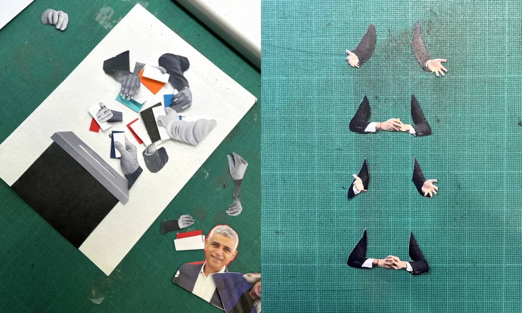
For the handmade/analog works I chose some that I came across during my research the past two semesters. A collage I wrote about in my las blogpost, a letterpress print I saw at DruckZeug, and an analog picture I took. The digital fakes I all took from online tutorials on faking the analog aesthetic. I chose a collage, an illustration and a photograph, to get a wide variety of different techniques.
I am really interested in the outcome of this survey. Since I have been working on this topic for a while now, I find it a bit easier to tell the difference, but I am not sure how obvious it is to others. To get an even more realistic answer I sent this survey not only to designers but also Students from other fields, that have never produced a design neither digitally nor analog.
“The rise in disinformation and fakery cemented the idea to do the opposite and lean into the craft of doing things for real.” – Chris Clark
During my free time I stumbled upon an article about how the creative team of the guardian create all their artworks concerning the election by hand, in an imperfect aesthetic. This caught my attention right away, because it fits my topic perfectly. Why would a big newspaper take the time and effort to create handmade graphics?
The creative director of this campaign Chris Clark said: “The main spark of inspiration came from a conversation with a desk editor describing the country as ‘broken’, with nothing fitting or working quite as it should. This in parallel with the rise in disinformation, and fakery either through AI or generative articles really cemented the idea to do the direct opposite and be as honest and transparent in the creative process as we could – to lean into the craft of doing things for real.”
One of the main ideas was to build trust. With all the misinformation and fake news that are spread surrounding elections, it was important for them to create an authentic, trustworthy and approachable atmosphere for the readers.
But by using ripped paper cut outs they also want to visualize a “broken Britain” and how it could be put back together.
They choose to make the graphics by hand instead of faking the look on a computer. Because why fake it if you can make the real thing, and because they were in the privilege of having a good and agile team. The style is influenced by the specific employees and has variations in it. It allows for quick working, that would take much longer on a Mac, the digital design director says. He also mentions that in the beginning it was hard to stop themselves from reworking the results but especially by limiting their time they got much more productive. Now they create up to six artworks a day.
It is not like in digital design, where you usually have a strict style guide, but instead the regular process of it and the methods are what creates consistency. They set up some rules, like using mainly black and white pictures, that they either cut out or rip, but the rest is left open to create the most fitting results for the stories.
When asked how they make the designs look so distinctively handmade, the creative director answered the following: “In not only embracing the imperfections but amplifying them. We’re deliberately not removing any of the damaged paper, worn photocopies or dirty toner, and trying to be as responsive and immediate as possible. We’re often choosing the first composition and giving them very little enhancement from what is captured in the camera. “
This confirms my assumption from last semester, that “handmade” can be a countermovement to new technological developments like AI. With more and more fake images circulation on the internet, and free tools to create these, it makes sense that people feel safer when seeing an analogue image. I found it really interesting that such a big campaign chose the handmade style, but it also confirms the relevance of the topic of handmade design. It’s not only for niche, small businesses to sell on etsy and craft martkets but also for the masses. And yet this campaign also fits right in with my findings about the associations of the handmade look. Craftivism gave handmade visuals a irrevocable connection to politics and morals. This can be seen clearly by this creative campaign of political coverage.
The reason why I got back into my topic was, because lately I have been doing more handmade design and found it fun and refreshing in comparison to sitting on the computer all day. In this blogpost I want to report on my personal experience on this topic. For the course ‘print production’ we got to do multiple things by hand. During our lecture at ‘Invinitive Factory’ and ‘Maarble’ for example, we got to bind books. Once we used book bolts, which was super fast and easy. We had to fold the papers by hand, punch holes into them, fold the cover page and then screw in the bolts. It surprised me how quick and easy this technique is, whilst still resulting in a very clean and professional look. If I already had all the utensils at home, I would personally much prefer binding brochures in a small quantity at home, rather than getting it bound by a cheap online service. The other time we bound books was with needle and thread. This took much longer and has a much more distinctive handmade looking result. What stuck out to me was how much fun it was to take the time and get lost in the details. With every stich you could see it coming together, which felt really great.
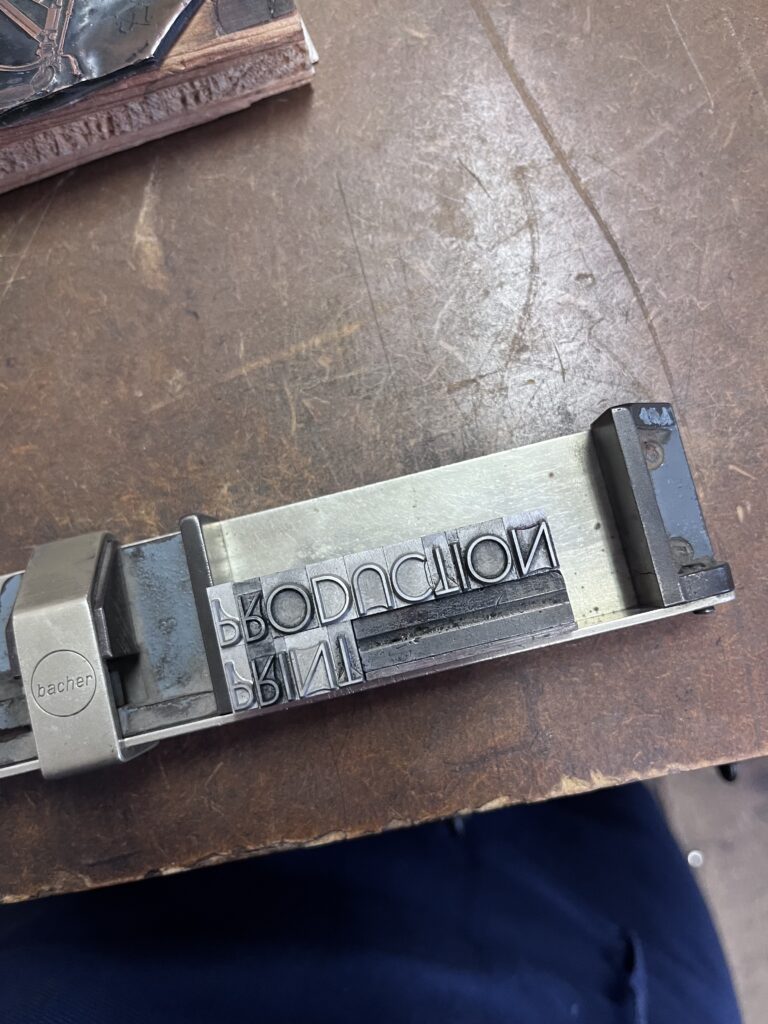
Another time we went to ‘DruckZeug’ to set and print postcards analog. I also went there again privately, to print the cover for a booklet. This, in comparison to book binding can be directly compared to digital designing in my opinion. I thought it was much harder, not only because you have to set the letters inverted, but because you have to use your imagination so much. When you set the words, you can’t yet decide where on the page they will be printed, or in which color. So, the result is much more of a surprise. But when it works out the surprise is so nice, that it really feels like a great accomplishment. Sometimes when designing digitally, the changes are so easy to make, that it never really feels finished and the result often feels more like a compromise because the options are endless. I also enjoyed the different steps of setting and afterwards printing. It makes the task more varied, so that it doesn’t get boring. In general, I believe I designed much more planned than when I open my laptop. I also felt braver in a way, because I couldn’t know what the result will look like anyways, so I just went for my idea and hoped for the best.
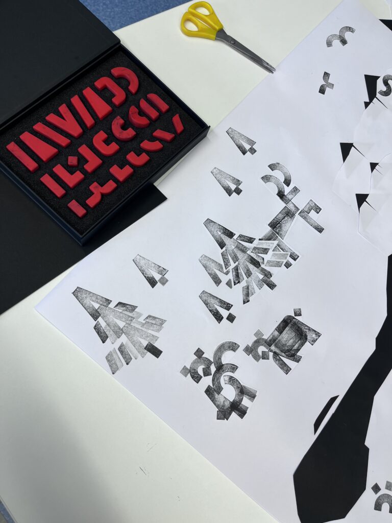
During the international week I was in the workshop of Daniel Utz, where we worked on pictograms. As a warming-up exercise we had to use stamps and cut out paper, to create simple shapes and put them together as scenes. Doing this in an analog way made it much easier to collaborate with others I noticed. Also, I felt keener to experiment and had many ideas of how to create interesting shapes. On the computer I tend to google and get inspiration of how other people did it.
In general, I had a lot of fun using my hands and analog techniques to design this semester and personally feel the benefits of it. But it has to be said, that these techniques are pretty time consuming and can therefore be considered sort of a luxury. They also require some equipment, some of which is easy to acquire, some of it harder.
For my first experiment I created a survey with the goal of figuring out what associations handmade design in branding has. I wanted to see if it aligns with the research I did last semester. I took four brands with different values and asked my participants what associations they have with the brand, as well as if the handmade design fit the brand in their opinion.
I had six participants in total. The first brand I asked them about was Oatly. I chose this brand because it has ethical connotations. The brand sells Oat milk, which is becoming more and more popular, because it is much more sustainable then cow’s milk. Five out of six participants mentioned climate or sustainability as an association to the brand. 4 people also mentioned that the brand has a young audience, which might be related to the sustainability concern in my opinion. When asked if the handmade-looking design fits the company values on a scale from 1 to 5, 50% of participants answered 5, 2 participants answered 4 and one person said 3. This shows a clear tendency that people think this handmade design fits this sustainable company.
The second brand I asked about was Fanta. Here the associations went in two directions. 3 people mentioned negative associations like “unhealthy” or “chemical”, whilst three people mentioned only positive words, like “fun”. I noticed the word “young” was also mentioned twice. With Fanta the opinion if the handmade style fits the brand are a bit more indecisive. Four participants thought the style fit well or even very well, one person thought it was neutral and one person answered, “not at all”. This surprised me a little, because according to my research the handmade style has ethical and political connotations, and since Fanta is a mega corporation that sells an unhealthy drink, it should not really fit this style of design. Personally I can imagine that the handmade style also has “fun”, and “young” associations, since these words were mentioned in connection to Fanta much more than “unhealty” and “corporation”.
The next brand I chose is Gucci. Even though their branding usually doesn’t involve the handmade style, I found an invitation to a fashion show with a handwritten font, that I found interesting. Five participants mentioned “high-class” or similar words and two people mentioned “trashy”/ ”fake”. 83,3% said that this style does not fit the brand at all or not well, and one person said it fits well. This aligns pretty much with my research.
The last brand I chose is stüssy. Unfortunately 50% of participants did not now the brand, but since I showed them pictures they could still form an opinion. This time the associations were quite cohesive. Participants mentioned words like “Hip-Hop”, “trendy”, “Artsy” and “provocative”. 66,6% thought the imperfect style fit the brand well or very well, and two people thought it fit neutrally. This kind of aligns with my research, since the brand represents subcultures with political connotations and should therefore fit the handmade style.
All in all, I got confirmation about the associations of handmade design. But I also found out that it has strong connotations to youth and fun.
In my first experiment, I am looking at the effect of the handmade design style. By means of a survey, I would like to look at brandings in the handmade style. I want to find out whether this ‘handmade’ aesthetic evokes certain associations and if so, which ones. Roughly speaking, which brands, and the associated brand values does the ‘handmade design style’ fit in with?
During my research last semester, I found out that the handmade/analogue style has strong associations with political movements. For example, there is a strong connection to zines – homemade magazines that spread a political counter-movement – where this style was used very dominantly. This also gave rise to the Craftivism movement, in which political messages were expressed through handcrafted designs. An after-effect of these political and ethical associations was the so-called ‘craftwashing’, where companies deliberately used a handmade aesthetic to fool consumers into thinking they were a particularly ethical company, that supports certain political views.
As these movements mainly took place in the 1990s and 2000s, I am interested in the after-effects of them. Are these associations still as strong or are there completely different ones now?
This is what I want to find out with my survey. I chose four brands that have some ethical and political associations, such as Oatly (environmentally conscious) and Stüssy (popular brand among subcultures, e.g. hip-hop, skater, punk scene). As well as brands without such a connection, like Fanta and Gucci. With all these brands, however, I have found branding that looks imperfect and handmade. In my survey, I would now like to ask my participants what values they associate with each of these brands and whether they think the handmade style fits in with these values.
I created my survey using Google Forms and sent it out to willing participants. Some of them are professional designers, some of them come from other fields. This way I want to make sure to get representative results.
For my experiments about the topic of handmade design I firstly want to divide the topic in to two perspectives:
The effects of handcrafted design
The process of handcrafted design
I have concluded that, even though both of these aspects of handmade design are intertwined, this division makes sense. In the end I hope I will get a clearer look on what a designer can get out of this way of designing and what an observer will perceive. Maybe then there could be a way to assess when it makes sense to design in this more time-consuming, less accurate way.
During my brainstorming I had the following ideas for experiments regarding the effects of handmade design:
Participants will be asked to evaluate branding for companies or events of different industries. The brandings will all have a similar handmade-look to them, and the key question will be: “When does this style seem authentic and align with the industry in question?” This way I can find out if my theoretic research from last semester can be confirmed in a real scenario. For example, I found out that handmade design has big associations to moral and political causes.
Participants (preferably non-designers) will be shown different designs that appear to be handmade. It is their job to evaluate which ones are handmade and which ones were designed with a computer program. With this experiment I want to find out if it is necessary to design something analog in order to get the authentic effects of handmade design, or if a fake handmade-effect is enough.
So far, I came up with one idea for an experiment regarding the process of handcrafted design:
I will give designers short little tasks that they should execute once in a digital way and a second time in an analog way. Afterwards I will interview them on their experiments. This way I want to find out if there is a clear tendency which workflow is more enjoyable, which takes longer and with which one they felt more creative.
Last semester I was intrigued with handmade design and researched many aspects of it. At the end of the semester, I was unsure if I want to continue with this topic, since it was quite hard to find research papers on it. I didn’t get exactly the information that I hoped for through research, but I think the information that I found was very interesting anyways. Now, a few months later I want to reflect on my research about the topic and see if I still feel passionate enough about it to continue with it.
I found out that handmade design is a trend that keeps evolving with the times and finds relevance again and again.
The difference between digital and handmade design for the consumer lies in the impact. Handmade design has connotations to political movements which is why this aesthetic tends to be associated with political revolt, sustainability, and fairness. It also has an obvious effect of nostalgia. All these associations can be used to emphasize a message. This can be used morally or immorally, and therefore is quite an important topic.
But it’s not only about its perceived qualities. For designers, the decision of handmade or digital design determines the whole workflow and process of creation. I read that with the slower analog process designers might be more focused because they can’t rely on the exactness of their computer programs, and therefore create more thought-out designs.
This semester I think we had both extremes already. In some projects we used a lot of Artificial Intelligence, like Adobe Firefly and only worked digitally, for example in the Greentech project. But we also did a lot of work by hand in other courses. We bound books and created postcards with a letterpress in our print production course. And for example, in my workshop during the international week we got to work with paper and scissors as well as stamps.
Personally, I enjoy both workflows and can see that they each have pros and cons. But the analog process seems especially exciting for me because I get to hold an immediate outcome. Also, most of the time I feel a bit more creative, working with my hands.
Reflecting on this now, I can say that I haven’t lost interest in my topic from last semester, and I can see many points that speak for further continuing with it.
To conclude what I found out during my research this semester I want to quickly summarize my most important findings and consider future steps for continuation.
I started out by being intrigued with the visual aesthetic of the hand-made style in graphic design. I noticed it in many places and was wondering if it is currently gaining popularity. I found out that on the one hand it does seem to be a current trend, because it can be found in many design-trend-lists. Especially hand-drawn illustration and natural-looking design as well as references to traditional media with visible imperfections were listed. But since I looked into the history as well, I found out it’s a bit more complicated than that. The arts & crafts movement popularized the style over 100 years ago, as a countermovement to the industrialization. Later the hand-made aesthetic was popularized again by the zine movement between the 1960s and 1990s. This paved the way for craftivism and continued to the craftwashing by big corporations.
I also wondered at the beginning of the semester what the reason for creating time-consuming handmade (or handmade looking) designs in times of computer programs and AI could be. What I have found out so far is there can be multiple reasons. It could be a political choice, to actively withdraw from mass-production and consumerist markets. It could also be the opposite: Appealing to a politically conscious customer-base by using this design-style and getting them to purchase a product. Either way kind of implies a counter-movement idea to the unification of visuals. And a return towards nostalgic qualities from simpler times. It’s the human touch that not only leads consumers to believe it to be made more ethically, but also creates a connection to the designer, that feels more personal.
Another question I asked myself was what effects can handmade aesthetics create that computer designs cannot? I found out that due to historic connotations handmade aesthetics have learned associations to them which, depending on the situation, might strengthen the message of the design. I also found out that the cleanliness of computer-made designs might trick the designer into thinking his design is polished and therefore done, whilst analogue techniques aren’t as forgiving and force the designer to focus more intensely. This might lead to more thought-out designs. The finished design tends to also be more intentional with analogue tools, because they require active decision-making for every small detail.
During this research I stumbled over quite a few possible techniques of handmade design. For example: handwriting, woodcutting, embroidery, drawing, letterpress, collaging, stamping, food decorating and knitting.
All in all the research was very interesting but I found it difficult to find scientific and academic writings about this topic, which slowed down my momentum. There are still a few questions I didn’t answer during this time and could possibly focus on in future research. This includes an investigation about which design styles are combinable with handmade design, in order to get aesthetically pleasing and meaningful results. I also didn’t find out how messy designs can get whilst still working and fulfilling their purpose. Maybe an opinion poll on some examples could be helpful for this. As to how this trend can evolve further, I don’t feel qualified to answer. Especially in branding it seems it is a bit reprehensible to use this style unless the company or cause can actually back up the ethical connotations. To conclude, even though I found it really interesting to find out more about this topic, I am not sure I want to continue with it next semester, because of the difficulty of finding sources.
As a reaction to the negative impact of the industrialization, the arts & crafts movement emerged in Britain in the late 19th century. It changed the general importance society placed on the production of goods and reformed design and manufacturing process of everything, including architecture and jewelry. It also gave the decorative arts a higher status. The movement gained momentum and reached its peak around the turn to the 20th century.
There was an awareness the negative impacts of mass-production for at least two decades before changes emerged in the 1860s. There needed to be a reprioritization of values in order to create products with integrity, that didn’t dehumanize workers during manufacturing. The Arts & crafts movement wanted to do this by orientation on a set of ideals.
The movement set out to popularize decorative art. “The Arts and Crafts Exhibition Society mounted its first annual exhibition in 1888, showing examples of work it hoped would help raise both the social and intellectual status of crafts including ceramics, textiles, metalwork and furniture.” One of the defining artists of this movement was William Morris, who became a commercially celebrated designer whose style influenced many artists. His vision was to create beautiful, well-made objects for every day. For this he was inspired by medieval ways of production, that focused on manufacturing on a small-scale. He didn’t oppose the use of machines but disapproved the efficiency-focused splitting of tasks during production. He wanted the working class to enjoy their jobs by being able to creatively construct a product from beginning to end, instead of having to do the same small repetitive tasks day after day. The leading art critic of the time, John Ruskin also argued that isolating the creative process from the manufacturing had social and aesthetic disadvantages. This goes as far as designers creating a total interior. Because many of the arts & crafts leaders trained as architects the common idea emerged, that every object on a room should blend in a harmonious way. Therefore, the designers would work on a huge variety of different design disciplines. Another ideal the movement was striving towards was a rural lifestyle. That’s why many designers moved to the countryside and established new forms of living there. They revived traditions of craftsmanship and improved the economy by giving jobs to locals. When hiring they encouraged even untrained workers to join.
This movement is a good example of how the handmade style can holistically and authentically work. I think that the arts and crafts movement had a big impact on giving the crafts and hand-made aesthetic an ethical and political connotation, similarly as craftivism, which means craftwashing can also be traced back to this movement.
Connecting to craftivism, which I wrote about in my last blogpost, is the topic of craftwashing. After crafting became a political movement in the 2000s, a rapid increase of crafts as part of marketing and consumer goods emerged. “Handmade” was branded as an ethical consumption practice. The term craftwashing is used to describe the phenomenon where the handmade/crafted aesthetic is used to perform political and social engagement whilst ignoring environmental and ethical labour issues in the chain of production.
Big marketing campaigns exploit the political connotations of crafts by channeling the power they hold into the market. This gives consumers the opportunity to obtain the moral value of crafted products whilst also enabling them to perform political activism through showing them off. It capitalizes on the customers wish to do good. It’s the myth that buying craft is a form of progressive political action. Like the term greenwashing, craftwashing indicates to the customer that the product isn’t worsening the environment or current economic system. “By marketing affectively charged handmade objects (or their lookalikes) as solutions to pressing environmental, social and economic injustice issues, craft aesthetics are twinned with notions of individual political agency and morality, while leaving existing power systems largely unquestioned and intact.”
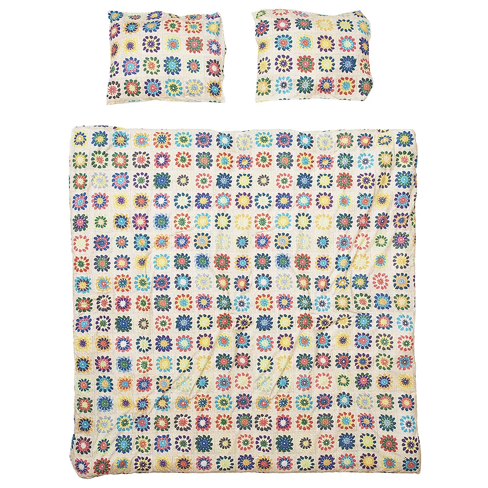
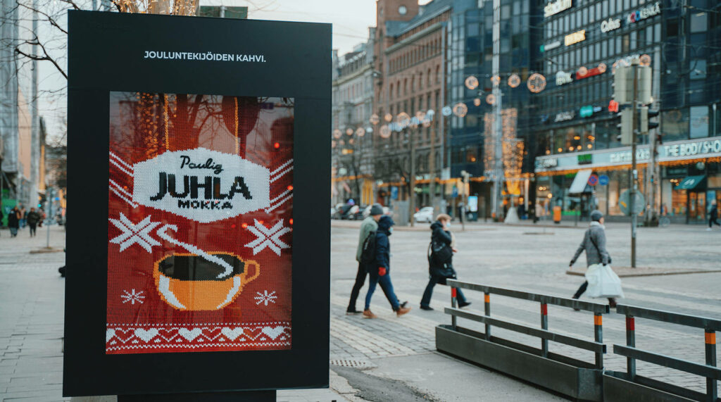
One example of craftwashing is a duvet cover by the brand snurks. They promoted this with the following description: “take one crochet pattern from grandmother’s time, one pile of colorful yarn and a bunch of lovely ladies from the local craft club. Stir in some cookies, tea, and bottles of prosecco and before you know it, you’ve all crocheted the most cheerful looking bedspread.” The product they were selling is a common duvet cover with a high-resolution print of a crocheted blanket printed on it. Similarly to this, knitted textures are featured in advertisements for all different kinds of products like milk, coffee, or smoothies.
The global companies that use these advertisements are not necessarily aligning their practices with the ethical associations of the craft aesthetic. This can be seen as an exploitation of the once charitable connotations of crafts, whilst encouraging consumerism at the same time. As to indicate buying a product is a solution to economic and social inequalities.