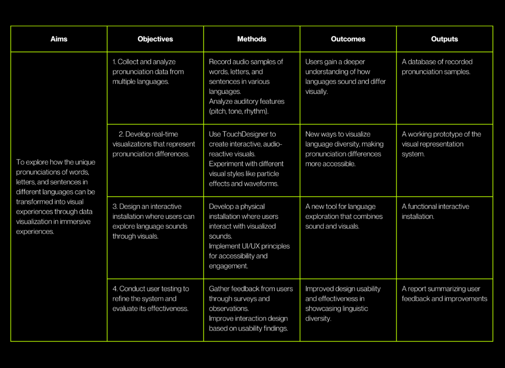
Research Matrix
For my last Impulse, I want to talk about the feedbacks I gather from 3 different experts. This week I had to chance to talk about my thesis expose with Ursula Lagger, Mr. Horst Hörtner from Ars Electronica Futurelab, and Mr. Kaltenbrunner from the University of Art and Design in Linz.
Ms. Lagger focused on my methods and the clarity of my exposé. She advised me to decide whether interviews are necessary and to refine my research focus. Her feedback reminded me of the importance of making my approach as clear as possible.
Mr. Hörtner gave me advice on presenting my work. After showing him my projects and portfolio, he suggested highlighting only three main projects that I want to pursue in the future. This helped me think about how to present my research in a more structured and impactful way.
Mr. Kaltenbrunner provided useful resources for my research and emphasized the importance of planning my installation. He suggested creating a draft, either in 3D or as a sketch, to clarify my concept. Since I already have experience with conceptual design, he encouraged me to refine my idea before moving into the production phase.
From these discussions, I learned that having a clear and focused exposé is crucial for my thesis. I also realized the importance of structuring my future projects and visually planning my installation before execution. These insights will help me stay organized and make my work more effective.
This feedback helped me see my next steps more clearly. Now, I will refine my thesis exposé, and start planning my thesis installation in a more structured way. Now, I feel more confident about how to move forward. These conversations really showed me the importance of balancing research with practical application!
For the 7th Impulse, I came across the TouchDesigner YouTube channel, found Bertrand de Becque’s talk about the Universal Project Template. It was fascinating to watch how he managed to achieve so much using TouchDesigner.

Seeing his workflow made me realize just how wide and flexible TouchDesigner is as a program. It’s exciting to think about all the possibilities, but it also reminded me that mastering such a tool takes a lot of time and practice :‘)

What stood out to me most was how he created a reusable template. Rather than starting from scratch with every new project, he built a structure that could be adapted for different purposes. This approach seemed so smart and efficient. It made me think about my own thesis and how valuable it would be if I could create something similar. For example, if I manage to design a template in TouchDesigner that I can use for visualizing how languages “look” or sound differently, it could save me so much time. It would allow me to focus on experimenting and refining the ideas instead of repeatedly building everything from the ground up.
It was also very interesting to see how organized and well-structured his work was. This level of preparation gave him the flexibility to adapt his template for various scenarios, and I realized how much planning can make a difference in any creative or technical process.

This talk taught me that creating templates is not only possible but also extremely helpful, especially when working on projects as complex as my thesis. It’s something I want to explore for myself, even though it might take time to figure out how to structure it properly. The way he approached TouchDesigner inspired me to think about my workflow and how I can improve it.
I also learned that TouchDesigner is a very broad and powerful tool, offering endless possibilities. This is both exciting and overwhelming because there’s so much to learn and explore. It made me realize that while I’m excited to use it for my thesis, I need to be patient and allow myself the time to become more familiar with it.
Overall, this talk was very motivating. It opened my eyes to new ways of working smarter, and it gave me ideas for making my thesis more efficient and creative.
→ Watch the Talk: Universal Project Template – Bertrand de Becque
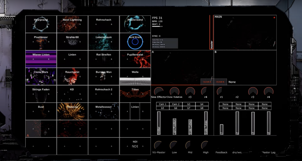
For my sixth Impulse, I wanted to try something online. I was hoping to join a free TouchDesigner workshop, but I couldn’t find one that worked with my schedule. Instead, I decided to follow a tutorial to help me with the voice interaction I’m working on for my thesis.
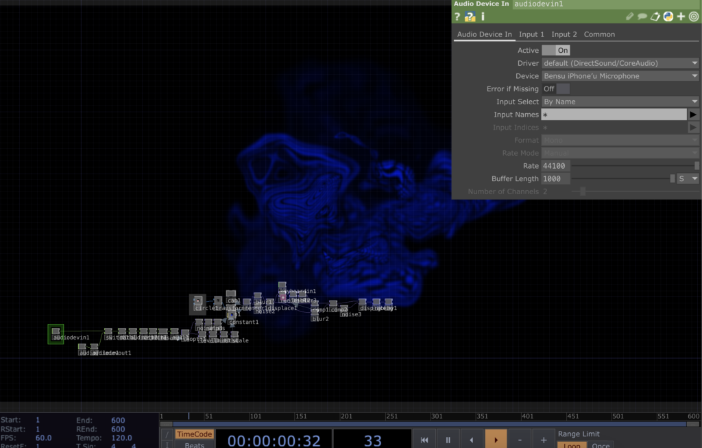
I chose the Abstract Speech Visualisation tutorial by Bileam Tschepe (Elekktronaut). His explanations were easy to follow, and the way he set up the audio interaction was really inspiring. He broke everything down step by step, which made it much easier to understand, especially for someone like me who’s still learning.
I then followed the tutorial and recreated the patch in TouchDesigner. I played around with some of the parameters and experimented with the settings to see how small changes could affect the visuals. It was interesting to see how different audio inputs created various effects, and I had fun testing different combinations. Below is a recording of my experiment with the patch.
So this tutorial helped me to practice TouchDesigner to create visuals that react to voice and sound better. Also, it is very important for my thesis, as I’m trying to visualize the unique characteristics of different languages.
→ Watch the Tutorial: Abstract Speech Visualisation by Bileam Tschepe
→ Learn more about TouchDesigner: TouchDesigner Official Website
Since my thesis is about how languages can „look,“ I thought it would be a good idea to rewatch the movie Arrival. I saw it a few years ago, but now I wanted to focus on its connection to language and visualization. Even though the movie is about aliens, it has a deeper message about how language works and how it can change the way we think and understand the world.

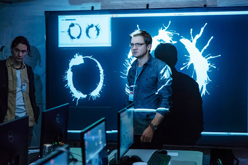
The movie is about a linguist named Louise Banks, who is asked to help communicate with aliens that have arrived on Earth. These aliens, called Heptapods, have a unique way of writing and speaking. Louise’s job is to figure out their language so humans can understand what they want. But the story is not just about aliens—it’s also about how learning a new language can affect your mind and even the way you see time.
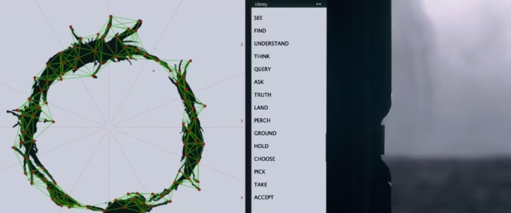
Attention spoiler alert🚨 One of the most memorable scenes for me was when Louise communicates with the Heptapods by touching the screen. Their written language is shown as circular symbols called logograms. These symbols are not written in a straight line like most human languages. Instead, they are designed to show the full meaning all at once, without following a specific order which is very interesting.
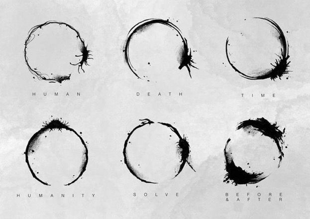

Idea of a nonlinear language really made me think about how I could visualize the sounds and meanings of different languages in my thesis. I also learned the term „logogram,“ which I guess, I didn’t know before. Now I want to research more about how other writing systems work, especially ones that are very different from the alphabets we use every day.
Overall, I really enjoyed watching Arrival again with an observation eye through language. Also it was visually appealing! I would recommend this movie if you are interested in science-fictions and aliens as well 🙂
→ Watch the Trailer: Arrival – Official Trailer
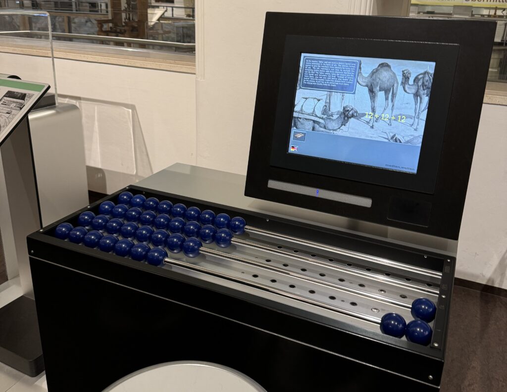
On November 30th, Mert and I visited the Technisches Museum Wien. There were several exhibitions, and luckily, we found some that fit our thesis topics. I was especially interested in how they designed the different exhibitions with different themes using interactive screens and installations. Even though some of them looked old, they were still inspiring!
One artwork that stood out to me was from the Musical Instruments exhibition. It showcased creativity, craftsmanship, experimentation, tradition, and the unique sounds of different instruments. The exhibit had a microphone hanging from the ceiling that captured the sound of the instruments and turned it into visuals. This was a great example of real-time data visualization, which really caught my attention.
Another inspiring part was the Media Worlds exhibition, which explored the history of media and its impact on society. It covered everything from early communication tools like the post and telegraph to modern inventions like computers and the internet. I had the chance to closely examine how interfaces and ways of interaction have evolved over time. There were also some interactive games, which I really enjoyed.
Also, the Energiewende exhibition and some others had very good examples of data visualization, even though they were not interactive. These examples showed how complex data could be made easier to understand through simple, effective visual representations. It was a reminder of how powerful data visualization is in communicating ideas and information clearly and effectively.
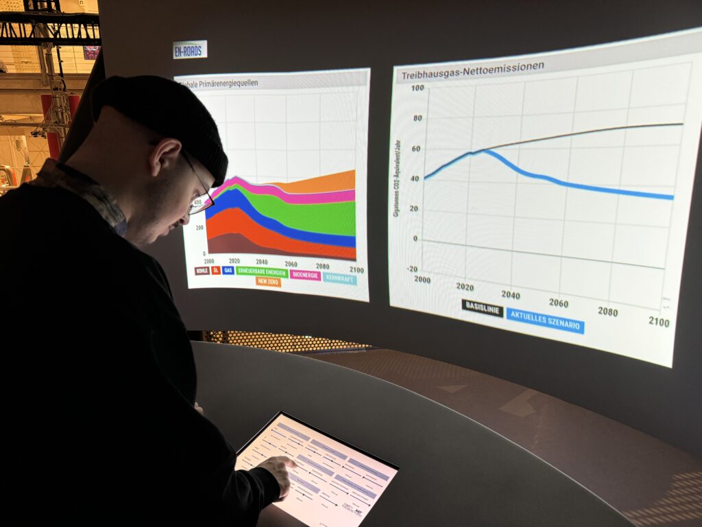
The visit to the Technisches Museum Wien gave me some inspos into interactive design and data visualization. I thought again how combining sound and visuals can create an engaging, real-time experience, and how effective data visualization can make complex information more accessible. The exhibitions helped me to have an idea about how I can apply these concepts to my thesis.
Overall, the museum visit was very fun with Mert! We spent almost 4 hour there, it was tiring yet so interesting!! Luckily, we got inspired about our future thesis!
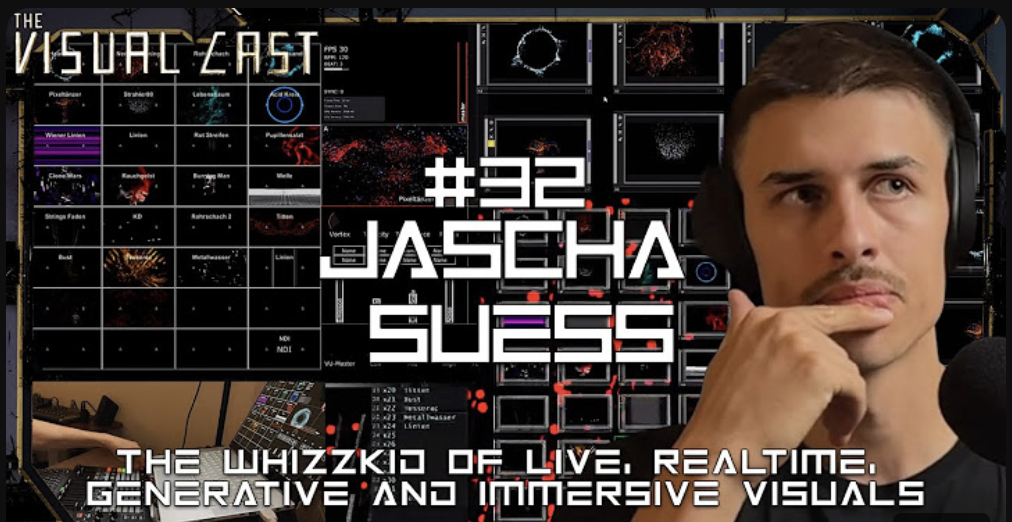
For my third impulse, I watched a podcast episode from Visual Cast featuring Jascha Suess, a very talented VJ who has worked on many projects with well-known DJs. I follow his work on Instagram, so I was curious to hear about the process and stories behind it.
Even though the podcast focused on VJing, it gave me new ideas for my own project about language visualizations. Jascha shared how he uses TouchDesigner to create visuals and build interactive systems. Hearing this made me realize again how powerful TouchDesigner is, and it inspired me to explore it even more.
One thing that stood out to me was how Jascha builds entire UIs and patches in TouchDesigner. He talked about how flexible and creative the software is, which is something I’ve started to experience in my own experiments. It’s exciting to see someone use it at such a high level, and it motivates me to keep learning.
Jascha mentioned that he isn’t a programmer and doesn’t write much code, but he loves working with TouchDesigner’s node-based interface. He finds it easier and more intuitive than traditional coding, and he said it allows him to focus more on creativity. This made me feel more confident because I also don’t have strong coding skills, but I can still create complex systems using nodes.
While the podcast was about VJing, it gave me fresh ideas for visualizing languages. Jascha explained how he connects inputs like music or motion to create visuals that react in real-time. This made me think about how I could make my project more interactive. For example, instead of static visuals, I could create a setup where users speak into a microphone, and the visuals change based on the sounds of their voice.
He also talked about organizing projects into smaller steps. He starts with simple patches to test ideas and then builds on them. This approach feels very practical, and I plan to try it in my own workflow.
Watching this podcast helped me see new possibilities in my work. Jascha’s approach to using TouchDesigner is creative and inspiring, and I want to dive deeper into what the software can do. I also learned that even without coding expertise, it’s possible to create complex and meaningful projects by focusing on the tools and workflows that work best for me.
→ Link of the podcast: https://www.youtube.com/watch?v=MWsk_JaCiew&t=2s
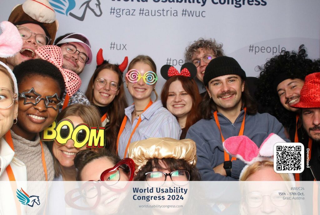
On 16&17th October, we attended the World Usability Congress 2024 as last year. While there were many interesting talks on UX/UI design, most didn’t connect directly with my thesis topic. However, one presentation stood out—Kent Eisenhuth’s „Lessons Learned From Our Accessibility-First Approach to Data Visualization.„ It gave me fresh ideas about how to approach data visualization, and I want to share some of the key points that can useful for me.
Kent Eisenhuth’s talk made me think about how important accessibility is in data visualization and how I can use it in my thesis. Visualizing language sounds in a way that’s clear and easy to understand is essential for making it useful to others. Overall, it was a very inspiring talk!
Klanglicht 2024 was both challenging and exciting for me. Having the chance to showcase two projects, I experienced some of the most rewarding but also stressful moments throughout the process. We presented Sonolux Speculative Future in the Young Masters exhibition with Mahtab Jafarzadeh Miandehi, Hannah Albrecht, Francisco Sylla, and David Laßlberger, and Langnicht as part of Spektrum. Klanglicht festival is such an inspiring event for me and my thesis, featuring installations that combine sound and visuals in creative ways.
SONOLUX SPECULATIVE FUTURE
For this project, we created a multi-sensory installation inspired by research into the acoustic ecology of the Hilmteich area in Graz. It explored how urbanization—like the construction of the LKH hospital—impacts this natural space. We imagined speculative futures for Hilmteich, showing two scenarios while reflecting on its current state. This installation was featured in the Young Masters exhibition at Schlossbergstollen.
David and I worked on audio-reactive visuals using TouchDesigner, which was a great way to practice my skills and showcase them in an exhibition. On top of that, we all worked together to construct the installation, which made the whole experience even more challenging but good 🙂
Being part of Young Masters was truly amazing. I’m really proud of our team and what we did!
SPEKTRUM
For Spektrum, we transformed the nave of Antoniuskirche in Graz into an immersive media experience. The title reflects the exploration of light and sound spectra, as well as the broader concepts of diversity and range. Our narratives focused on the in-betweens—like emotional and meaning spectra, harmony and chaos, colors and movement.
This was made possible with the guidance of our amazing lecturers: Astrid Drechsler, Daniel Fabry, Michael Kernbichler, Didi Mosbacher, and Roman Pürcher.
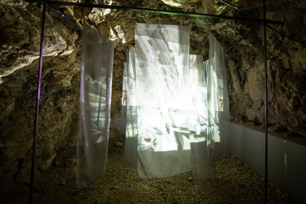
LANGNICHT
Langnicht explores the spectrum between nature and technology. The entire process—from planning to building to the final presentation—was such a mix of excitement, learning, and occasional stress. Our team grew so much during this time, and we created something we’re all really proud of. For me, working with After Effects and contributing to the construction was especially inspiring.
I feel really proud and lucky to have been part of Klanglicht 2024! It was an amazing experience to not only showcase our work but also to see and connect with other artists, exchange ideas, and receive feedback from professionals from the field of design. All the hard work, stress, and long hours were absolutely worth it. I’m so grateful for this opportunity and everything I’ve learned along the way! ✨💙
Overall,
Author: Yi-Chia Cheng
Title: Down the Rabbit Hole: Visualizing Linguistic Distance and Relationships with Alice in Wonderland
Publication: Boston, November 2019
Institution: Northeastern University, Department of Art + Design
Study Program: Information Design + Visualization
Level of Design:
The design of this thesis stands out for its attention to detail and creativity. She uses visually appealing elements like color-coded charts and phonetic mappings, which help make complex linguistic ideas feel approachable.
Degree of Innovation:
I find the topic very innovative, as Cheng goes beyond traditional ways of visualizing language relationships, such as family trees, and creates new visual methods. Using Alice in Wonderland as a shared text across different languages adds a unique touch and gives a clear reference point for the comparisons.
Independence:
Cheng clearly worked independently, especially with the custom visual tools and color-coded notation system they developed for the analysis. This creative approach goes beyond the standard methods and shows Cheng’s ability to think critically and come up with their own solutions.
Outline and Structure:
The structure of the thesis is clear and flows well. It starts with an introduction and research background, then moves into a case study that breaks down the language comparisons. Each section logically builds on the previous one, making it easy to follow. However, I think some of the visuals could use a bit more explanation to make them clearer for readers who aren’t familiar with linguistics.
Degree of Communication:
Overall, she communicates their ideas well. I like that they use Alice in Wonderland to make the research more accessible and relatable.
Scope of the Work:
The scope feels ambitious, covering both phonetic and syntactic comparisons across ten languages. This is impressive, but focusing on fewer languages might have allowed for a deeper analysis of each. Still, Cheng does a thorough job within the chosen scope.
Orthography and Accuracy:
The writing seems polished, with no obvious spelling or grammar errors, and Cheng uses technical terms accurately. I did feel that a bit more explanation of certain terms could make the thesis easier for non-expert readers.
Literature:
Cheng includes a solid range of literature, drawing on sources in linguistics and language visualization. I noticed a good mix of both older foundational works and more recent sources. However, adding some more recent studies on visual communication might have given additional depth.
Source: https://repository.library.northeastern.edu/files/neu:m0455c25q/fulltext.pdf