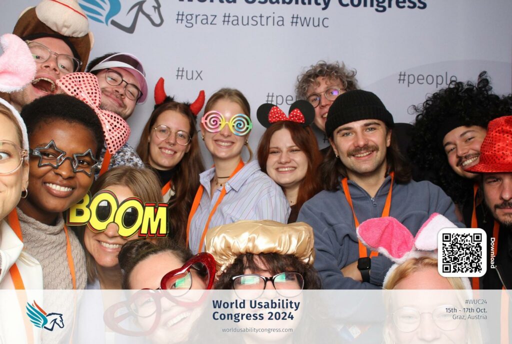
On 16&17th October, we attended the World Usability Congress 2024 as last year. While there were many interesting talks on UX/UI design, most didn’t connect directly with my thesis topic. However, one presentation stood out—Kent Eisenhuth’s „Lessons Learned From Our Accessibility-First Approach to Data Visualization.„ It gave me fresh ideas about how to approach data visualization, and I want to share some of the key points that can useful for me.
What I Learned
- Clarity Makes Data More Universal
Kent emphasized the importance of making visualizations simple and clear. Overly detailed or complex charts make it harder for people to understand the message. This idea connects with my work on language visualization. If visualizing the sounds of words or sentences becomes too busy, it could lose its meaning. - Accessible Visuals Help Everyone
One takeaway that stuck with me was how accessibility benefits all users, not just those with disabilities. For example, using high-contrast colors, patterns, or clear text labels in data visualization makes it easier for everyone to interpret, even in situations like low light or small screens. I realized this applies to visualizing language sounds too—users should be able to understand the visuals without needing extra effort. - Using Multiple Senses
Kent talked about going beyond visuals by incorporating sound or touch into data visualizations. This reminded me of the potential for multisensory designs in my language visualization project. For example, visualizing how German or English sounds could include audio feedback to make the experience richer for users. - Focus on the Message
A big part of accessibility is focusing on what you’re trying to say with the data. Kent showed examples where the message was lost because of too much decoration or unnecessary details. For my work, this means focusing on the core idea: how different languages “look” when spoken, and not getting distracted by extra effects.
Conclusion
Kent Eisenhuth’s talk made me think about how important accessibility is in data visualization and how I can use it in my thesis. Visualizing language sounds in a way that’s clear and easy to understand is essential for making it useful to others. Overall, it was a very inspiring talk!