An important aspect I have to consider when designing maps for people on the road is the optimization for mobile devices. Van lifers are often off the grid with no cellular connection, or bad cell service and more often than not the usage of a mobile phone is more convenient for using the map, rather than accessing it through a desktop device.
This brings three key considerations to the table which have to be addressed. The first two are technical aspects that will have to be solved with good caching policies and offline functionality. However, since I am mainly focusing on the design of the map, I will omit these considerations for my current research.
I started by researching the current state of popular mapping tools, and how they handle mobile screen sizes and interactions.
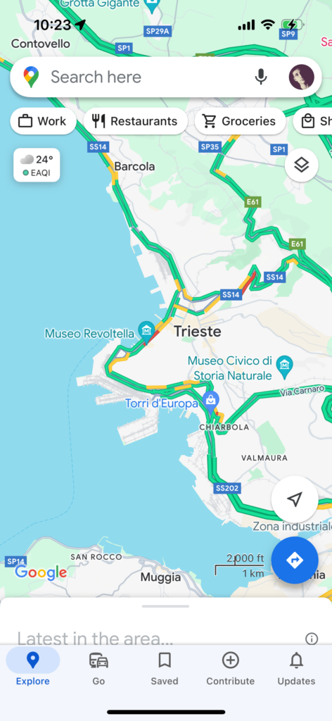
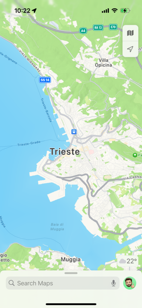
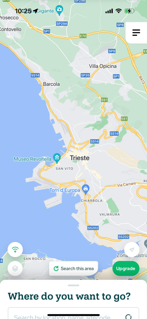
Google maps, the most popular map app, is overly complicated and cluttered (which is typical of Google). I found that a design like this can be too confusing and overwhelming when creating a specialized map app. Apple Maps on the other hand, does a good job at reducing the visible functionality to a usable minimum – maybe too much for a specialized map, though. Lastly, a competitors app does show a good mean between the two, offering relevant information for the typical user of its service, while also keeping the map unobstructed. But there still are some things that could be improved on, like the non-automatic search functionality and the inconsistent design across the interface.
One thing all maps have in common is the detail view for locations. They utilize the bottom sheet, a common design element in mobile apps, to display detailed information about a location. The benefit of this is that the user can easily drag it down to have an unobstructed view of the map, without losing the context they were in. Seeing as the most popular mapping apps use this precedent, I’ve decided to also go with this practice in my design.
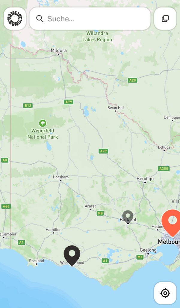
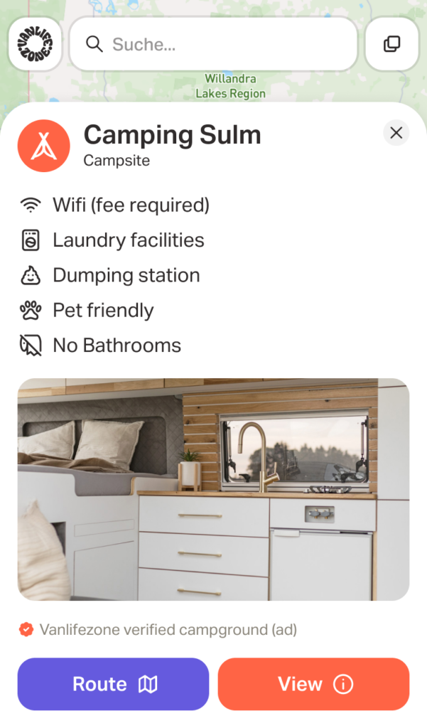
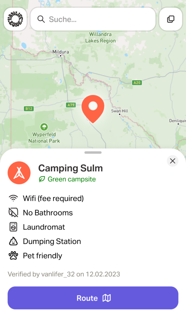
I placed the search bar and layer selection functionality at the top so users have an unobstructed view of the map while navigating. When clicking on a location, the bottom sheet comes up with information about the location. It can then be dragged down to have a split view of the map and the location information, while still keeping buttons in view.
https://www.statista.com/statistics/865413/most-popular-us-mapping-apps-ranked-by-audience
https://www.statista.com/statistics/1186009/data-use-leading-us-navigation-apps