The shift from a focus on digital precision to an appreciation for imperfections in graphic design was influenced by several pioneering graphic designers who embraced a more organic and handcrafted approach. Some notable figures are:
David Carson
David Carson is a prominent graphic designer known for his unconventional and experimental approach to typography. His groundbreaking work in the 1990s, particularly with the alternative music magazine Ray Gun, challenged the dominance of digital precision and celebrated imperfections. Carson’s work often incorporated irregular layouts, hand-drawn elements, and a disregard for traditional design rules, paving the way for a more playful and expressive approach to design. His innovative and rule-breaking approach to graphic design, characterized by layered imagery, unconventional typefaces, overlapping elements, and a disregard for strict grid-based layouts, aligned closely with the ethos of the grunge movement. Carson’s contributions and innovative design approach remain highly influential in the realm of graphic design, inspiring designers to embrace imperfections and experimentation. Overall, David Carson played a significant role in the shift from a focus on digital precision to an appreciation for imperfections in graphic design, paving the way for a more diverse and expressive approach to design that embraces imperfections and experimentation.





https://graphicdesign90s.com/graphic-design-1990/
https://uxmag.com/articles/an-introduction-to-designing-for-imperfection
https://davidmiranda.us/blog/grunge-graphic-design/
Stefan Sagmeister
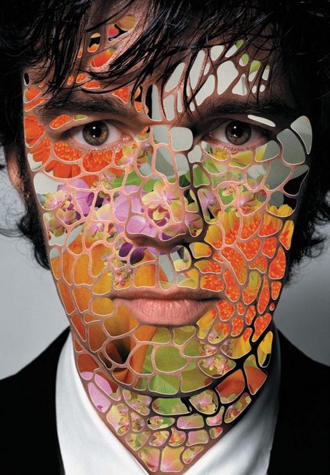
An Austrian-born graphic designer who is recognized for his innovative and expressive designs. Stefan Sagmeister’s work is an excellent example of the shift from digital precision to an appreciation of imperfection in graphic design. Sagmeister often integrates handcrafted elements, playful typography, and imperfections in his work, challenging traditional design norms and embracing a more personal and artistic style. His approach reflects a departure from the strict digital precision that was prevalent in the industry, and his work has played a pivotal role in reshaping the visual language of contemporary graphic design. One example of Sagmeister’s work that fits this topic is his „Things I Have Learned in My Life So Far“ project, which features handcrafted typography and imperfections that add a personal and human touch to the design. Sagmeister’s innovative and expressive designs have contributed significantly to the shift towards appreciating imperfections in graphic design, inspiring a more diverse and expressive approach that celebrates the beauty of imperfection.



https://graphicdesign90s.com/graphic-design-1990/
https://www.mcbw.de/en/magazine/stefan-sagmeister
Neville Brody
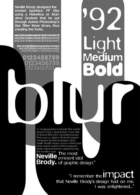
The work of the British designer Neville Brody often incorporates irregular layouts, hand-drawn elements, and a disregard for traditional design rules, paving the way for a more playful and expressive approach to design. His innovative and rule-breaking approach to graphic design, characterized by layered imagery, unconventional typefaces, overlapping elements, and a disregard for strict grid-based layouts, aligned closely with the ethos of the grunge movement. Brody’s contributions and innovative design approach remain highly influential in the realm of graphic design, inspiring designers to embrace imperfections and experimentation. Neville Brody played a significant role in the shift from a focus on digital precision to an appreciation for imperfections in graphic design, paving the way for a more diverse and expressive approach to design that embraces imperfections and experimentation.





https://www.smashingmagazine.com/2017/03/beauty-imperfection-interface-design/
Milton Glaser
Milton Glaser, an American graphic designer, has also made contributions to this movement. Glaser’s work often involved a combination of hand-drawn elements and a distinctive style that embraced imperfections, giving his designs a unique and human touch. His innovative and expressive designs challenged traditional norms, reflecting a departure from the strict digital precision that was prevalent in the industry. Glaser’s influential and iconic „I ♥ NY“ logo, along with his extensive body of work, exemplifies his embrace of imperfections and the human touch in graphic design, ultimately reshaping the visual language of contemporary graphic design.





https://ndion.de/en/milton-glaser-the-subtle-populist/
Paula Scher
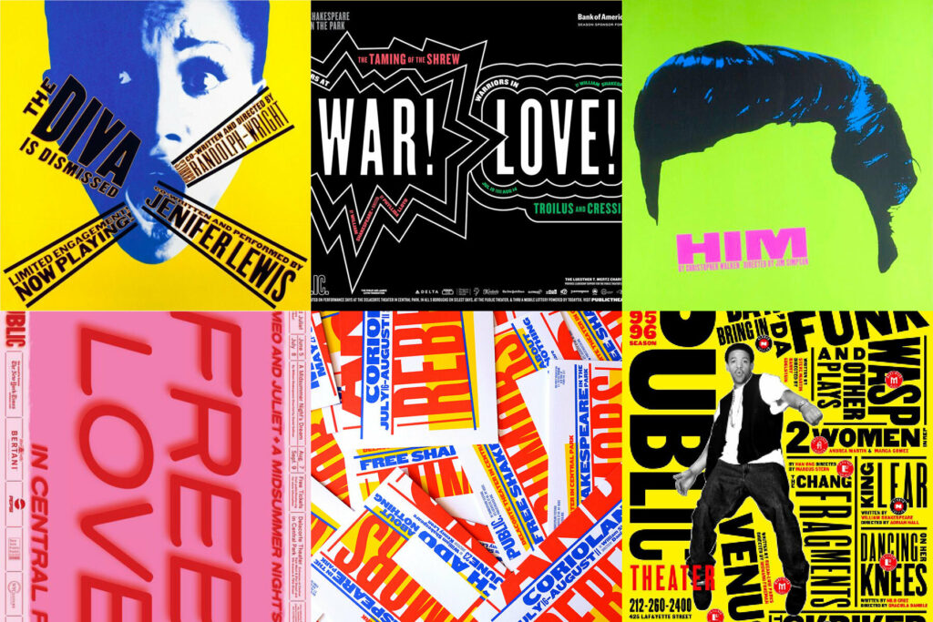
Paula Scher is a contemporary American graphic designer, and painter who co-founded the design firm Pentagram. She has also been a pivotal figure concerning this topic. Scher is Recognized for her bold use of typography and hand-painted elements, her work embodies an imperfect and expressive nature that challenges traditional design norms. Her innovative approach has contributed to a more diverse and expressive form of design, celebrating the beauty of imperfection. Scher’s work has been highly influential in the industry, and some of her most famous designs include the iconic Swatch poster modeled after Swiss designer Herbert Matter’s work, the new identity creation of The Public Theater, and the Citibank logo redesign. Her work reflects the broader trend in the 1990s towards embracing a more vibrant and eclectic aesthetic in graphic design.
https://www.famousgraphicdesigners.org/paula-scher