Impulse #1

World Usability Congress

Just like last year, the World Usability Congress gave me a lot of really great insights. After my experience last year, I already knew what to expect, which helped me organize the time spent there and focus on the talks that seemed the most important to me, since seeing all of them was not possible. I spent most of my time in the “Accessibility & Inlcusion” room this year, and one talk from the second day left the biggest impression on me, especially because I was listening  with my master thesis topic in mind.
Mari-Ell Mets from Trinidad Wiseman gave a talk titled „Website and Apps for Everybody – Making Accessibility Easy.“ The presentation focused on practical strategies to make digital platforms more inclusive, offering advice for creating user-friendly websites and apps for everyone, including those with special needs. The presentation laid out ten essential rules for improving accessibility, each of which provides valuable guidance for my own work. I summarized the key takeaways and how they connect to my research.

1. Avoid Moving Content

Mets stressed the importance of avoiding autoplaying videos, animations, or sounds, which can overwhelm users. She also recommended providing a „stop“ button for any moving content and eliminating flickering elements entirely.

2. Use Contrasted Colors

Proper color contrast is essential for readability. Mets outlined the recommended contrast ratios: at least 4.5:1 for regular text and 3:1 for larger or bold text. She emphasized avoiding text over images and using tools like contrast checkers to ensure compliance.

3. Adapt to User Settings

Websites and apps should respect a user’s browser or device settings, such as font size or color preferences. Mets encouraged the use of relative font and container sizes to ensure flexibility.

4. Ensure Keyboard Navigation

Accessibility isn’t complete without full keyboard navigation. Mets highlighted the importance of using native elements, avoiding drag-and-drop actions, and carefully managing focus order.

5. Make Focus Visible

It’s crucial for users to see where their keyboard focus is on the page. Mets advised keeping focus styles visible and maintaining a logical focus order throughout the site.

6. Specify Language in Code

To support screen readers and multilingual content, the language of the page must be defined using the lang attribute in the code.

7. Reflect Visual Relationships in Code

Visual structures, such as headings, lists, and tables, must also be coded correctly to make sense to assistive technologies. Mets recommended testing with screen readers to ensure usability.

8. Clearly Define UI Elements

Each user interface element must have a defined name, role, and value in the code. Mets encouraged the use of native elements and careful research before implementing ARIA attributes.

9. Provide Text Alternatives

Mets highlighted the importance of providing text alternatives for informative images and hiding decorative images from assistive technologies.

10. Deliver Clear Error Messages

Error messages should clearly indicate what went wrong and how to fix it. Mets emphasized providing clear labels, marking errors visually, and ensuring screen readers can announce the messages.

Conclusion

Mari-Ell Mets concluded the talk by emphasising that accessible design benefits everyone, not just those with disabilities. For my research, this presentation really showed the importance of accessibility as a foundation for designing educational tools. Incorporating these principles into my work will ensure that the tools I create are inclusive, empowering children with autism to engage confidently with technology.
→ Impulse_02 | World Usability Congress

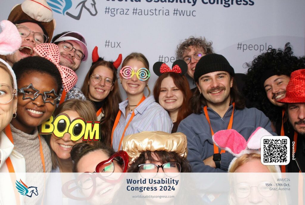
On 16&17th October, we attended the World Usability Congress 2024 as last year. While there were many interesting talks on UX/UI design, most didn’t connect directly with my thesis topic. However, one presentation stood out—Kent Eisenhuth’s Lessons Learned From Our Accessibility-First Approach to Data Visualization. It gave me fresh ideas about how to approach data visualization, and I want to share some of the key points that can useful for me.

  1. Clarity Makes Data More Universal
    Kent emphasized the importance of making visualizations simple and clear. Overly detailed or complex charts make it harder for people to understand the message. This idea connects with my work on language visualization. If visualizing the sounds of words or sentences becomes too busy, it could lose its meaning.
  2. Accessible Visuals Help Everyone
    One takeaway that stuck with me was how accessibility benefits all users, not just those with disabilities. For example, using high-contrast colors, patterns, or clear text labels in data visualization makes it easier for everyone to interpret, even in situations like low light or small screens. I realized this applies to visualizing language sounds too—users should be able to understand the visuals without needing extra effort.
  3. Using Multiple Senses
    Kent talked about going beyond visuals by incorporating sound or touch into data visualizations. This reminded me of the potential for multisensory designs in my language visualization project. For example, visualizing how German or English sounds could include audio feedback to make the experience richer for users.
  4. Focus on the Message
    A big part of accessibility is focusing on what you’re trying to say with the data. Kent showed examples where the message was lost because of too much decoration or unnecessary details. For my work, this means focusing on the core idea: how different languages “look” when spoken, and not getting distracted by extra effects.

Conclusion

Kent Eisenhuth’s talk made me think about how important accessibility is in data visualization and how I can use it in my thesis. Visualizing language sounds in a way that’s clear and easy to understand is essential for making it useful to others. Overall, it was a very inspiring talk!

Impulse #01 – World Usability Congress

Links

World Usability Congress: https://worldusabilitycongress.com
European Accessibility Act: https://ec.europa.eu/social/main.jsp?catId=1202
Material Design Accessibility: https://m2.material.io/design/usability/accessibility.html#understanding-accessibility

22 | IMPULSE #1 – Insights from the World Usability Congress 2024

I recently attended the World Usability Congress 2024 in Graz, and it was packed with insightful talks about user experience, accessibility, and how we as designers can better connect technology to the people who use it. Two talks, in particular, stood out to me – John Bowie’s presentation on how UX designers see things no one else can see, and Kent Eisenhuth’s talk about accessibility in design. These sessions really got me thinking about how these topics could help me with my master’s thesis.

In this blog post, I’ll show the key takeaways from those talks and explain how they provide crucial input for my thesis, both in terms of research and practical application, since I’ve changed my topic to designing an app which rewards people who make sustainable decisions in their everyday life in a gamified way either with real rewards like e.g. discounts or in a virtual way or both.

John Bowie’s talk hit on something that anyone working in design has probably experienced: the disconnect between engineers, product managers, and UX designers. Engineers and product managers often overlook UX problems because they’re so focused on making the product function. Bowie raised a critical point: How can we help others see what we see? How can UX designers make engineers and product managers aware of user experience issues that might be invisible to them?

He also cited a quote from Alan Cooper’s 1999 book The Inmates Are Running the Asylum:

„Our lives are becoming ever more centered around the whims, quips, decisions, and disasters of the high-tech industry. And these hardware, software, and technology developers don’t think like us. Despite appearances, business executives are simply not the ones in control of the high-tech world – it is the engineers who are running the show. We have let the inmates run the asylum.“

This perfectly captures the reality of how decisions in tech are often made without enough consideration for how real people will interact with products. In my project, where I’m working on making sustainability a part of everyday life through gamification, this insight is crucial. If I don’t stay focused on the user’s experience, my product could fall into the same trap of prioritizing technical functionality over actual usability.

Bowie also introduced the UX Maturity Model, a framework to assess how much an organization values and integrates UX into its processes. This is something that could come in handy for any UX designer trying to push for more user-centered design in their company. The model breaks organizations into six stages, from „Absent“ (UX doesn’t exist) to „User-driven“ (UX is a core part of the company’s culture).

  • Absent: UX is ignore
  • Limited: UX work is sporadic and unimportant
  • Emergent: There’s some UX work, but it’s inconsistent
  • Structured: UX practices exist but vary in effectiveness
  • Integrated: UX is widespread and effective
  • User-driven: UX is central to every part of the organization

For my thesis, this maturity model is a practical way to assess how different apps/websites that I might evaluate over time (or even my own design process) approach user-centered design. Knowing where a sustainability app or product falls on this scale helps me see the opportunities for where they could evolve to better engage with the users and create meaningful behavior change.

One of the most actionable parts of Bowie’s talk was his advice on asking three critical questions when designing for user experience: Relevance, Findability, and Effectiveness. These are things I need to consider when building my own project.

  1. Relevance – Does the information or task help the user move closer to their goal, or is it just a detour? This is key when designing interactions in my app – everything needs to feel like it’s helping the user move forward.
  2. Findability – Can users easily locate the information they need? Are they aware they need it? In my project, if users can’t find the eco-friendly habits or challenges they need to engage with, they’ll likely lose interest.
  3. Effectiveness – Once the user finds what they’re looking for, can they easily use it? This ties directly into the usability of my app – if it’s not easy to use, no one will want to engage with it.

These questions help me keep the user at the center of the design process, ensuring the app stays simple, clear, and intuitive.

Kent Eisenhuth’s talk on accessibility was also very interesting. Accessibility is often treated as an afterthought, but he argued that it should be a priority from the start of any design process. This is something I hadn’t considered as deeply before, but Eisenhuth showed how designing for accessibility can actually result in better design for everyone—not just for people with disabilities.

His talk was packed with practical tips on making data visualizations and interfaces more accessible. For example, he recommended using a combination of fills and borders to highlight important information, moving labels next to segments instead of using confusing legends, and using dark mode to reduce visual clutter and help users to focus.

One of Eisenhuth’s most interesting points to me was about data sonification, or using sound to describe charts and graphs. By thinking about different ways to present information – like using sound cues instead of relying solely on visual elements – one can reach a wider audience.

He also mentioned that sometimes, charts and graphs are just not a good solution. In some cases, offering a data table might be a better option for accessibility, as it allows users to navigate the information with ease, especially for people who rely on screen readers.

Both of these talks have helped me see how essential it is to consider every aspect of the user experience – from how users find and interact with information to ensuring the design is accessible for everyone. As I continue developing my thesis on gamifying sustainable habits, these insights will shape both the theoretical framework and the practical elements of my project. Ultimately, the goal is to create an app that not only helps users build sustainable habits but does so in a way that’s engaging, intuitive, and accessible for all.

More about the UX maturity model: https://www.nngroup.com/articles/ux-maturity-model/

A website that Kent Eisenhuth mentioned and that I found very interesting and might come in handy at some point to find inspiration, is Google’s open source design system Material 3: https://m3.material.io/

The Nielsen Norman Group also has a useful collection of relevant information on accessibility and inclusivity: https://www.nngroup.com/articles/accessibility-inclusivity-study-guide/