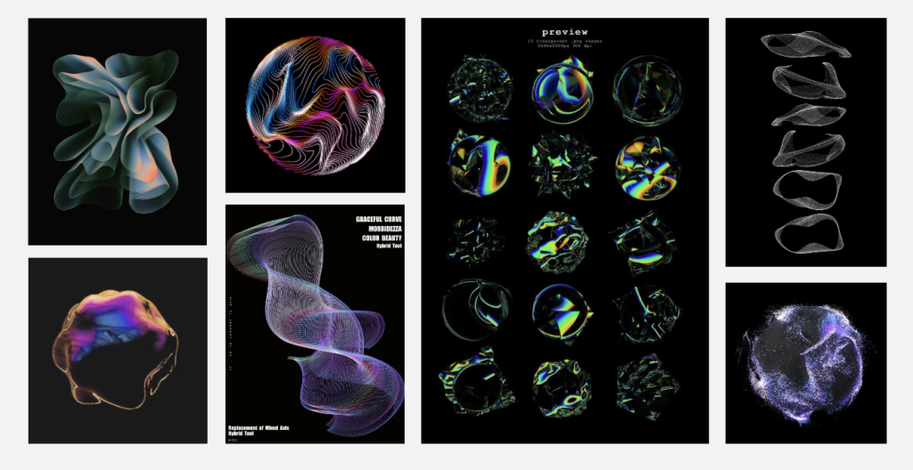
I am still experimenting the visuals but now, I will share how I made them audio-reactive in TouchDesigner.
I followed a tutorial and then downloaded Turkish and German alphabet audios to see how the visuals change with different letters. By working with individual letters, I can easily extend this to words and sentences later.
First Visual – Audio Reactive
I tried to make the first visual audio-reactive. I think this one fits best because it looks like an audio wave and a weird mouth. The lines are clear, so I can record or take screenshots of each letter. This clarity can help in analyzing it.
Applying Audio Reactivity to Other Visuals
After figuring out how to make the first visual audio-reactive, I applied the same process to the other visuals. Here are the results:
Next Step
I think I will go with the mirrored first visual. My next step is to use an AI voice and see how it looks with words and sentences. I’m excited to see how these visuals evolve and become more refined as I continue experimenting.
After creating my first visual, I wanted to experiment more with TouchDesigner and come up with different visuals.
Mirror Effect on the First Visual
First, I changed the initial visual by applying a mirror effect. I aimed to create clear lines that resemble an audio wave. I liked that it looks like a mouth, and I am happy with the result. However, I wanted to try more variations.
Second Visual with Particles
For the second visual, I followed a tutorial on working with particles. While I enjoyed this process, the result felt too random for my project. I realized that I need more control over the particle movements to fit my theme better.
Mirror Effect on the Second Visual
Lastly, I mirrored the second visual. This resulted in too many mirrored sections and small particles. Despite this, I loved the outcomes and really enjoyed experimenting with TouchDesigner.
Next Step
In next step, I plan to make all of these visuals audio-reactive and then choose the one that fits my project best. I am having a lot of fun experimenting with TouchDesigner, I love itttt!
After deciding on my topic, I gathered some tutorials from YouTube to help with my data visualization project. I aimed to create something using lines so I could showcase the differences between various languages.
Moodboard for visualization
I believe using line shapes will effectively highlight the audio differences between different language inputs. Lines also have a clean, aesthetic look that I think will result in a visually appealing project. However, with my limited knowledge in TouchDesigner, I am not sure if I can achieve the exact outcome I envision. Therefore, I will experiment with some tutorials and see which ones work best. I’m really excited to dive into TouchDesigner and learn more!
First Attempt – Successful!
I followed this tutorial and found the beginning challenging because it focused on making the project audio-reactive from the start. My first step, however, was to create the visual aspect. The initial outcome didn’t quite meet my expectations as it resulted in a line that moved randomly. Randomness might not be ideal for my project since I want to compare different letters clearly.
Above, you can see my initial outcome. With some modifications and added audio reactivity, it might work for the prototype phase. I’m satisfied with the progress so far, but I plan to either refine this outcome further or try other tutorials. I believe having multiple visualization options will be beneficial during the testing phase.
Next Step
I will continue working through more tutorials, focusing on making the visualizations audio-reactive. Then, I’ll choose the one that fits the best! My goal is to create a dynamic, clear and aesthetic visualization that shows the differences between various languages through their audio characteristics.
Although I initially planned to delve deeper into various forms of data visualization in TouchDesigner, I decided to postpone that. Instead, I set out to connect a controller to the software. Why? Because I want to create an interactive experience, currently focusing on data visualization. For this, a user input method is necessary, which ultimately makes the experience interactive.
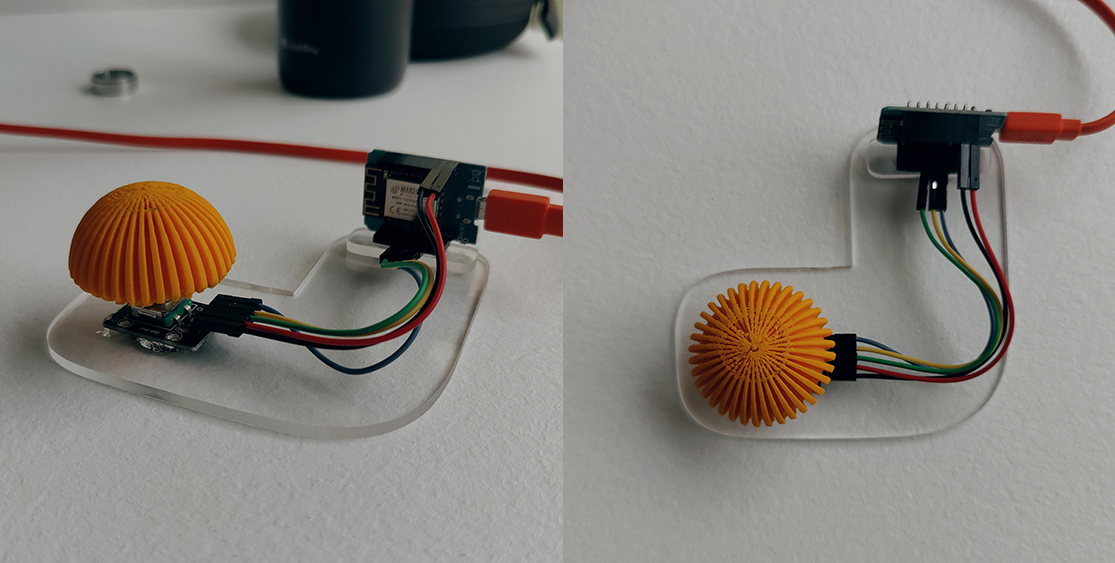
The Controller
I would have preferred to build the controller myself, but I simply don’t have the time for that anymore. This is, of course, my own fault, as I haven’t spent enough time on this project in the past few weeks. Nevertheless, I received a great prototype controller from Lucas, which we developed for another project, or rather he developed. The controller consists of an ESP8266 12-F board, an HW-040 Rotary Encoder, and a 3D-printed knob. The Rotary Encoder allows for changing values with the rotation function and also includes a button. With the help of ChatGPT, I wrote an Arduino script for the controller that reads the rotation speeds and the button state. I then integrated the controller with the DAT components in TouchDesigner and converted the numerical values using the Math functions. Finally, I connected the converted numerical values to the controls of the particle system, allowing the particle system to be manipulated with the controller.
This setup proved to be quite efficient. The integration process went smoothly, and it was fascinating to see how the physical interaction translated into changes within the digital particle system. It brought a tangible aspect to the data visualization, making the experience much more engaging and interactive.
Arduino Controller made of an ESP8266 12-F board, an HW-040 Rotary Encoder, and a 3D-printed knob.
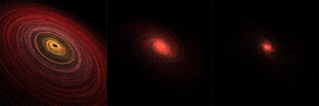
Particle System
To test everything, I used the galaxy visualization and defined the following states. The neutral state is the visualization shown in the last blog post, which represents a galaxy with a moderate rotation speed. If the specified values are „bad“ / negative, the galaxy rotates faster and shrinks, representing the phase just before a galaxy’s death. With good values, the galaxy rotates slower and is significantly larger, representing a healthy galaxy. I also wanted to integrate the button function to reset the display, but after three hours of work, it didn’t function, so I left it out.
Even without the reset function, the current setup is quite versatile. The ability to manipulate the galaxy’s behavior based on input values adds a dynamic element to the visualization. It’s a compelling way to illustrate how different data sets can affect the same system in various ways.
TouchDesigner Visuals (left to right: good state, neutral state, bad state)
What’s Next?
In the next step, I want to explore various forms of data visualization and find some examples. This will help me understand the different possibilities and how they can be integrated into my project. Expanding my knowledge in this area will enable me to create even more sophisticated and engaging visualizations. Cheers!
As I mentioned in my last blog post, I love particle systems. However, in my last prototype, I could only visualize about 10,000 particles. Once this limit was exceeded, the frame rate of the visualization dropped. Unfortunately, since I’m not an expert in coding, I couldn’t fix it. Because particle systems look better with more particles, I wanted to continue exploring the idea. But this time, not with code, but with TouchDesigner.
What is TouchDesigner?
TouchDesigner is software used by artists and developers to create visual effects and interactive multimedia projects. It allows for the creation of real-time graphics, animations, and interactive installations by connecting various visual and audiovisual elements. With TouchDesigner, you can create complex visual representations by simply connecting building blocks or nodes. I delved into the subject of „Projection Mapping“ in TouchDesigner and found it enjoyable. The software also allows for the creation of really cool particle systems, which is perfect for my project. That’s why I created my next prototypes with TouchDesigner.
Visualization
How do I want to visualize everything? I’m not exactly sure. Classic data visualizations mostly consist of conventional charts. These include bar, column, pie, line charts, and so on. That’s not what I want. I want to give it an artistic touch. That’s why I’m using particle systems. Since I didn’t know exactly what I wanted to do, I just started experimenting, watching a few tutorials, and following them. The following three visualizations were created:
(From left to right: Tornado, Galaxy, Lava Flow)
Although these visuals look pretty cool, there’s now a big problem. The issue is: how can I use these to visualize data so that the data’s message is clear and quickly recognizable? Here are my ideas. For the Tornado, I could use the diameter of the vortex. The larger the diameter, the greater the environmental impact of a certain behavior, for example. For the Galaxy, I could use the rotation and size. The faster it rotates and the smaller it is, the worse the data is. For the Lava Flow, I would simply use the flows. The higher the environmental impact, the more lava flows there are until it becomes just one large lava (water)fall. Nonetheless, I will continue experimenting with data visualizations in TouchDesigner, simply because it’s cool and fun. Cheers!