Schlagwort: TouchDesigner
18 | New Visuals 🌱
Since the last blog post, I’ve spent some time on various platforms like Instagram, YouTube, and Pinterest, drawing inspiration. As a result, I developed two new visualizations using TouchDesigner for the prototype. I would like to introduce them to you now.
Plasmasphere
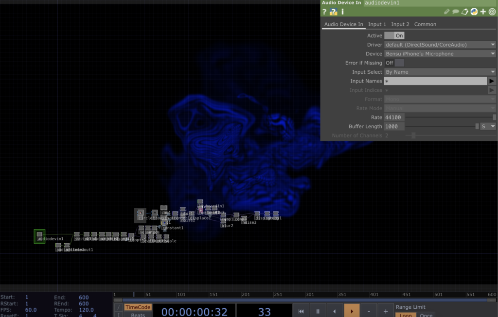
The idea behind this visualization was to create a sphere that changes with the values. The more negative the values, the more chaotic the representation should be, and vice versa. To achieve this, I followed a YouTube tutorial by Bileam Tschepe. This visualization is built on the ParticlesGPU component and has been enhanced with various settings. Additionally, I programmed the controller using Python scripts. By rotating the controller, you can change the values, and with the button function, you can change the values without affecting the visualization in real time or reset them to their original state. The screenshot below shows the TouchDesigner project.
Flowers
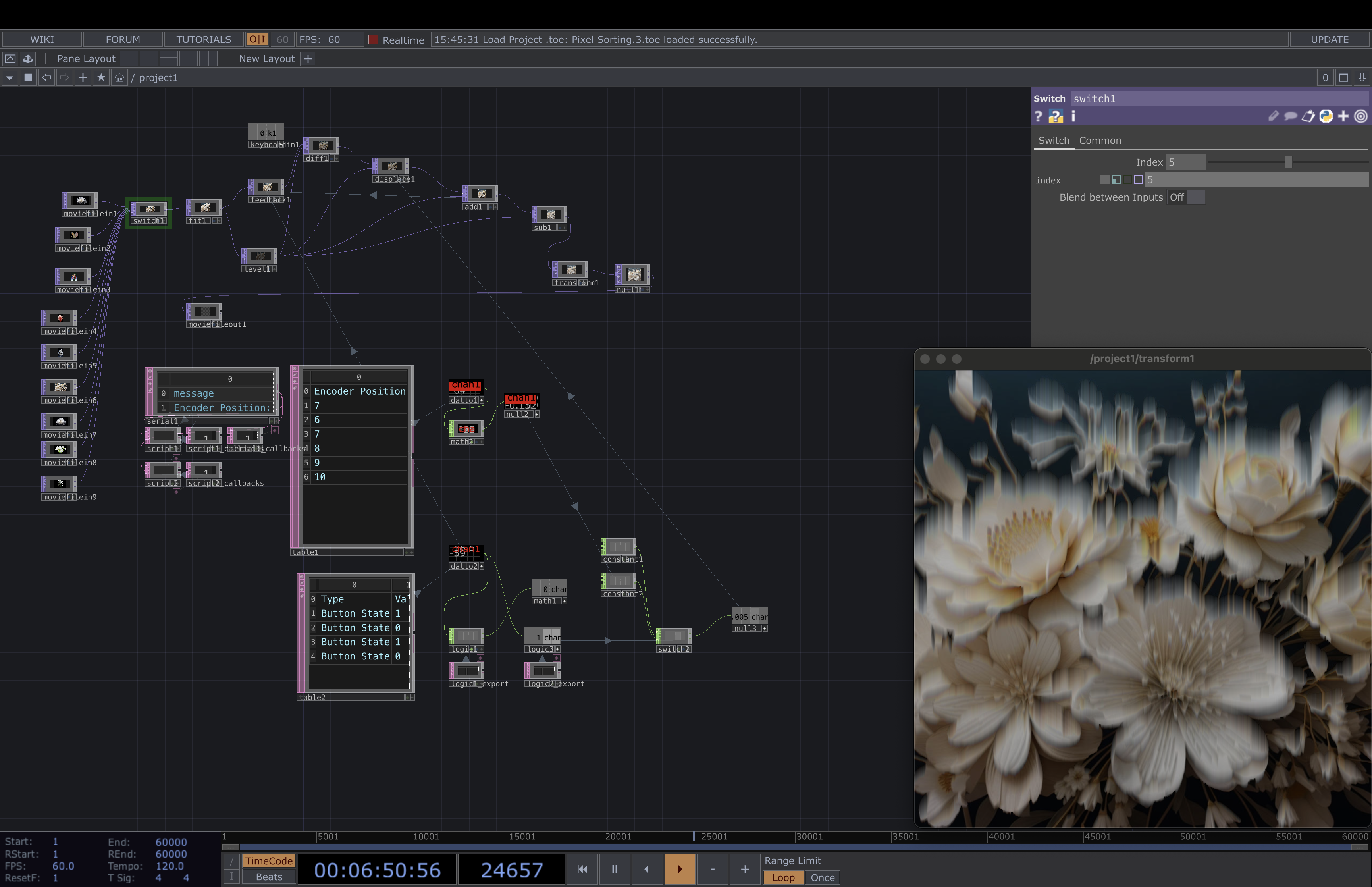
The concept behind this visualization is that flowers wilt when they are not properly cared for, much like how our Earth deteriorates if we do nothing about the global climate crisis. Therefore, I used various photos and AI-generated images of white flowers and applied the pixel sorting method to simulate wilting. The more negative the data, the faster and more intense the wilting becomes. This is the first visualization that somewhat relates to the subject matter being addressed. The TouchDesigner project is shown below.
🟦 09_Learnings & Next Steps
From exploring audio-reactive visuals in TouchDesigner to conceptualizing and designing a simple app prototype in Figma, it was so much fun! It all began with a curiosity about how different languages visually manifest through sound, leading me to experiment with various tools and techniques.
I am so happy that I dived into TouchDesigner a bit more I learned a lot about creating and manipulating visuals, especially making them respond to audio inputs which was very fun to learn. Also Along the way, I listened to the German alphabet countless times, which was unexpectedly useful (and quite amusing🤭)
Transitioning to Figma, I designed a mini prototype for a pronunciation visualizer app. This app allows users to select their native language and a language they wish to learn, providing real-time visual feedback on pronunciation patterns. The thing is, I had so many ideas for using the visuals in a practical application. Ultimately, I focused on perfecting the visuals, which was both challenging and rewarding.
Next Step
Looking ahead, I see a lot of potential for expanding this project. For example a Language Learning Kit with developing a comprehensive language learning kit using these types of visuals could make learning more engaging. Different visuals for different languages might be interesting. Or in the testing phase, it would be interesting to test the visuals with deaf individuals to see if they can detect patterns in each language. This could open up new ways of understanding and teaching languages. So I’m excited about the possibilities and let’s see if I will work on more on this project in the future!
🟦 08_Prototype
After analyzing the audio-reactive visuals, I wondered how I could apply these outcomes practically. While creating an app might seem like an easy route, I wanted to explore how it would look and function in this context.
App Prototype
I designed a demo app prototype using Figma:
- Home Screen: Native Language Selection
- Users start by selecting their native language.
- Language Learning Selection
- Next, users choose the language they want to learn. This screen ensures that the app tailors the visualizations and pronunciation guides to the selected language.
- Start Pronunciation Practice
- The final page displays the data visualized video that I made in TouchDesigner. There is a simple prompt: „Hold to Pronounce.“ This allows users to practice pronunciation and see the visual feedback in real-time.
I made a quick prototype because for me the process and learnings from TouchDesigner was more challenging and interesting.
Next Step
I plan to write about my learnings and reflect on the overall process.
🟦 07_Analysis of Outcome
After experimenting with AI voices and creating audio-reactive visuals for different languages, the next step is to analyze the outcomes in detail. Here’s how I approached the analysis and what I discovered.
Collecting and Comparing Data
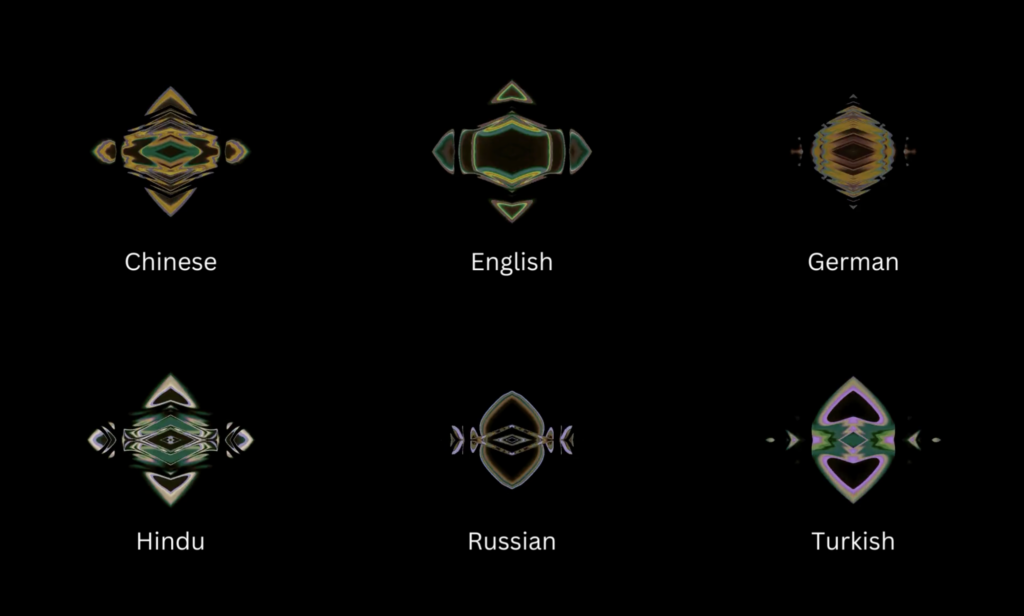
First, I recorded of the visuals for each language and phrase under consistent conditions. By placing these visuals side by side, I could directly compare them. I looked for patterns, shapes, and movements unique to each language, paying special attention to how the visuals reacted to specific sounds, particularly vowels and consonants.
Observations and Differences
During my analysis, I noted some differences:
- German and English: Both languages produced clear, structured lines. However, German visuals had slightly more detailed patterns.
- Turkish: Turkish visuals showed more fluid and continuous lines, reflecting its smooth flow and connected structure.
- Russian: Russian visuals had a mix of sharp and smooth lines, showing its varied sounds and pronunciation.
- Hindi: Hindi visuals displayed intricate and dense patterns, likely due to its mix of different sounds.
- Chinese: Chinese visuals featured rhythmic, wave-like patterns, capturing the tones and unique structure of the language.
Here are some examples of the outcomes for „hello“ and „how are you?“:
- German: „Hallo, wie geht’s?“ – Clear and structured lines with some complexity.
- English: „Hello, how are you?“ – Similar to German but slightly less complex.
- Turkish: „Merhaba, nasılsın?“ – Fluid lines, continuous patterns.
- Russian: „Привет, как дела?“ – Mix of sharp and smooth lines.
- Hindi: „नमस्ते, आप कैसे हैं?“ – Dense, intricate patterns.
- Chinese: „你好, 你好吗?“ – Rhythmic, undulating patterns.
Next Step
Analyzing the audio-reactive visuals revealed subtle yet fascinating differences between languages. Each language’s phonetic characteristics influenced the visuals in unique ways. Moving forward, I want to gather some feedback from people around me where these visuals can be used and what they think about the visuals so far.
🟦 06_First Testing with AI
After making the visuals audio-reactive with alphabet audios, I used AI to see if there were any noticeable changes when it comes to words and sentences.
I wanted to test phrases like „hello“ and „how are you?“ in various languages like: German, English, Turkish, Russian, Hindi, and Chinese. Unfortunately, the AI tools I found were either not free or had limited trials, so I didn’t have many options. I chose one AI voice tool and one voice actor for each sentence in the different languages.
Prompts for AI
- English: „Hello, how are you?“
- German: „Hallo, wie geht’s?“
- Turkish: „Merhaba, nasılsın?“
- Russian: „Привет, как дела?“ (Privet, kak dela?)
- Chinese (Mandarin): 你好,你好吗?(Nǐ hǎo, nǐ hǎo ma?)
- Hindi: „नमस्ते, आप कैसे हैं?“ (Namaste, aap kaise hain?)
And here are few examples of visualization „Hello, how are you?“ :
It was kind of hard to realize the differences between languages just by looking at the visuals. However, the process was very interesting for me. I could see subtle variations in the patterns and reactions of the visuals to different sounds.
Next Step
In the next steps, I will analyze the outcomes in more detail. I want to see if I can pinpoint specific differences and understand how each language influences the visuals.
🟦 05_Audio Reactivity
I am still experimenting the visuals but now, I will share how I made them audio-reactive in TouchDesigner.
I followed a tutorial and then downloaded Turkish and German alphabet audios to see how the visuals change with different letters. By working with individual letters, I can easily extend this to words and sentences later.
First Visual – Audio Reactive
I tried to make the first visual audio-reactive. I think this one fits best because it looks like an audio wave and a weird mouth. The lines are clear, so I can record or take screenshots of each letter. This clarity can help in analyzing it.
Applying Audio Reactivity to Other Visuals
After figuring out how to make the first visual audio-reactive, I applied the same process to the other visuals. Here are the results:
Next Step
I think I will go with the mirrored first visual. My next step is to use an AI voice and see how it looks with words and sentences. I’m excited to see how these visuals evolve and become more refined as I continue experimenting.
🟦 04_Visualization Samples
After creating my first visual, I wanted to experiment more with TouchDesigner and come up with different visuals.
Mirror Effect on the First Visual
First, I changed the initial visual by applying a mirror effect. I aimed to create clear lines that resemble an audio wave. I liked that it looks like a mouth, and I am happy with the result. However, I wanted to try more variations.
Second Visual with Particles
For the second visual, I followed a tutorial on working with particles. While I enjoyed this process, the result felt too random for my project. I realized that I need more control over the particle movements to fit my theme better.
Mirror Effect on the Second Visual
Lastly, I mirrored the second visual. This resulted in too many mirrored sections and small particles. Despite this, I loved the outcomes and really enjoyed experimenting with TouchDesigner.
Next Step
In next step, I plan to make all of these visuals audio-reactive and then choose the one that fits my project best. I am having a lot of fun experimenting with TouchDesigner, I love itttt!
🟦 03_Diving into TouchDesigner
After deciding on my topic, I gathered some tutorials from YouTube to help with my data visualization project. I aimed to create something using lines so I could showcase the differences between various languages.
Moodboard for visualization
I believe using line shapes will effectively highlight the audio differences between different language inputs. Lines also have a clean, aesthetic look that I think will result in a visually appealing project. However, with my limited knowledge in TouchDesigner, I am not sure if I can achieve the exact outcome I envision. Therefore, I will experiment with some tutorials and see which ones work best. I’m really excited to dive into TouchDesigner and learn more!
First Attempt – Successful!
I followed this tutorial and found the beginning challenging because it focused on making the project audio-reactive from the start. My first step, however, was to create the visual aspect. The initial outcome didn’t quite meet my expectations as it resulted in a line that moved randomly. Randomness might not be ideal for my project since I want to compare different letters clearly.
Above, you can see my initial outcome. With some modifications and added audio reactivity, it might work for the prototype phase. I’m satisfied with the progress so far, but I plan to either refine this outcome further or try other tutorials. I believe having multiple visualization options will be beneficial during the testing phase.
Next Step
I will continue working through more tutorials, focusing on making the visualizations audio-reactive. Then, I’ll choose the one that fits the best! My goal is to create a dynamic, clear and aesthetic visualization that shows the differences between various languages through their audio characteristics.
16 | Arduino with TouchDesigner 🌱
Although I initially planned to delve deeper into various forms of data visualization in TouchDesigner, I decided to postpone that. Instead, I set out to connect a controller to the software. Why? Because I want to create an interactive experience, currently focusing on data visualization. For this, a user input method is necessary, which ultimately makes the experience interactive.
The Controller
I would have preferred to build the controller myself, but I simply don’t have the time for that anymore. This is, of course, my own fault, as I haven’t spent enough time on this project in the past few weeks. Nevertheless, I received a great prototype controller from Lucas, which we developed for another project, or rather he developed. The controller consists of an ESP8266 12-F board, an HW-040 Rotary Encoder, and a 3D-printed knob. The Rotary Encoder allows for changing values with the rotation function and also includes a button. With the help of ChatGPT, I wrote an Arduino script for the controller that reads the rotation speeds and the button state. I then integrated the controller with the DAT components in TouchDesigner and converted the numerical values using the Math functions. Finally, I connected the converted numerical values to the controls of the particle system, allowing the particle system to be manipulated with the controller.
This setup proved to be quite efficient. The integration process went smoothly, and it was fascinating to see how the physical interaction translated into changes within the digital particle system. It brought a tangible aspect to the data visualization, making the experience much more engaging and interactive.
Particle System
To test everything, I used the galaxy visualization and defined the following states. The neutral state is the visualization shown in the last blog post, which represents a galaxy with a moderate rotation speed. If the specified values are „bad“ / negative, the galaxy rotates faster and shrinks, representing the phase just before a galaxy’s death. With good values, the galaxy rotates slower and is significantly larger, representing a healthy galaxy. I also wanted to integrate the button function to reset the display, but after three hours of work, it didn’t function, so I left it out.
Even without the reset function, the current setup is quite versatile. The ability to manipulate the galaxy’s behavior based on input values adds a dynamic element to the visualization. It’s a compelling way to illustrate how different data sets can affect the same system in various ways.
What’s Next?
In the next step, I want to explore various forms of data visualization and find some examples. This will help me understand the different possibilities and how they can be integrated into my project. Expanding my knowledge in this area will enable me to create even more sophisticated and engaging visualizations. Cheers!