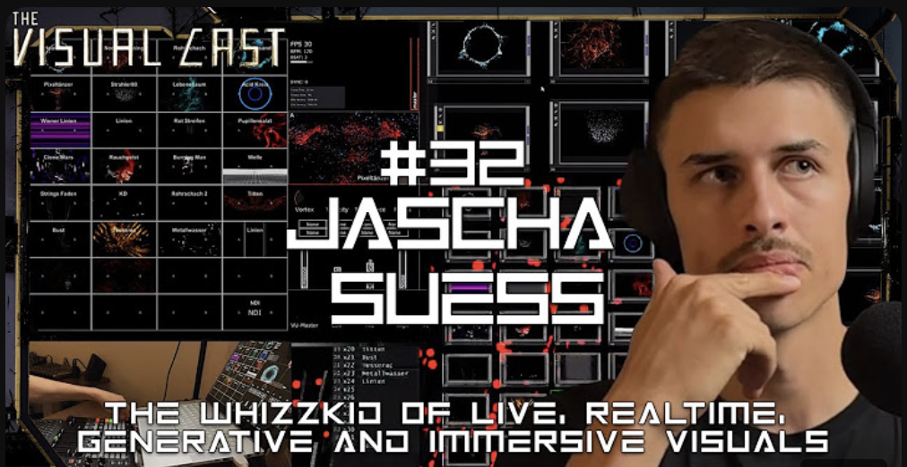
For my third impulse, I watched a podcast episode from Visual Cast featuring Jascha Suess, a very talented VJ who has worked on many projects with well-known DJs. I follow his work on Instagram, so I was curious to hear about the process and stories behind it.
Even though the podcast focused on VJing, it gave me new ideas for my own project about language visualizations. Jascha shared how he uses TouchDesigner to create visuals and build interactive systems. Hearing this made me realize again how powerful TouchDesigner is, and it inspired me to explore it even more.
About TouchDesigner
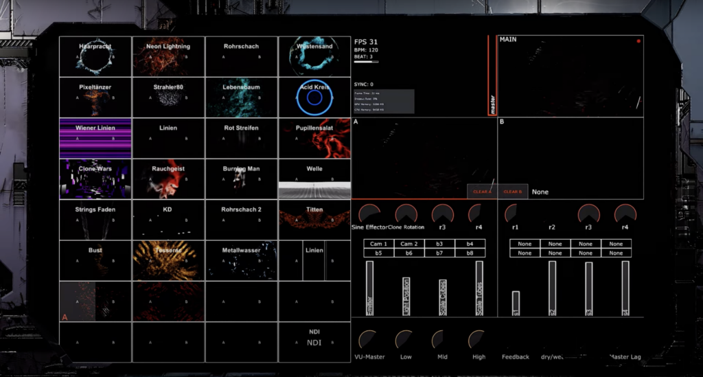
One thing that stood out to me was how Jascha builds entire UIs and patches in TouchDesigner. He talked about how flexible and creative the software is, which is something I’ve started to experience in my own experiments. It’s exciting to see someone use it at such a high level, and it motivates me to keep learning.
Jascha mentioned that he isn’t a programmer and doesn’t write much code, but he loves working with TouchDesigner’s node-based interface. He finds it easier and more intuitive than traditional coding, and he said it allows him to focus more on creativity. This made me feel more confident because I also don’t have strong coding skills, but I can still create complex systems using nodes.

What I Learned
While the podcast was about VJing, it gave me fresh ideas for visualizing languages. Jascha explained how he connects inputs like music or motion to create visuals that react in real-time. This made me think about how I could make my project more interactive. For example, instead of static visuals, I could create a setup where users speak into a microphone, and the visuals change based on the sounds of their voice.
He also talked about organizing projects into smaller steps. He starts with simple patches to test ideas and then builds on them. This approach feels very practical, and I plan to try it in my own workflow.
Conclusion
Watching this podcast helped me see new possibilities in my work. Jascha’s approach to using TouchDesigner is creative and inspiring, and I want to dive deeper into what the software can do. I also learned that even without coding expertise, it’s possible to create complex and meaningful projects by focusing on the tools and workflows that work best for me.
→ Link of the podcast: https://www.youtube.com/watch?v=MWsk_JaCiew&t=2s
