I took Professor Feil’s advice and went outside to photograph interesting objects in nature that seemed appealing to touch. As I observed nature, I realized that when I think about tactile experiences, I often start to feel the texture of an object in my mind before I even touch it.
This exercise turned out to be really useful. As I explored, I found many intriguing tactile elements in the natural world. For example:
Edge of the leaf
Flowers
Nature elements combined with everyday objects (rain + car)
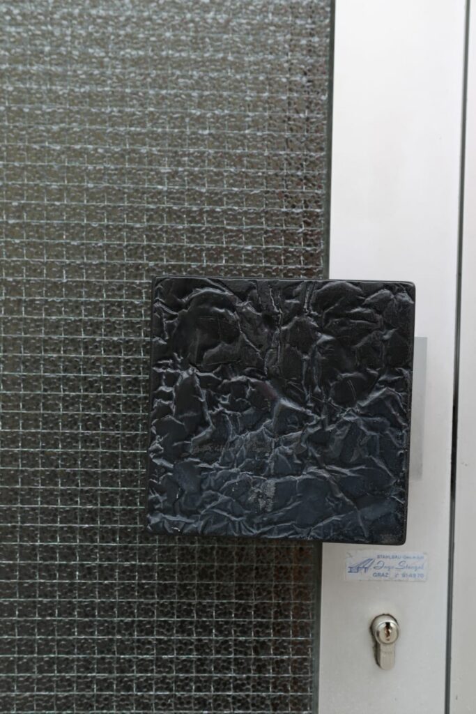
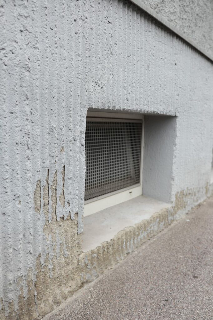
Metal objects
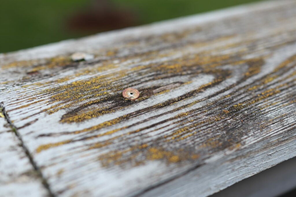
Fence
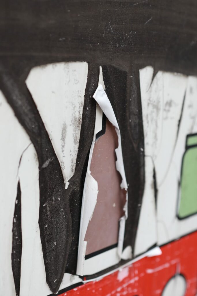
Ripped paper
There were more textures, patterns, and forms than I had expected. This experiment helped me pay more attention to details and gave me a better understanding of how to incorporate tactile elements into my future photography projects.
Although the exercise was really helpful, I realized that for my final project, I don’t want to focus solely on simple photographs of objects. Instead, I aim to capture more complex scenes that evoke deep emotions and tell a story. I’m going to use these natural elements as an inspiration.
I want my final photographs to go beyond mere visual representation and engage viewers on a more emotional and sensory level. By doing so, I hope to create a more immersive and impactful experience that resonates with people. I want to continue pushing the boundaries of traditional photography by integrating more tactile and interactive components into my pieces.
This is as experiment about combining photography with everyday materials.
For the first experiment, I wanted to limit myself so I decided to only use materials that I can find at my place. Since I’m still not sure how exactly I’m going to approach this topic – I wanted to push myself to be as creative as possible with the limited materials. I used old photographs.
I chose to work with thread first. Having tried sewing last year, I have a personal connection to it. I used white thread to mimic the fluffiness in the image. When I made a few stitches on the photograph, I was immediatelly drawn to touch it, which I took as a positive sign. I put the thread on the place on the photography where the “flower” is because that seemed logical. This material was easy to work with. In the next experiments with thread I would like to try sewing on the place that don’t have a connection with the thread so I can focus more on creating a feeling of the entire photography.
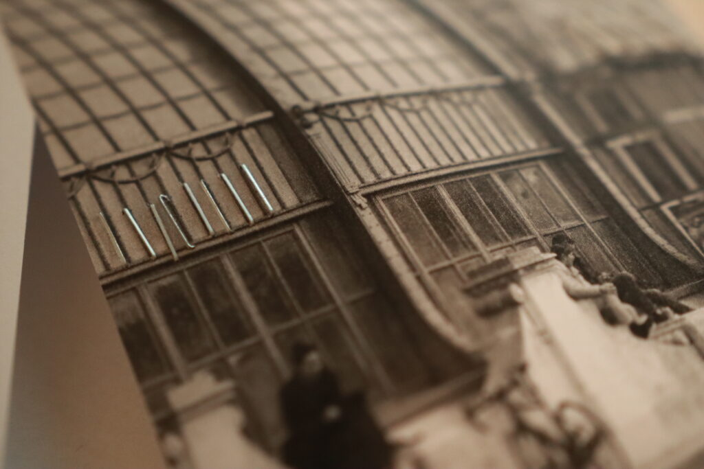
The next material I used was staples. I chose a photograph featuring a metal structure for this experiment. Staples proved to be particularly interesting due to the thin paper of the photograph. When touched, the staples move, creating an engaging user experience. Additionally, the sharp edges of the staples on the back of the photo added an intriguing tactile element. The negative side is that my stapler is small so it is not possible to staple in the middle of the photo.
The next idea was to use a needle to create small holes in the photo. I selected an image of a tree by the seaside because it conveys a sense of tranquility and windiness. I used the holes to represent the wind. This technique was somewhat challenging because I wasn’t sure where to place the holes. Since the photograph is very minimalistic, the holes became quite visible, and I’m not sure if this was the best technique to use.
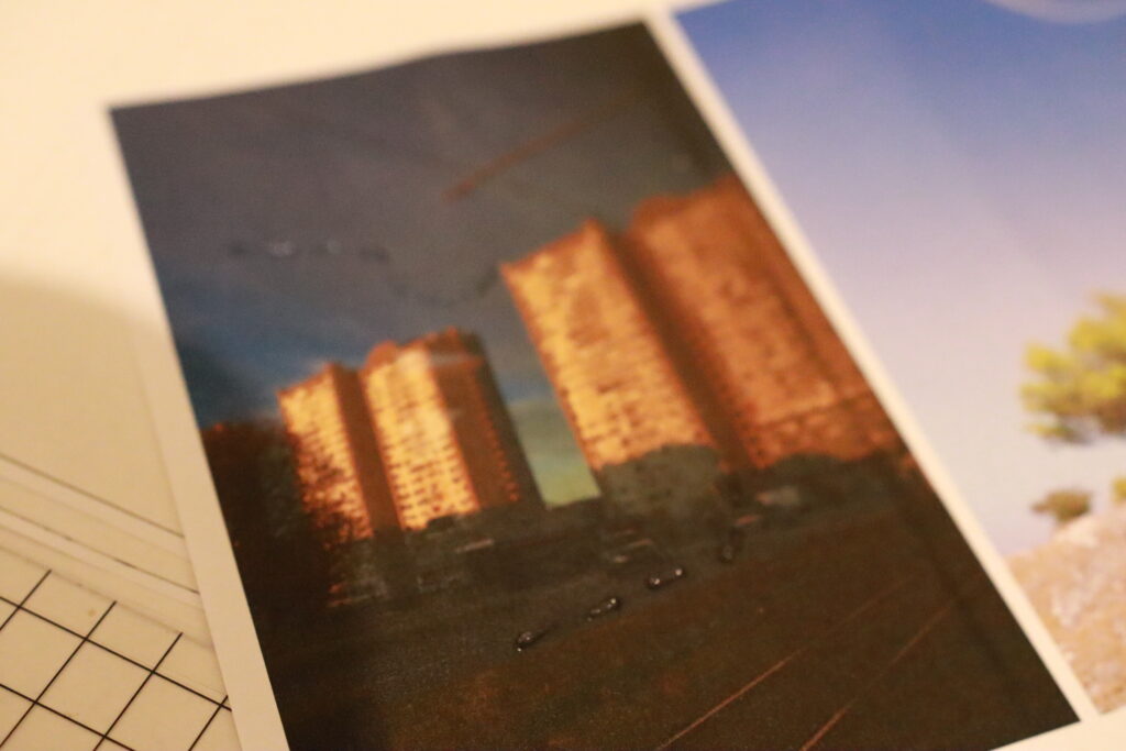
The last technique was using glue. I chose an photography that was taken from a tram so it has reflections in it which is why it made sense to use a transparent material. However, I faced the same issue as with the needle holes—I wasn’t sure where to apply the glue. The shapes created by the glue dominate the picture, and I would prefer something more subtle.
Overall, I think this experiment was a success because I learned that I prefer subtle tactile experience especially when it is surprising and it doesn’t take over the photography – which I think is the main point of my project.
Magnus Feil, Dipl. Designer (FH), M.F.A., is a faculty member of the Industrial Design program at FH JOANNEUM—University of Applied Sciences in Graz, Austria. His work and research focus on sustainable solutions for circular economies, social good, storytelling, tangible interactions, and re-envisioning design education. His course on User Experience particularly impressed me, which is why I spoke with him.
Professor Feil told me that it is very important that I look more into a history of photography, since tactile experience was more present in early days of photography.
The next thing Professor Feil emphasized was not just to focus on adding tactile elements, but to connect these elements with the emotions present in the photograph. Thus, the addition of new information serves a greater purpose.
He consistently stressed the importance of not being literal. This means, for example, not placing a fluffy material on the part of the picture where a blanket is shown. He advised interpreting the images artistically and poetically, as this approach leads to truly innovative design.
Another idea that I hadn’t considered is: ‚Where are our fingers positioned when touching the photograph?‘—both in front and behind. Therefore, it would be very interesting to place tactile elements not only on the front but also on the back of the photograph, and perhaps even on the edges.
One possible approach to my task/topic could be: ‘How could you recreate pictures in a tactile way?’ I need to think about how to express a photograph in a tactile manner if the visual aspect were not visible. This approach also touches on designing for visually impaired people.
Professor Feil told me that tactile elements serve like a memory bridge. He advised me to investigate whether combining visual and tactile elements with other senses could produce interesting results. Considering we have multiple senses, it might be intriguing to incorporate them as well. For example, applying a specific scent to a photograph.
Finally, the professor advised me to concentrate on the process rather than the outcome. He suggested engaging in extensive photography and experimentation to determine the direction I want to take. Since it’s a broad topic, it’s crucial to explore extensively to define the problem and then work towards finding a solution.
1. Examining People’s Interaction with Printed Photos
Objective: Analyze how people interact with printed photos, focusing on time spent, attention to details, and differences between viewing photos in an album versus holding individual photos.
Methodology:
Preparation:
Prepare a photo album and individual photos.
Set up an observation space.
Participants:
Select participants of different ages.
Observe each individually.
Procedure:
Phase 1: Album Interaction
Give the participant the album.
Record time spent, expressions, body language, and comments.
Phase 2: Individual Photos
Give the participant individual photos.
Record time spent, attention to details, and reactions.
Expected Results:
More time and focus on individual photos.
Stronger emotional reactions to individual photos.
2. Home Experiments with Photographs
1. Sewing Photographs:
Materials: Printed photos, needle, thread.
Procedure:
Choose a photo and decide where to sew (edges, specific details).
Use a needle and thread to stitch along your chosen pattern.
Observation: Note how the thread affects the photo’s appearance and durability.
2. Puncturing Small Holes:
Materials: Printed photos, a pin or small needle.
Procedure:
Select a photo and plan a design or pattern for the holes.
Carefully puncture small holes in the photo.
Observation: Observe the effect of light passing through the holes and the overall aesthetic change.
3. Stapling Photographs:
Materials: Printed photos, stapler, staples.
Procedure:
Choose photos to staple together or add staples as part of a design.
Staple the photos and ensure they are securely fastened.
Observation: Examine the structural integrity and visual impact of the staples on the photos.
Last semester, I learned a lot about tactility in general and why tactile design matters. When researching, I stumbled upon a topic about tactile images. Since I also consider myself a photographer, I think it could be really interesting to try and combine these two topics.
How to combine photography and tactile design?
Nowadays, people look at their photos on digital screens. Rarely, anyone actually prints photos ( maybe for special events like wedding, etc.) and even when they print them, they don’t really interact with them. They store photography in albums or books, seldom touching them. Even me, who likes to capture important events, am not really prone to actually printing my photography. Sometimes it’s really sad that we have all these photos and we forget about them because we don’t really know what to do with them. I remember that when I used to be little, I looked at photos in albums and I was really excited when I had them in my hands. At the same time, I was a little bit afraid that I will ruin them with my fingers because the material wasn’t touch-friendly.
Wouldn’t it be great to have photos which encourage you to touch and explore them? What consequences would that have? Would people be more interested into looking? What about people who are not so passionate about photography – how would their reaction be? What about those who are in fact really passionate? Does adding another dimension to photography “ruin” its purpose? How does adding tactile elements to photography affect its appearance? Does photography appreciation grow with interactive elements?
I have a lot more questions, but for now, I think I wan’t to explore different ways in which I can actually manipulate photos so that they have tactile experience. I want to research how to add interactive dimension to photography using tactile materials.
The goal of my research will be not only to bring back the tactile experience to photography, but to add an extra meaning to it using interesting and experimental tactile elements.
Sustainability and environmental concerns stand as pivotal topics influencing strategic business and product development decisions. Environmental sustainability is defined by conditions in which human activities, at both planetary and regional levels, do not disrupt natural cycles beyond the capacity of planetary resilience. Sustainable development encompasses the management of energy and material flows, the integration of clean technology, closed-loop systems, and considerations of quality, economics, and social aspects.
The printing industry significantly contributes to environmental impacts, characterized by energy consumption and environmental pollution resulting from chemical-intensive processes. Recent research has extensively addressed sustainability challenges within the printing sector. Each printing technique employs various chemicals, contingent upon the specific operations involved.
Offset printing, recognized as a chemical-intensive technique, generates diverse types of waste (Euroth & Johansson, 2006).
Key environmental concerns associated with offset printing include the use of non-renewable resources (mineral pigments in paper, mineral oil-based inks and solvents, metal plates, and plastic in equipment), the utilization of toxic or harmful substances (additives in inks and adhesives, biocides in fountain solutions), emissions of volatile organic compounds (VOCs) from various sources (inks mixing, drying, fountain solution, cleaning solutions, and blanket washes), generation of toxic waste (ink and cleaning solvent waste), production of regenerative waste (paper and unacceptable prints), energy consumption (in production equipment, ink drying, and transport), and emissions from transportation (paper supply chain, ink, varnish, delivery of printed matter, and waste transport) (Mirkovic et. al, 2011).
The printing process poses environmental challenges due to its energy and material resource usage. A life cycle assessment revealed that sheet-fed offset printing is the primary contributor to the environmental impact of printed materials, with 52% attributed to printing, 31% to paper, and 17% to ink. This process significantly contributes to acute ecotoxicity. Emissions involve fugitive volatile organic compounds (VOCs), with a consumption of 3 kg/tone product. There is potential to substitute VOC-containing chemicals with alternatives having lower environmental and health impacts. The adoption of UV inks, dried with LED-UV lighting, not only reduces electricity consumption but also contributes to VOC reduction. Paper remains the dominant resource at 48%, with concerns about the impact of forestry on biodiversity, energy consumption in papermaking, and emissions from chemical pulping, deinking, and bleaching. Amid current environmental concerns, attention is turning towards the development of non-wood fibers, like algae, as raw materials for papermaking. Strategies such as alternative fibers, recycling, reforestation programs, and plantation management are being explored to achieve a sustainable fiber supply (Mirković et. al, 2019).
In response to the pressing environmental challenges posed by the printing industry, there is a growing momentum towards adopting sustainable practices and exploring innovative solutions. Companies are increasingly recognizing the need to minimize their ecological footprint and are investing in research and development to enhance the environmental performance of printing processes. This includes the development of eco-friendly inks, the implementation of energy-efficient technologies, and the exploration of alternative materials for printing substrates. Furthermore, industry stakeholders are actively engaging in collaborative efforts to establish industry-wide sustainability standards and certifications. As consumer awareness of environmental issues continues to rise, there is a growing market demand for eco-conscious printing services, prompting businesses to align their practices with principles of sustainability. Through a concerted effort across the printing supply chain, the industry aims to strike a balance between meeting consumer demands and minimizing its impact on the environment.
Sources:
Euroth, M. & Johansson, M. (2006). Environmental data on gravure and offset printing. Acta Graphica, 18(4) 1-10.
Bolanča Mirković, I., Majnarić, I., Mustač, S., & Bolanča, Z. (2011). Printing and environmental sustainability. 38th International Research Conference of IARIGAI – Advances in Printing and Media Technology. Enlund, N., Lovreček, M. (eds.) Darmstadt, 361-368. https://www.bib.irb.hr/ 573521
Bolanča Mirković, I., Medek, G. i Bolanča, Z. (2019). Ecologically Sustainable Printing: Aspects of Printing Materials. Tehnički vjesnik, 26 (3), 662-667. https://doi.org/10.17559/TV-20180620181128
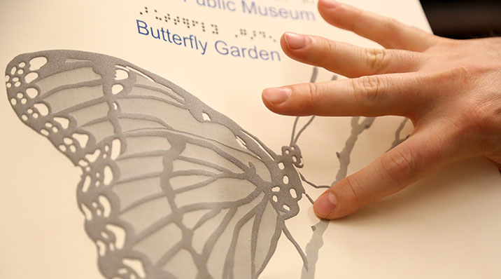
Tactile photographs allow persons to experience photographs beyond pure information, and allows for interactions between persons with visual impairments and sighted persons. However, tactile photographs are always interpretations of photographs, not direct translations, and should just as all tactile images be supplemented with captions. There are several techniques for creating tactile reliefs from photos. One technique for creating an image which is both tactile and visual, and where the original photo remains visible, is to mill the photo’s structures and contours in different layers of transparent plastic material. The plastic is then attached to a printout of the photo, which can be seen through the transparent layers of plastic. Tactile photographs made using the above technique have long lives, are resistant to wear and tear, and are easy to clean. As it is an exclusive technique, you often choose to only interpret a few photos, for example, from a larger exhibition. This means that the selection of photos is very important. The tactile design is uniquely made based on each individual photo, in consultation between the customer and designer. It is important to be clear about the information that is to be highlighted in the image. If possible, the photographer should also be involved in the selection and in the production of captions for the photos.
Furthermore, enabling tactile accessibility for two-dimensional images and photographs involves employing techniques like swell-paper, collage pictures, and tactile photos. Skillful design is crucial in creating tactile images, requiring prior experience with the medium to fully leverage its potential. Clarity about the highlighted information in the image is also paramount. Swell-paper images, a cost-effective and straightforward method, offer tactile representation. Easily produced from a digital original, additional copies can be swiftly printed as needed. Convenient to handle and store, these images typically come in A4 or A3 size, fitting into binders or folders like regular paper. Produced using thermosensible swell-paper in a specialized printer, these images comprise raised lines and raster surfaces, making them easily discernible by touch. In addition to the tactile elements, swell-paper images can incorporate color, although it does not contribute to the raised relief. The versatility of swell-paper images extends beyond aiding individuals with visual impairments, as they can be read both tactually and visually. This technique also serves as an additional information medium for 3D models (Lindbäck, 2020).
Example: Klimt from the 3D printer: „The Kiss“ – tactile relief for visually impaired
On October 12, 2010, the collaborative efforts of the AMBAVis project team and the Belvedere Vienna culminated in an invitation to experience a renowned art piece in an inclusive format. Over the past two years, as part of the EU project, groundbreaking 3D technologies have been developed to enhance the accessibility of museum objects for individuals who are blind or visually impaired. A significant contribution to this endeavor was made by VRVis, which meticulously crafted a tactile relief of Gustav Klimt’s masterpiece, „The Kiss,“ housed at the Belvedere. This iconic artwork is now presented in a groundbreaking, barrier-free version, marking a pivotal moment as it becomes accessible to individuals with visual impairments for the first time. The endeavor reflects a commitment to leveraging technology and innovation to make art and cultural experiences more inclusive and enriching for diverse audiences (Klimt from the 3D printer: „The Kiss“ – tactile relief for visually impaired).
In his exploration of materiality, James Elkins contends that vision is inherently linked with touch, feeling, and the entire range of somatic responses. This perspective aligns with the transformative potential of 3D printing, hailed as heralding a new industrial revolution. Beyond industrial applications, an emerging community utilizes 3D printers for personalized small-scale production at home. Inspired by this focus on the physicality of artwork and our engagement with tactile materials for visually impaired exhibition visitors, we propose the groundwork for a novel multisensory discipline termed „tactile photography.“ This discipline, rooted in stereoscopy and computer-aided conversion of digital images into reliefs, allows for the creation of tangible objects through technologies like 3D printing. While particularly beneficial for visually impaired artists, tactile photography extends beyond the realm of „disability arts“ (Sutherland 2005). We aim to demonstrate how it aligns with a longstanding interest in enhancing photography with depth and physical space, akin to multi-photography, Andrew Davidhazy’s peripheral photography, the Lumière Brothers’ photostereo synthesis, and photo sculpture. Unlike other forms, photo sculpture aims to translate photography into tactile sculptural forms. Originating in 1859 with François Willème, Photosculpture involves capturing simultaneous photographs of a subject from various angles, converting them into a three-dimensional portrait-sculpture. Despite an initial euphoric reception, Photosculpture faced challenges due to its cost and was not widely accepted as an independent art medium. However, recent advancements in body-scanning and 3D printing technologies have led to a resurgence of interest in photo sculpture (Reichinger & Neumuller, 2018).
Sources:
Lindbäck, V. (2020). 8. tactile images. Retrieved from https://www.raa.se/in-english/outreach-and-exhibitions/guide-for-increased-accessibility-through-3d-models/9-tactile-images/)
(N.d.). Retrieved from https://www.vrvis.at/en/news-events/news/klimt-from-the-3d-printer-the-kiss-tactile-relief-for-visually-impaired
Reichinger, A., & Neumuller, M. (2018). Redefining the Photographic Medium. Tactile Photography, 245–251.
Emerging technology, the development of novel printing techniques, and an increased desire to provide materials for individuals with varying needs and abilities have all contributed to an increase in the desire to create tactile representations. It is well-known that sight and touch operate on very separate levels, resulting in significantly different ways of experiencing the world. Sight is a passive, instantaneous perception, while touch is dynamic and sequential (Lopes, 1997).
Touch has lower resolution compared to vision, with receptors spread across the body. Tactile reading in public is limited to hands, often using a single index finger, making vision relatively superior in simultaneously processing layers of information. Apprehending information and recognizing visuals by touch is more slower than it is by sight, demands a higher level of cognitive maturity, and puts a greater strain on a person’s memory. Finally, research into shape identification reveals that it is rare for certain shapes and details (for example, acute, obtuse angles) to be differentiated through touch.
It is crucial to keep in mind that visual impairment is heterogeneous, meaning that different people have different degrees of sight and will experience different stages of vision loss throughout their lives. While some people may have seen a great deal in their lifetime, others may have seen nothing at all. In addition, people’s motivations to touch can vary depending on context and culture (e.g., how much they have been encouraged or discouraged to touch things). As a result, people may have varying levels of experience using touch to explore their surroundings (Strickfaden, & Vildieu, 2014)..
In the journal Lopes argued that pictures aren’t exclusively visual (1997): ”We have made two mistakes. The first lies in defining pictures as essentially visual. The picture-interpretation and drawing skills of congenitally and early blind people show that this mistaken… But if, as I have argued, pictures are not exclusive representations, then this argument topples and there is no reason that pictures‘ aesthetic properties are only visual and must be apprehended by using our eyes. A new possibility opens up before us. Art is in the business of exploring and expanding its own boundaries, and tactile pictures are terra incognita.”
One challenge in communicating through tactile images is the decline in touch sensitivity with age, varying among individuals based on experience and education. Striking a balance is crucial in designing tactile layers – they should be explicit enough to convey details without oversimplifying to the point of diminishing cognitive engagement. Textural elements like cross-hatching, smooth areas, and rough surfaces contribute to contrast within a tactile image, aiding in the differentiation of materials or figures. This contrast is pivotal for comprehension. Establishing a focal point is essential for tactile exploration, achieved by using thicker materials or incorporating high-contrast elements. Unlike vision, where faces or color contrast draw attention, touch is drawn to contrasting tactile elements. The focal point in touch can begin anywhere on the composition, emphasizing the importance of adding contextual information, such as audio, after creating the image.
Individuals‘ ability to recognize tactile elements varies, regardless of sight. Tactile image comprehension depends on the willingness to engage with touch, especially for visually impaired individuals who rely on abstracting concepts. Users must correlate audio or textual descriptions with the tactile experience. Crafting touch-supportive artifacts requires careful consideration for enhanced understanding. While transforming visual artifacts into perfect tactile replicas is impossible, capturing specific attributes in a tactile form can represent key aspects of the original (Strickfaden, & Vildieu, 2014).
When thinking about tactile images, into consideration should be taken the following: first, the success rate for recognizing pictures by touch is much lower than it is for vision. Second, some pictures are more frequently recognized than others. Third, there is also some variation from individual to individual: while some blind people recognized many images others recognized few (Lopes, 1997).
Sources:
Dominic M. M. Lopes. (1997). Art Media and the Sense Modalities: Tactile Pictures. The Philosophical Quarterly (1950-), 47(189), 425–440. http://www.jstor.org/stable/2956276
Strickfaden, & Vildieu. (2014). On the Quest for Better Communication through Tactile Images. The Journal of Aesthetic Education, 48(2), 105. doi:10.5406/jaesteduc.48.2.0105
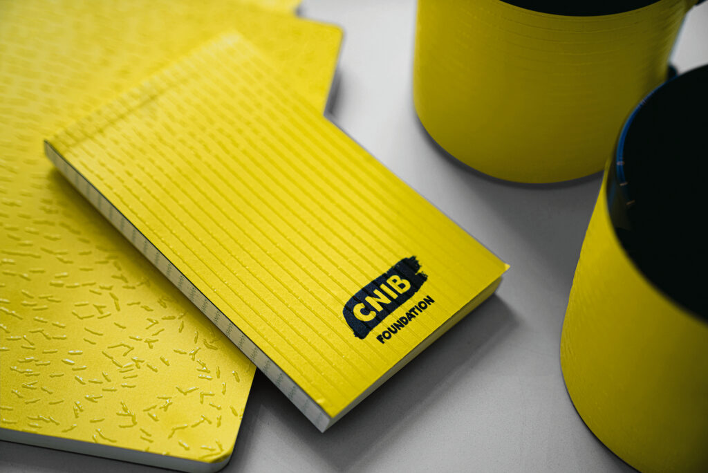
Red dot winner 2021→ Brand Design Relaunch “A Brand You Can Feel”
“A bold, beautiful visual identity is just that: a visual identity. To give deeper meaning to the branding of the CNIB, we challenged ourselves to create a brand that’s as meaningful to someone who is sighted as to someone with sight loss. The result, made in collaboration with the visually impaired community is the first tactile brand identity – a texture that tells the story of the CNIB through touch.” – winners
In the crowded landscape of modern marketing, brands seek to establish connections that transcend the ordinary. Beyond the visual and auditory realms, the integration of tactile experiences becomes a pivotal element in crafting a memorable brand identity. The sense of touch, often overlooked, holds the power to evoke emotions, create lasting impressions, and differentiate a brand in a meaningful way. By incorporating textures, materials, and physical interactions, brands not only engage consumers on a sensory level but also forge a deeper, more emotional connection. Tactile experiences go beyond aesthetics; they tell a story, convey value, and enhance the overall brand narrative. In this multi-sensory approach, brands find a unique avenue for differentiation, leaving an indelible mark in the minds and hearts of consumers.
Red dot winner 2021→ Food Packaging “ALL ABOUT SHEEP”
“The focus of the packaging design for this brand of sheep milk powder was to enable consumers to easily distinguish it from other milk powders, as these products are relatively new on the market in China. This is achieved through a direct visual and tactile reference to the animal. For example, the handles of drawers take the shape of a lamb’s forelock, and the edges of the envelopes are cut into the form of a sheep’s ear. Thus, by cleverly adapting their structure, the boxes become square lambs. The feel of the wool is simulated by embossed characters and patterns.” – winners
Crafting a tactile experience through product packaging is more than just functional; it’s a strategic choice that can elevate a brand’s identity. Beyond mere aesthetics, this approach engages the consumer’s sense of touch, creating a memorable and immersive interaction. The unique form not only stands out on the shelves, setting the product apart, but also communicates a narrative—connecting the consumer to the essence of the product and the brand. Such thoughtful packaging goes beyond containment; it becomes an integral part of the product experience, making a lasting impression on consumers.
Red dot winner 2023 → Haptic Puzzle
“HAPTIC PUZZLE is a puzzle that encourages the development of children’s sensory integration, especially their sense of touch. It encourages children to explore shapes and cultivate their imagination by relying on their sense of touch and delicate colors. This puzzle provides a foundation for the development of sensory integration and the cultivation of higher senses by developing the sense of touch and imagination in a fun way.” – winners
Encouraging tactile experiences and play in children is vital for their holistic development. Tactile play, which involves exploring various textures and engaging the sense of touch, serves as a foundation for multiple aspects of a child’s growth. Through hands-on interactions, children not only refine their sensory perception but also stimulate cognitive development. Tactile experiences offer opportunities for problem-solving, creativity, and the development of fine motor skills. Graphic design plays a role in this by contributing to the creation of visually and texturally engaging materials that enhance the overall tactile experience for children. Whether it’s designing educational materials, toys, or interactive displays, thoughtful graphic design can amplify the impact of tactile play, making learning more enjoyable and memorable for children.
Packaging designers frequently dedicate a significant amount of their time contemplating how a product’s visual packaging will convey the brand’s message and objectives. Nevertheless, it is crucial to consider the tactile packaging elements that can truly set a product apart.
“Without a doubt, tactile finishes make a pack more intriguing. When you hold something that feels good, the brain formulates where this pack sits in terms of quality and the product within” says Lloyd Neilson, IPL’s head in China.
In packaging design, graphic designers commonly use packaging materials to incorporate real textures closely related to product information, a traditional method with proven effectiveness. Another approach involves the imitation of product features using conventional packaging materials like glass, plastics, or paper, aiming to achieve a tangible manifestation of tactile sense and visual effect. Consumers, upon seeing visual information conveyed by commodity packaging, gain a preliminary understanding of basic product information, influencing their decision-making process (Wang & Li, 2014). A fundamental concept to keep in mind when considering the tactile characteristics of product packaging is the concept of ’sensation transference,‘ a term coined by the renowned marketer Louis Cheskin in the 1930s. The underlying idea is that individuals, including consumers, generally struggle to distinguish their perceptions of the product from their feelings about its packaging. In the words of Stern, ‚Consumers commonly fail to make a clear distinction between a product and its packaging, as many products are also packages (and vice versa).‘ Importantly, a substantial body of research now indicates that the consumer’s thoughts or emotions, whether consciously or subconsciously, regarding the packaging frequently influence their evaluation (and presumably their overall experience) of the product itself (Spence, 2018).
Luxurious sensations are achieved through materials like leather, suede, glass, and silver. Wooden boxes offer diverse finishes, from smooth and glossy to open, exposing the natural grain. Techniques like laser etching and electroform decals enhance the tactile experience of packaging. Rigid board paper-wrapped packaging, coupled with emboss treatments and UV gloss prints, provides a smooth and shiny finish. Speciality papers such as leatherette or soft-touch paper introduce varied tactile surfaces. These tactile elements not only reinforce luxury values but also align with a brand’s image, whether modern or heritage-focused. High-tech brands may opt for materials reflecting their modern positioning, while ‚old world‘ brands choose materials to reinforce their heritage. Spence (2018) also discusses the growing popularity of products with heavier packaging. This helps to explain why so many customers claim that drinking Coca-Cola from a glass bottle is more desirable to drinking it from a noticeably lighter metal can. Here’s something to keep in mind: a lot of customers say they prefer beer in a bottle over a can. One latest research actually showed that when beer comes from a glass bottle as opposed to a can, people perceive the beer to taste much better.
Source: 99designs.com
The perceived temperature of the packaging is also likely to play some role too, though there has been little research specifically on this question to date. Giving product packaging an interesting feel, or finish, constitutes an effective marketing tool, if it encourages the consumer to pick the product up off the shelf, and by so doing, increases the likelihood that they will end up placing the product in their basket (Spence,2018).
Selecting the right packaging material is a crucial aspect of product packaging that goes beyond mere aesthetics. It involves a careful consideration of various factors to ensure the protection of products, cost-effectiveness, environmental sustainability, and customer satisfaction. In this guide, we’ll explore the key factors to consider when choosing packaging materials for your products.
Product Characteristics: When selecting packaging materials, it’s vital to take into account the specific characteristics of your products, such as size, weight, and fragility. Different items require different levels of protection and support.
Protection and Durability: Assess the level of protection needed during transportation and storage. Fragile items may demand materials with cushioning or shock-absorbing properties to prevent damage.
Environmental Impact: Consider the environmental impact of your packaging. Opt for materials that are recyclable, biodegradable, or made from renewable resources. Sustainable packaging not only benefits the environment but also aligns with consumer preferences.
Cost: Strike a balance between the cost of packaging materials and the value of your product, investing in higher-quality materials is justified, especially for valuable items that require added protection.
Regulatory Compliance: Ensure that your chosen packaging material complies with relevant regulations and industry standards. Adhering to guidelines is crucial, especially in industries with specific packaging requirements.
Customer Experience: Packaging plays a role in shaping the overall customer experience. Consider the aesthetics and functionality of your packaging, as it can influence customer perception and satisfaction.
Ease of Handling: Evaluate the ease of handling and processing during manufacturing, filling, and sealing processes. Opt for materials that contribute to efficient packaging, which can lead to cost savings.
Brand Image: Packaging is an extension of your brand. Align your packaging materials with your brand image and values. Sustainable and eco-friendly packaging can enhance your brand’s reputation among environmentally conscious consumers.
Recyclability and Reusability: Prioritize materials that can be recycled or reused. This commitment to sustainability not only benefits the environment but also resonates with consumers increasingly seeking eco-friendly practices.
Innovations in Packaging: Stay informed about new developments in packaging materials. There may be innovative, sustainable options or materials with improved performance characteristics that can give your products a competitive edge.
A really interesting fact that shows the effectiveness of tactile marketing is that a branch of Asda, a British supermarket, unwrapped multiple brands of toilet tissue in-store, enabling shoppers to feel and compare textures. The tactile engagement resulted in a significant boost in sales for the in-store brand, ultimately leading to a 50% increase in shelf space dedicated to that specific product line (Ellison & White, 2000).
In conclusion, we (consumers) might not be aware of it, but tactile experience affects our purchasing behaviour more than we think.
Wang, Q., & Li, H. (2014). Analysis on tactile field in current graphic vision design. Proceedings of the 3rd International Conference on Science and Social Research. https://doi.org/10.2991/icssr-14.2014.235
Ellison, S., & White, E. (2000, November 24). ‘Sensory’ marketers say the way to reach shoppers is the nose. Wall Street Journal. Retrieved from https://www.wsj.com/articles/SB975016895886269171