As we look ahead, the importance of imperfect, handmade elements in visual communication are likely to continue growing, offering designers unique opportunities to create authentic and human-centric designs.
While there are many new technologies that are getting more important, such as AI and VR, there is also a countermovement visible, back to analog, and handmade aesthetics. The future of design will be characterized by emerging trends and technologies that will redefine the way designers create and experience visual designs. These emerging technologies include virtual reality (VR), augmented reality (AR), mixed reality (MR), 3D printing, artificial intelligence (AI), and chatbots, among others. By embracing these technologies, designers can create more innovative, efficient, and engaging designs that resonate with users and build trust.
However, designers must also balance these technological advancements with the growing emphasis on diversity, inclusivity, and authenticity in design, incorporating “imperfect” elements to create designs that are more meaningful, relatable, and impactful. Ultimately, the future of design will be shaped by a harmonious collaboration between human creativity and technological innovation, as designers continue to push the boundaries of what’s possible and create designs that resonate emotionally with users.
Several future trends and developments, concerning the shift to imperfect and authenticity, can be anticipated:
Embrace of Eclecticism: The future is expected to witness a further embrace of eclectic design styles, with designers integrating a mix of digital precision and imperfect, handmade elements. This fusion allows for a diverse visual language that captures attention and communicates messages effectively.
Technological Integration: Advancements in technology, such as AI and machine learning, may offer new tools and possibilities for designers to seamlessly integrate handmade elements into digital designs. This synergy can enhance efficiency while preserving the warmth and authenticity of imperfections.
Sustainable Design Practices: There is a growing emphasis on sustainability in design. Handmade and imperfect elements inherently align with sustainable practices, as they often involve a reduction in reliance on purely digital, resource-intensive processes.
Personalized and Story-Driven Design: Designers may increasingly focus on creating personalized and story-driven visual narratives. Imperfections can play a key role in storytelling, helping to evoke emotions, establish connections, and convey the uniqueness of each narrative.
Collaboration Between Analog and Digital Artists: The future may witness more collaboration between traditional artists and digital designers. This synergy allows for the exchange of ideas, techniques, and skills, resulting in visually rich and diverse designs that celebrate both analog and digital elements.
Continued Focus on Human-Centered Design: The importance of human-centered design principles is likely to persist, with designers prioritizing the user experience and incorporating imperfections to enhance relatability, empathy, and a sense of connection.
In navigating these future trends, designers can continue to use imperfect, handmade elements by:
Balancing Precision and Imperfection: Striking a balance between digital precision and imperfections ensures that designs remain polished and professional while incorporating a human touch.
Experimenting with New Tools: Staying abreast of emerging design tools and technologies allows designers to experiment with novel ways of incorporating handmade elements, pushing the boundaries of visual communication.
Storytelling and Emotion: Placing emphasis on storytelling and emotional resonance in designs enables designers to leverage imperfections as powerful tools for conveying authenticity and connecting with audiences.
Continuous Learning: Actively seeking inspiration from a variety of sources, attending design events, and collaborating with peers fosters continuous learning. This helps designers stay innovative and adaptive in their approach to incorporating imperfections in design.
By embracing these strategies and staying attuned to evolving design landscapes, designers can navigate the future with creativity and ingenuity, leveraging imperfect, handmade elements to craft designs that are truly unique, authentic, and deeply human.
The shift from a focus on digital precision to an appreciation for imperfections in graphic design was influenced by several pioneering graphic designers who embraced a more organic and handcrafted approach. Some notable figures are:
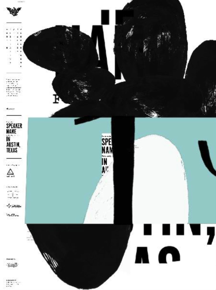
David Carson
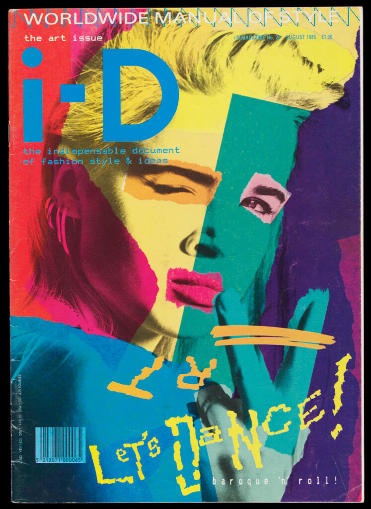
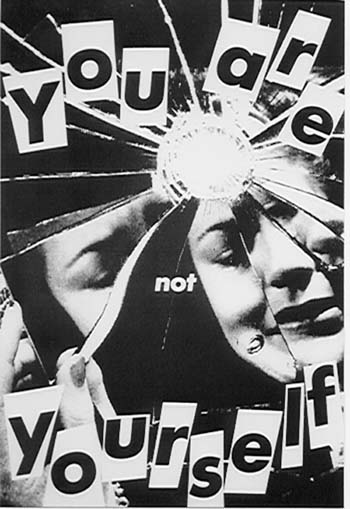
David Carson is a prominent graphic designer known for his unconventional and experimental approach to typography. His groundbreaking work in the 1990s, particularly with the alternative music magazine Ray Gun, challenged the dominance of digital precision and celebrated imperfections. Carson’s work often incorporated irregular layouts, hand-drawn elements, and a disregard for traditional design rules, paving the way for a more playful and expressive approach to design. His innovative and rule-breaking approach to graphic design, characterized by layered imagery, unconventional typefaces, overlapping elements, and a disregard for strict grid-based layouts, aligned closely with the ethos of the grunge movement. Carson’s contributions and innovative design approach remain highly influential in the realm of graphic design, inspiring designers to embrace imperfections and experimentation. Overall, David Carson played a significant role in the shift from a focus on digital precision to an appreciation for imperfections in graphic design, paving the way for a more diverse and expressive approach to design that embraces imperfections and experimentation.
An Austrian-born graphic designer who is recognized for his innovative and expressive designs. Stefan Sagmeister’s work is an excellent example of the shift from digital precision to an appreciation of imperfection in graphic design. Sagmeister often integrates handcrafted elements, playful typography, and imperfections in his work, challenging traditional design norms and embracing a more personal and artistic style. His approach reflects a departure from the strict digital precision that was prevalent in the industry, and his work has played a pivotal role in reshaping the visual language of contemporary graphic design. One example of Sagmeister’s work that fits this topic is his „Things I Have Learned in My Life So Far“ project, which features handcrafted typography and imperfections that add a personal and human touch to the design. Sagmeister’s innovative and expressive designs have contributed significantly to the shift towards appreciating imperfections in graphic design, inspiring a more diverse and expressive approach that celebrates the beauty of imperfection.
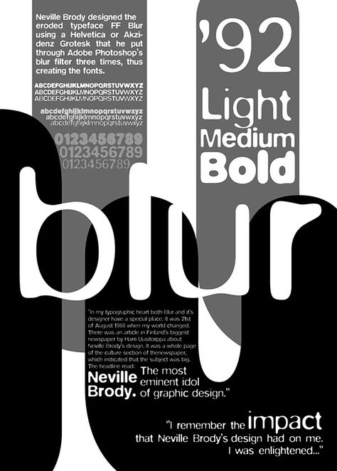
The work of the British designer Neville Brody often incorporates irregular layouts, hand-drawn elements, and a disregard for traditional design rules, paving the way for a more playful and expressive approach to design. His innovative and rule-breaking approach to graphic design, characterized by layered imagery, unconventional typefaces, overlapping elements, and a disregard for strict grid-based layouts, aligned closely with the ethos of the grunge movement. Brody’s contributions and innovative design approach remain highly influential in the realm of graphic design, inspiring designers to embrace imperfections and experimentation. Neville Brody played a significant role in the shift from a focus on digital precision to an appreciation for imperfections in graphic design, paving the way for a more diverse and expressive approach to design that embraces imperfections and experimentation.
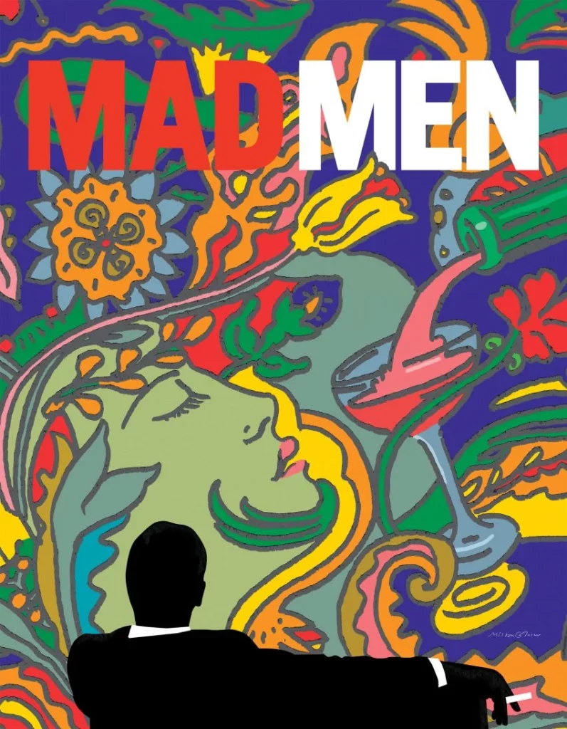
Milton Glaser, an American graphic designer, has also made contributions to this movement. Glaser’s work often involved a combination of hand-drawn elements and a distinctive style that embraced imperfections, giving his designs a unique and human touch. His innovative and expressive designs challenged traditional norms, reflecting a departure from the strict digital precision that was prevalent in the industry. Glaser’s influential and iconic „I ♥ NY“ logo, along with his extensive body of work, exemplifies his embrace of imperfections and the human touch in graphic design, ultimately reshaping the visual language of contemporary graphic design.
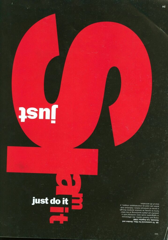
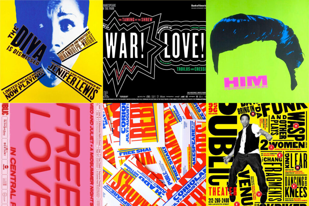
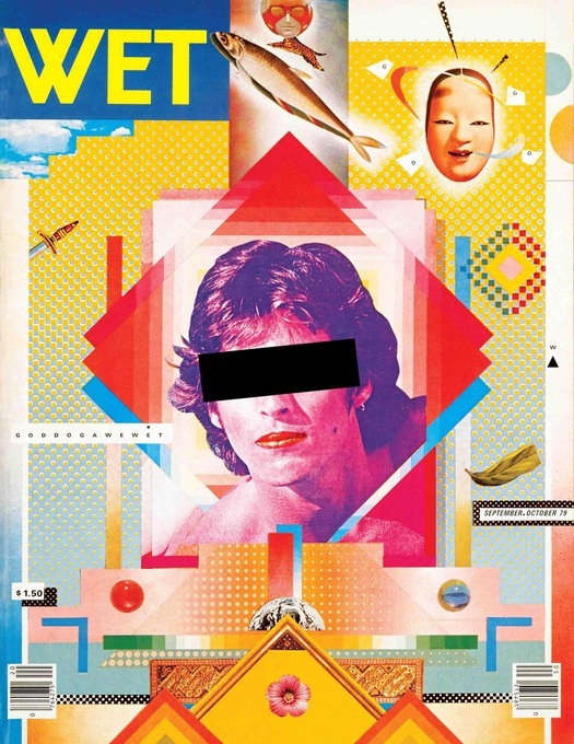
Paula Scher is a contemporary American graphic designer, and painter who co-founded the design firm Pentagram. She has also been a pivotal figure concerning this topic. Scher is Recognized for her bold use of typography and hand-painted elements, her work embodies an imperfect and expressive nature that challenges traditional design norms. Her innovative approach has contributed to a more diverse and expressive form of design, celebrating the beauty of imperfection. Scher’s work has been highly influential in the industry, and some of her most famous designs include the iconic Swatch poster modeled after Swiss designer Herbert Matter’s work, the new identity creation of The Public Theater, and the Citibank logo redesign. Her work reflects the broader trend in the 1990s towards embracing a more vibrant and eclectic aesthetic in graphic design.
The shift from a focus on digital precision to an appreciation for imperfections in graphic design has been a gradual and ongoing evolution, influenced by various factors over time. It’s challenging to pinpoint an exact moment or period when this shift occurred, as design trends are often shaped by a combination of cultural, technological, and artistic influences. However, here are some key developments that contributed to this shift:
Late 20th Century Postmodernism:
The late 20th Century Postmodernism played a significant role in the shift from a focus on digital precision to an appreciation for imperfections in graphic design. Postmodernism emerged as a reaction against the strict rules of modernism and embraced eclecticism, experimentation, and a departure from the clean lines and precision associated with modernist design. This movement challenged the rigid rules of modernism and paved the way for a more playful and expressive approach to design. Designers like David Carson and Stefan Sagmeister experimented with typography, blending different styles and breaking conventions. The advent of computers and digital technology in the 1980s revolutionized the field of graphic design, enabling designers to explore new possibilities in visual communication, image manipulation, and multimedia design.
Postmodernism also encouraged designers to question the nature of „art“ and to incorporate kitsch and „bad“ taste for humor, further contributing to the shift towards appreciating imperfections in graphic design. The postmodernist movement played a crucial role in shaping the evolution of graphic design, paving the way for a more diverse and expressive approach to design that embraces imperfections and experimentation.
As digital design tools became more prevalent, designers initially focused on achieving perfect precision, leveraging the capabilities of software for accuracy and consistency. However, as these tools matured, designers started exploring ways to break away from the rigidity of purely digital creations and embrace imperfections and experimentation. The emergence of new design trends and styles that embraced imperfections and experimentation can be traced back to the postmodernist movement, which challenged the rigid rules of modernism and paved the way for a more playful and expressive approach to design. Additionally, the resurgence of grunge design, which embraces imperfection and a raw aesthetic, is another example of the influence of postmodernism on graphic design.
The shift towards appreciating imperfections in graphic design was influenced by a combination of factors, including advancements in digital tools, the postmodernist movement, and a desire for authenticity and experimentation.
The Arts and Crafts Movement, a design and arts movement that emerged in the late 19th century as a reaction to the industrialization and mass production of the era. The 1851 Great Exhibition in London played a pivotal role in its emergence. The movement, led by influential figures such as William Morris, sought to revive traditional craftsmanship and celebrate the beauty of handmade goods. Designers began incorporating imperfections, textures, and handcrafted elements to add a human touch to their creations, partly as a response to the mass-produced, digitally dominated design landscape. The Arts and Crafts movement, which prioritized handmade craft and a love of materials, is an example of the influence of handmade and craft aesthetics on graphic design.
The movement spread to the US, aligning with Progressive Era politics. However, as it failed to adapt to the demands of the 20th century, it declined around the 1920s. Yet, its legacy endured, inspiring later movements like Mingei in Japan and influencing the Bauhaus school. In contemporary graphic design, a resurgence of Arts and Crafts is observed, with designers seeking to reintroduce craftsmanship, personalized touches, and handcrafted aesthetics, drawing inspiration from Medieval art and employing techniques that evoke an old-world, non-digital feel.
The availability of digital tools and software also played a role in this shift, as designers began to explore ways to break away from the rigidity of purely digital creations and embrace imperfections and experimentation. Overall, the growing interest in handmade and craft aesthetics, combined with advancements in digital tools, contributed to the shift towards appreciating imperfections in graphic design.
As consumers and audiences started valuing authenticity and uniqueness, designers sought ways to convey a more genuine and human feel in their work. Imperfections were seen as a means to communicate sincerity and authenticity. This shift towards appreciating imperfections in graphic design was influenced by a combination of factors, including, as mentioned above, the growing interest in handmade and craft aesthetics, the postmodernist movement, and the maturation of digital design tools. As designers began to explore ways to break away from the rigidity of purely digital creations and embrace imperfections and experimentation, they were able to create more authentic and engaging designs that resonated with audiences. The shift towards appreciating imperfections in graphic design was driven by a desire for authenticity and a more human-centered approach to design.
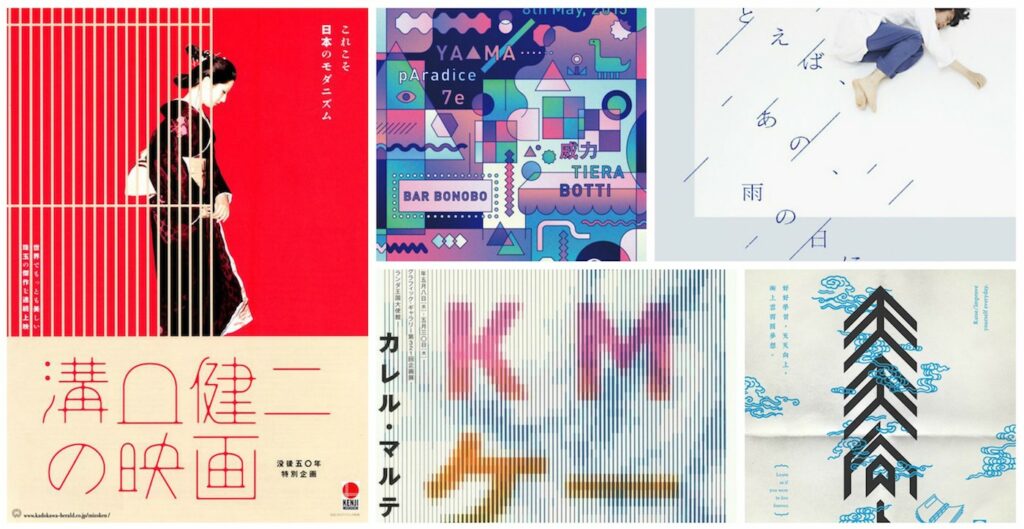
The influence of Japanese aesthetics, particularly the concept of Wabi-Sabi, has played a significant role in the shift from a focus on digital precision to an appreciation for imperfections in graphic design. Wabi-Sabi is a Japanese aesthetic concept that emphasizes the beauty of imperfection, transience, and simplicity (I go more into depth in my blog entry about Wabi-Sabi). This philosophy has influenced designers to incorporate these principles into their work for a more organic and genuine feel.
Japanese graphic design has had a major impact on the field of design, both in Japan and around the world. The bold and innovative designs of Japanese graphic designers have been recognized for their unique characteristics, such as elegant simplicity, harmonious asymmetry, and the use of natural materials. The concept of Wabi-Sabi, which is rooted in Japanese aesthetics and philosophy, has gained popularity and influenced designers to embrace imperfection and transience in their work. The influence of Japanese aesthetics on graphic design can be seen in various design trends and styles, such as the minimalist design trend, which emphasizes simplicity and subtlety.
Additionally, the use of natural materials, such as wood and paper, has become more prevalent in graphic design, reflecting the appreciation for nature and the environment that is deeply ingrained in Japanese culture. The influence of Japanese aesthetics, particularly the concept of Wabi-Sabi, has contributed to the shift towards appreciating imperfections in graphic design.
Besides Wabi-Sabi, there are several other Japanese design principles that have influenced graphic design. Here are some examples:
Kanso: This principle emphasizes simplicity and clarity, with a focus on eliminating unnecessary elements and achieving a sense of balance and harmony.
Ma: This principle refers to the use of negative space to create a sense of balance and harmony in a design
Shibui: This principle emphasizes simplicity, subtlety, and elegance, with a focus on natural materials and organic shapes.
Yugen: This principle refers to the use of suggestion and mystery to create a sense of depth and complexity in a design.
Iki: This principle emphasizes sophistication and refinement, with a focus on understated elegance and attention to detail.
Overall, Japanese design principles have had a significant impact on graphic design, influencing designers to embrace simplicity, natural materials, and a focus on balance and harmony. These principles have contributed to the shift towards appreciating imperfections in graphic design, as designers seek to create more authentic and engaging designs that resonate with audiences.
As designers began to focus more on creating designs that resonated emotionally with users, imperfections were seen as elements that could enhance emotional connections rather than detracting from the design. This shift was influenced by the growing emphasis on user experience and the desire to create designs that were more personal and authentic.
The visual culture on social media platforms has played a significant role in shaping design trends, contributing to the shift towards appreciating imperfections in graphic design. There has been a move away from overly polished and perfect visuals, with a preference for more authentic, relatable content. Designers have adapted to these changing expectations, incorporating imperfections and handcrafted elements to create designs that resonate emotionally with users.
The design industry began recognizing and celebrating diversity, not only in terms of designers but also in design aesthetics. This acknowledgment led to a broader acceptance of different styles, including those that embraced imperfections.
Wabi-sabi is a Japanese aesthetic concept that emphasizes the beauty of imperfection, impermanence and modesty. It is based on the idea that there is a special beauty in things that are outdated, incomplete or even flawed. The term is made up of two main concepts:
Wabi (侘): This part refers to simplicity, modesty and the beauty of imperfection. It can also mean a certain roughness or simplicity in relation to the surroundings or things.
Sabi (寂): Sabi represents the age, patina or dignity that objects develop over time. It is the beauty that emerges from the passing of time and use.
Together, wabi-sabi emphasizes the beauty in the inconspicuous, the transience of things and the acceptance of imperfections. It can be applied to different areas of life, from art and design to philosophies of life. Wabi-Sabi encourages us to appreciate the simplicity and naturalness in things rather than striving for perfection.
How can this concept be applied to graphic design, how can it be expressed?
In art and design, Wabi-Sabi is manifested through organic shapes, natural materials, and the acceptance of natural processes. It is about creating art and design that acknowledge the passing of time and the beauty of imperfection. For example, a designer might choose to incorporate the natural grain of wood, rather than painting over it. Or an artist may leave rough brush strokes visible, rather than smoothing them out.
The beauty of Wabi-Sabi design lies in its ability to create a profound connection between an object and its observer. It encourages us to see the beauty in everyday objects and settings that we might otherwise overlook.
In the fast-paced world of digital graphic design, we’re surrounded by amazing tools that make our work efficient and precise. The advantages of our digital tools are clear – efficiency and speed, precision and consistency, collaborations across the globe, and endless creative options. But in the midst of this digital workflow, something seems to be missing or to be lost in the digital process. The hands-on, personal touch of traditional design isn’t really there. It’s a challenge to bring in that human element – the imperfections and quirks that give designs character. Striking the right balance between the digital perks and the warmth of handmade touches becomes the key to creating designs that not only look good but also feel uniquely human.
In graphic design, the use of wabi-sabi refers to the integration of elements that embody the principles of simplicity, modesty and imperfection. Here are some ways to incorporate aspects of wabi-sari in graphic design:
Imperfection: Graphic design can deliberately include imperfections, be it in texture, lines or the arrangement of elements. This can help to integrate a natural and human dimension into the design.
Simplicity and modesty: Wabi-sabi in graphic design often emphasizes a humble aesthetic. This means that the design is not overloaded and is reduced to the essentials. Clean lines, simple shapes and a limited color palette could be part of this approach. The use of empty space or white space creates a calm and open atmosphere and gives more meaning to the few elements present.
Transience: To emphasize the impression of transience and change, worn textures, faded colors, alternative printing techniques or other visual clues to the influence of time can be used.
The choice of materials and textures can also play an important role. Natural materials or those that age and develop patina over time could be integrated into the design.
Handcrafted elements: The use of hand-drawn or handmade elements emphasizes the appreciation for craftsmanship and individuality and gives design a personal and unique touch.
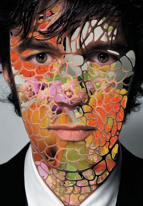
Yes, imperfections in graphic design actually can enhance empathy and trust, but how is it done and why is that so important? For example, high-quality design is essential, but embracing imperfections can foster more empathy. Imperfections can also add a human touch to designs, making them more relatable and engaging. Additionally, imperfections can create a sense of authenticity and uniqueness, which can enhance trust and credibility. By embracing imperfections, designers can create designs that are more meaningful, relatable, and impactful, ultimately fostering empathy and trust with their audience and resonate emotionally with users.
Why is empathy so important?
Empathy is crucial in design for several reasons. It is fundamental to human-centered design processes such as design thinking, as it allows designers to truly uncover and understand the latent needs and emotions of the people they are designing for. By empathizing with users, designers can create products, services, and experiences that align with their desires and aspirations, resulting in solutions that truly resonate and add value. Additionally, empathy helps break down assumptions and biases that may hinder the innovation process, fostering emotional connection, driving iterative feedback, inspiring creativity, and leading to the development of sustainable and user-centered solutions.
In the context of design thinking, empathy is considered the starting point for any design project and constitutes phase one of the Design Thinking process. During the empathize phase, the designer spends time getting to know the user and understanding their needs, wants, and motivations, using this empathy to make smart design decisions. Ultimately, empathy is the cornerstone of any successful design project, as the extent to which designers understand and empathize with their users ultimately determines the outcome and user-centricity of the design.
Know your users: The first step to empathize with your users is to know who they are, what they want, and what their needs are.
Involve your users: Involve your users in the design process and seek their feedback and input throughout the design process.
Challenge your assumptions: Challenge your assumptions and biases that may hinder the innovation process, fostering emotional connection, driving iterative feedback, inspiring creativity, and leading to the development of sustainable and user-centered solutions.
Understand the audience: Understand the audience and their unique needs and perspectives, using this empathy to make smart design decisions.
Express emotion through color: Use color to express emotion and create a more empathetic connection with the audience.
Typography for emotional tone: Use typography to create an emotional tone that resonates with the audience.
Use authentic imagery: Use authentic imagery that reflects the audience’s experiences and perspectives.
Storytelling with visuals: Use visuals to tell a story and create a more empathetic connection with the audience.
By incorporating these elements into the design process, designers can create designs and products that users trust and feel confident in, ultimately leading to increased user satisfaction, engagement, and loyalty.
Clear communication: Ensure that the design communicates the intended message effectively and clearly, avoiding ambiguity or confusion.
Visual appeal: Create visually appealing designs that are aesthetically pleasing and engaging, as this can positively influence user perception and trust.
Usability: Design products that are easy to use and navigate, as this can enhance user satisfaction and trust in the product.
Consistency: Maintain consistency in design elements, such as color schemes, typography, and layout, to create a cohesive and trustworthy user experience.
Avoid dark patterns: Design products that avoid manipulative or deceptive design patterns, as this can enhance trust and credibility.
User-centered design: Incorporate user feedback and preferences into the design process, as this can foster trust and engagement.
Imperfections in design can influence empathy by adding a human touch and authenticity to designs that resonate emotionally with users. Imperfections can create a sense of uniqueness and relatability, which can enhance trust and credibility. By embracing imperfections, designers can create designs that are more meaningful, relatable, and impactful, ultimately fostering empathy and trust with their audience. Imperfections can also help break down assumptions and biases that may hinder the innovation process, fostering emotional connection, driving iterative feedback, inspiring creativity, and leading to the development of sustainable and user-centered solutions. Imperfections in design can enhance empathy by creating a more authentic and relatable connection with the audience, fostering emotional connection, and driving iterative feedback.
Here are some examples of imperfect elements that can be used to influence empathy:
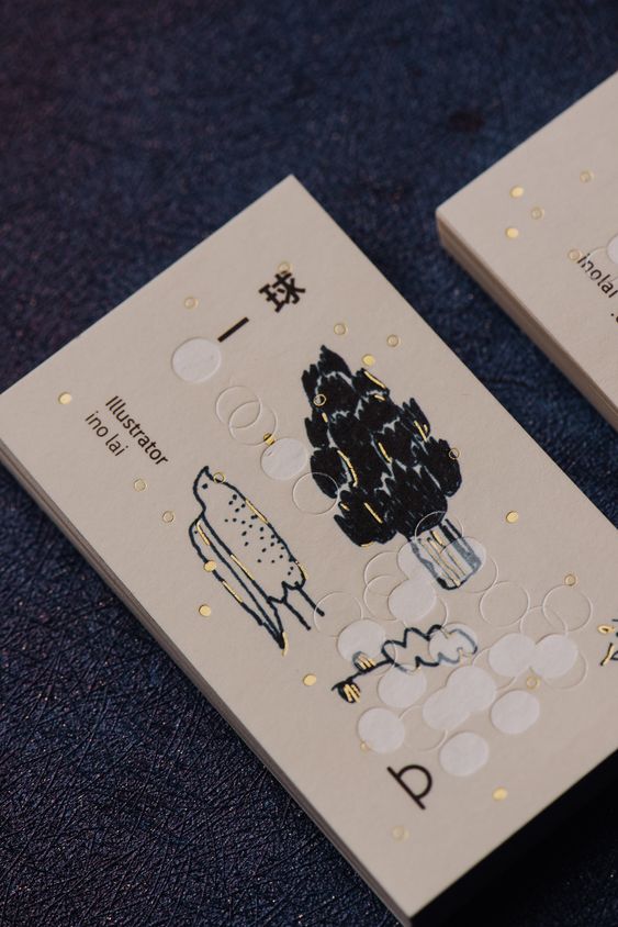
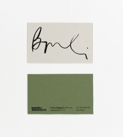
Handwritten typography: Handwritten typography can add a personal and human touch to designs, making them more relatable and engaging.
Irregular layouts: Irregular layouts can create a sense of uniqueness and authenticity, which can enhance trust and credibility.
Hand-drawn elements: Hand-drawn elements can add a sense of warmth and personality to designs, making them more relatable and engaging.
Inconsistent color schemes: Inconsistent color schemes can create a sense of authenticity and uniqueness, which can enhance trust and credibility.
Imperfect illustrations: Imperfect illustrations can add a sense of playfulness and creativity to designs, making them more relatable and engaging.
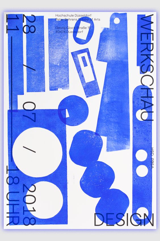
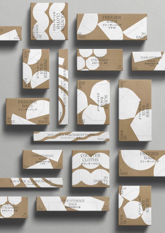
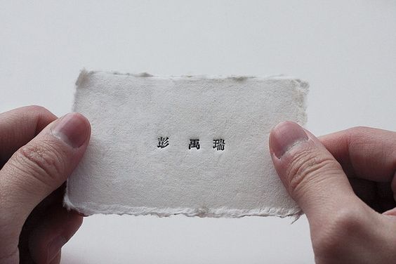
Designers incorporate handmade, imperfect elements such as texture, folds, tears, grains and handmade typography into graphic design for a number of reasons:
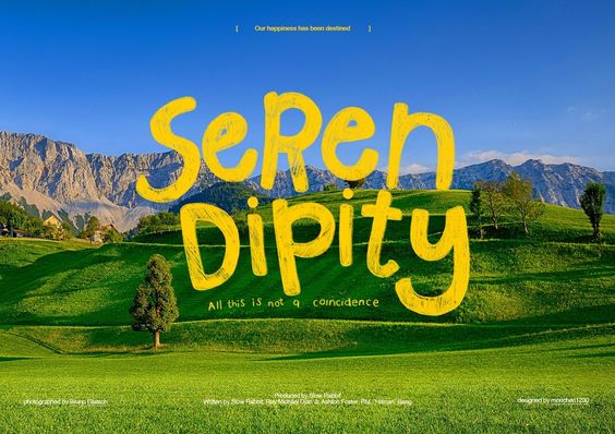
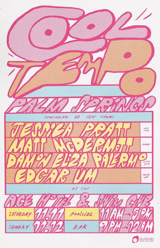
Handmade elements build a relationship with the viewer based on trust and shared experience, as imperfections are natural, human and signifiers of a narrative that reveals how an object was made.
The recent shift in design trends towards a more raw and natural aesthetic is accelerating as people increasingly embrace the imperfections in everyday things, recognising that the roughness and uniqueness of these elements is what makes them special.
Sometimes it’s the imperfections that make a design truly memorable, as they can evoke surprise, delight or empathy in users, adding a human touch and authenticity to designs that resonate emotionally with users.
Precise geometric lines illustrate objects that are artificial and technological, whereas curvy, imperfect lines can represent more natural and organic forms, creating a more authentic and relatable aesthetic that resonates with people.
Integrating analogue elements into digital platforms can enhance the user experience and foster a sense of nostalgia as it helps us appreciate imperfection and process, celebrating the beauty of imperfection in a digital age and rediscovering the timeless appeal of authenticity.
In summary, designers are integrating handmade, imperfect elements into graphic design to create designs that are more meaningful, relatable and impactful, ultimately fostering empathy and trust with their audiences.
What are some examples of analogue elements in graphic design?
The following examples and techniques can add a unique and personal touch to a design, making it stand out from purely digital creations.
Handmade designs: These designs are created using traditional tools such as pens, pencils, and brushes, allowing for a more personal touch and unique style.
Vintage fading: Digital mediums can emulate analog looks, such as vintage fading, but handmade designs can capture the authentic feel of these styles.
Hand-drawn elements: Hand-drawn elements can add a sense of warmth and personality to a design, making it feel more human and less sterile.
Collaborative work: In some cases, designers may work together on a project, using a mix of analog and digital tools to create a unique and cohesive design.
Experimentation: Analog design allows designers to explore different techniques and methods, such as cutting, reordering, and composing elements in a way that might not be possible digitally.
Physical interfaces: Designers can create physical interfaces using traditional materials like paper, cardboard, and wood, which can offer a more tactile and personal experience for users.
Mixed media: Combining analog and digital elements can create a rich and layered design, allowing designers to take advantage of the strengths of both worlds.
What are the benefits of using analogue design in graphic design?
There are several benefits of using analogue design in graphic design, which can help designers create unique and engaging designs that stand out from purely digital creations. These benefits include:
Personal touch: Handmade designs and hand-drawn elements can add a personal touch to a design, making it feel more unique and less sterile.
Creative potential: Analog design can inspire creativity by forcing designers to work within limitations and think outside the box.
Authenticity: Analog design can capture an authentic look and feel that is difficult to replicate digitally.
Tangible experience: Analog design allows designers to work with physical materials, providing a tactile experience that can be lacking in digital design.
Different perspective: Working with analog tools can provide a different perspective and help designers break out of creative ruts. This could also result in leading to more innovative and engaging designs or user experiences.
Resilience: Analog design has endured despite the rise of digital design, indicating that it still has value and relevance in the industry.
Nostalgia and familiarity: Analogue elements can evoke a sense of nostalgia and familiarity, making the user experience more approachable and human.
Timelessness: Analogue design elements can be timeless, as they rely heavily on nostalgia and aesthetics from previous eras, making them less likely to go out of style
Imperfections and blemishes: Analogue design can incorporate imperfections and blemishes, which can make the design feel more authentic and less sterile.
Simplicity: Analogue design often seeks to create a simpler layout, which can make the user experience more focused and less cluttered
Do analogue design elements evoke more trust than digital elements?
There is no specific information on whether analogue design elements in graphic design evoke more trust than digital elements. Whether an individual thinks of something as trustworthy or not is very subjective and therefore depends on the context and the target audience. Some individuals may associate analogue elements with authenticity, craftsmanship, and a human touch, which could enhance trust. However, others may perceive digital elements as more reliable and modern, leading to a different trust perception. Ultimately, the trust evoked by design elements, whether analogue or digital, is influenced by various factors, including the specific design, the brand, and the preferences of the audience.
What are possible challenges or disadvantages of using analog elements?
Error-prone design cycles: Analog design can involve more variables and factors to consider, making it more difficult to design and debug.
Unpredictable aging models: Analog devices deal with higher temperature, voltage swings, and electric currents, which means design engineers have to manage thermal stress. When the standards for longevity are high and aging models are unpredictable, engineers have to manage all the variables well.
Cost and complexity: Analog design can be more complex and expensive compared to digital design.
Limitations: Analog design can be limiting in terms of physical surface area, and what can be done within the page is constrained only by the stroke of a pen.
Talent shortage: There is a talent shortage in the analog design space, making it difficult to find skilled designers.
The exploration of the interplay between digital precision and analog imperfection offers a unique opportunity to unravel the unfolding creative dynamic. This exploration places a special emphasis on understanding the emotional resonance and trust that can be achieved through designs that seamlessly blend the best of both worlds.
The Dilemma of Digital Precision:
In the field of design, the exclusive use of digital tools has its price. Computers are characterized by accuracy and perfection —straight lines, right angles, flawlessly colored surfaces. However, this perfection often sacrifices the personal touch, authenticity, and character in handmade creations. Interestingly, designers consciously incorporate analog elements into digital designs, such as script fonts, paper textures, folds, and wear and tear. This raises a question: Do these imperfections enhance empathy and trust in a design?
Current Graphic Design Trends:
If you look at current trends in graphic design, you can see a conscious effort to counteract the constraints of digital perfection imposed by computer-based work. Designers are opting against pristine surfaces, straight lines, and right angles. Instead, there is a deliberate move towards infusing designs with an analog feel, embracing imperfections and irregularities.
The Analog Touch:
A closer look at the deliberate addition of analog elements – fonts, handwritten aesthetics, paper textures, folds and wear – reveals an effort to bring warmth and personality into digital designs. This shift away from clinical precision aims to add a human touch to creations and promote authenticity and character.
Questioning the Motivation:
Why do designers choose to build imperfections into digital designs? The pursuit of empathy, trust and authenticity seems to be the reason for this deliberate deviation from digital perfection. Incorporating analog elements is a strategic decision to appeal to human emotions and create a genuine connection with the viewer.
Conclusion:
Combining analog elements with digital creations becomes a useful way to build authenticity and trust. Designers use imperfections and analog styles on purpose to create a more understanding and relatable visual style. In today’s design trends, blending digital precision with analog imperfections shows a commitment to genuine and human-focused visual communication
Perfectly Imperfect: The integration of analog elements into digital designs and illustrations and their impact on authenticity and trust
The connection between digital precision and analog imperfection
Provides an opportunity to explore the creative connection between digital precision and analog imperfection, with a focus on the emotional resonance and trust such designs can create.
Much is lost through the exclusive use of digital tools in design. Computers make everything super accurate and perfect: straight lines, right angles, perfectly colored surfaces, …personal touch, authenticity, personality, character that comes from handmade does not exist. Is also deliberately added in digital: E.g. script fonts or handwritten-looking fonts, paper and cardboard textures, textures in general, folds and creases, wear and tear, grain. Why are we doing this? Do these imperfections make a design more empathic or trustworthy?
Digital precision: Analysis of digital design and its characteristics, which are geared towards precision and perfection. What are the advantages of digital precision and why is it often preferred nowadays?
Analog elements: Examine various analog elements that can be incorporated into digital designs, including textures, paper and cardboard, handwritten fonts, folds, creases and wear and tear. Why do designers deliberately add these elements? How are they used?
Authenticity and personality: The importance of authenticity and personality in visual communication. How can analog elements help to give the design a personal touch and character?
Emotional resonance: How can imperfect, handmade elements in digital designs trigger emotional resonance in the viewer? What emotions and connections can these imperfections create?
Building trust: Can the integration of analog elements build trust with viewers? Can these imperfections convey a sense of honesty and humanity?
Practical applications: Examples from various fields such as graphic design, web design, book illustration and branding where the analogization of digital designs has been successfully applied.
Future trends and developments: Speculation on the future importance of it in visual communication and how designers can continue to use it to create unique, authentic and human designs.
Topic 2
Influence and impact of social media on creativity and graphic design
Constant comparison with other designers. Thinking you are not good enough (Imposter syndrome). Are posts from others inspiration or pressure to perform?
Stealing ideas, copying, no originality or authenticity, very trendy and fast-moving design – often reduced to just looking good (social media is often all about appearance), whether a design works well and fulfills its purpose is pushed into the background.
The influence and effects of social media on graphic design are manifold and include both positive and negative aspects.
Originality and authenticity: The importance of uniqueness and authenticity has increased through social media in graphic design. Designers strive to create visual content that is unique and reflects the personality of their project. This emphasis on uniqueness supports creative expression as designers strive to discover and develop their own artistic identity.
Constant comparison with other designers: A challenging dynamic in the world of graphic design on social media is the constant comparison with other designers. Designers can tend to be critical of themselves and often struggle with Imposter Syndrome, where they believe they are not good enough and their output is inferior to that of others. Posts from other designers can serve as inspiration but can also be pressure to perform. This can even lead to the countless pieces of work circulating on social media having a demotivating effect. It is important to find a healthy balance between these two influences.
Stealing ideas and imitation: The fast-paced nature of social media has led to a certain superficiality in design. Designers can be tempted to copy ideas and trends rather than develop original concepts. This can lead to a lack of originality and authenticity.
Trend orientation and external focus: Social media platforms tend to pay a lot of attention to visual content. Therefore, many designers focus on creating designs that are visually appealing and in line with the current trend. This can lead to the functionality and fulfillment of the actual purpose of a design taking a back seat. It is often forgotten that a design should not only look good, but also fulfill its intended purpose.
Topic 3
Illustration to simplify communication
Improving communication and accessibility through visual support
Image superiority effect: Image has a faster, more emotional and therefore more intensive effect than pure text. Easily accessible, easy to understand, self-explanatory, confidence-building, better memorization and retention. Faster understanding of information, instructions, etc.
Illustrative, easily accessible navigation support for websites etc. Confidence and identification-building for people with disabilities such as intellectual impairments, dementia, poor language skills, poor digital skills, etc.
Use for online processes, for example: Online shopping, orders, e-banking, bookings, forms, … But also things in everyday life, for example package inserts for medication, making important information recognizable at a glance, as support for text. Cooking recipes, building instructions for furniture, etc. Helpful for „normal“ people but especially for older or impaired people
Illustrations play a crucial role in simplifying communication, especially in the digital age. To deepen understanding of the many ways that illustrations can improve communication and make it more accessible. Could also provide recommendations for designers, companies and organizations on how to use illustrations effectively to increase the accessibility and comprehensibility of their messages.
The image superiority effect: How illustrations can use the image superiority effect to convey information faster and more emotionally than text alone. This can create a deeper and more intense connection between sender and receiver.
Easy-to-understand communication: Illustrations can make information easily accessible and understandable by visualizing complicated concepts. This makes content self-explanatory and easier to remember.
Accessibility and trust building: How illustrations can help people with intellectual impairments, dementia, limited language skills and limited digital skills.
Use in different areas: Illustrations can be used in different areas of life, such as online shopping, ordering, e-banking, bookings and forms. They can also be useful in everyday life, for example on package inserts for medicines or in cooking recipes.
Improved accessibility on the Internet: Importance of illustrative and accessible navigation aids on websites to ensure an accessible online experience. This is particularly important for people with disabilities.
Support for older people: Relevance of illustrations for older people who can benefit from clear, visual communication. Older people are often less familiar with digital technologies and can benefit from simple and image-based communication.
Practical examples and case studies: Research practical examples and case studies where illustrations have been successfully used to simplify communication. (Perhaps areas such as: Healthcare, education, technology and everyday life)