IMPULSE #4

Studying ProtoPie – A No-Code UX Tool

Creating an Interactive Bouquet for January’s Exhibition

When our group began brainstorming for an upcoming exhibition in January, we wanted to create something truly unique and interactive – something that would leave a lasting impression. The idea we landed on was both creative and ambitious: an interactive flower bouquet where visitors could personalize and create their own virtual bouquets.

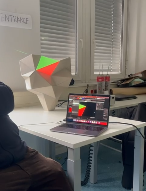
The concept was simple in theory: an app running on a screen would let users design their bouquet, while a 3D sculpture would serve as the physical centerpiece. Flowers would then be projected onto the sculpture, turning it into a dynamic, evolving artwork.

However, as exciting as the idea was, the execution quickly became a challenge. None of us were particularly skilled at coding, and when we began developing the app using Angular, we ran into roadblocks almost immediately. Progress was painfully slow, and we were stuck trying to figure out how to integrate live projection or connect the app with tools like Resolume software. It felt like we had hit a dead end.

That’s when Michi stepped in with a fresh perspective and a bunch of new ideas. „We need to change the strategy,“ he said, introducing us to ProtoPie -a no-code UX design tool. At first, we were skeptical. Could this tool really solve our problems?

Discovering ProtoPie

To our surprise, ProtoPie turned out to be exactly what we needed. Its intuitive and user-friendly interface made it accessible, even for a team like ours with limited coding experience. We quickly got the hang of it and realized how much fun it was to use.

One of the most helpful features was its integration with Figma. This meant we could take our designs directly from Figma and import them into ProtoPie without any hassle. From there, we „coded“ interactions using simple triggers, buttons, and actions-no complicated programming required.

ProtoPie’s component-based design system was another game-changer. We could build modular elements and reuse them across the project, making the process much faster and more efficient. And perhaps the most exciting feature was the ability to preview our work at any time, which made testing ideas and iterating on them incredibly easy.

Progress at Last

With ProtoPie, we made rapid progress on our interactive bouquet project. Suddenly, tasks that felt impossible just days ago became achievable. We could focus on creativity and user experience instead of getting bogged down in technical challenges.

This journey taught us the value of adaptability and the importance of finding the right tools for the job. ProtoPie empowered us to bring our vision to life without requiring deep coding knowledge, and it opened the door to possibilities we hadn’t even considered before.

As the January exhibition approaches, we’re thrilled to see our interactive bouquet take shape, and we can’t wait to share it with the world. If you’re ever looking for a no-code solution to create interactive prototypes or experiences, we can wholeheartedly recommend giving ProtoPie a try.

Stay tuned for updates on our project – and if you’re attending the exhibition, make sure to stop by and create your own personalized bouquet!

https://www.protopie.io/learn/docs/cloud/sharing-prototypes

IMPULSE #3

Recap of World Usability Day Austria 2024

UX Graz Meetup event offered me a unique chance to connect theoretical knowledge with valuable, real-life perspectives from the UX community. The event, provided me with the opportunity to examine how casual meetings among industry professionals can influence the development of UX design strategies.
World Usability Day Austria 2024 was held online on November 14, centering on accessibility and usability in design. The agenda featured engaging presentations about how iPhones assist visually impaired individuals in their everyday activities, the #A11yFans initiative that promotes effective accessibility design, and conversations regarding typographic selections for better accessibility.

Various UX communities throughout Austria took part, including notable speakers like Claudio Zeni and Oliver Schöndorfer. The event was wrapped up with an open networking session, allowing participants to share insights and connect with each other. This event was free and open to attendees from around the world.

UX Community Engagement – Insights for my thesis

One of the most significant takeaways from the event was understanding the importance of community engagement in UX. The Meetup’s informal, open format encouraged dialogue between UX professionals, developers, and researchers, highlighting the role of such events in refining UX strategies.
While my thesis emphasizes a structured UX process—through stages like “Understanding the User” and “Mapping the User Journey”—the Meetup demonstrated that community-driven interactions often spark new insights into user needs and challenges.

While World Usability Day Austria 2024 was a pleasant experience with excellent networking prospects and a well-structured agenda, I personally thought it fell short in delivering innovative, impactful insights. The presentations and sessions were educational, but most of the material seemed repetitive and didn’t offer any unexpected or revolutionary findings. For those already knowledgeable about UX and usability, the event may not present many new viewpoints. Nevertheless, if you’re a beginner in the field or looking for a casual introduction to usability subjects, it could still be worth your while for the community aspect and general understanding.

https://www.meetup.com/uxgraz/events/304402433
https://worldusabilityday.at
https://www.youtube.com/watch?reload=9&v=mZ_O0eSX8GM&embeds_referring_euri=https%3A%2F%2Fworldusabilityday.at%2F

IMPULSE #2

Reading exercise – Jamie Levy „Ux Strategy„.

Inspired by Jamie Levy’s speech and personality during the UX Conference in Graz last year, I finally decided to purchase her book in my native language and audiobook – both for my personal development and master’s thesis. I was surprised to hear her voice while listening to her audiobook on Audible. (no product placement.) We get not only UX but also tips on business and marketing approaches.

UX Strategy is a book that guides us through the whole UX process step by step, incorporating real-life storytelling into the plot. As the author explains, „UX Strategy starts with the product vision and ends on a roadmap on how to tactically get there.“ The Strategy is to bring the product to the market.

„UX Strategy = Business Strategy + Value Innovation + Validated User Research + UX Frictionless“
UX Strategy = Delivering Value to users and achieveing business goals.

Jaime Levy’s UX Strategy provides a clear framework for designing digital products that not only meet user needs but also align with business goals.

The book emphasizes four core tenets of UX strategy:

  1. Business Strategy: A successful product must align with the business’s overall goals. Understanding market trends, business models, and competitive positioning is key.
  2. Value Innovation: To stand out, products must offer unique solutions that address real user problems in ways competitors do not.
  3. Validated User Research: Gathering insights directly from target users ensures that the product is solving the right problems for the right audience.
  4. Killer UX Design: An engaging, intuitive, and aesthetically pleasing design is critical to user satisfaction and product success.

The process for creating a UX strategy includes several steps:

  • Market Research: Analyze competitors to identify market gaps and opportunities. This helps teams avoid “reinventing the wheel” and focus on delivering unique value.
  • User Research: Understand the target users‘ identities, needs, and behaviors. Tools like personas and customer journeys clarify these insights.
  • Value Proposition Design: Brainstorm and refine innovative ideas that differentiate the product while solving core user problems.
  • Prototyping and Validation: Create prototypes or mockups to test the product’s concepts with real users. Feedback from usability tests and business viability checks helps refine the idea.
  • Iterative Design and Improvement: As the product evolves, it should continuously be tested and improved based on user feedback and market dynamics.

Throughout the book, Levy uses real-world case studies to demonstrate how companies have successfully implemented these strategies.
In summary, UX Strategy is a step-by-step guide for teams looking to create digital products that are both user-friendly and strategically positioned for success in competitive markets. It equips designers, product managers, and business leaders with tools to innovate, validate, and deliver exceptional user experiences while achieving business objectives.ols to innovate, validate, and deliver exceptional user experiences while achieving business objectives.

Applying the book into my Master Thesis:
1. Business goals: I would like to mirror her strategy for identifying measurable goals to guide UX decisions. Value proposition mapping or competitive research.
2. User behavior: Use her techniques for identifying gaps in the market or user frustrations to create a solid foundation for analyzing pain points and opportunities.
3. Understanding the user: Incorporate her strategies for synthesizing user insights to prioritize actionable outcomes, such as defining personas and refining user needs.
4. Killer UX Design: An engaging, intuitive, and aesthetically pleasing design is critical to user satisfaction and product success.
5. Ideation: Use her tools like the “Value Proposition Canvas” or prioritization frameworks to evaluate and refine ideas based on their potential to fulfill both business and user needs.
6. Prototyping: Adopt her methods for testing hypotheses through prototypes, ensuring they align with your defined business goals and user needs.
7. Continous Improvement: Align her approach to tracking KPIs and post-launch analytics with your matrix’s emphasis on continuous improvement and stakeholder collaboration.

https://www.audible.de/pd/UX-Strategy-Hoerbuch/B09B4GMXPX?qid=1732812601&sr=1-1&ref_pageloadid=not_applicable&pf_rd_p=e54013e2-074a-460e-861f-7feac676b789&pf_rd_r=DQRH41N4Z0DHTRAFRMBZ&plink=76Uz5k6N9hWarsL8&pageLoadId=RM3tSP0fPhtA46yg&creativeId=41e85e98-10b8-40e2-907d-6b663f04a42d&ref=a_search_c3_lProduct_1_1
https://www.blinkist.com/en/books/ux-strategy-en
https://worldusabilitycongress.com/

Evaluation of Master’s Thesis

Evaluation of Master’s Thesis related to own research area ( UX, Eye tracking, User testing, improving conversion rates)

Title: The Role of Visual Attention and Eye Movements in Product Purchases on Websites
Author: Tommaso Ceroni
University: Utrecht University, Department of Social and Behavioral Sciences
Master’s Degree Course: Applied Cognitive Psychology

  1. Level of Design: The design is straightforward and effective but lacks creativity and complexity, which might have added interest or depth to the reader. The structure is clear and has predictable composition which may feel overly simplistic and even a bit dry for readers familiar with the field. The design quality could be significantly enhanced by incorporating more detailed schemes and sketches, which could increase its visual appeal.
  2. Degree of Innovation: The research is original to the extent that it goes further with how visual attention and decision making has been researched previously by looking at e-commerce situations. Nevertheless, the contribution could be increased by including different consumer characteristics (for example: how used they are to shopping online) or by manipulating other web page elements beyond product labels.
  3. Independence: The thesis shows a high level of of independence, as the author has designed the study, collected data, analyzed results, and interpreted findings. The author demonstrates the ability to manage the research process and and make reasoned deductions from the results obtained.
  4. Outline and Structure: The thesis is well-organized and follows a clear, logical structure. It includes all essential sections (introduction, methods, results, discussion) and maintains coherence throughout, and there is no inconsistency that would make it difficult to follow the content.
  5. Degree of Communication: The author communicates ideas effectively, with clarity in the description of methods and findings. Pertaining to the relationship of cognitive psychology to eye tracking, relevant concepts are well covered, however some terminologies used in this area (i.e. fixation duration, AOI) might require more explanations and/or pictures.
  6. Scope of the Work: The study scope is appropriate for a master’s thesis, focusing on a specific aspect of consumer behavior through a manageable experiment. In as much as the sample is rather small, the research scope is in harmony with the goals of the project and provides relevant information.
  7. Orthography and Accuracy: The thesis has a few minor grammatical errors. Despite these minor issues, the thesis demonstrates overall good orthographic standards and accuracy.
  8. Literature: The author draws on a strong foundation of relevant literature, particularly focusing on studies related to eye-tracking, attention, and decision-making. The references are appropriate and support the research questions, although including more recent studies on e-commerce or consumer behavior would strengthen the review.

IMPULSE #1

Key Insights for my thesis from two-day Conference in World Usability Congress, Graz 16.10 & 17.10

As a student and UX Designer, I’m happy and thankful for the opportunity to attend one of the world’s biggest UX events. These two days consist of inspirational speeches, delicious food (!), and networking. I also found some interesting input to my thesis topic, which is related, among other things, to User Behavior in Digital Contexts, Conversion Rates, and the Importance of User-Centered Design.
Many interesting topics were discussed during the event from the importance of transparent AI systems to accessible design and UX practices. The lesson from these two days focused on how businesses and designers can collaborate to improve UX while acting ethically and involving everyone.

Transparency, Problem Solving, and Storytelling in UX
During the first day of the World Usability Congress, many important elements regarding UX research were emphasized, particularly in respect to the need for making AI systems more interpretable and practical for the end user. Another important issue dealt with the matter of the transparency of AI and the importance of building systems which are not black boxes to the user. Users, however, seem to mainly use AI systems without knowing how decisions are reached most of the time, which is quite annoying, distrustful and can even lead to users’ apathy. This observation is in line with the objective of my thesis, which states that user-centered design can positively influence the user experience. This is where incorporating transparency as well as user feedback in AI features is very important for designers to build trust and enhance control, attributes which help increase conversion rates. Systems that are understandable and trusted are more likely to be patronized by the users.

Another key focus of the first day was how to effectively communicate research findings to business stakeholders. Change can only be achieved by UX research when its results are shared in a manner aligning with the interests of those making decisions. The importance of storytelling as a bridge between research and commercialism emerged. This is where UX designers turn UX insights around in a radical way; they explain the business value of user-centered design by showing the advantages of this approach—i.e. better customer satisfaction, retention, and conversion rates. This teaching is significant for my thesis as I assert that stakeholders will only be persuaded to embrace UX enhancements if they correlate these improvements with business metrics.

Accessibility, Ethical Design, and Future-Focused UX
The second day of the congress built upon these ideas, exploring more detailed aspects like inclusive design, applying ethics in UX, and the paradox of designing for the users that are not yet there. One of the most significant lessons was the stress put on accessibility within design systems. I got familiarized with design systems, and I understood the importance of being accessible for all users at almost every stage, beginning with primary styles and components, and even to full-page designs. Making sure that design systems are accessible is not just the case in many parts of the world that it is a statutory issue, like in the case of the European Union’s accessibility requirements, but is the essence of diversity designing. A considerate design allows for the end product to be used by a mix of people, irrespective of the functional ability of their bodies or minds.
This insight is highly relevant to my thesis, as it underlines how accessibility directly impacts user satisfaction and conversion rates. By making products more inclusive, businesses can tap into a broader user base, improve trust, and increase user engagement. Accessibility issues are often tied to general usability problems, meaning that addressing these concerns can improve the overall experience for all users, not just those with disabilities. This holistic approach to design is central to the concept of user-centered design that my thesis advocates for, showing that businesses can boost their bottom line by prioritizing accessibility.

In addition to accessibility, I learned about the challenge of designing for users who don’t yet exist. This is especially relevant for businesses developing products for emerging markets or future users whose needs and behaviors may not yet be fully understood. While personas are useful, they cannot always account for future trends or changes in user behavior. For businesses, it is important to balance innovation with best practices in UX design to create products that are adaptable to future user needs. This anticipatory approach is crucial for ensuring that digital products remain relevant and effective as user needs evolve, ultimately improving conversion rates as the user base grows.

One of the most thought-provoking discussions on day two revolved around dark patterns—deceptive design practices that manipulate users into taking actions they might not otherwise choose. While dark patterns can lead to short-term gains, such as higher conversion rates or more sales, they often result in long-term damage to a brand’s reputation and user trust. This raised important ethical questions about how far designers should go to influence user behavior. For businesses, the key takeaway is that ethical UX design leads to sustainable success. Respecting user autonomy and focusing on transparency and honesty will result in more satisfied and loyal customers, which in turn boosts long-term conversion rates and brand loyalty.

The day concluded with a session on shifting from cycles of failure to delivering quality and value in UX processes. Many UX initiatives fail because teams don’t engage in tough conversations about quality, or they struggle to align their work with broader business objectives. This insight reinforces the importance of translating UX improvements into business language. For UX designers, speaking in terms of metrics that matter to stakeholders—such as increased customer retention, reduced churn, or higher conversions—is essential for gaining support for user-centered design initiatives. This lesson is particularly useful for my thesis, as it highlights the need for UX designers to demonstrate how their work drives tangible business outcomes.

Integrating These Insights into My Thesis
The World Usability Congress provided insights that will greatly inform my thesis, which explores how UX design can improve both user satisfaction and business outcomes. Across both days, the emphasis on transparency, accessibility, ethical design, and alignment with business goals highlighted the importance of a user-centered approach.
By incorporating these principles into product design, businesses can create digital experiences that are not only more satisfying for users but also more effective at driving conversion rates and customer loyalty.

LINKS:
https://worldusabilitycongress.com/
https://www.twn.ee/en
https://uxpa.org/
9. Red Bull Spect: An Overview of the Brand and Its Digital Presence

(Master Topic:
Optimizing Design Strategies and Interactive Media to improve User Experience: A Case Study in the Eyewear Industry.)

Brand Identity: Red Bull Spect is a collaboration between Red Bull, the renowned energy drink company, and Spect Eyewear, a leading eyewear brand. This partnership brings together Red Bull’s energetic spirit and Spect’s expertise in crafting quality eyewear. The brand focuses on delivering eyewear that combines style, performance, and innovation, catering to active individuals who value both aesthetics and functionality.

Product Range: Red Bull Spect offers a diverse range of eyewear, including sunglasses, prescription glasses, and sports-specific eyewear. Each product is designed with precision and attention to detail, incorporating advanced materials and technologies to enhance durability and performance. The collection features sleek, modern designs that appeal to fashion-conscious consumers and athletes alike.

Digital Presence

Website: The Red Bull Spect website is a central hub for showcasing the brand’s products and engaging with customers. The website features a clean, modern design that reflects the brand’s dynamic energy. Key features include:

  • Product Showcase: High-quality images and detailed descriptions of each eyewear model, highlighting unique features and benefits.
  • Virtual Try-On: An interactive feature that allows users to virtually try on different eyewear styles using their device’s camera.
  • User Reviews: Customer reviews and ratings to provide social proof and help users make informed purchasing decisions.
  • Blog and News: Articles and updates related to eyewear trends, product launches, and lifestyle content that resonates with the brand’s audience.

Social Media: Red Bull Spect maintains an active presence on social media platforms like Facebook & Instagram. These channels are used to showcase new products, share user-generated content, and engage with the community. The brand’s social media strategy emphasizes vibrant visuals, adventure-inspired content, and interactive posts that encourage user participation.

E-commerce Integration: The website features e-commerce integration, enabling users to browse, select, and purchase eyewear effortlessly.Additionally, the site offers international shipping, expanding the brand’s reach to a global audience.

User Personas and Client Descriptions

Understanding the diverse customer base of Red Bull Spect is crucial to tailoring marketing strategies and product offerings. Here are the primary user personas and client descriptions that define the brand’s audience:

– Athlete
– Trendsetter
– Sport enthusiast
– The Tech-Savvy Professional

The age of our target group varies from 16 to 40yo.

8. Simple Navigation as a UX Priority

In the world of digital design, navigation is a fundamental element that can make or break the user experience (UX). Simple and intuitive navigation is essential for helping users find what they need quickly and effortlessly.
Whether designing a website or an app, prioritizing navigation ensures that users can easily move through the interface, enhancing their overall experience and satisfaction.
In this blog post, I’ll explore why simple navigation is a UX priority and how to achieve it effectively.

Simple Navigation:

  • Enhances Usability
  • Increases User Retention
  • Boosts Conversion Rates
  • Supports Accessibility

Key Principles:

  • Clear and Consistent Menus
  • Logical Structure
  • Simplified Navigation Paths
  • Visual Hierarchy
  • Search Functionality
  • Breadcrumbs
  • Responsive Design

Practices for Simple Navigation:

  • User Testing
  • Use Analytics
  • Prioritize Key Actions
  • Keep It Minimal
  • Stay Updated

Conclusion

Simple navigation is a cornerstone of effective UX design. By prioritizing clear, logical, and consistent navigation structures, you can enhance usability, increase user retention, boost conversion rates, and support accessibility.

7. Principles of UX in Eyewear Website Design

Here’s another post about the literature research for my Master’s topic. This time, a friend recommended a book titled „Universal Principles of UX“ by Lidwell, Holden, and Butler. I wanted to share with you the best parts I found while researching the book.

1. Simplicity:

  • Explanation: Simplicity is about making interfaces intuitive and easy to navigate. This principle emphasizes the importance of reducing complexity and eliminating unnecessary elements that can overwhelm users.
  • Application to Eyewear Websites: For eyewear websites, simplicity can be achieved by designing clean, uncluttered pages with straightforward navigation. Users should be able to easily browse through different categories of eyewear, filter their search by various criteria (such as frame style, material, or color), and view product details without excessive scrolling or clicking. A minimalist design with a clear call-to-action, like „Shop Now“ or „Try On,“ can guide users smoothly through the browsing and buying process.

2. Consistency:

  • Explanation: Consistency ensures that users have a predictable and cohesive experience across all parts of a website. This involves using the same visual and interactive elements throughout the site.
  • Application to Eyewear Websites: Eyewear brands can enhance their digital presence by maintaining consistent branding across all pages. This includes using uniform color schemes, typography, button styles, and layout structures. For example, if the „Add to Cart“ button is always the same color and in the same position, users will quickly learn where to look when they decide to make a purchase. Consistency extends to the tone of voice in product descriptions and customer service messaging, reinforcing the brand identity.

3. Feedback:

  • Explanation: Feedback in UX design involves providing users with information about the results of their actions. This can be visual, auditory, or tactile signals that confirm an action has been completed successfully or guide the user on what to do next.
  • Application to Eyewear Websites: On an eyewear website, effective feedback mechanisms could include visual cues like highlighting form fields that need correction, showing a progress bar during checkout, or confirming that an item has been added to the cart with a brief animation. For example, when a user selects a pair of glasses to try on virtually, a confirmation message or visual indicator can assure them that the action has been processed, enhancing the overall user experience.

4. Visibility of System Status:

  • Explanation: This principle involves keeping users informed about what is happening on the website with clear and timely feedback. Users should always know what the system is doing or what state it is in.
  • Application to Eyewear Websites: Eyewear websites can apply this principle by displaying real-time updates on product availability, order status, and shipping information. For instance, if a particular frame style is low in stock, a visible notification can encourage prompt purchasing decisions. During checkout, displaying each step of the process and providing status updates (e.g., „Processing Payment“ or „Order Confirmed“) keeps users informed and reduces anxiety.

5. User Control and Freedom:

  • Explanation: Users should feel in control of their interactions with a website and have the ability to undo actions if necessary. This principle is about providing easy ways to navigate back or cancel operations.
  • Application to Eyewear Websites: Implementing features such as an easily accessible „Back“ button, clear options to remove items from the cart, and an uncomplicated return policy can give users a sense of control. For example, allowing users to easily reset their virtual try-on session if they want to start over with a different frame selection can improve their experience and satisfaction.

6. Error Prevention and Recovery:

  • Explanation: Design should aim to prevent errors from occurring in the first place, and when errors do occur, provide easy ways to recover from them.
  • Application to Eyewear Websites: Eyewear websites can prevent errors by incorporating form validation that guides users to enter correct information, such as valid email addresses and correct payment details. In case of an error, clear and concise error messages should inform users what went wrong and how to fix it. For example, if a user tries to purchase an item that is out of stock, the website should immediately notify them and suggest alternative products.

7. Flexibility and Efficiency of Use:

  • Explanation: This principle involves designing for both novice and expert users by providing shortcuts and customization options.
  • Application to Eyewear Websites: An eyewear website can cater to both new and returning customers by offering features like saved preferences, quick reorder options, and personalized recommendations based on browsing history. Advanced users might appreciate keyboard shortcuts for navigating through different sections of the site or filtering options that streamline their shopping experience.

By applying the principles outlined in Universal Principles of UX, eyewear brands can significantly improve their digital presence.
Focusing on simplicity, consistency, feedback, visibility of system status, user control and freedom, error prevention and recovery, and flexibility and efficiency of use can lead to improved usability and higher user satisfaction. These timeless strategies not only make the website more user-friendly but also reinforce the brand’s identity and trustworthiness. For eyewear brands looking to stand out in a competitive market, integrating these UX principles into their digital platforms is a crucial step towards creating a memorable and engaging user experience.

6. Interactive Elements in Figma

During my prototyping journey, I experimented with various interaction methods in Figma. Initially, I was exploring different techniques and prototyping methods without much direction. However, I discovered short videos by Zander Whitehurst, the owner of Memorisely, which encouraged me to experiment more and try new animations. His tips are always up to date and I must say, his coffee cups are also quite inspiring.

Check out his Tiktok account!
https://www.tiktok.com/@zander_whitehurst/video/7360767385361583377?is_from_webapp=1&sender_device=pc