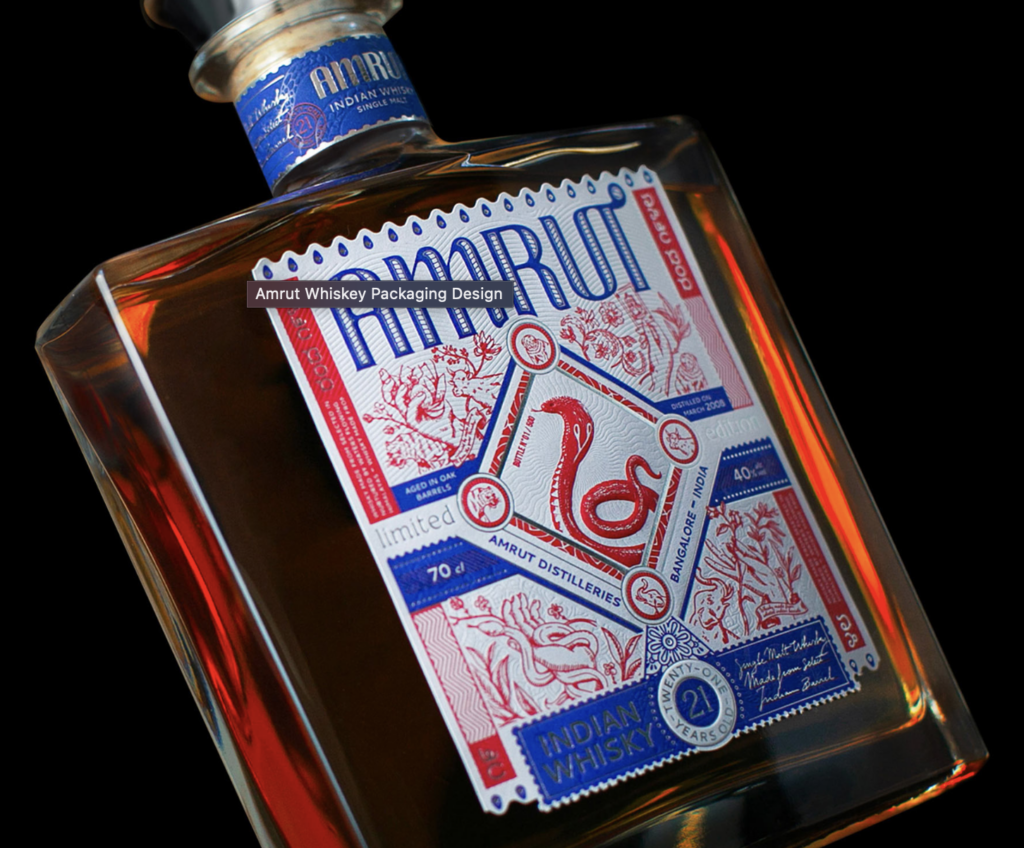
Amrut Whiskey Packaging Design
Amrut partnered with Studio Boam, a prestigious Parisian branding agency, to create packaging highlighting the spirit’s Indian roots. The design features a striking King Cobra at its center, surrounded by mystical motifs evoking India’s cultural richness. The label, elegantly simple yet culturally rich, incorporates intricate elements inspired by Indian mythology. Silver hot stamping enhances the duotone palette, while traditional Indian motifs add depth, maintaining an elegant restraint in expression.


Changin’ Packaging Design
Baries Design, headquartered in Düsseldorf, meticulously designs the packaging for Changin‘ to embody a transformative experience. Through carefully curated label illustrations, vibrant color palettes, and typography reminiscent of psychedelic imagery, the packaging serves as a visual narrative, inviting consumers into an immersive journey. The fusion of the words ‚change‘ and ‚gin‘ in the brand name reflects not only the product’s gin-inspired taste but also its overarching philosophy of altering perceptions. The logo font and back label colors are strategically chosen to symbolize the fluidity of perception and mental associations, aligning with Changin’s ethos of embracing change. The intricate design of the bottle, coupled with its compelling visuals, beckons consumers to engage on a deeper level, prompting them to examine and ponder its contents. In a fast-paced world where attention spans are fleeting, Changin’s packaging stands as a testament to the power of thoughtful design, encouraging consumers to pause, reflect, and explore the nuances within.


William Grant & Sons
William Grant & Sons, a distinguished purveyor of premium spirits, has enlisted the expertise of the international creative design agency, threebrand, to introduce its latest offering, the Ghosted Reserves. As part of the esteemed Rare Cask Reserves program, these ‚ghosted vattings‘ grant consumers access to exceptionally rare Scotch whisky stocks sourced from defunct distilleries. tasked threebrand with crafting both label sets and secondary packaging that embody the distinctive narrative of the Ghosted Reserves while exuding a premium and tactile quality. Malcolm Thomson, associate creative director at threebrand, explained that a palette of grey tones was deliberately chosen to evoke the ethereal essence of the vattings, evoking themes of opacity.

FibreForm Caps
FibreForm Caps by Billerud is a groundbreaking substitute for conventional metal caps utilized in sparkling wine production globally. Despite its eco-friendly composition derived from 100% recyclable and biodegradable primary fiber paper sourced from sustainably managed forests, it matches the aesthetic appeal, embossing, and superior print quality of traditional metal caps.

Quellen:
https://lovelypackage.com/changin-packaging-design/
https://www.billerud.com/products/packaging-materials/formable-paper/cups