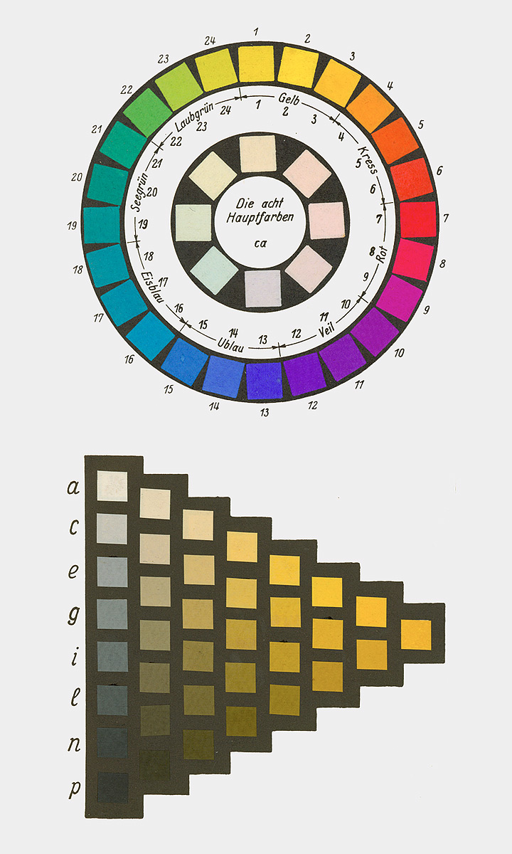
Chemist and Nobel laureate Wilhelm Ostwald addressed the „Normalfarbenfrage“ (normal color question) by developing a color order system. This system took the form of a double cone, capturing all body colors as colorful phenomena regardless of their material composition. Ostwald colored this order representatively with 2400 colors in the large version and 680 colors in the small version. Each color, given its specific place in Ostwald’s system, is referred to as a „color norm.“
Ostwald utilized vibrant, though often not lightfast, coal-tar dyes for his system, particularly deeming them suitable for school use. The Munich Academy professor Max Doerner and his group expressed concerns about the quality of painting materials, striving to set quality standards for pigments and dyes. However, this endeavor did not lead to a definitive solution.
Heinrich Trillich’s „Deutsche Farbenbuch,“ published from 1923 onwards, attempted to establish quality standards. In its second volume in 1925, it dedicated a section specifically to artist colors, expressing reservations about Ostwald’s advocacy for initially lightfast coal-tar dyes and the abstract color norm labeling that obscured the material character of the color.
Ostwald actively promoted his color theory through publications, lectures, workshops, and his Unesma publishing house, which distributed books, color atlases, and educational materials. Industries, including Günther Wagner with an official license from Ostwald, adopted his ideas, producing school paint sets. Winsor & Newton and Reeves in England also created school paint sets based on Ostwald’s principles.
Ostwald’s color theory introduced a new color theory, influenced by Ewald Hering, featuring four „primordial colors“: Yellow, Red, Green, and Blue. Hering defined these as psychologically neutral colors, and Ostwald incorporated them into his color circle, though deviations existed from Hering’s psychological primordial colors.
Ostwald actively promoted his color theory in schools, publishing a specially tailored „Farbschule“ (color school) in 1920. The „Kleinchen“ paint set, aligned with his color system, was central to this educational initiative. The set included 12 color pills, with 8 considered „main colors.“ Ostwald, aware of compromises in his color choices, emphasized the need for corrections to achieve the correct Ostwald color circle. Despite his disregard for lightfastness, Ostwald highlighted the distinction between dye and color.
Ostwald’s push into schools had a significant impact, generating extensive public discussions about his color theory in the early 1920s. Both critics and advocates, especially among art educators like R. Dorias, H. Hensinger, Martin Schaller, and Max Bühler, engaged in debates, presentations, and publications promoting or questioning Ostwald’s ideas.
The industry joined the trend, offering numerous school paint sets labeled with Ostwald’s name. Günther Wagner, the authorized distributor, explicitly emphasized the authenticity of its products, facing competition from unauthorized sets with Ostwald labels.
With Ostwald’s influence, the schools transitioned from the traditional three-color theory (Yellow, Red, Blue) to the four-color theory (Yellow, Red, Blue, Green). Ostwald’s compromises in pigment choices to achieve extensive color mixing capabilities required corrections for specific color areas.
Ostwald’s venture into schools left a lasting impact, leading to a shift in color theory education and influencing the production of art supplies in the early 1920s.

Sources:
https://dr-andreas-schwarz.de/schulmalkaesten-farbentheorie-farbwahrnehmung.html
Albers‘ Farbtheorie (20. Jahrhundert)
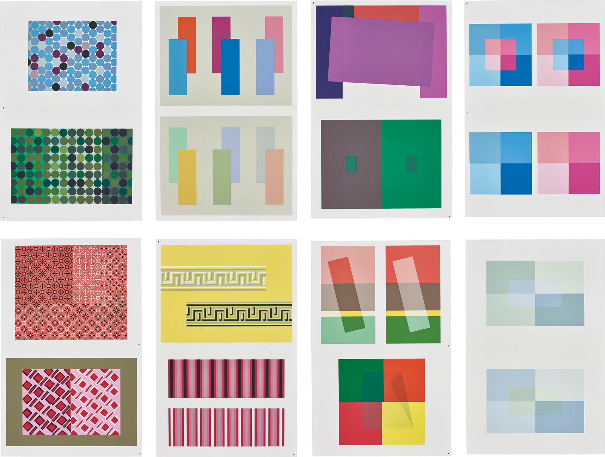
Josef Albers‘ book, „Interaction of Color,“ delves into the nuances of black and white, exploring them not just in terms of value but also in hue. The text challenges the simplistic view of white being just white and black being merely black, emphasizing that their specificity emerges when juxtaposed with similar forms or other colors.
Albers intricately addresses the conditionality of color, highlighting how it exists in our imagination and can be subject to interpretation. The book questions whether color’s meaning is relative to specific situations and underscores the interactive nature of color. Albers emphasizes that color is not passive; instead, it requires active engagement and purposeful activation through group reasoning.
Transparency emerges as a crucial concept in „Interaction of Color.“ When two colors mix transparently, the result is a new color, distinct from the blend of the original two. Albers stresses the importance of considering color for both its value and saturation, particularly in the context of a specific place. Group perception, according to Albers, can activate colors and imbue them with purpose within a given space.
In the context of societal issues, such as the tragic murder of George Floyd by the Minneapolis Police, Albers’s insights resonate. The book’s emphasis on avoiding negative judgments of color aligns with the call to recognize and confront biases. Albers encourages us to challenge notions of „taste“ and reject the labeling of any color as distasteful or „ugly.“ The overarching goal is to understand that color gains clarity in context, standing next to another color to reveal its value. This understanding extends beyond individual perceptions, fostering collaboration and trust in establishing a consensus that transcends personal limits.

Sources: https://www.artsy.net/article/artsy-editorial-josef-alberss-teachings-color-helped-way-address-social-change
Munsell-Farbsystem (20. Jahrhundert)
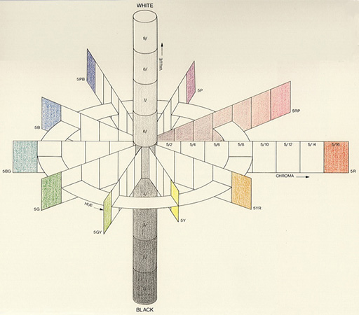
Munsell aimed to systematically account for each attribute of color through organized visual steps. He introduced 100 steps for hue, based on five primary and five intermediate colors. Munsell structured his system with ten units of value and an open-scale named „Chroma,“ resembling saturation. The resulting three-dimensional system can be visualized as a color tree. Among various attempts to construct color systems, Munsell’s approach, founded on „perceptual equidistance,“ achieved widespread success.
Initially proposing a subtle color sphere influenced by N. O. Rood’s „Modern Chromatics,“ Munsell later realized its geometric symmetry inadequacy for representing perceived color relationships. His efforts culminated in the 1915 publication of the „Color Atlas,“ presenting a naturally grown order organized around a central vertical gray axis, also known as the „color tree.“
Munsell built his system on a ten-part circle, arranging colors at equal intervals and selecting opposites that mix to produce neutral gray (the Principle of Compensativity). The color tones of hand-painted chips were aligned based on three variables in Munsell’s unique nomenclature: „Hue“ (color tone), „Value“ (brightness index), and „Chroma“ (saturation levels). Each color was characterized by the symbolic H/V/C triplet. Munsell developed the entire system through color wheel mixtures, trusting his eyes‘ judgment.
The vertical Value scale divided the range between Black and White into ten steps, determined using a self-constructed photometer. Munsell calibrated the steps by considering the square root of the measured reflected intensity, deviating from linear changes in reflection. Munsell selected samples of Red (R), Yellow (Y), Green (G), Blue (B), and Purple (P) that appeared equidistant from each other and from a gray of the same value. These became the fundamental hues of his system, supplemented by five mixtures, arranged in a circle around a neutral gray. Chroma values were arbitrarily assigned to all ten main colors and their mixtures, with an open-ended scale reaching values up to 12 or 14, depending on color intensity.
Munsell’s color wheel featured a total of 40 hues, resulting from subdividing the original five hue intervals into 10, 20, and 40 segments, ensuring perceptual equidistance. The unconventional color names are also listed.
A new edition of the „Color Atlas,“ titled „Munsell Book of Color,“ emerged in 1929 after Munsell’s death, and it is the version still in use today. In 1942, the „American Standards“ organization recommended its application for specifying surface colors. The Munsell notation was refined in connection with the „Optical Society of America,“ known as „renotation.“
This material standardization was crucial, allowing the translation of all other color systems into Munsell’s framework using standard physical methods. Modern color researchers express the desire for Munsell to reconstruct his system with contemporary color measurement tools, potentially combining his sensitive color evaluation with valence metrics, a uniquely German term referring to the contribution of a color stimulus to the effect of a mixture. Munsell’s reliance on color wheel mixtures was adjusted to minimize systematic deviations from modern valence metrics.


Sources: https://www.colorsystem.com/?page_id=860